

How to Write CTA Button Text That Converts

How to Write CTA Button Text That Converts
![]() 04-10-2025 (Last modified: 06-10-2025)
04-10-2025 (Last modified: 06-10-2025)
Want more clicks on your call-to-action (CTA) buttons? It all comes down to the words you choose. Effective CTA button text is clear, action-focused, and highlights value. For example, swapping “Order” with “Get” can boost conversions by up to 90%. Personalized CTAs can perform 202% better than generic ones. Here’s how to craft CTAs that work:
- Use action verbs: Words like “Get,” “Start,” or “Download” drive immediate action.
- Be specific and clear: Avoid vague terms like “Submit.” Instead, use “Start My Free Trial” or “Get Your Free Quote.”
- Show the value: Highlight benefits, e.g., “Save 20% Now” or “Unlock Exclusive Access.”
- Keep it short: Aim for 2-5 words that are easy to scan, especially on mobile.
- Test and optimize: Tools like PageTest.AI can help you refine your CTAs for maximum impact.
Strong CTA text guides users, reduces hesitation, and motivates clicks. Ready to improve your buttons? Let’s dive deeper.
Call-to-Action: How to Write High-Converting CTAs (+ Examples)
Core Principles for Writing High-Converting CTA Text
Creating effective CTA (Call-to-Action) button text isn’t a guessing game. It’s about applying tried-and-true principles that consistently deliver results. The secret lies in three key elements: actionability, clarity, and value. Nail these, and you’ll have buttons that people actually want to click.
Use Action-Oriented Language
The best CTAs use strong, action-driven verbs like “Get”, “Start”, “Download”, or “Join.” These words encourage users to take immediate action. For example, “Get Started Free” is far more engaging than a dull “Submit.” In fact, action-oriented CTAs can increase conversion rates by 20% or more compared to passive alternatives. They eliminate hesitation and guide users toward their next step.
Adding power words like “Free”, “Guaranteed”, “Instant”, or “Save” can make your CTA even stronger. These words tap into what users care about – saving money, reducing risk, or saving time. For instance, Adobe Creative Cloud saw impressive results in 2022 with their “Save Now” button during a summer promotion. By combining urgency with value, they boosted click-through rates and sales. The word “Save” worked because it immediately communicated both the action and the benefit.
Focus on Clarity and Specificity
Vague CTAs don’t work because they leave users guessing. Clear, specific CTAs remove uncertainty by setting exact expectations. Instead of generic phrases like “Submit” or “Click Here”, use language that explains what the user will get.
For example, “Start My Free Trial” performs better than “Get Started” because it tells users exactly what they’re getting. Similarly, “Reserve Your Spot” is more compelling than “Sign Up” because it suggests exclusivity and urgency. Being specific not only builds trust but also reduces the mental barriers that stop people from clicking.
Personalized CTAs convert 202% better than generic ones. Why? Because they address the user directly, making the action feel more relevant. For instance, “Get My Free Quote” feels more personal than “Get Free Quote”, with the word “My” creating a sense of ownership.
Nike’s minimalist “Shop” CTA is another great example. It’s crystal clear, and while it sets expectations, its simplicity works because the value is implied – users know they’re about to browse products.
Emphasize Value Proposition
Every click needs a reason, and that reason should be obvious in your CTA. Highlighting the value proposition within your button text motivates users by showing them what they’ll gain. This turns a simple instruction into an enticing offer.
Phrases like “Unlock Exclusive Access”, “Save 20% Now”, or “Get Instant Access” spell out the benefit. They answer the user’s internal question: “What’s in it for me?” And it works – CTAs with clear value propositions can boost conversion rates by up to 90%. This happens because value-driven copy speaks directly to the user’s needs instead of just asking them to act.
Take Zenni Optical’s “Shop new arrivals” CTA as an example. It combines specificity and novelty, encouraging users to explore the latest products. This approach not only drives engagement but also promotes new inventory. The value here is discovery – users know they’ll find something fresh.
The most effective CTAs combine all three principles. “Start My Free Trial Today” is a great example. It includes action (“Start”), clarity (“My Free Trial”), and value (“Free”). Together, these elements make the CTA irresistible, giving users every reason to click while removing any doubts.
Step-by-Step Guide to Writing Effective CTA Text
Crafting effective CTA (Call-to-Action) text isn’t about throwing random phrases together – it’s a thoughtful process. Every word should align with your goals, audience, and brand message. Here’s how to create CTAs that drive real results.
Define the Goal of the Page or Campaign
Before you start writing, be crystal clear about what you want users to do. Your page’s goal dictates your CTA language. A page focused on collecting email signups will need different wording than one encouraging product purchases or demo requests.
For example:
- Lead generation campaigns benefit from CTAs like “Get My Free Guide” or “Download Now” because they highlight immediate value.
- E-commerce pages thrive on action-oriented phrases like “Add to Cart” or “Buy Now” to streamline the buying process.
- SaaS companies often use low-commitment options such as “Start Free Trial” or “Try It Free” to reduce hesitation.
Generic CTAs like “Click Here” or “Learn More” don’t cut it. Match your CTA to the stage of the user journey. Early-stage visitors may need softer nudges like “Discover More”, while ready-to-buy users respond better to direct options like “Get It Now.”
Identify Your Target Audience and Their Motivations
Once your goal is set, it’s time to focus on who you’re talking to. Your audience’s needs and desires should shape every word in your CTA. Different groups respond to different triggers. For instance:
- Busy professionals value time-saving solutions.
- Budget-conscious shoppers look for deals and discounts.
Dive deep into what drives your audience. Are they motivated by convenience, savings, security, or exclusivity? Use these motivations to craft CTAs that feel personal. For example:
- If your audience is small business owners struggling with time management, a CTA like “Automate in Minutes” directly addresses their pain point.
- If you’re speaking to deal-seekers, “Save 50% Today” taps into their desire for savings.
The tone matters too. Someone exploring their options for the first time might prefer reassurance with CTAs like “Learn How” or “See How It Works.” On the other hand, someone further along in their decision-making process is ready for “Get Started Today” or “Claim Your Offer Now.”
Include a Benefit and Keep It Concise
The best CTAs are short, clear, and packed with value. Your CTA should answer two questions: “What do I get?” and “What should I do?” This mix of action and benefit is what makes CTAs effective.
For instance:
- “Download Your Free Template” is more compelling than just “Download” because it specifies the value.
- “Start Saving Money” works better than “Get Started” because it promises a concrete outcome.
Stick to 2-5 words whenever possible. Long CTAs lose their impact, especially on mobile devices where text can get cut off. Use punchy, action-driven words like “Get,” “Start,” or “Save” to create urgency and make your CTA easy to scan. For example:
- “Download Free Guide” follows a winning formula: Action Verb + Benefit + Urgency.
- Other examples include “Start Trial Today” or “Save 30% Now.”
Test different approaches to highlight the benefit. Instead of “Sign Up for Newsletter,” try “Get Weekly Tips” or “Join 10,000+ Readers.” Both achieve the same goal but emphasize unique benefits – knowledge versus community. The benefit you choose should resonate with your audience’s top priorities.
Lastly, consider mobile users. Place the most important words at the beginning to avoid truncation issues. For example, “Free Trial” is better than “Trial Free” because even if the text is shortened, the key benefit remains visible.
sbb-itb-6e49fcd
Testing and Optimizing CTA Button Text with PageTest.AI
Creating attention-grabbing CTA text is just the first step. The real magic happens when you test and refine your approach to discover what connects best with your audience. Even seasoned copywriters can’t always predict which CTA will hit the mark – that’s where testing becomes essential. With PageTest.AI, this process is simplified and streamlined.
AI-Powered A/B Testing for CTA Text
PageTest.AI removes the technical hurdles that often make CTA testing feel out of reach. Forget about needing coding skills or a developer’s help – this platform’s no-code interface allows you to set up and manage CTA tests directly from your browser using a handy Chrome extension.
Here’s how it works: choose the CTA button you want to test on your website, and PageTest.AI’s AI engine gets to work. It generates alternative versions of your CTA using proven strategies like action-oriented phrasing, clear value propositions, and urgency.
For instance, if your current CTA says “Learn More”, the AI might suggest variations like “Get Free Guide”, “See How It Works”, or “Start Your Journey.” These options are inspired by patterns found in high-performing CTAs. Once the alternatives are ready, the platform rotates them automatically to ensure each version gets fair exposure to your audience.
What’s great about this approach? It’s fast and easy. Tasks that used to take weeks can now be done in minutes. You can test multiple variations across different pages simultaneously, giving you deeper insights into what resonates most with your audience. But testing is only half the battle – tracking performance is where the real insights come to life.
Tracking Key Performance Metrics
PageTest.AI tracks the key metrics that matter – click-through rates, engagement, conversions, and user behavior. Its intuitive dashboard breaks down which variations are winning and, more importantly, why they’re performing well. You won’t just see which button gets the most clicks; you’ll also know which one drives actual results, whether that’s sign-ups, purchases, or downloads.
The platform also separates data for desktop and mobile users, understanding that user behavior can differ significantly depending on the device. This detailed breakdown helps you tailor your CTAs for each platform, ensuring they’re just as effective for someone on their phone as they are for someone browsing on a laptop.
To make things even easier, PageTest.AI integrates seamlessly with popular website builders. It automatically pulls performance data, so you don’t have to juggle multiple tools or deal with manual tracking.
Continuous Optimization with Data-Driven Insights
Optimization isn’t a one-time task – it’s an ongoing effort. User preferences shift, markets change, and what worked last month might not work today. PageTest.AI keeps you ahead of the curve by offering actionable recommendations based on your data and evolving trends.
For example, if “Start Free Trial” outshines “Get Started,” the platform might suggest testing alternatives like “Try It Free” or “Start Your Free Trial Today” to refine your results further. These suggestions are grounded in your actual performance data, not generic advice.
Research shows that fine-tuned CTA text can boost conversion rates by 20% or more compared to generic options. PageTest.AI makes it easy for businesses of all sizes to achieve these gains without needing a full tech team.
What’s more, the platform ensures your tests run until they reach statistical significance, avoiding common pitfalls like acting on incomplete data or ending experiments too soon. Over time, as you gather more data, the AI becomes even better at predicting what will work for your audience. Each test builds on the last, creating a snowball effect where your results keep improving.
With PageTest.AI, you’re not just testing – you’re building a smarter, data-driven approach to engaging your audience and driving conversions.
Common Mistakes to Avoid When Writing CTA Text
Getting your call-to-action (CTA) right is more than just a matter of creativity – it’s essential for driving conversions. But even the best intentions can falter if you fall into these common traps. Avoiding these missteps can mean the difference between a user clicking through or moving on without engaging.
Using Generic or Vague CTAs
Phrases like “Submit”, “Click Here”, or “Proceed” often fail to deliver results. Why? They lack clarity and don’t communicate any real benefit. Imagine encountering a button that says “Submit” – what happens when you click it? Will you get a quote, download a resource, or begin a signup process? That kind of uncertainty can leave users hesitant, and hesitation often leads to inaction.
Instead, focus on action-oriented, benefit-driven language. Swap out “Submit” for something like “Get Your Free Quote.” Replace “Click Here” with “Download Now” or “Start My Free Trial.” These alternatives work because they clearly outline both the action and the reward.
For example, KlientBoost increased engagement by changing “Contact Us” to “Get Your Free Marketing Plan.” This simple tweak transformed a vague request into a clear, value-packed offer.
Dropbox uses “Sign Up for Free” alongside “No credit card required” to reassure users. This combination reduces friction by addressing concerns about cost or commitment, making the offer feel more approachable.
The takeaway? A great CTA eliminates doubt and replaces it with confidence. Be specific, show the value, and make it easy for users to say “yes.”
Overloading the Page with Multiple CTAs
Too many CTAs on one page can overwhelm users, leading to decision paralysis. When faced with multiple competing options, people often choose none at all. Instead of trying to do everything at once, focus on one clear action.
Effective pages prioritize a single, primary CTA. This main action should align with the page’s overall goal. For instance, if your objective is to collect leads, “Get Free Consultation” should take center stage. If you’re driving sales, “Add to Cart” or “Buy Now” should be the star. Any secondary CTAs – like “Learn More” or “Share” – should play a supporting role and remain visually understated.
The key is strategic focus. Identify your top priority and design the page around it. A clutter-free layout with one prominent CTA is far more likely to get results than a page bombarded with options.
Neglecting Mobile Optimization
Mobile users interact with CTAs differently than desktop users, and ignoring these nuances can cost you conversions. For example, buttons that look great on a desktop might feel tiny and frustrating on a smartphone.
Make sure buttons are easy to tap. They should be large enough to avoid accidental clicks and spaced far enough apart to prevent frustration. Long CTA phrases that are readable on a desktop might need to be shortened for mobile. For instance, “Download Your Complete Marketing Strategy Guide” could be streamlined to “Get Marketing Guide” for better clarity on smaller screens.
Visibility and usability are critical for mobile CTAs. Ensure your CTA stands out, even within limited screen space. Sticky buttons that stay visible as users scroll can be particularly effective. Also, test your CTAs across devices to catch any issues – tools like PageTest.AI can help identify where mobile users might struggle.
With so much web traffic coming from mobile devices, optimizing your CTAs for smaller screens isn’t optional – it’s essential. A seamless mobile experience ensures you’re not leaving conversions on the table.
Conclusion: Write CTA Text That Drives Results
Bringing together the strategies and testing insights shared earlier, crafting CTA text that truly works is no accident. Effective CTA button text stems from applying proven principles and continuously refining your approach. It’s about using action-driven, clear, and benefit-focused language while adapting to how your audience behaves.
Testing and refining are non-negotiable. What resonates with one audience might not click with another, and even small changes can lead to noticeable improvements.
This is where data-driven testing becomes your secret weapon. A/B testing different CTA wording, placement, and design can lead to an average of 28% higher conversion rates. That’s the difference between guessing what might work and knowing what actually delivers results.
Tools like PageTest.AI can make this process seamless. Its CTA Optimization Simulator and CTA Effectiveness Checker provide insights, fresh ideas, and actionable feedback to fine-tune your CTAs across platforms. Instead of debating whether “Get Started” is better than “Try Free”, you can test both and let real user behavior guide your choices.
Put these strategies to work, test your ideas, and see your conversion rates soar.
FAQs on CTA button text
How can I create CTA button text that works best for my audience?
To create CTA button text that connects with your audience, aim for clarity, action, and relevance. Use straightforward language that highlights the benefit of clicking, like “Start Your Free Trial” or “Get Instant Access.” Make sure the message matches the audience’s needs and fits the purpose of the page.
Testing plays a big role in figuring out what works best. A/B testing different text options can help you understand which version gets more clicks. Tools with AI capabilities can make this process easier by generating and testing multiple variations, allowing you to pinpoint the phrasing that resonates most with your users.
What mistakes should I avoid when writing CTA button text?
When writing text for CTA buttons, steer clear of vague or uninspiring language that doesn’t clearly convey the next step. Words like “Click Here” or “Submit” are too generic and don’t encourage action. Instead, focus on specific, action-driven phrases that highlight the benefit for the user and align with what they’re looking to achieve.
Another pitfall to avoid is cluttering your page with multiple CTAs, which can leave users feeling confused or unsure about what to do next. Stick to a single, well-placed CTA that grabs attention and guides users smoothly. Make sure it visually stands out by using contrasting colors and easy-to-read fonts. And don’t forget to customize the message to resonate with your audience’s needs and preferences for the best results.
How can PageTest.AI help improve conversion rates by optimizing CTA button text?
PageTest.AI takes the guesswork out of improving conversion rates by offering tools to test and refine your CTA button text. With features like A/B testing and multivariate analysis, you can try out different text, colors, and placements to discover what resonates best with your audience.
The platform’s AI delivers insights based on data and creates content variations tailored specifically to your target audience. This ensures your CTAs are not just eye-catching but also encourage action. By regularly fine-tuning these elements, many businesses experience noticeable increases in user engagement and conversions.
Related Blog Posts
say hello to easy Content Testing
try PageTest.AI tool for free
Start making the most of your websites traffic and optimize your content and CTAs.
Related Posts

![]() 30-03-2026
30-03-2026
 Ian Naylor
How Internal Links Boost Conversions
Strategic internal links guide users, improve SEO, and turn site navigation into measurable conversion growth.

![]() 28-03-2026
28-03-2026
Ian Naylor
Core Web Vitals Benchmarks by Industry
Industry Core Web Vitals benchmarks and practical fixes for LCP, INP, and CLS, plus mobile vs desktop gaps and optimization tips.
![]() 26-03-2026
26-03-2026
Ian Naylor
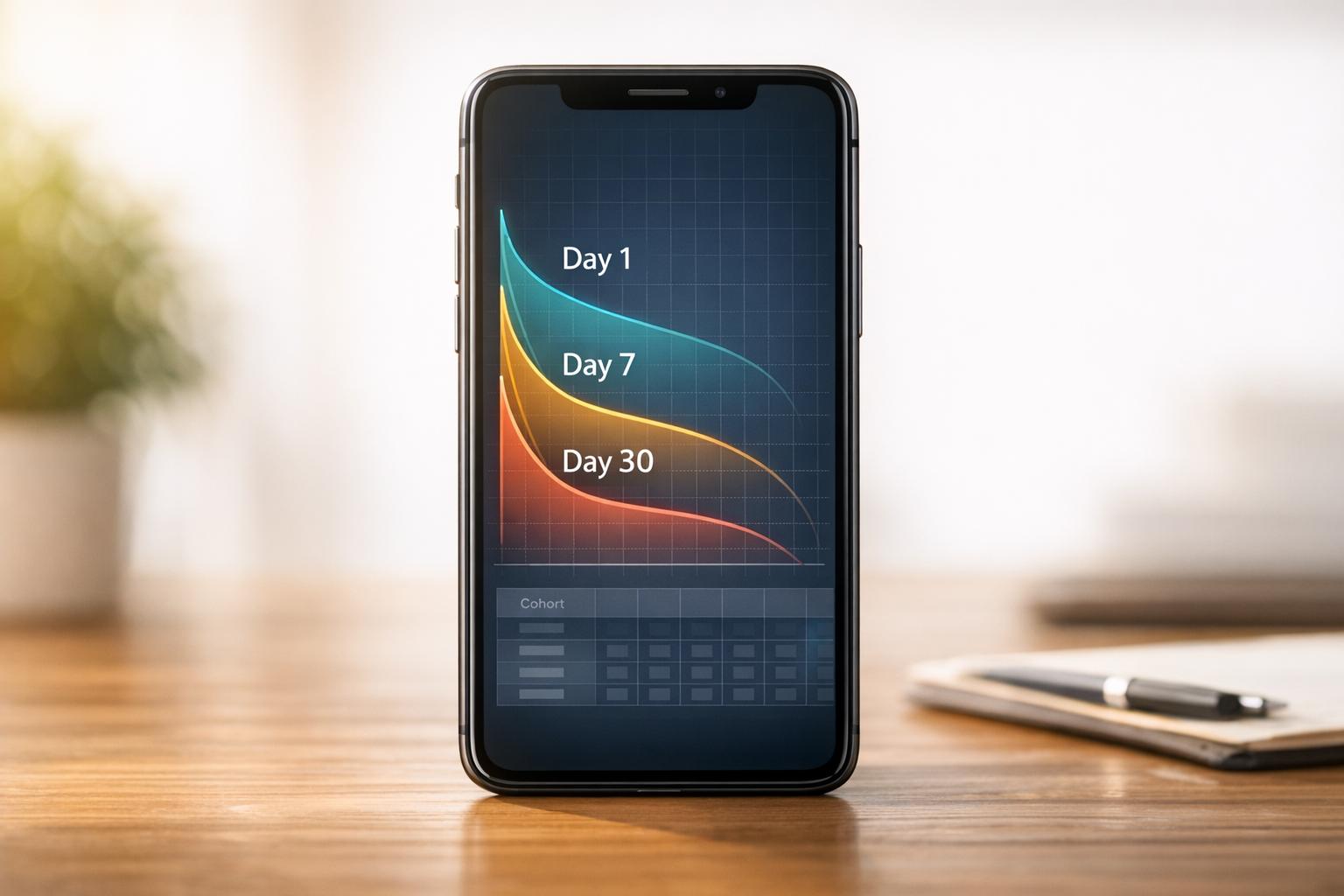
How to Benchmark Mobile Retention Rates
Benchmark Day 1/7/30 retention, run cohort analysis, and optimize onboarding, habit triggers, and personalization to improve app retention.