

Top 10 CRO Tips for Web Page Design
Top 10 CRO Tips for Web Page Design
 23-02-2026 (Last modified: 06-03-2026)
Want to increase site conversion? Here’s the deal: most websites convert less than 3% of visitors into customers. But the best ones? They hit 10% or more. The difference comes down to smart design choices and data-driven tweaks.
Here’s what you’ll learn with our top CRO tips for web page design:
- Clear value propositions grab attention in 3 seconds or less.
- Strong CTAs boost clicks with better design and wording.
- Faster load times can increase sales by up to 33%.
- Mobile-friendly layouts are non-negotiable (60%+ traffic is mobile).
- Simplified navigation keeps users focused and engaged.
- High-quality visuals and videos drive purchases.
- Social proof and trust signals build credibility.
- Clear visual hierarchy ensures users see what matters.
- Shorter forms reduce friction and increase sign-ups.
- A/B testing helps you make decisions based on data, not guesses.
Small changes like improving page speed or tweaking a CTA can lead to big results – like a 35% jump in sales or a 90% increase in clicks. Let’s break down how to optimize your site for more conversions without spending a dime on extra traffic.
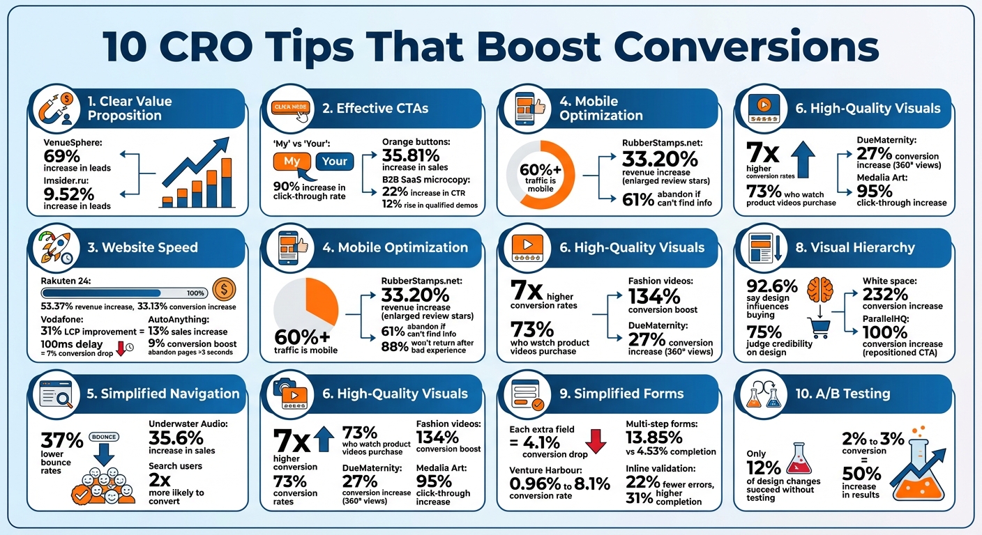
10 CRO Tips Impact on Conversion Rates – Key Statistics
15 Conversion Rate Optimization Tips That Will 2x Your Sales Overnight
sbb-itb-6e49fcd
1. Write a Clear Value Proposition
A clear value proposition is one of the most important steps in optimizing conversions. It answers the critical question, “Why should I care?” – and it does so in just three seconds. The focus here is on being clear, not clever. As Harry Dry, Founder of Marketingexamples.com, puts it:
“Clarity above everything. 50% of websites, ads, etc … are simply not clear. The smart stuff only works if what you’re selling and why I should care are easy to understand.”
Impact on Conversion Rates
A well-crafted value proposition can significantly improve conversion rates. For instance, VenueSphere ran a website A/B test on their subheadline to better communicate their value proposition, leading to a 69% increase in leads. Similarly, Imsider.ru, a Russian website, replaced a generic headline with one emphasizing a time-sensitive benefit, resulting in a 9.52% increase in leads.
Headlines are crucial in grabbing attention. As David Ogilvy, the Founder of Ogilvy, famously said, five times as many people read the headline as the body copy. This makes a strong, benefit-driven headline essential.
Ease of Implementation
Creating a clear value proposition doesn’t require a complete website overhaul. Instead, it involves refining a few key elements. Focus on these three components:
- A benefit-focused headline (under 10 words)
- A concise, supporting subheadline (under 20 words)
- A hero image that visually reinforces the benefit
Position these elements above the fold so visitors don’t have to scroll to see them. Use high-contrast colors to make your message stand out. A quick “squint test” can help: if your page’s purpose isn’t clear when blurred, it’s time to refine your value proposition.
User Experience Improvement
A clear value proposition isn’t just about conversions – it also improves user experience. By immediately communicating what you offer and why it matters, it reduces cognitive load and avoids overwhelming visitors with too much information. As Blake Emal, Senior Manager of Demand Gen at Talkdesk, points out:
“Worry first about creating FOCUS. What’s your main offer? Stick to that. Clear focus eliminates the possibility of ‘paralysis by analysis.'”
Instead of listing features, focus on outcomes, such as “Save 5 hours every week”. Use action-oriented, first-person phrases like “Start My Free Trial” to frame the value around the user. Remember, the brain processes images 60,000 times faster than text, so make sure your hero image reinforces your message rather than serving as mere decoration.
2. Design Effective CTAs
Once your value proposition grabs attention, the next step is guiding visitors toward action with a well-designed call-to-action (CTA). A CTA button can make or break conversions, and small design tweaks often make a big difference. Michael Aagaard, Senior CRO Consultant, highlights the importance of button design:
“Button design is a visual cue that helps attract prospects’ attention to the call-to-action… Button copy on the other hand helps prospects make up their minds in the last critical moment”.
Impact on Conversion Rates
Even tiny changes to your CTA’s design or wording can dramatically boost results. For instance, Michael Aagaard and Oli Gardner conducted a three-week A/B test for Unbounce. By changing the button text from “Start your free 30-day trial” to “Start my free 30-day trial”, they saw a 90% increase in click-through rate. That single word – switching “your” to “my” – created a sense of personal ownership that encouraged action.
Other adjustments, like button color and shape, can be just as impactful. A major European e-commerce site increased sales by 35.81% by using vibrant orange buttons, while a commercial real-estate site more than doubled its click-through rate with a similar approach. These examples highlight how thoughtful design choices can drive measurable results.
Ease of Implementation
Improving your CTAs doesn’t have to mean a complete overhaul. Start with the “squint test”: step back, squint at your page, and see if the CTA button stands out. If it doesn’t, you may need to increase contrast or add more white space around it. Your primary CTA should dominate visually, using bold, high-contrast colors. Secondary CTAs, on the other hand, can use subtler designs like neutral tones or ghost buttons to maintain a clear hierarchy.
For mobile users, ensure buttons are easy to tap by making touch targets at least 48 by 48 pixels, aligning with modern accessibility and SEO standards. Adding hover effects, such as a 10% brightness change, can also signal interactivity. When it comes to button copy, avoid generic terms like “Submit.” Instead, opt for specific, benefit-driven phrases such as “Get My Free Quote” or “Start My 14-Day Trial”.
User Experience Improvement
Effective CTAs do more than look good – they also guide users through the decision-making process. A well-thought-out CTA reduces uncertainty and makes the action feel seamless. Montana Thomas from Quick Sprout explains:
“People don’t fear clicking – they fear what happens after the click. Remove uncertainty right where the decision happens”.
Adding microcopy near your CTA can help ease these fears. Phrases like “No credit card required” or “Cancel anytime” reassure users and remove barriers to action. For example, a B2B SaaS company replaced the generic “Request a Demo” with “See It in Action” and added the microcopy “No Pitch – 5 Minutes.” This change led to a 22% increase in click-through rate and a 12% rise in qualified demo bookings.
Lastly, limit each section to one primary CTA to avoid overwhelming visitors with too many choices. Decision paralysis can lead to inaction, so keeping it simple is key. As Melanie Deziel, Director of Content at Foundation Marketing, puts it:
“Consider your CTA as a call to value. Explain how clicking the button will change your visitor’s world”.
3. Improve Website Speed
Website speed isn’t just a technical metric – it’s a make-or-break factor for user engagement and conversions. Did you know that a 100ms delay in page load time can slash conversions by 7%? Or that 53% of mobile users abandon a page if it takes more than 3 seconds to load? Steve Souders, Head Performance Engineer at Google, sums it up perfectly:
“80-90% of the end-user response time is spent on the front-end. Start there”.
Impact on Conversion Rates
Faster websites don’t just keep users happy – they drive results. Here’s proof:
- Rakuten 24 saw revenue per visitor jump by 53.37% and conversion rates climb by 33.13% after optimizing their Core Web Vitals.
- Vodafone improved their Largest Contentful Paint (LCP) by 31%, which boosted total sales by 8%.
- AutoAnything cut their page load time in half, resulting in a 13% increase in sales and a 9% boost in conversions.
The numbers speak for themselves: pages that load in 2 seconds have a bounce rate of just 9%, but stretch that to 5 seconds, and the bounce rate skyrockets to 38%. On mobile, even a 1-second delay can tank conversion rates by up to 20%.
Ease of Implementation
Speed improvements don’t have to be overwhelming. Start with these steps:
- Optimize images by switching to modern formats like WebP or AVIF and using the
srcsetattribute to serve device-appropriate image sizes. - Enable Gzip compression to shrink HTTP response sizes by around 70%.
- Use browser caching to ensure returning visitors experience faster load times.
Other technical fixes include minifying code (removing unnecessary characters from HTML, CSS, and JavaScript) and moving scripts to the bottom of your HTML or using async and defer to eliminate render-blocking. For Core Web Vitals, aim for these benchmarks: LCP under 2.5 seconds, Interaction to Next Paint (INP) under 200ms, and Cumulative Layout Shift (CLS) below 0.1. These changes lay the groundwork for a faster, smoother user experience.
User Experience Improvement
Speed isn’t just about numbers – it transforms how users interact with your site. Features like lazy loading ensure non-critical images and videos load only when they’re about to be seen, saving bandwidth for what matters. A Content Delivery Network (CDN) minimizes data travel distance, reducing latency for users in different regions.
The results can be game-changing. For instance, the 2011 Obama for America campaign shaved 3 seconds off their page load time (from 5 seconds to 2 seconds), leading to a 14% increase in onsite donations – an extra $34 million raised. Similarly, Mozilla reduced their landing page load time by 2.2 seconds, which drove a 15.4% increase in download conversions – equivalent to an estimated 60 million additional Firefox downloads annually. These examples show how speed optimization isn’t just a technical boost – it’s a direct path to better engagement and higher conversions.
4. Optimize for Mobile Devices
Making your website mobile-friendly isn’t just a nice-to-have – it’s a must. With over 60% of all website traffic coming from mobile devices and 92.3% of internet users accessing the web through their phones, your site’s mobile experience can make or break your success. Plus, Google’s mobile-first indexing means it evaluates your mobile site to determine your rankings. For digital marketing agencies, mastering these mobile nuances is essential for client success. As Douglas Karr, Founder and Publisher at Martech Zone, explains:
“Mobile conversion optimization is not just about making your website look good on a smaller screen. It’s about engineering a frictionless, intuitive experience that anticipates user needs, eliminates barriers, and guides them confidently to conversion”.
Impact on Conversion Rates
A poor mobile experience can drive users away fast. 61% of users abandon a site immediately if they can’t find what they’re looking for, and 88% won’t come back after a bad mobile interaction. Speed is another critical factor – a one-second delay in mobile load time can cut conversions by 7% to 20%.
But here’s the upside: small improvements can lead to big results. For example, RubberStamps.net boosted their revenue per visitor by 33.20% just by enlarging their review stars on mobile. Simple tweaks like these show how much potential lies in optimizing for mobile.
Ease of Implementation
Start with straightforward changes. Make sure buttons and links are at least 44×44 pixels to avoid accidental clicks, and use a 16px minimum font size for body text so users don’t have to zoom in. Place important elements – like CTAs and navigation menus – within the “thumb zone”, which is the center and lower part of the screen where one-handed users naturally interact.
Streamline forms by enabling autofill, offering guest checkout, and integrating payment options like Apple Pay or Google Pay to reduce typing effort. Use responsive design, which ensures your site adapts to any screen size without needing separate mobile URLs. This is Google’s recommended approach and simplifies maintenance. Also, keep mobile meta descriptions under 120 characters to avoid truncation in search results.
A mobile-friendly design doesn’t just look good – it eliminates friction, making it easier for users to take action.
User Experience Improvement
Beyond technical fixes, enhancing the overall mobile experience can significantly boost conversions. Mobile users want quick, easy navigation. Use single-column layouts to avoid horizontal scrolling, and incorporate hamburger menus or sticky headers to keep navigation accessible without overwhelming the screen. Break up content into short paragraphs or use bullet points to make it easy to scan.
Avoid intrusive pop-ups that interrupt the user experience – Google penalizes these, and they frustrate visitors. Instead, opt for subtle banners or exit-intent triggers. If your business relies on phone leads, add click-to-call buttons – 70% of mobile searchers use this feature to contact businesses. A great example comes from Cocohanee, an Indonesian retailer that reorganized their mobile menu to display sub-categories upfront. This simple change led to a 29% increase in transactions in just 22 days.
Alignment with Modern Design Practices
Mobile-first design isn’t just about shrinking desktop layouts – it’s about designing with mobile users in mind from the start. Focus on one-handed usability with features like floating action buttons and bottom navigation. For instance, Ideal of Sweden used a sticky countdown banner during a “Black Month” campaign to create urgency on mobile, leading to a 5.6% increase in add-to-cart clicks.
Emerging trends like Progressive Web Apps (PWAs) are also reshaping mobile experiences. These apps function offline, send push notifications, and don’t require app store downloads. Voice search and AI-based interfaces are further changing how users interact with mobile sites. The stakes are high – 75% of consumers judge a brand’s credibility based on its website design, and for most, that first impression happens on mobile.
5. Simplify Navigation and Site Structure
After addressing speed and mobile design, simplifying your site’s navigation is the next step to refining the user experience. Think of your navigation menu as more than just a collection of links – it’s a guide that leads visitors toward conversion. When users visit your site, they shouldn’t waste time figuring out what to do next. Overly complicated menus with too many options can overwhelm visitors, causing indecision and distraction.
Impact on Conversion Rates
Clear, simple navigation can significantly improve your site’s performance. For instance, websites with streamlined menus see 37% lower bounce rates compared to those with cluttered navigation. Simplifying navigation doesn’t just make your site look better – it removes barriers that could disrupt the path to conversion. Like optimized speed and mobile design, a clean menu helps users quickly find what they need, encouraging them to stay longer and take action. Case in point: visitors who use a site’s search function are twice as likely to convert compared to those who don’t.
One example of this in action is Underwater Audio. By redesigning its homepage to improve navigation and visual hierarchy, the company saw a 35.6% increase in online sales.
Ease of Implementation
Here are some practical tips for simplifying navigation:
- Limit menu items: Keep top-level navigation between 5–7 items to avoid overwhelming users.
- Use specific labels: Replace vague terms like “Services” with clear options such as “Web Design” or “SEO Consulting” to help visitors understand what they’ll find.
- Rethink social icons: Move header social media icons to the footer to prevent visitors from leaving your site prematurely.
- Prioritize key links: Leverage the serial position effect by placing your most important links, like “Shop” or “Get Started”, at the beginning of your menu and less critical ones, like “Contact”, at the end.
This approach not only simplifies navigation but also aligns with modern, minimalist design principles.
User Experience Improvement
Visitors rely on navigation for clear “information scents” – signals that tell them where a link will lead. Ambiguous labels force users to guess, often leading to frustration or site abandonment. For larger sites, breadcrumb navigation can help users keep track of their location within the site hierarchy and easily backtrack if needed.
For mobile users, ensure navigation elements are touch-friendly, with tap targets of at least 44×44 pixels. Adding a sticky header that stays visible as users scroll allows easy access to navigation without needing to return to the top. One e-commerce client saw a 15% increase in conversions simply by reorganizing their mobile menu to prioritize shopping-related links over informational pages like “About Us”.
Alignment with Modern Design Practices
Modern design trends emphasize simplicity and focus. Menus are becoming more minimal, with even desktop sites adopting hamburger menus to reduce visual clutter. For sites with extensive content or product categories, mega menus are gaining popularity. These menus display all options in a well-organized, visual layout, making it easier for users to find what they need.
AI is also transforming navigation. Predictive search and dynamic menus that adapt to user behavior are becoming the norm. As Neil Patel, Co-Founder of NP Digital, points out:
“The design of a website’s navigation has a bigger impact on success or failure than almost any other factor. It affects traffic and search engine rankings. It affects conversions and user-friendliness”.
Your navigation isn’t just functional – it’s a critical tool for driving conversions and creating a seamless user experience.
6. Use High-Quality Visuals and Videos
Once you’ve streamlined your site’s navigation, it’s time to focus on visuals. Why? Because the human brain processes visuals 60,000 times faster than text. Visitors form impressions of your site in just 2.6 seconds – so those images and videos need to work hard to engage them and drive conversions. Beyond making your site look good, high-quality visuals build trust, answer questions, and help users imagine themselves using your product.
Impact on Conversion Rates
The right visuals can make a huge difference. Brands using engaging visuals report conversion rates that are up to 7 times higher. Videos are especially powerful – 73% of visitors who watch a product video go on to make a purchase. For fashion brands, product videos can boost conversions by an incredible 134%.
There are plenty of examples to back this up. DueMaternity.com swapped out static product images for 360° rotating views, leading to a 27% increase in conversions. Mall.cz tested larger product images with mouseover descriptions and saw a 9.46% revenue boost. Even small tweaks can have a big impact – Medalia Art replaced generic graphics on its homepage with photos of its artists, resulting in a 95% jump in click-throughs.
Ease of Implementation
You don’t need a massive budget to make this work. Start by replacing stock photos with authentic images of your products, team, or customers. Even high-quality photos taken on a smartphone can feel more genuine and relatable. For product pages, use high-definition images (at least 1500×1500 pixels) and include zoom functionality so users can examine details closely. Lifestyle shots are another great option – they help visitors imagine owning or using the product.
When it comes to videos, keep them short and to the point – 15–30 seconds is ideal. Display the video’s duration upfront to reduce hesitation, and use muted auto-play with captions for a better user experience. If full-scale video production isn’t an option, consider animated GIFs to highlight key features. Finally, make sure all visuals are optimized for speed – use formats like WebP and enable lazy loading for content further down the page.
User Experience Improvement
Strong visuals don’t just look good – they make the shopping experience smoother. For example, BrickHouse Security added product images to their site search drop-down and saw conversion rates among search users double – a 100% increase. Another trick? Use photos where subjects naturally look toward your call-to-action to subtly guide visitors’ attention. As Craig Sullivan from Optimal Visit explains:
“The best image is not the one that YOU WANT to put there, but the one that will have the biggest impact on the mind and feelings of your viewer”
On the flip side, generic stock photos can leave visitors feeling disconnected or even distrustful. Authenticity is key.
Alignment with Modern Design Practices
Web design trends today lean heavily toward authenticity and interactivity. Users expect more than just static images – they want 360° views, engaging product videos, and even augmented reality tools that let them “try” products virtually. In fact, 93% of consumers say that visual appearance is their top deciding factor when making a purchase. Swapping polished stock photos for real, authentic images builds trust and connection. As Peep Laja, Founder of CXL, puts it:
“People hardly buy anything without seeing it. Usually, they also want to touch it, hold it, or take it for a spin. You really can’t do those things online… So, to compensate for all of that, you need to work twice as hard to make your products come alive via excellent photography and graphics”
7. Add Social Proof and Trust Signals
Building trust with your audience is essential, and social proof is one of the most effective ways to do it. In fact, 88% of consumers trust online reviews just as much as personal recommendations from friends or family. When visitors arrive on your site, they’re looking for validation – proof that others have made the same choice and are satisfied with it. Social proof works by easing doubts, triggering FOMO (fear of missing out), and borrowing credibility from respected sources.
Impact on Conversion Rates
The numbers don’t lie: social proof can boost conversion rates by an average of 34%. Testimonials and trust signals alone can increase conversions by 15–42%, and when placed strategically near CTAs (call-to-actions), the boost can reach as high as 90%. Even simple security badges near checkout buttons can reduce cart abandonment by up to 32%. Star ratings also play a big role – 82% of consumers say that positive reviews and ratings make them more likely to buy. Interestingly, a rating between 4.2 and 4.5 is often more convincing than a perfect 5.0, which can feel too good to be true. These stats make it clear: social proof isn’t just nice to have – it’s a must.
Ease of Implementation
Getting started is easier than you might think. Begin by reviewing third-party platforms like Trustpilot, Google Reviews, or even your social media channels for positive feedback. Highlight this feedback on high-traffic pages. Place client logos prominently – ideally above the fold in your hero section – and position testimonials next to CTAs to reduce hesitation at critical moments. Full details like names, photos, and job titles make testimonials feel more genuine. Anonymous or vague quotes, on the other hand, can feel fabricated. As copywriter Joel Klettke advises:
“Try to choose testimonials that go beyond a platitude, like ‘They’re great!’ and instead choose testimonials that speak to specific parts of your value or offer… you can bold these parts… to quickly support claims”
User Experience Improvement
Adding trust signals doesn’t just improve metrics – it also creates a smoother user experience. They serve as mental shortcuts, making visitors feel more comfortable sharing their data or making a purchase. By showing that others have already taken the leap, trust signals reduce decision fatigue. For instance, a SaaS company saw a 35% increase in trial sign-ups over three months simply by adding customer logos, star ratings, and video testimonials. Video testimonials, in particular, are highly effective – they outperform text-based reviews by 25-35% because they’re more authentic and harder to fake. For best results, avoid testimonial sliders, which can feel clunky; instead, stack them vertically for a more natural scrolling experience.
Alignment with Modern Design Practices
Transparency and authenticity are key in today’s design landscape. Skip the stock photos and corporate jargon – opt for real team bios, photos, and even LinkedIn links on your “About Us” page. Featuring “As Seen In” logos from respected media outlets can also lend you credibility. Dynamic counters, like “10,000+ customers served”, tap into the bandwagon effect and build trust. To make testimonials even more effective, place them near the claims they support. For example, a testimonial about speed should sit next to your performance metrics. As legendary copywriter Gary Bencivenga advises:
“Never make your claim bigger than your proof. And always join your claim and your proof at the hip in your headlines, so that you never trumpet one without the other”
8. Create a Clear Visual Hierarchy
Visual hierarchy is all about directing attention to the most important elements on a page. When done effectively, it transforms a cluttered layout into a user-friendly experience that drives conversions. First impressions happen fast – just 50 milliseconds, to be exact. That’s why a clear visual structure is key. It reduces mental effort, guides visitors toward your goals, and establishes trust almost instantly.
Impact on Conversion Rates
Here’s the reality: 92.6% of shoppers say design influences their buying decisions, and 75% of people judge a brand’s credibility based on how its website looks. A poorly organized page can be costly – 38% of users will leave if the design is unattractive, and 70–90% of visitors bounce if the visual hierarchy doesn’t grab their attention. On the other hand, simplifying your design and incorporating white space can increase conversions by as much as 232%. Even small tweaks matter. For instance, changing the color of a CTA button has been shown to boost conversions by 21%. Neil Patel shared a case where cutting 80% of a page’s content to focus on core elements led to a 300% increase in conversions.
Ease of Implementation
The good news? You don’t need to be a design expert to improve your visual hierarchy. Start with a simple “squint test” – blur your vision slightly and see what stands out. Ideally, your headline and CTA should dominate. Aim for a 2.5:1 size ratio between primary and secondary elements to create a clear distinction. Position key features along natural scanning paths, like the top-center of the page. For example, ParallelHQ doubled its conversion rate by moving a sign-up CTA from the bottom of the page to a more prominent spot in the hero section and increasing its size. As Robin Dhanwani from Parallel explains:
“Visual hierarchy is simply the ordering of visual elements so people see what matters first – and it’s the difference between an interface that converts and one that confuses.”
User Experience Improvement
Good hierarchy doesn’t just make a site look better – it makes it easier to use. By organizing content logically, you help users grasp information quickly and make decisions faster. ParallelHQ saw a 20% jump in sign-ups and a 30% reduction in time-to-value by redesigning its onboarding flow with better spacing and grouped metrics. Simple cues like arrows or even the direction of a person’s gaze in an image can subtly guide users to your CTA.
Alignment with Modern Design Practices
Today’s design trends lean heavily on mobile-first layouts, where elements are reordered or stacked to maintain their importance on smaller screens. With over 60% of web traffic now coming from mobile devices, this approach isn’t optional – it’s essential. Minimalist design is also gaining traction, focusing on simplicity and seamless navigation. The goal? Create an experience so intuitive that users don’t even think about the design – they just flow through it effortlessly. Using a 60-30-10 color ratio (60% primary, 30% secondary, 10% accent) ensures balance while making CTAs pop. Don’t forget about accessibility either; a minimum text contrast ratio of 4.5:1 is a must. As Clay, a leading design agency, puts it:
“Good design should be invisible. When a website works well, users never think about the design. They move through it naturally and find what they need without confusion.”
9. Simplify Forms and Reduce Friction
Complicated or overly long forms can destroy your conversion rates. Research shows that every extra field in a form drops conversions by 4.1%. Here’s a striking example: in 2022, Expedia found that a single unnecessary “Company” field (which users mistook for their bank name) was costing them $12 million annually in lost revenue. Once they removed it, the profits came back. The takeaway? Every field in your form needs to justify its existence. Simplified forms, like streamlined navigation, minimize friction and lead to higher conversions.
Impact on Conversion Rates
The fewer fields your form has, the more likely people are to complete it. For instance, Imagescape saw a 120% increase in conversions by trimming their contact form from 11 fields to just 4. Venture Harbour experienced an even bigger boost when they switched from a single-page form to a multi-step process, with their conversion rate jumping from 0.96% to 8.1%. Multi-step forms work because they average a 13.85% completion rate, compared to just 4.53% for single-page forms. Breaking forms into smaller sections reduces “form fatigue” and takes advantage of commitment bias – once users start, they’re more likely to finish.
Other tweaks can also make a big difference. Inline validation, which provides real-time feedback on errors, can reduce form mistakes by 22% and increase completion rates by 31%. On the flip side, outdated elements like CAPTCHAs can hurt your results, cutting conversions by up to 30%. Simplifying and refining your forms isn’t just a design choice – it’s a smart business move.
Ease of Implementation
You don’t need a full redesign to simplify forms and see improvements. Start by auditing each field and removing anything unnecessary for the current transaction. Use top-aligned labels (instead of left-aligned ones) to make scanning faster. Enable browser autofill with standard HTML autocomplete attributes, which can reduce form completion time by 35%.
For mobile users, who now make up over 60% of web traffic, use HTML5 input types like type="tel" or type="email" to trigger the correct keyboard. Ensure touch targets are at least 44×44 pixels to prevent tapping errors. Even small changes, like replacing generic “Submit” buttons with action-oriented phrases like “Get My Free Guide”, can have a big impact. Using first-person language (“my” instead of “your”) can boost click-through rates by 90%.
User Experience Improvement
Simplifying forms isn’t just about conversions – it’s also about respecting your users’ time. For example, single-column layouts are faster to complete, shaving off an average of 15.4 seconds compared to multi-column designs. Real-time inline validation not only catches errors early but also reduces frustration, cutting completion time by 42%. For longer forms, include a progress bar or step counter (e.g., “Step 2 of 4”) to set clear expectations.
As Ian Heinig from The Manifest explains:
“A business that creates effortless web forms is sure to benefit. A linear and intuitive web form experience is guaranteed to increase your conversion rate.”
By making the process smoother, you’re not just increasing conversions – you’re also leaving a positive impression on your users.
Alignment with Modern Design Practices
The best-performing forms today are built with mobile-first design and automation in mind. Instead of relying on visible CAPTCHAs, consider using hidden “honeypot” fields that bots are more likely to fill out, maintaining security without adding friction. Use address autocomplete APIs to save users from typing out full addresses manually. Avoid placeholder text as a primary label – it disappears when users start typing, which can lead to confusion.
Accessibility is another key consideration. Make sure your forms include proper <label> tags with for attributes so screen readers can identify fields for visually impaired users. The goal is to create a seamless process where users don’t even think about the form – they just complete it effortlessly and move on. With these strategies, your forms can become a powerful tool for boosting conversions.
10. Use A/B Testing with AI Tools
A/B testing is the backbone of making smart, data-driven design choices. While traditional methods can feel slow and demand a lot of resources, AI-powered tools make the process faster and more efficient. By automating content creation and tracking performance metrics, these tools help you test ideas quickly. Interestingly, research shows that only about 12% of design changes bring measurable results. This highlights just how important frequent testing is to figure out what actually works. With this approach, you can continuously fine-tune your design elements for better outcomes.
Impact on Conversion Rates
Start by setting clear goals and forming a hypothesis. For example, you might predict a 15% increase in conversions by tweaking the wording of your call-to-action (CTA). To ensure accurate results, run your tests on at least 20% of your monthly traffic. Since most design changes don’t produce major improvements, ongoing iteration is key. Once you find a winning variation, implement it right away and move on to testing the next idea.
Ease of Implementation
AI-powered platforms like PageTest.AI simplify A/B testing by removing many of the technical challenges. These no-code tools let you easily select elements like headlines, CTAs, or product descriptions for testing. They then generate multiple variations and track metrics such as clicks, engagement, time spent on the page, and scroll depth. However, one thing to watch out for is “cloaking” – a practice where search engines are shown different content than users. This can negatively impact your SEO efforts.
Alignment with Modern Design Practices
AI-driven testing fits seamlessly into today’s web design workflows. For instance, you can install a Chrome extension, pick the elements you want to test, and let the AI handle everything – from generating variations to tracking performance. This method not only speeds up optimization cycles but also allows for multivariate testing vs A/B testing, helping you boost conversion rates without disrupting the user experience. Whether you’re refining CTAs, forms, or other design elements, this approach ensures every detail works toward better results.
Conclusion
These 10 tips offer a practical roadmap to reshape your web page design and improve conversions. But here’s the thing: boosting your conversion rate isn’t a one-time fix – it’s an ongoing process. As Josh Gallant, Founder of Backstage SEO, wisely points out:
“Great CRO isn’t a campaign – it’s a mindset. The difference between teams that get occasional wins and those that transform their results comes down to one thing: Making experimentation a habit, not a project”.
This approach is the foundation of every strategy shared here. Whether it’s crafting a strong value proposition or fine-tuning your mobile experience, each tactic plays a role in creating a smooth and engaging user journey that encourages action.
Here’s some perspective: raising your conversion rate from 2% to 3% delivers a 50% increase in results without spending extra on ads. Even small tweaks can add up over time, driving better performance without requiring a bigger budget. However, user preferences, technology, and competition are always changing. What works today might not deliver the same results next quarter. That’s why regular testing is crucial – it saves you from costly redesign mistakes that could unintentionally hurt sales.
Consider this: only 12% of design changes succeed without proper testing. Guesswork can be expensive, but systematic testing pays off. Whether you’re simplifying forms, refining CTAs, or improving page speed, every test provides valuable insights that replace opinions with hard data.
Tools like PageTest.AI make this process easier. With its no-code Chrome extension, you can test elements like headlines, CTAs, button text, and product descriptions. The AI handles variation creation and tracks performance metrics like clicks and engagement. It integrates smoothly with platforms like WordPress, Shopify, and Wix, so you can dive into testing without technical hurdles. Plans start at $10/month for 10,000 test impressions.
Improving conversions is a journey, not a destination. Each test builds on the last, helping you refine your approach over time. Start small, analyze the data, and keep moving forward. With consistent testing and thoughtful design, your website can become a powerful driver of growth and success.
CRO Tips for Web Page Design – FAQs
Which CRO changes should I test first on my website?
When looking to make improvements, start with high-impact areas that can deliver quick results. For example, evaluate your calls-to-action (CTAs) – are they clear, compelling, and easy to find? Next, check your page load speed; even a slight delay can drive users away. Finally, review your site navigation to ensure it’s intuitive and helps users find what they need without frustration.
Pay close attention to key parts of your site, like the homepage, the hero image or video, and the overall user experience. Use data to guide your decisions – whether it’s analytics or user feedback – so you’re focusing on the areas that matter most. By prioritizing these elements early on, you can make meaningful improvements that drive better results.
How fast should my pages load to improve conversions?
Pages need to load in 2 seconds or less to keep users engaged and improve conversions. If your load time exceeds 3 seconds, you risk losing 40% of your audience. And it doesn’t stop there – every extra second can slash conversion rates by roughly 7%. Speed isn’t just a nice-to-have; it’s a crucial factor in retaining users and boosting your site’s performance.
How much traffic do I need for an A/B test to be reliable?
To get dependable A/B test results, your page should generally attract at least 5,000 visitors per week. On top of that, you need a sufficient number of conversions to ensure the results are statistically significant.
CRO Tips for Web Page Design – Related Blog Posts
say hello to easy Content Testing
try PageTest.AI tool for free
Start making the most of your websites traffic and optimize your content and CTAs.
Related Posts

30-03-2026
 Ian Naylor
How Internal Links Boost Conversions
Strategic internal links guide users, improve SEO, and turn site navigation into measurable conversion growth.
28-03-2026
Ian Naylor
Core Web Vitals Benchmarks by Industry
Industry Core Web Vitals benchmarks and practical fixes for LCP, INP, and CLS, plus mobile vs desktop gaps and optimization tips.
26-03-2026
Ian Naylor
How to Benchmark Mobile Retention Rates
Benchmark Day 1/7/30 retention, run cohort analysis, and optimize onboarding, habit triggers, and personalization to improve app retention.