

Conversion Rate Optimization Checklist for Beginners
Conversion Rate Optimization Checklist for Beginners
![]() 21-06-2025 (Last modified: 15-07-2025)
21-06-2025 (Last modified: 15-07-2025)
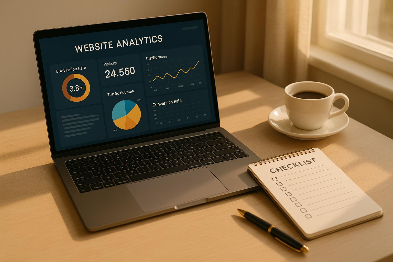
Conversion Rate Optimization (CRO) focuses on turning more site visitors into buyers, sign-ups, or leads. It’s about making small, data-driven changes that improve how users interact with your website. Here’s my top takeaways and handy checklist to get started:
Key Takeaways:
- What is CRO? It’s the process of boosting the percentage of visitors who take desired actions on your site, like making a purchase or filling out a form.
- Why it matters: Even a 1% increase in conversions can lead to huge revenue growth.
- How to start: Use tools like Google Analytics, Hotjar, and PageTest.AI to track user behavior and test improvements.
- Quick wins: Optimize call-to-action buttons, simplify forms, and speed up your website.
Quick Checklist:
- Track your data: Use Google Analytics and heatmaps to find where users drop off.
- Simplify checkout: Reduce form fields, allow guest checkout, and show costs upfront.
- Test changes: Use A/B testing to refine headlines, CTAs, and page layouts.
- Speed matters: Ensure your site loads in under 3 seconds, especially on mobile.
- Use AI tools: Personalize content and automate testing for better results.
Want to dive deeper? Let’s explore how to make these changes step-by-step.
Conversion Rate Optimization (CRO) for Beginners: Turn Visitors into Customers
Get Ready to Use Data and Know Your Start Point
Before you start to make changes, it’s key to know your start point. A clear start line will let you check your progress well.
Put in Data Tools
Start with Google Analytics, a no-cost and well-known tool. It helps track where users come from, what they do on your site, and where they leave.
“Clients want to see the end goal–what’s converting, what’s working, and where there is consistent growth. If something is not working, we want to understand why and make recommendations to fix it.” – Valerie Jennings, CEO of Jennings Social Media & MarTech
To move past Google Analytics, think about using PageTest.AI to try out different page designs and find clear ways to upgrade. Combine this with Hotjar, which gives heatmaps and videos of user sessions to show how people use your site. For instance, Brand24 used Hotjar and saw their conversions jump by nearly 300%.
Once you have these tools set up, focus on the key numbers that help boost your conversion goals.
Look at Key Stats
Some stats give you a better view of how your site is doing:
- Conversion rate: This is the share of visitors who do what you want them to do, like join up or buy something. The normal rate across fields is about 2.9%, but the best sites often reach 4.6% or more.
- Bounce rate: This shows how many visitors leave your site after only seeing one page. Try to keep your bounce rate under 40% – a higher rate may show that visitors aren’t finding what they need.
- Time on page: This can tell you how much your content pulls in readers.
- Click-through rate (CTR): This measures how well your buttons and links work to get people to take action.
- Traffic sources: It’s key to know where your visitors come from. Organic searches usually have a conversion of 2.6%, while email drives show a 2.4% conversion for B2B firms.
“I will always look at sessions, traffic sources, and conversion rates before anything else. When working to improve any of these metrics, many more engagement metrics become relevant and interesting, as they reveal where and how I can improve the customer experience.” – Phil Vallender, Director at Blend Marketing and HubSpot Elite partner
Watch your page load times too – long waits can really push people away, even doubling how often they leave.
Check Your Best and Worst Pages
Your tracking tools can show you which pages work well and which ones need work. High exit rates on some pages often tell where people stop. Look at these weak pages next to your good ones to see where you can do better.
For instance, direct traffic usually works best at 3.3%. But, pages from ads or blog posts might not do as well as those visited by repeat customers or social media fans.
Take CNN Brasil as an example. In 2022, they teamed up with NP Digital to better their content plan with what analytics showed. The outcome? A 91% boost in all pageviews – over 1 billion – and a 19% rise in top 10 Google keyword ranks.
“It is our goal to help our clients understand their reports and the website data it is collecting so that they can make the best decisions for their business.” – Ariene Malicdem, Digital Media Account Director, Connections Marketing
One more win comes from Every.org. They used clip logs to make their site better and up the gifts to good causes by 29.5%.
Boost Website Parts That Get More Clicks
After you set up your data tools and know your main numbers, turn your eye to the parts that make people act or leave your site. Small changes in important spots can make more people say yes.
Make Call-to-Action Buttons Better
Call-to-action (CTA) buttons are very important for more clicks. Even small tweaks can make a big change. For example, a clear CTA can lift click rates by up to 161%.
Start simple: size is key. Buttons need to be big enough for all to use, including phone users. They say 44px by 44px is the least size, yet 48px by 48px is better for phones. Just making buttons bigger has shown to increase click rates by up to 90%.
Color also matters a lot. Your button should pop off the page – aim for a 3:1 color gap between the button and its back. Studies say the right color can push up clicks by 21%.
“Color usage does matter, sometimes a lot. But…What works on one site, doesn’t necessarily work on another. Visual hierarchy matters and making your call to action stand out matters.” – Ott Niggulis
The words on your button can change how many people click. For example, PartnerStack got more people to click by changing their home page button from “Book a Demo” to “Get Started”. Also, Content Verve saw more clicks, up to 90% more, by using “get my free template” instead of “get your free template”.
Where you put the button is key too. Most people look over pages in an F-shape or Z-shape, so put your buttons where people tend to look first. HubSpot tried two things: adding a sticky CTA bar and just updating the hero image. The first got 9% more clicks, the second got a 10% jump.
When your CTAs work well, look at your headlines and product descriptions to get people interested right away.
Make Better Headlines and Product Descriptions
Your headlines and product texts are often the first things people see. They should catch the eye fast and make the value clear.
Tools like PageTest.AI let you try out and test different headlines and texts to find out which work best. You use real data, not guesses, to choose the best words.
Focus on the good things your product brings, not just what it does. Show how it fixes issues or makes things better for the user. Don’t be unclear – tell people exactly what they will get.
“People don’t buy features – they buy better versions of themselves. Your words should always show them that transformation clearly.” – Ian Naylor, PageTest Founder
Keep your words simple and easy to scan. Use short blocks of text, use bullet points for main points, and bold text to show big benefits. This really helps people who use phones and tend to read fast.
Now, with good content ready, it’s time to make the forms and buying steps easier to cut down problems for your site’s visitors.
Make Forms and Buying Steps Easier
Hard forms and buying steps are big reasons why people stop and leave their shopping carts. On average, about 70% of people leave their carts.
Why do people leave their carts?
- Hidden costs make 48% of shoppers quit.
- Having to make an account stops 24% of shoppers.
- Hard buying steps make 17% of shoppers give up.
Making these steps simpler can change a lot. For instance, UK store White Stuff cut their buying steps from three pages to one, boosting phone speed by 100%, sales rates by 37%, and order size by 26%.
Here are some tips to make buying easier:
- Allow guest checkout: Let users buy without making an account.
- Ask for less info: Only need key details.
- Use autofill tools: Things like browser autocomplete and real-time ZIP code finding help save time.
- Show all costs early: Share shipping costs, taxes, and other fees early to stop surprises.
“Optimizing the checkout process isn’t just about making transactions seamless – it’s about creating an experience that is fast, secure, and frictionless while reinforcing trust and confidence in the buyer.” – Santiago Vera
Adding things like safety logos, buyer reviews, and clear return rules can help make buyers feel safe. Make sure return and refund rules are easy to find – 8% of people will leave their carts if they can’t find this info.
Make Your Pages Fast and Fix Issues on Mobile
A slow site can turn people away. In fact, 53% of users will leave a site if it loads in more than three seconds. With more than 52% of web use from mobile devices, being fast and working well on mobile is a must.
How to make pages faster:
- Make pictures smaller using new types like WebP and start lazy loading.
- Make CSS, HTML, and JavaScript files smaller by cutting out extra characters.
- Use Gzip or Brotli to cut down file sizes.
- Set up browser caching so old visitors don’t have to load the same files again.
Think about using a Content Delivery Network (CDN) to bring your site closer to your visitors, cutting down on how long it takes to load.
“If you want to improve user experience, rankings, and those all-important conversions, mobile site speed optimization is non-negotiable.” – Neil Patel
Make sure your site runs well on phones. Check it on many screen sizes to make sure buttons are simple to hit, menus work well, and text is clear without zooming in. Use clear tools like hamburger menus and items that can fold to keep it neat and easy to use.
To spot exact problems, tools like Google PageSpeed Insights can give you a full list of issues and steps you can take. Fixing these things can really help make the user experience and conversion rates better.
Run A/B and Many Changes Tests
Now your data is ready and your site looks good, it’s time to make your conversion plans better by testing. Once the simple stuff is set, testing can show what changes make users act. This part uses the facts you already know. A/B testing looks at two forms of one thing, while many changes testing looks at how different changes work together.
It’s interesting that only about 12% of design changes make things better, as found from a study of 127,000 tests done by Optimizely. But, marketers who test their calls-to-action often see a 25% rise in conversions.
“The concept of A/B testing is simple: show different variations of your website to different people and measure which variation is the most effective at turning them into customers.” – Dan Siroker and Pete Koomen
Get Ready and Start Your Tests
Before you start any test, know your goal. Use data to find pages where people leave a lot. Begin with hard data, user actions, and feedback to see what may keep people from making a move.
From this data, make a clear guess you can test.
Tools like PageTest.AI help make changes and split site visits evenly among them. Look at things people see first – titles, action buttons, or big images. For example, Obama’s 2012 drive got 49% more gifts by trying two different user looks. Bing also changed title colors and saw over $10 million more in money.
When making tests, split traffic fairly and run the test for at least a week to see meaningful results .
Look at Your Test Results
When your test ends, check the data. Pick the best change by comparing them to your set aims. Making sure it’s not by chance is key – a p-value of 0.05 or less is good .
Don’t just look at one goal (like how many buy). Check other things too, like how long they stay, how fast they leave, or how many pages they look at per visit. A good change in one area might hurt another.
You must also think about things like the time of year or other ads that might change results. Breaking your data into chunks – by new or return visitors, phone or pc use, or where they came from – can show more . Even without a clear winner, what you learn can help later tests.
Check Your Tests Every Month
Testing needs to happen more than once. A/B testing is about always getting better. Look at your results each month to see what’s happening and think about next tests. Keep testing to help grow your CRO work.
Write down what you do in tests, what happens, and what you learn so you don’t redo work and can see trends over time. Use what works from one test on other pages where it fits. Make a test plan that looks at busy or key pages for your work.
As what users want changes, test again from time to time to keep your insights fresh and avoid staying the same.
“It’s about being humble… maybe we don’t actually know what’s best, let’s look at data and use that to help guide us.” – Dan Siroker
sbb-itb-6e49fcd
Use AI to Make Your Site Better
When you learn from your site tests, it’s time to step it up with AI. With AI, you can make custom experiences that hit the right note with different groups of users. And here’s why this is key: 71% of users now want interactions made just for them when they talk to brands.
The data proves it. Firms that do well in making things personal pull in 40% more money than those that don’t. Plus, 96% of marketers say making things personal helps bring people back, and 94% think it helps sell more.
“Personalized content is no longer optional. It’s a competitive differentiator. Personalization transforms the customer experience from generic to unforgettable. When users feel like a brand understands them and their needs, they’re more likely to engage, purchase, and be loyal.” – Mike Ford, CEO of Skydeo
So, how can AI-driven changes and tools like visitor tracking boost your sales rate game to a new high?
Offer Tailored Content to Different Visitors
AI changes things by looking at how users act on your site – like where they come from, what pages they look at, how long they stay, and what they click. From this info, AI tools can give content that fits what each person likes. Tools like PageTest.AI make this easy, even if you don’t know how to code. They can make and show different versions of your headlines, product details, or calls-to-action, making sure visitors see what hits home for them.
For example, Luisaviaroma.com used the SAP Emarsys AI Marketing Platform to up their email gains by 900% by mixing smart groups, profiles, and real-time tailored content on their web and email spots. In the same way, City Beach, an Australian style store, saw a 105% yearly boost in email cash and got back 48% of leaving buyers in 90 days with AI changes through SAP Emarsys.
Starbucks gives us another great case. Their smart change plan, run by machine learning, suggested drinks to app users based on past buys. They even thought about what users might want based on time or weather, linking these guesses to their stock system.
The good news? Today’s AI tools are made to be easy. They have simple setups that let you start with main pages like your home, product, or pay pages – and let AI do the hard work of testing and changing content bits.
Look at User Videos and Heat Maps
While AI tunes your content, user videos and heat maps give key views on how visitors use your site. These tools let you see real acts and find spots to get better, making a loop that helps your change work.
Heat maps, for one, show hot spots – places where users click most – and cold zones, where key parts may be missed. If your call-to-action button is in a cold zone, it tells you it needs to move to catch eyes.
User videos go deeper, showing how visitors move on your site. You can see them stop before clicking, go back and forth looking for info, or struggle with your pay process. These bits tell the “why” behind your sales info, helping you fix parts that AI might not catch on its own.
When you mix AI-driven changes with behavior checks, the outcome is strong. Use heat maps and videos to spot issues, then let AI try fixes by itself. As time goes on and more data comes in, AI gets better at knowing what works for different groups of people.
“Through natural language processing and advanced data analytics, AI-powered personalization will continue to anticipate user intent, recommending products, services, and content before users even ask.” – Mike Ford, CEO of Skydeo
This method helps save time and lets you make choices based on what users really do. The AI handles making and trying out different versions, so you can pay more attention to knowing your crowd and guiding your site’s plan.
Begin with little steps. Choose one main page, put in simple tracking, and let the AI start shaping the experience. As you learn more and find out what hits the mark, you can grow to other parts of your site and put in more complex personalization rules.
Present Your Data and Compare Results
Organize your test data into clear, actionable reports that guide your next steps in conversion rate optimization (CRO). Dive into key metrics like overall conversion rates and micro-conversions – such as form starts, CTA clicks, or page engagement. Segment your data by traffic source, device type, and visitor type to uncover trends and patterns. This structured approach provides a solid foundation for comparing traditional CRO methods with AI-driven strategies.
Compare Manual vs AI-Powered Methods
Knowing the differences between traditional and AI-powered CRO methods can help you choose the best approach for your business. Traditional CRO depends on manual analysis and A/B testing. While effective, this process is time-consuming and prone to missing subtle patterns due to the natural limitations of human analysis. Bias can also creep into results, making it harder to extract objective insights.
AI-powered CRO, on the other hand, leverages machine learning to process large datasets rapidly. It identifies trends and opportunities that manual methods might overlook. For example, companies using AI in their marketing report an average 20% boost in conversion rates. McKinsey research highlights that personalization efforts driven by AI can lead to a 10-15% revenue increase, with top performers seeing as much as 25% improvement. Additionally, businesses using AI-powered tools often reduce their optimization workload by 80-90%, achieving better results with less effort.
| Method | Time Investment | Data Processing | Personalization | Results |
|---|---|---|---|---|
| Manual CRO | High – requires ongoing effort | Limited by human capacity | Basic segmentation | Slower conversion gains |
| AI-Powered CRO | Low – automated processes | Analyzes vast datasets instantly | Real-time personalization | 20% increase in conversions |
The benefits of AI-powered CRO are already evident in real-world examples. Chad Rubin, for instance, used ChatGPT to craft product descriptions, boosting his conversion rate from 26% to 46% in just eight weeks. Similarly, PatientGain helped a Midwest addiction treatment center triple its conversion rate in under a year by combining traditional methods with AI. HubSpot achieved a 94% higher conversion rate in email campaigns using AI compared to their non-AI control group.
With these comparisons in mind, let’s take a closer look at how before-and-after results can emphasize the impact of these changes.
Show Before and After Results
Simple before-and-after comparisons can clearly illustrate the effectiveness of your CRO strategies. Focus on key metrics like conversion rates, bounce rates, and average time on page. Breaking these results down by user segments can reveal which changes worked best for different audiences.
For example, when Varnish & Vine swapped basic product names for benefit-focused headlines and feature lists, they saw a 12% increase in orders and a 43% boost in revenue. This case highlights how even small tweaks in presentation can lead to significant outcomes.
Your reports should cover both macro-conversions (like sales or sign-ups) and micro-conversions (such as product page visits or demo video views). Track metrics like improved conversion rates, higher average order values, reduced bounce rates, and increased form completions.
To stay on top of performance, establish regular reporting schedules – weekly for ongoing tests and monthly for overall reviews. Tools like Google Analytics can help you monitor core metrics, while heat maps and user recordings add qualitative insights to explain the numbers.
The ultimate goal isn’t just to show improvement but to pinpoint the specific changes driving those results. This way, you can replicate successful strategies across other areas of your site.
Key Points for CRO Beginners
Starting out with conversion rate optimization (CRO) doesn’t have to feel daunting. The best way to begin? Focus on small, targeted changes that bring quick results before diving into more complex strategies. Research shows that a structured approach to optimization can significantly boost sales. These initial tweaks set the stage for bigger, long-term gains.
Start by addressing high-impact, low-effort areas near key conversion points. Conversion expert Ben Labay puts it perfectly:
“Start with down-funnel opportunities… Lifts there mean more money… Up the funnel, it’s harder to move the needle enough to make a difference”.
Translation: Prioritize your product pages, checkout process, and forms – these areas tend to deliver faster wins compared to revamping your homepage or other broader efforts.
Here’s a quick checklist to get you started:
- Optimize your CTAs: Placement and wording matter. Make sure they’re clear, visible, and compelling.
- Streamline forms: Only ask for essential information. For example, Unbounce saw a 120% increase in conversions by reducing their form fields from 11 to just four.
- Improve page load speed: Remove auto-playing videos and compress images to speed things up.
A great example? TrustRadius doubled their clicks simply by moving their CTA into a sticky header that stayed visible as users scrolled. These seemingly small changes can lead to big results.
If you’re new to CRO, AI tools like PageTest.AI can make the process easier. This platform removes the guesswork by letting you test website elements with just a few clicks. It even uses AI to suggest optimized content automatically. Plus, it’s beginner-friendly and affordable. You can test up to 5 pages and 5 elements for free, with paid plans starting at just $10 per month for more advanced testing. This allows you to see real ROI before committing to larger investments.
For sustained success, combine these quick wins with ongoing testing. Use tools like PageTest.AI’s reporting dashboard to track your progress and make data-driven decisions. Even small design tweaks – like adjusting the color or text of a CTA button – can make a noticeable difference. As Brendan Moore wisely advises:
“Tell the customer what the product does, instead of what it does for them”.
FAQs
How can I identify which parts of my website need improvement to boost conversions?
To improve your website’s performance, start by diving into key metrics like traffic, bounce rate, conversion rate, and user behavior. Tools like heatmaps, click maps, and session recordings can give you a clearer picture of where visitors might be struggling, leaving, or getting frustrated.
Next, perform a conversion rate optimization (CRO) audit to identify any friction points, errors, or gaps that could be holding back your site’s potential. Focus on high-traffic pages, those with high exit rates, and areas with low engagement or high bounce rates – these are often the best places to uncover opportunities for improvement.
How can I use AI tools to create personalized experiences on my website?
Using AI tools to make your website more personalized can go a long way in improving user engagement and driving conversions. Start by using AI-powered platforms that analyze data like browsing habits, purchase history, and individual preferences. This allows you to serve up tailored content and product recommendations that resonate with each visitor.
Another game-changer is incorporating AI-driven chatbots equipped with natural language processing. These chatbots can handle real-time questions, guide users through your site, and even provide personalized suggestions. The result? A smoother, more interactive experience that feels tailored to the user.
By combining these approaches, you can create a website that feels intuitive and personalized, helping to build stronger connections with your audience while boosting satisfaction and loyalty.
How can I tell if my A/B test results are statistically significant and trustworthy for decisions?
To figure out if your A/B test results are reliable, look at the p-value. If it’s below 0.05, it suggests there’s less than a 5% chance the results happened by random chance. In other words, the difference you’re observing is probably meaningful.
Also, make sure your sample size is big enough to give accurate results, and check that the outcomes remain steady over time. When your results are statistically significant, you can feel confident using them to make decisions and improve your website effectively.
Related posts
say hello to easy Content Testing
try PageTest.AI tool for free
Start making the most of your websites traffic and optimize your content and CTAs.
Related Posts

![]() 30-03-2026
30-03-2026
 Ian Naylor
How Internal Links Boost Conversions
Strategic internal links guide users, improve SEO, and turn site navigation into measurable conversion growth.

![]() 28-03-2026
28-03-2026
Ian Naylor
Core Web Vitals Benchmarks by Industry
Industry Core Web Vitals benchmarks and practical fixes for LCP, INP, and CLS, plus mobile vs desktop gaps and optimization tips.
![]() 26-03-2026
26-03-2026
Ian Naylor
How to Benchmark Mobile Retention Rates
Benchmark Day 1/7/30 retention, run cohort analysis, and optimize onboarding, habit triggers, and personalization to improve app retention.