

Visual Design Mistakes That Hurt Conversions
Visual Design Mistakes That Hurt Conversions
 12-03-2026 (Last modified: 12-03-2026)
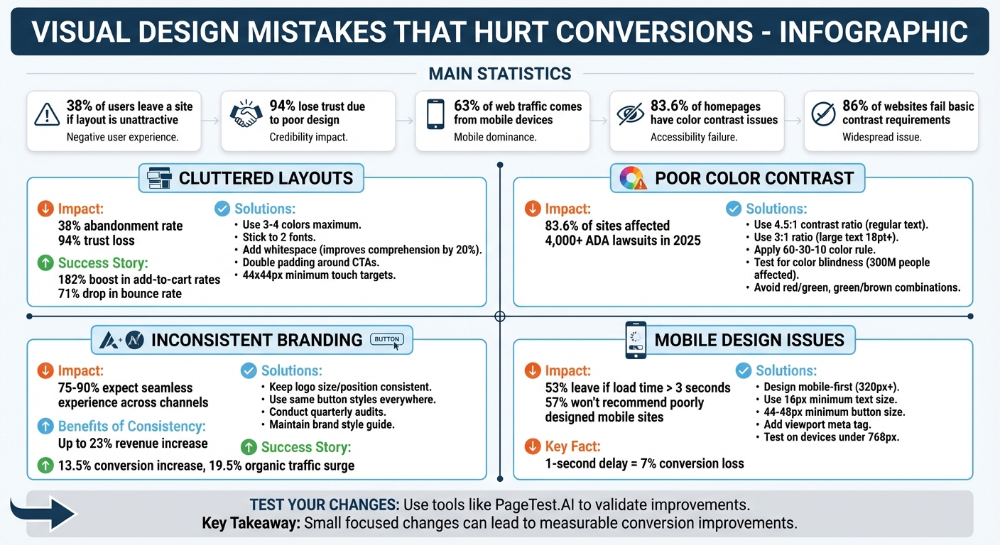
Did you know that 38% of users leave a site if the layout is unattractive, and 94% lose trust due to poor design? Your website’s design directly impacts conversions, trust, and user engagement. Common mistakes like cluttered layouts, bad color choices, inconsistent branding, and mobile-unfriendly designs are costing you users – and revenue.
Here’s a quick breakdown of what hurts conversions and how to fix it:
- Cluttered Layouts: Overpacked designs confuse users. Simplify with fewer elements, 3-4 colors, and whitespace to boost trust and readability.
- Poor Color Contrast: Low contrast makes text hard to read, alienating users and violating accessibility standards. Use a minimum 4.5:1 contrast ratio.
- Inconsistent Branding: Shifting logos, fonts, or button styles across pages erodes trust. Consistency can increase revenue by up to 23%.
- Mobile Design Issues: With 63% of traffic from mobile, unoptimized designs lead to lost visitors. Start with a mobile-first approach, use readable font sizes, and test on real devices.
Bottom line: Fix these issues to improve user experience and drive site conversion. Tools like PageTest.AI can help you test changes and track results effectively.
Visual Design Mistakes That Hurt Conversions: Key Statistics and Solutions
KILLER UI Design Mistakes That Are Destroying Your Website’s Conversion Rate?
sbb-itb-6e49fcd
Too Many Elements and Cluttered Layouts
Packing your page with too many competing elements can confuse and overwhelm users. When visitors are bombarded with multiple headlines, images, and buttons vying for their attention, they’re more likely to hesitate – or worse, leave without engaging.
Here’s a striking fact: 38% of users will abandon a site if the layout feels unattractive, and 94% lose trust when the design is disorganized. Simplifying your design isn’t just about aesthetics – it’s about building trust and driving action. For instance, in late 2025, a direct-to-consumer wellness brand partnered with Design Sphere to address clutter. By cutting their navigation from 9 items to 4 and refining their hero section with a concise, value-focused headline, they saw a 182% boost in add-to-cart rates and a 71% drop in bounce rate in just 60 days. A streamlined design doesn’t just look better – it works better.
"Visual hierarchy turns chaos into clarity." – Clay
So, how do you create a clean, focused layout? Follow these design principles to reduce clutter and guide users effortlessly.
Stick to 3-4 Colors and 2 Fonts
Too many fonts and colors can overwhelm users, making it harder for them to process your page. Keep it simple: use one font for headings and another for body text. Limit your color palette to 3-4 shades: a primary brand color, a secondary tone, and an accent for buttons or CTAs. To add variety, play with font weights and sizes within the same font family.
Add More Whitespace
Whitespace – or negative space – helps break content into manageable chunks. It’s not just about aesthetics; it’s functional. Studies show that effective use of whitespace improves reading comprehension by 20% and speeds up content scanning by as much as 40%. To achieve this, use consistent spacing increments (e.g., 4, 8, 16, or 24 pixels) for margins and padding. For better readability, set your line-height between 1.5 and 1.7 and keep paragraph widths to 50–75 characters.
Clear the Area Around CTAs
Your primary call-to-action (CTA) should stand out – don’t let it get lost in the noise. Surround it with at least double the padding of nearby elements. If you have multiple buttons, make the primary action pop with a bold color and high contrast, while styling secondary actions more subtly (e.g., outlined buttons or text links). For mobile users, ensure touch targets are at least 44×44 pixels.
Bad Color Choices and Low Contrast
Choosing the wrong colors for your website can make your content harder to read, hurt conversions, and even clash with your brand’s message. Problems with color contrast are especially common, showing up on 83.6% of homepages in 2025. These issues don’t just affect accessibility – they can also bring legal trouble. Around 86% of websites fail to meet basic contrast requirements, and with over 4,000 ADA-related lawsuits reported in 2025, ignoring contrast standards could put your business at risk. Beyond compliance, poor contrast drives users away; if your content isn’t easy to read, visitors won’t stick around.
"Your website’s color choices aren’t just aesthetic decisions. They’re accessibility decisions that directly impact whether people can actually use your site." – ColorStudio.online
Here’s how to fix these issues and create a better user experience.
Use a 4.5:1 Contrast Ratio
To ensure text is readable, aim for a 4.5:1 contrast ratio between your text and its background, as required by WCAG 2.2 Level AA standards. This applies to regular-sized text (under 18pt or 14pt bold). For larger text (18pt+ or 14pt+ bold), a 3:1 ratio is acceptable. UI elements like buttons and form fields should also meet the 3:1 ratio.
For example, light gray text (#999999) on a white background only achieves a 2.85:1 ratio, which falls short. Darkening it to #767676 meets the 4.5:1 requirement, while #595959 achieves a stronger 7:1 ratio. Also, don’t forget about placeholder text – browser defaults often fail accessibility standards with ratios around 2.32:1. If you’re placing text over images, use a dark, semi-transparent gradient (60–80% opacity) behind white text to maintain readability.
Match Colors to Your Brand Message
Colors do more than look good – they evoke emotions and guide user behavior. For instance, blue suggests trust and clarity (great for tech and finance), red signals urgency and energy (perfect for calls-to-action), and green conveys growth and balance (ideal for health and eco-focused brands). Choose colors that align with your brand’s goals and the actions you want users to take.
A good rule of thumb is the 60-30-10 rule: dedicate 60% of your design to neutral backgrounds, 30% to a primary brand color, and 10% to a high-contrast accent color for CTAs. Make sure your CTA color stands out from your primary palette. The Isolation Effect (also known as the Von Restorff Effect) shows that users are more likely to interact with elements that visually break the design’s rhythm.
Check for Color Blindness Issues
Globally, about 300 million people live with some form of color vision deficiency – 8% of men and 0.5% of women. To make your site accessible, don’t rely on color alone to convey information. Add extra cues like icons, labels, shapes, or patterns. Also, avoid using difficult combinations such as red/green, green/brown, red/brown, and purple/blue, as these can look identical to colorblind users. Safer combinations include blue with orange or red.
Test your design in grayscale to ensure it works without color, and use tools like WhoCanUse, WebAIM Contrast Checker, Coblis, or WAVE to spot problems before they affect your audience. If your site offers a dark mode, make sure the colors still meet the 4.5:1 ratio. Avoid pure white text on pure black backgrounds, as this can cause eye strain.
Inconsistent Branding Across Pages
When logos, buttons, or fonts change from page to page, visitors may start questioning if they’re still on the same website. Research shows that between 75% and 90% of consumers expect a seamless experience across all channels. When visual elements unexpectedly shift, it creates doubt and disrupts the user experience. Just like cluttered layouts or poor color choices can erode trust, inconsistent branding can break the flow of a user’s journey.
Maintaining consistent branding doesn’t just build trust – it can also directly impact your bottom line. Studies suggest it can increase revenues by up to 23%. Why? Because consistency reduces the mental effort required for users to navigate your site, making it easier for them to convert. For example, in 2024, Siteimprove overhauled its branding by introducing a centralized design system. They swapped their "corporate blue" for an electric lime green and unified all web components. This level of optimization often requires multivariate testing to improve website performance and validate design changes. The result? A 13.5% increase in conversion rates and a 19.5% surge in organic traffic. Presenting a unified brand helps users make decisions faster, leading to higher conversions.
As Saphia Lanier, Marketer and Journalist at Siteimprove, explains:
"Visual consistency is a signal to customers: ‘Yes, you’re in the right place. We’ve got what you need.’" – Saphia Lanier
By following a few simple guidelines, you can ensure your website consistently reflects a trustworthy and cohesive brand image.
Keep Logo Size and Position the Same
Your logo acts as a visual anchor for your brand, so it’s critical to keep its size and position consistent across all pages. Most websites place their logo in the top-left corner – this is where users instinctively look for it. If the logo shifts in size or location, it can come across as careless and disrupt the user’s sense of familiarity.
Use the Same Button Styles Everywhere
Call-to-action (CTA) buttons are another key element that must remain uniform. If button colors, shapes, or hover effects vary across pages, users may feel disoriented. For instance, United Airlines tackled this issue by consolidating three different date picker styles into one standardized component, simplifying their booking process. Whether you prefer pill-shaped buttons or rounded corners, stick to one style throughout your site to avoid confusion.
Check All Pages for Visual Consistency
Even small inconsistencies – like spacing irregularities, outdated logos, or unauthorized color variations – can creep in over time. Conduct quarterly audits to catch these subtle changes before they become noticeable to users. Pay attention to your typography hierarchy (H1, H2, H3), ensure HEX codes are consistent across elements, and verify that grid patterns follow the same spacing rules everywhere. A detailed brand style guide can serve as your go-to reference for logo placement, color codes, and imagery styles. These audits, combined with other design improvements, can help you maintain a polished and conversion-friendly website.
Designs That Don’t Work on Mobile
Mobile optimization is no longer a bonus – it’s a must. With 63% of all web traffic coming from mobile devices, websites that fail to provide a smooth mobile experience risk losing visitors and sales. When designs don’t scale properly to smaller screens, users face issues like unreadable text, buttons that are hard to tap, or complicated navigation. And the consequences are serious: 53% of mobile users will leave a site if it takes longer than three seconds to load, and 57% of users won’t recommend a business with a poorly designed mobile site.
A lot of these problems stem from technical missteps. For instance, missing viewport meta tags make mobile browsers display desktop layouts, forcing users to zoom in just to read the text. Fixed-width layouts (e.g., width: 1200px) lock designs into one size, making them unusable on smaller screens. On top of that, small buttons and links – anything smaller than 44–48px – are frustratingly difficult to tap accurately.
As Kellie Kowalski, Head of UX Design at Fuel Made, explains:
"Mobile design is often overlooked by businesses. Yet, with mobile now accounting for 60% of total US ecommerce sales (and growing), delivering a seamless mobile shopping experience is no longer optional – it’s a necessity." – Kellie Kowalski
Google’s mobile-first indexing means your mobile site directly affects your search rankings. But the good news? By following a few key design principles, you can create a mobile experience that keeps users engaged and boosts conversions.
Design for Mobile First
Start with mobile in mind. Designing for smaller screens first (320px and up) forces you to focus on essentials – streamlining content and simplifying functionality. This approach naturally reduces clutter and ensures your design works on all devices.
Here are some practical tips:
- Add a viewport meta tag:
<meta name="viewport" content="width=device-width, initial-scale=1">to prevent desktop layouts from shrinking onto mobile screens. - Design buttons and links with a minimum size of 44x44px to 48x48px for easy tapping.
- Position key actions, like CTAs, within the "thumb zone" (middle or bottom of the screen) for one-handed use.
- Use flexible grids with CSS Flexbox or Grid instead of fixed-width containers.
- Optimize images with
srcsetandsizesto serve the right resolution for each device, speeding up load times.
Adjust Text and Layout for Small Screens
Text that looks great on a desktop can overwhelm users on mobile. Use a minimum body text size of 16px to ensure readability without zooming. Relative units like rem, em, or vw allow text to scale naturally across devices. For even more control, the CSS clamp() function helps set fluid font sizes between breakpoints.
Keep layouts simple with single-column designs and stacked elements, which work best for vertical scrolling. Avoid hover-only interactions since mobile devices don’t support hover. For forms, use specific HTML5 input types like type="tel" or type="email" to trigger the correct keyboard and make filling out forms easier.
Test on Phones and Tablets
Testing isn’t a one-and-done task – it’s ongoing. Regularly check your designs on devices with widths under 768px to ensure usability across smartphones and tablets. Look for issues like untappable buttons, unreadable text, or images that load too slowly on cellular data.
Here’s a quick checklist:
- Define
widthandheightattributes for images or use the CSSaspect-ratioproperty to prevent layout shifts. - Use lazy loading (
loading="lazy") for images below the fold, but avoid this for hero images to maintain fast Largest Contentful Paint (LCP) times. - Remember: even a one-second delay in page load time can slash conversions by 7%—making it critical to use the best conversion rate optimisation platforms to track these leaks.
| Device Category | Typical Width | Layout Strategy |
|---|---|---|
| Mobile (Base) | 320px – 639px | Single-column layout, stacked elements, hamburger menu |
| Tablet | 640px – 1023px | Two-column grids, increased whitespace, visible search |
| Desktop | 1024px – 1279px | Multi-column layouts with horizontal navigation |
| Large Desktop | 1280px+ | Max-width containers and high-resolution assets |
As you roll out updates, keep testing on real devices to catch problems early. Once your mobile design is polished, tools like PageTest.AI can help you validate performance across devices and maintain a seamless mobile experience.
Testing Visual Changes with PageTest.AI
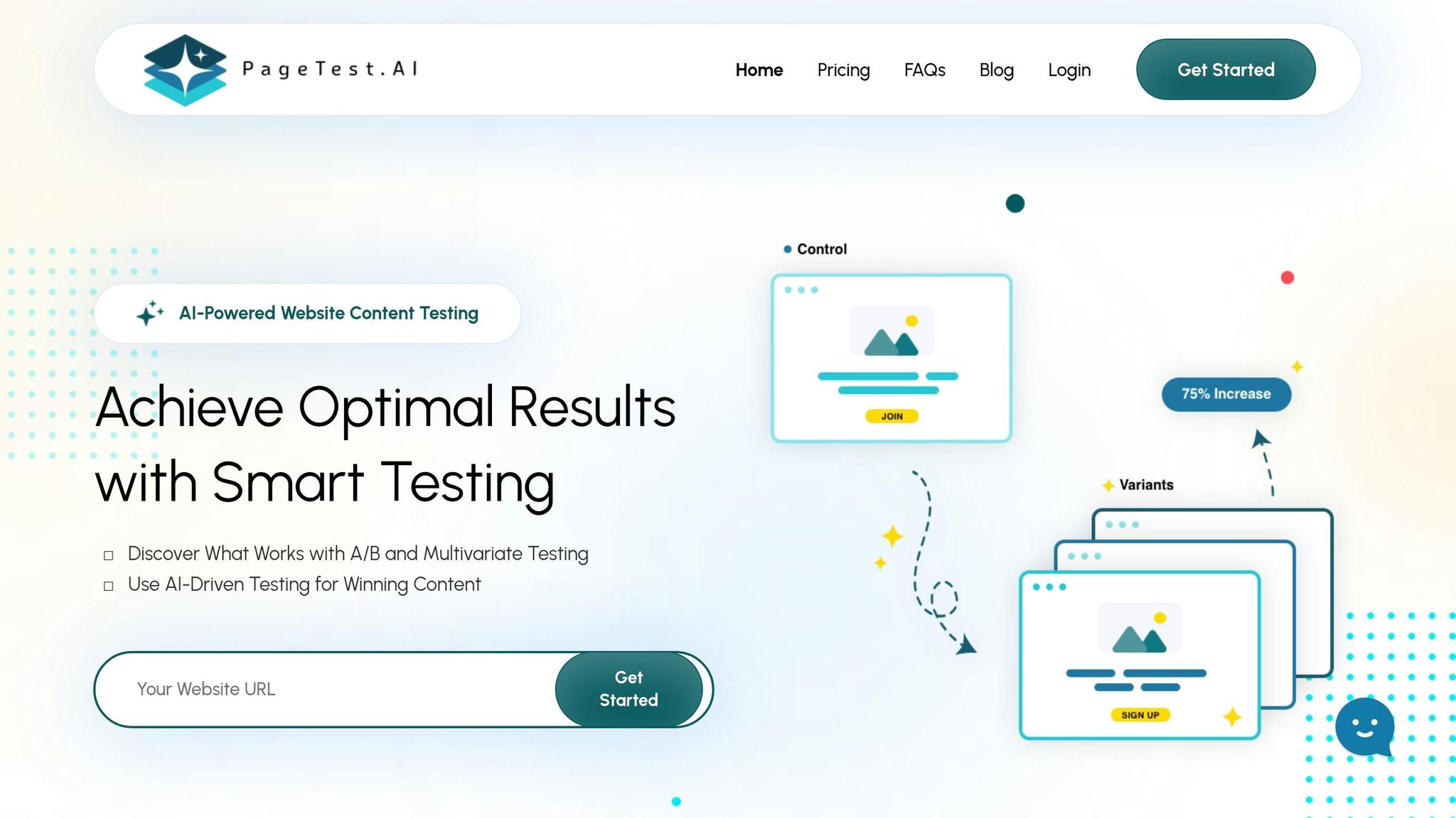
Once you’ve identified and addressed visual design issues, it’s time to see if your changes deliver results. That’s where PageTest.AI comes in. This intuitive, no-code platform allows marketers and small business owners to test visual elements like headlines, CTAs, button colors, and product descriptions using an AB testing guide – without needing to touch a single line of code. By leveraging AI, the platform creates content variations and tracks real user behavior, helping you uncover what drives conversions. Website AB testing with PageTest.AI ensures your updates are not just cosmetic but actually improve performance.
How to Use PageTest.AI
Getting started is simple. Add a unique PageTest.AI snippet to your website – it’s compatible with popular platforms like WordPress, Wix, Shopify, Magento, and more. Then, install the Chrome extension, which lets you select elements for testing with just a click. From there, the AI generates 10 content suggestions for each element, saving you hours of trial and error.
"As a marketer I have struggled so much with AB testing… I love that you have a chrome extension, it makes it so much easier!" – Werner Geyser, Founder of Influencer Marketing Hub
PageTest.AI adheres to a key testing principle: each visitor is exposed to only one test at a time, ensuring your data stays clean and actionable.
Track Clicks, Engagement, and User Behavior
PageTest.AI goes beyond basic metrics. It tracks detailed data like time spent on a page, scroll depth, click events, and completed conversions. These insights allow you to map the entire visitor journey, giving you a clearer picture of how users interact with your site.
"Testing every call-to-action to optimize SEO and user engagement is highly effective." – David Hall, CEO of AppInstitute
Pricing Plans for Every Budget
PageTest.AI offers flexible pricing options to fit businesses of all sizes:
- Trial Plan (Free): Includes 10,000 test impressions, 5 pages, and 5 tests for 1 website.
- Startup Plan ($10/month): Offers 10,000 test impressions per month, 10 pages, and 10 tests for a single website.
- Enterprise Plan ($50/month): Provides 100,000 impressions, 100 pages, and 100 tests across up to 10 websites.
- Agency Plan ($200/month): Designed for larger operations, it includes 1 million impressions, unlimited pages, and tests across 100 websites.
All plans come with AI content suggestions and access to the Chrome extension, making it easy to optimize your site no matter your budget.
Conclusion
Visual design mistakes aren’t just about appearances – they can directly impact your bottom line. Issues like cluttered layouts, poor color contrast, inconsistent branding, or designs that don’t work well on mobile devices create barriers that push visitors away before they take action. The upside? You don’t need a full-scale redesign to address these problems. Small, focused changes can lead to noticeable improvements.
Once you’ve identified these common mistakes, the next step is implementing fixes. Focus on simplifying layouts by incorporating more whitespace, using proper contrast to make your CTAs pop, maintaining branding consistency across all pages, and ensuring your design is mobile-friendly. Even minor tweaks can lead to a measurable increase in conversions.
Keep in mind, optimization isn’t a one-and-done process. User preferences shift over time, and what works now might not work later. That’s why ongoing testing is so important. Since the sunset of popular tools, finding the right A/B testing alternatives is essential for maintaining your edge. For instance, reducing load time by just one second can increase conversions by up to 2%.
To get started, apply the tips from this checklist and use tools like PageTest.AI to measure your progress. Its AI-driven features – such as testing variations and tracking user behavior metrics like scroll depth and click events – remove the guesswork from improving your design. With plans starting as low as $0 for the Trial Plan, there’s no need to rely on assumptions when you can make data-backed decisions instead.
FAQs
Which design fix will improve conversions the fastest?
Fixing unclear or weak calls-to-action (CTAs) can quickly improve your conversion rates. CTAs play a key role in influencing user behavior and encouraging engagement, so they deserve careful attention. To get better results, make sure your CTAs are clear, persuasive, and impossible to miss.
How can I check if my colors meet accessibility contrast?
To make sure your colors are accessible, check the contrast ratio between your text and background colors. For regular text, the minimum ratio should be 4.5:1 to meet WCAG 2.1 Level AA guidelines. You can use a contrast checker tool to test your color combinations and confirm they meet the standards. If any colors fall short, tweak them to ensure better accessibility for people with visual impairments.
What should I A/B test first with PageTest.AI?
When optimizing for better results, focus first on elements that directly affect conversions. For example, CTA (Call-to-Action) placement and messaging play a big role in driving user actions. Position CTAs prominently – ideally above the fold – and use clear, action-driven language to encourage clicks.
Another crucial factor is page load speed. Slow-loading pages can frustrate users and lead to higher bounce rates. To tackle this, optimize images and scripts to ensure your site loads quickly. Finally, review your layout and visual hierarchy. A clean, intuitive design makes navigation easier, builds trust, and enhances the overall user experience.
Related Blog Posts
say hello to easy Content Testing
try PageTest.AI tool for free
Start making the most of your websites traffic and optimize your content and CTAs.
Related Posts

30-03-2026
 Ian Naylor
How Internal Links Boost Conversions
Strategic internal links guide users, improve SEO, and turn site navigation into measurable conversion growth.
28-03-2026
Ian Naylor
Core Web Vitals Benchmarks by Industry
Industry Core Web Vitals benchmarks and practical fixes for LCP, INP, and CLS, plus mobile vs desktop gaps and optimization tips.
26-03-2026
Ian Naylor
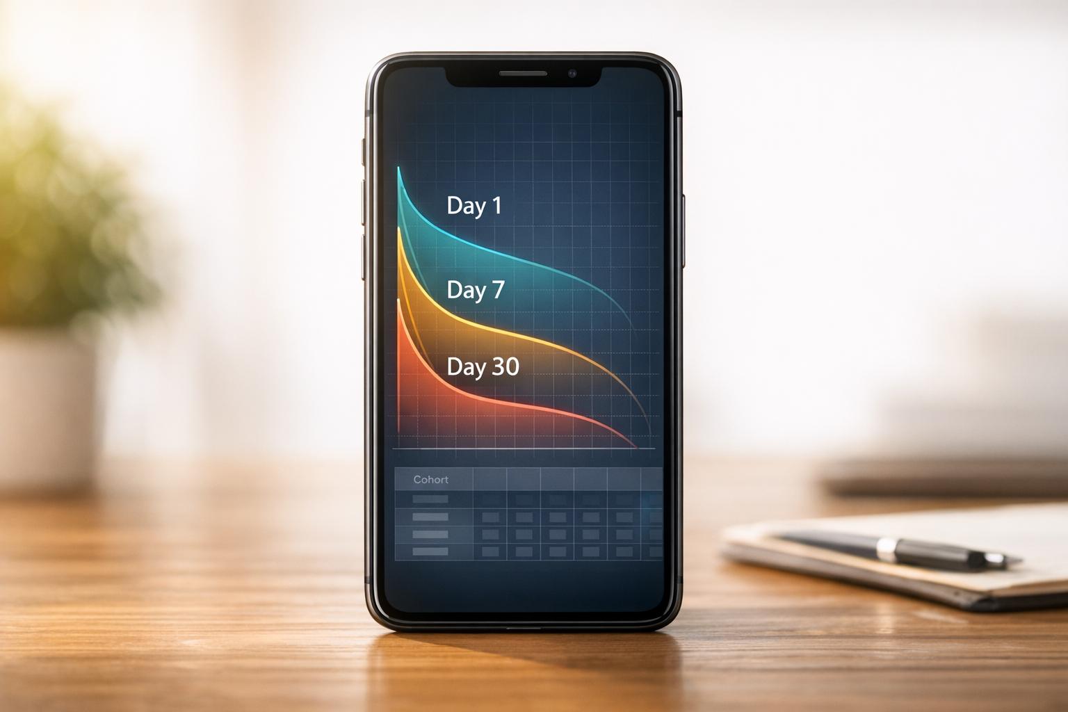
How to Benchmark Mobile Retention Rates
Benchmark Day 1/7/30 retention, run cohort analysis, and optimize onboarding, habit triggers, and personalization to improve app retention.