

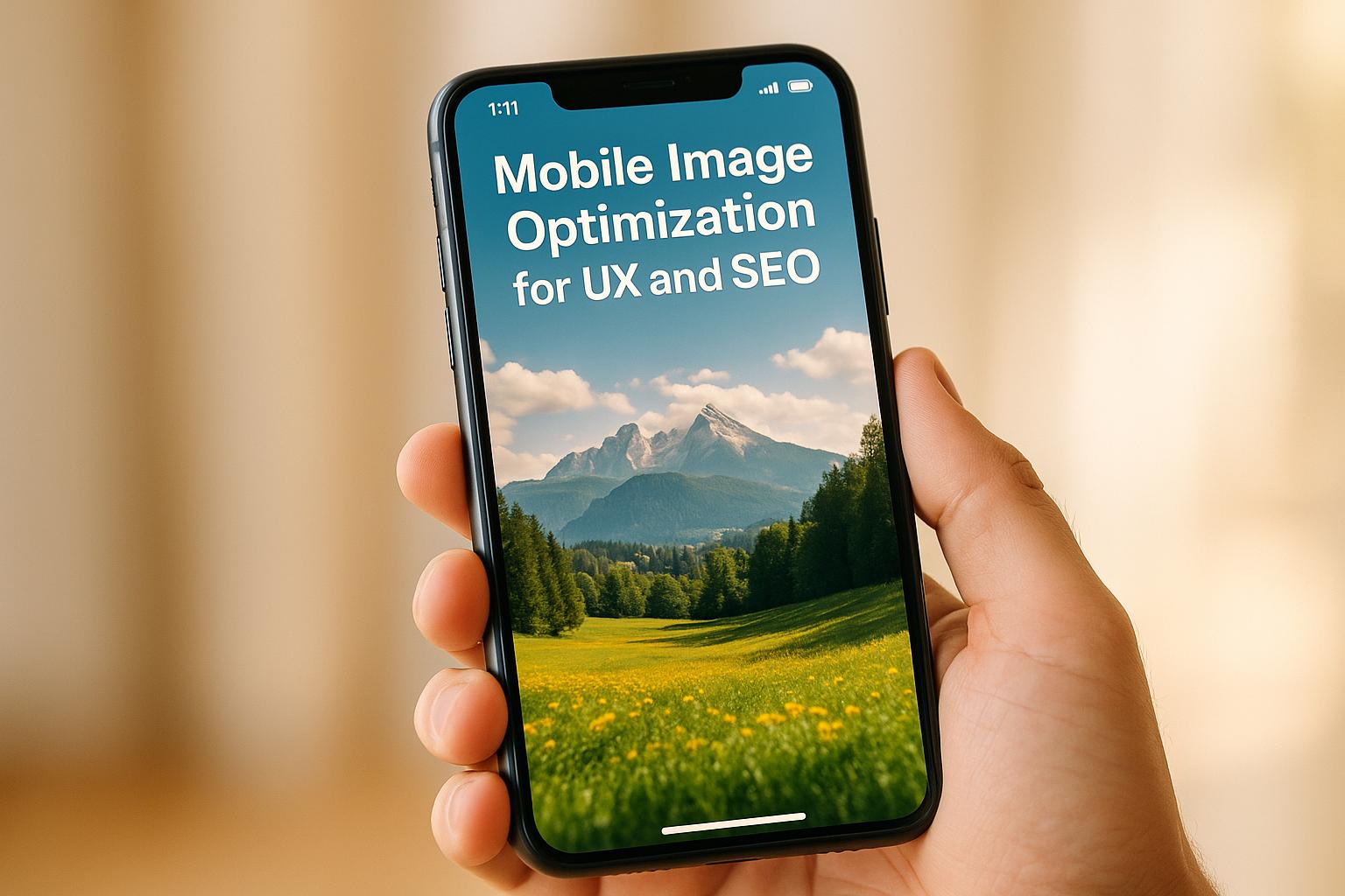
Mobile Image Optimization for UX and SEO
Mobile Image Optimization for UX and SEO
 16-10-2025 (Last modified: 17-10-2025)
Your website’s images play a huge role in how users experience your content and how search engines rank your site. Optimizing images for mobile devices ensures faster load times, better visuals, and improved search engine performance. With mobile devices accounting for 60% of web traffic and Google prioritizing mobile-first indexing, unoptimized images can hurt your rankings, user engagement, and revenue.
Here’s what you need to know:
- Why it matters: Slow-loading, unoptimized images frustrate users and lead to higher bounce rates, lower search rankings, and lost conversions.
- Key benefits: Faster load times improve user experience, boost conversions, and enhance Google’s Core Web Vitals scores like LCP (Largest Contentful Paint) and CLS (Cumulative Layout Shift).
- Techniques to use: Responsive images, modern formats (WebP, AVIF), lazy loading, and automated workflows reduce file sizes and improve performance.
- Real-world results: Companies like Walmart and Zadig&Voltaire improved revenue and reduced bounce rates with optimized mobile images.
Optimizing images isn’t just about aesthetics – it’s a direct path to better rankings, higher engagement, and increased revenue.
How to Optimize Images for Mobile SEO?
Core Principles of Mobile Image Optimization
Optimizing images for mobile devices revolves around three key techniques. These methods work together to ensure that images load quickly and look great across various devices and screen sizes. Here’s how each technique contributes to smoother mobile experiences.
Responsive Images and Device-Specific Delivery
Responsive images are all about delivering the right image size for the right device. This is made possible with HTML tools like the <picture> tag and the srcset attribute. The <picture> tag allows you to specify different image sources depending on the device – a smaller image for smartphones, a medium-sized one for tablets, and a larger version for desktops. Meanwhile, the srcset attribute in an <img> tag lets the browser automatically pick the best image based on the device’s resolution and capabilities.
Google strongly endorses responsive design for mobile image delivery, as it ensures content adjusts smoothly to different screen sizes and orientations. This is particularly relevant since a whopping 94% of mobile users browse in vertical orientation.
Modern Image Formats for Faster Loading
Switching to modern image formats like WebP and AVIF can significantly reduce file sizes without sacrificing quality. For instance, WebP files can be up to 30% smaller than JPEGs while maintaining similar quality levels. Smaller files mean faster loading times and less bandwidth usage – a win-win for both users and servers.
While WebP enjoys wide browser support, AVIF is still gaining traction. A smart approach is to use the <picture> element to serve AVIF to browsers that support it, fallback to WebP for others, and rely on traditional formats as a last resort.
Lazy Loading for Better Performance
Lazy loading is a technique where images load only when they’re about to appear on the screen. Instead of loading every image on a page upfront, only images near the user’s viewport are loaded initially. This speeds up the initial page load and improves overall performance.
Implementing lazy loading is simple with the native loading="lazy" attribute in image tags, as modern browsers handle the process automatically. For longer pages, like product catalogs or photo galleries, this ensures that the most important content loads first. It’s worth noting that every second of delay in mobile page load time can lead to a 20% drop in conversion rates.
How Image Optimization Affects UX and SEO
Optimizing images is more than just a technical tweak – it’s a game-changer for site performance, search rankings, and user engagement. On mobile devices, where bandwidth and processing power are often limited, fast-loading images are especially important. The benefits go beyond speed, influencing how search engines rank your site and how users interact with your content.
Better Core Web Vitals Scores
Image optimization plays a key role in improving Core Web Vitals, Google’s metrics for assessing user experience. Two specific metrics see the most improvement: Largest Contentful Paint (LCP) and Cumulative Layout Shift (CLS).
- LCP measures how quickly the largest element on a page – often an image – loads. By using appropriately sized and compressed images, this metric can improve significantly. Responsive images ensure the right size is delivered for each device.
- CLS tracks how much the page layout shifts while loading. Images without defined dimensions can cause frustrating jumps in the layout. Specifying image dimensions and using compressed files keeps the layout stable during loading.
Since Core Web Vitals are now part of Google’s ranking algorithm, better scores lead to higher search visibility and more organic traffic. These improvements also reduce bounce rates and encourage users to stay engaged with your site.
Lower Bounce Rates and Higher Engagement
Unoptimized images can frustrate users, leading to slow load times and increased bounce rates. The consequences are serious – 88% of online shoppers say they’re unlikely to return to a site after a poor experience.
On the other hand, fast-loading, well-displayed images create a seamless browsing experience. When images look great on any screen size and load quickly, users are more likely to stick around and explore. This increased engagement sends positive signals to search engines, boosting your rankings and driving even more traffic. Plus, higher engagement often leads to better conversion rates.
Higher Conversion Rates
The link between image optimization and conversions is crystal clear: every second of delay in page load time can reduce conversion rates by 20% on mobile. Quick-loading, properly displayed images make users more likely to complete actions like making a purchase or signing up for a newsletter.
When images load smoothly, users don’t have to deal with waiting or abandoning their shopping carts due to sluggish performance. This streamlined experience translates directly into more transactions and higher revenue.
To fine-tune your approach, tools like PageTest.AI let you A/B test different image optimization strategies. You can measure their impact on engagement and conversions without needing advanced coding skills. This kind of data-driven optimization ensures you’re delivering the best experience for your audience.
Ultimately, image optimization isn’t just a technical fix – it’s a smart business strategy. It improves search rankings, enhances user satisfaction, and drives higher conversion rates, all of which contribute to your bottom line.
sbb-itb-6e49fcd
Practical Mobile Image Optimization Techniques
Boost mobile performance and improve conversions by refining how images are handled on your site. These techniques offer actionable steps to ensure your images are optimized for mobile users, whether you’re running a small blog or managing a large e-commerce platform.
Image Compression and Resizing for Mobile
Start with compression to strike the right balance between file size and visual quality. Modern tools offer both lossy and lossless compression options, making it easy to reduce file sizes without noticeable quality loss.
Switching from JPEG to WebP can shrink file sizes by up to 38% while maintaining clarity. This means faster load times for users, especially on mobile networks, without sacrificing image quality.
When it comes to resizing, adopt a mobile-first mindset. Instead of using desktop-sized images across all devices, create multiple versions tailored to different screen sizes. The srcset attribute in HTML makes it easy to deliver the right image size based on the user’s device:
<img src="desktop-image.jpg" srcset="mobile-image-400w.jpg 400w, tablet-image-800w.jpg 800w, desktop-image-1200w.jpg 1200w" sizes="(max-width: 600px) 400px, (max-width: 1200px) 800px, 1200px" alt="Product showcase"> This ensures that mobile users only download the data they need, leading to quicker load times. Tools like TinyIMG can automate this process, especially on platforms like Shopify that include built-in CDN support.
By combining compression and resizing, you lay the groundwork for a more efficient and user-friendly mobile experience.
Automated Optimization Workflows
Automation can simplify image optimization and maintain consistent quality. Automated workflows handle repetitive tasks, freeing up your time while ensuring your images are always optimized.
Leverage platform-specific solutions to streamline your process. For example, Shopify’s CDN automatically delivers WebP images when supported, while third-party tools like Imgix offer advanced features such as background removal and text overlays. Dynamic image services can also handle compression, resizing, and format conversion in real time, delivering the best image version based on the user’s device and browser. Look for solutions that support next-gen formats, responsive delivery, and seamless integration with your setup.
Once automation is in place, it’s crucial to measure its effectiveness through performance testing.
Performance Testing and Measurement
Testing ensures your optimization strategies are actually improving performance. Regular checks help you fine-tune your approach and maximize results.
Start by analyzing Core Web Vitals using tools like Google PageSpeed Insights or Lighthouse. Focus on metrics like Largest Contentful Paint (LCP) and Cumulative Layout Shift (CLS) to evaluate the impact of your optimizations on both user experience and search rankings.
Real-world examples highlight the benefits of thorough testing. For instance, Swimply reduced image sizes by 38% and cut response times by 50% after implementing responsive images. Similarly, Zadig&Voltaire achieved a 66% improvement in mobile page speed by delivering images tailored to device specifications.
For deeper insights, consider using A/B testing platforms like PageTest.AI. These tools let you experiment with different optimization techniques – such as varying compression levels, formats, or lazy loading – and measure their impact on engagement and conversions. Metrics like clicks, time on page, and scroll depth provide valuable feedback. Given that even a one-second delay can slash mobile conversion rates by 20%, these insights are crucial for boosting your bottom line.
Ongoing testing also helps you stay ahead of potential issues. As devices and browsers evolve, regular monitoring ensures your optimization efforts remain effective and aligned with user expectations.
Image Format and Method Comparisons
Selecting the right image format and optimization method can significantly influence your mobile site’s performance. Each format comes with its own set of strengths and weaknesses, affecting loading speed, visual quality, and the overall user experience.
Image Format Comparison
When optimizing for mobile, it’s important to weigh the pros and cons of different image formats. Here’s a quick breakdown of the key characteristics of popular formats:
| Format | File Size | Quality | Browser Support | Best Use Case | SEO Impact |
|---|---|---|---|---|---|
| JPEG | Medium | Good (lossy) | Universal | Photographs, complex images | Good (if optimized) |
| PNG | Large | Excellent (lossless) | Universal | Graphics, transparency | Moderate (larger files can slow load) |
| AVIF | Small | Excellent (lossy/lossless) | Limited (e.g., Chrome, Firefox) | High-quality, low-bandwidth scenarios | Excellent (where supported) |
| WebP | Small | Excellent (lossy/lossless) | Most major browsers (Safari in later versions) | General web use | Excellent (fast loads) |
Modern formats like WebP and AVIF are game-changers for improving load times and boosting Core Web Vitals scores, particularly the Largest Contentful Paint (LCP) metric. However, browser compatibility can vary. A practical solution is to use the <picture> element, which allows you to serve different formats depending on the browser:
<picture> <source srcset="image.avif" type="image/avif"> <source srcset="image.webp" type="image/webp"> <img src="image.jpg" alt="Product image"> </picture> This approach ensures users get the best possible experience, with faster load times and improved SEO performance through better Core Web Vitals scores.
Manual vs. Automated Optimization
Beyond choosing the right format, deciding how to optimize your images is equally important. The choice often boils down to manual precision versus automated efficiency.
- Manual Optimization: Offers complete control over compression and quality settings. For instance, using an 85% quality setting combined with an unsharp mask can strike a great balance between file size and visual quality. This method works well for smaller sites with specific needs but can be time-consuming as your site grows.
- Automated Optimization: Ideal for larger sites or those with frequent updates. Automated tools can compress, resize, and convert images dynamically, saving time while maintaining consistency. Services like Imgix have demonstrated up to a 50% reduction in file sizes without noticeable quality loss, helping to improve Core Web Vitals scores.
Here’s a quick comparison of the two approaches:
| Method | Control | Scalability | Time Required | Best For |
|---|---|---|---|---|
| Manual | High | Low | High | Small sites, custom needs |
| Automated | Moderate | High | Low | Large sites, frequent updates |
For example, Chronext reported an 80% reduction in image response times by adopting automated workflows, which also freed up developer resources. Automated tools can even adapt to user contexts by detecting browser capabilities, device types, and network conditions – ensuring optimal image delivery for every visitor.
To take it a step further, platforms like PageTest.AI can A/B test different image optimizations, helping you measure engagement, bounce rates, and conversions. This data-driven approach ensures your choices not only enhance the user experience but also align with business goals. Whether you go manual or automated, efficient image optimization directly impacts mobile performance and conversion rates.
Mobile Image Optimization Summary and Checklist
Mobile image optimization isn’t just about making your website look good – it directly impacts Core Web Vitals and conversion rates. By using responsive images, modern formats, and smarter loading techniques, you can significantly enhance both user experience and search engine performance.
Key Points to Remember
Mobile image optimization plays a big role in how Google evaluates your site. Metrics like Largest Contentful Paint (LCP) and Cumulative Layout Shift (CLS) are heavily influenced by how quickly and smoothly your images load. These aren’t just technical benchmarks – they directly affect business outcomes. For instance:
- 88% of online shoppers won’t return after a poor mobile experience.
- Every second of delay can slash conversion rates by 20%.
Using responsive images and modern formats can speed up loading times. Techniques like lazy loading and image compression take this further, ensuring a smoother experience for users.
Optimized images also boost your SEO efforts. Google considers page experience a ranking factor, and including images in your sitemaps can improve search engine visibility. These strategies, when combined, create a better user experience and drive measurable results.
Implementation Checklist
Here’s a quick rundown of actionable steps to ensure your mobile images are optimized for performance and usability:
- Test Mobile Speed: Use tools like Google’s PageSpeed Insights to measure load times and aim to keep them under 3 seconds.
- Responsive Design: Implement responsive images and use modern formats like WebP for better compression and faster loading.
- Optimize Usability: Ensure touch targets are at least 44×44 pixels, and font sizes are no smaller than 14 points to improve mobile usability.
- Monitor Key Metrics: Regularly check metrics like Core Web Vitals, load times, bounce rates, engagement, and conversions using tools like PageSpeed Insights or GTmetrix.
- A/B Testing: Use platforms like PageTest.AI to experiment with different image configurations and track their impact on user engagement and conversions.
- Mobile Readability: Write in short paragraphs for better readability on smaller screens, and test your site on actual smartphones.
- Enhance Offline Capability: Cache content for offline use and steer clear of intrusive full-screen interstitials that disrupt the user experience.
- Stay Updated: Regularly review and adjust your strategies to align with evolving image formats and optimization techniques.
FAQs
Why is optimizing images for mobile important for both user experience and SEO?
Optimizing images for mobile is essential for creating a smooth user experience. It ensures pages load quickly, visuals look sharp, and content adjusts seamlessly across different screen sizes. Mobile users expect fast and hassle-free browsing, and well-optimized images help eliminate the frustration of slow-loading or distorted visuals.
From an SEO standpoint, optimized images play a big role in improving page speed – a crucial factor for search engine rankings. Pages that load faster tend to perform better in search results, attract more visitors, and keep them engaged longer. Incorporating descriptive file names, alt text, and the right image formats not only enhances accessibility but also boosts visibility in search engines.
Why should I use modern image formats like WebP and AVIF for mobile optimization?
Modern image formats such as WebP and AVIF offer an impressive balance between high-quality visuals and reduced file sizes, outperforming older formats like JPEG and PNG. This reduction in file size translates to faster loading times, which not only enhances the browsing experience on mobile devices but can also give your SEO rankings a boost.
These formats come packed with modern features, including advanced compression methods, transparency support, and even animation capabilities. By switching to these formats, you can improve your website’s performance while delivering a seamless experience for mobile users.
How can I evaluate the impact of mobile image optimization on user engagement and conversions?
To gauge how well your mobile image optimization efforts are working, keep an eye on metrics that reveal user engagement and conversion success. Pay attention to click-through rates (CTR), time spent on page, and scroll depth – these numbers shed light on how users are interacting with your content. On top of that, tracking conversion rates will show how effectively your optimized images are driving your business goals.
Tools like PageTest.AI can help you dive into user behavior and engagement trends, offering insights to guide data-backed improvements. By reviewing these metrics, you can fine-tune your strategies to boost both user experience and SEO performance.
Related Blog Posts
say hello to easy Content Testing
try PageTest.AI tool for free
Start making the most of your websites traffic and optimize your content and CTAs.
Related Posts

03-03-2026
 Ian Naylor
How to Use AI for Dynamic Content Personalization
Step-by-step guide to using AI to collect behavior data, segment users, create personalized headlines and CTAs, run tests, and optimize conversions.

02-03-2026
Ian Naylor
AI Content Personalization: Expert Guide
AI personalization uses unified profiles, predictive analytics, and real-time updates to serve tailored content that boosts conversions.

28-02-2026
Ian Naylor
Real-Time Metrics for Different User Roles
Role-specific real-time dashboards that help marketers, product teams, and executives act faster, improve conversions, and align decisions.