

Mouse Tracking Data: What to Measure

Mouse Tracking Data: What to Measure
![]() 24-02-2026 (Last modified: 06-03-2026)
24-02-2026 (Last modified: 06-03-2026)
Mouse tracking data reveals how users interact with websites by analyzing cursor movements, clicks, and hovers. It helps identify user behavior patterns, improve design elements, and boost engagement. Key metrics include:
- Clicks: Total clicks, click-through rates (CTR), and indicators of frustration like “rage clicks” (rapid repeated clicks) or “dead clicks” (clicks on non-interactive elements).
- Hover Data: Hover duration and heatmaps show where users focus their attention, helping refine design and prioritize key elements like CTAs.
- Scroll Metrics: Scroll depth highlights where users lose interest, ensuring critical content and CTAs are well-placed.
- Mouse Movement: Speed and patterns, like erratic movements or looping, signal confusion or frustration.
For example, companies like De Beers and Harrods improved conversions by analyzing these metrics and making targeted design changes. Tools like PageTest.AI simplify this process, offering real-time tracking and actionable insights for as little as $10/month.
Mouse tracking bridges the gap between basic analytics and deeper user behavior insights, enabling smarter design decisions and better user experiences.
Mouse Tracking Metrics: Key Data Points and Performance Indicators
Mouse Hover Tracking with Google Tag Manager and Google Analytics

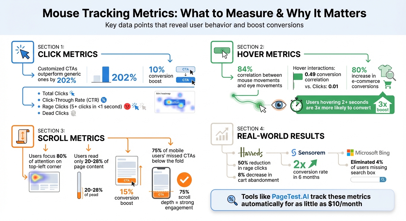
Click Metrics to Track
Click data provides a window into user behavior, shedding light on what’s working and where users encounter obstacles. It highlights both engaging elements and areas that might need some attention.
Total Clicks
Tracking total clicks shows how active users are on a page. It’s especially valuable when comparing different designs. For instance, if one layout racks up 1,200 clicks while another only gets 400, it’s clear which one resonates more with users.
Click mapping can pinpoint hotspots like navigation menus or CTAs (Call-to-Actions) and reveal cold zones where important buttons are getting ignored. Did you know that customized CTAs can outperform generic ones by 202%? That’s a huge difference. It’s also smart to break down click data by device type. Mobile users, for example, often deal with smaller tap targets, which can lead to accidental clicks or missed interactions. These insights can guide tweaks to your design, making it more user-friendly.
Click-Through Rate (CTR)
CTR measures the percentage of visitors who click on key elements like “Add to Cart” or “Book a Demo.” It’s a solid indicator of how effective your design and element placement are. Research even shows that a user’s first click is often a strong predictor of whether they’ll successfully complete their task.
Take this example: An older homepage version had a video engagement rate of just 0.04% (3 out of 7,000 users), which pointed to poor placement. In another case, moving an overlooked CTA to a sticky position boosted conversions by 10%.
CTR data can also flag “dead clicks”, where users click on items that aren’t actually links, like static images or plain text. If your click map shows lots of interaction with non-clickable elements, you might want to either make those elements functional or redesign them to avoid confusion. Fixing these issues can significantly reduce user frustration.
Click Rage and Dead Clicks
Beyond basic click data, there are other signals that point to user frustration. Click rage – defined as five or more clicks in under a second – often indicates a problem. This could be a broken button, a slow-loading page, or a lack of feedback to show that a click was registered.
Dead clicks are another red flag. These happen when users interact with elements that don’t respond, like static images or unlinked text. Both click rage and dead clicks highlight usability issues that standard analytics might miss.
Here’s a real-world example: In 2024, Harrods identified rage clicks on their checkout form. The “First Name” field was blocking special characters without explaining why, and the “Click & Collect” option had slow load times. After addressing these issues, rage clicks dropped by 50%, and cart abandonment went down by 8%.
Similarly, Microsoft’s Bing team discovered that 4% of users were missing the search box due to poorly designed margins. By adjusting the margins, they nearly eliminated the issue, improving overall user satisfaction.
Look for patterns in your data. If rage clicks are clustering around a specific button, test it right away. Simple fixes like adding loading spinners, repairing broken links, or ensuring every interactive element responds properly can make a big difference.
Hover and Engagement Metrics to Monitor
Hover data provides insights into how users evaluate elements on a page before taking action. By analyzing hover duration, heatmaps, and paths, you can better understand user behavior and refine your design for improved engagement.
Hover Duration
Hover duration, or hover dwell time, measures how long a user’s cursor lingers over a specific element. This metric often reflects a “consideration mode”, where users deliberate, gather information, or hesitate before acting. When paired with click and scroll data, it gives a fuller picture of user interaction. Research shows an 84% correlation between mouse movements and eye movements, making hover duration a reliable indicator of visual attention [22, 24]. Additionally, hover interactions correlate more strongly with conversions (0.49) compared to clicks (0.01).
“Mouse trajectories mirror eye movements with high precision. When users hover, they’re conveying literally where they’re looking, giving marketers X-ray vision into user attention patterns.” – Dr. Sarah Chen, Director of Stanford Human-Computer Interaction Group
For instance, users who hover over a call-to-action (CTA) for more than 2 seconds are three times more likely to convert. Hover dwell times that increase from 5% to 15% have been linked to a 45% boost in conversion rates. A practical example comes from Dorado Fashion: after noticing users hovered over product images for an average of 3.2 seconds without clicking “Add to Cart”, they introduced a hover-triggered zoom feature. The result? An 80% increase in e-commerce conversions and a 26.55% overall rise in conversions within three months. Similarly, Bandwidth improved visit-to-lead conversion rates by 12% by repositioning customer logos and making CTAs more hover-friendly.
When implementing hover tracking, set a minimum threshold of 500–1,000 milliseconds to exclude accidental movements. Focus on tracking key elements like CTAs, product images, and pricing information. However, if you notice high hover times but low clicks, it could signal confusion or unmet expectations [22, 23].
Hover Heatmaps
Hover heatmaps, or movement maps, visually represent where users concentrate their cursor activity. These maps use color coding – red and dark orange for high engagement, yellow and light orange for moderate interest, and green or blue for low activity – to highlight areas of focus on a page [23, 26].
One major advantage of hover heatmaps is identifying design elements that confuse users. For example, if users hover over non-clickable elements like headlines or decorative images, it might indicate they expect these elements to be interactive. Similarly, erratic or chaotic cursor movements often suggest frustration or difficulty navigating the page.
“Understanding attention can help you assess the effectiveness of the page design, especially above the fold area.” – Peep Laja, Founder, ConversionXL
Use hover heatmaps to ensure users focus on the right areas. If the “hottest” zones on your map don’t align with your conversion goals – such as users hovering over secondary content instead of the primary CTA – it might be time to adjust the layout. Additionally, compare hover patterns across devices, keeping in mind that hover tracking isn’t applicable on mobile devices, where touch or tap heatmaps are more relevant.
Hover Paths
Hover paths trace the continuous movement of a user’s cursor as they navigate your page. These paths reveal not just where users focus, but also how they explore and make decisions. They’re particularly useful for spotting navigation issues. For instance, random or looping movements often indicate confusion, poor site structure, or unclear labels.
“Erratic or looping mouse tracks indicate user confusion or unclear navigation.” – Phonexa
Pay attention to areas where hover paths and scrolling activity drop off sharply, as these “logical ends” often signal to users that they’ve reached the end of the page. Given that users typically focus 80% of their attention on the upper-left corner and read only 20–28% of a page’s content, analyzing hover paths can help ensure your most critical information gets noticed.
sbb-itb-6e49fcd
Scroll and Movement Pattern Metrics
Tracking how users scroll and move through your content offers a deeper understanding of their engagement beyond clicks and hovers. These insights can highlight design issues and guide adjustments to improve the visibility of key elements like CTAs and testimonials.
Scroll Depth
Scroll depth measures how far users scroll on a page, typically at 25%, 50%, 75%, and 100% intervals. It’s a great way to identify where users lose interest. For instance, excessive whitespace or horizontal lines can create the illusion of a page ending prematurely, causing users to stop scrolling.
In 2024, ClickMechanic used scroll maps to analyze their landing pages and found that most visitors didn’t scroll past the hero section. By redesigning that area to make it more engaging, they saw a 15% boost in conversion rates while cutting back on design and engineering efforts.
“If your CTA is in a cold blue zone, that’s a problem.” – Marie Sevel Aagaard Andersen, SEO Manager, Mouseflow
Similarly, Anna Grünanger of Vimcar discovered through scroll maps that 75% of mobile users missed the main CTA because it was placed too low on the page. By repositioning the CTA above the fold, the company saw an immediate uptick in users reaching their key conversion pages. For long-form content, a scroll depth of 75% is considered strong engagement, while 25% is acceptable for a homepage if the primary CTA is above the fold.
Mouse Speed and Velocity
Mouse speed and velocity offer a peek into the user’s mindset. Quick, erratic cursor movements often signal frustration, like when a page loads too slowly or tasks are confusing. On the other hand, slow, deliberate movements suggest users are weighing their options carefully.
“Mouse movements can also contain valuable hints at users’ intent, state of mind, and frustration level.” – Tim Rotolo, Co-founder and Chief Growth Officer, Trymata
Horizontal movements typically indicate active reading, while rapid vertical movements suggest skimming. Patterns of “click indecision”, where users hover between two clickable elements, can point to unclear or overly similar options. These metrics can also flag technical issues like slow-loading videos or pages, giving you a chance to fix them before they impact user experience.
Reading Patterns
Reading patterns reveal how users process content and navigate your page. Some common patterns include:
- F-shaped pattern: Users focus on headlines and skim the body text, forming an “F” shape.
- Commitment reading: Dense heatmaps show users are fully engaged and reading carefully.
- Layer cake pattern: Users read headlines but skip the subtext, reviewing the page at a surface level.
- Scrolling pattern: Vertical heatmaps with little horizontal movement suggest users are scanning for specific information they can’t locate.
“Random or looping mouse tracks could mean the user is confused or the travel routes are unclear.” – Oleksandr Rohovnin, Data-Driven Copywriter, Phonexa
Using PageTest.AI for Mouse Tracking Data and Optimization

PageTest.AI provides an AI-driven solution to simplify mouse tracking and improve website performance, all without needing to write a single line of code. By automatically analyzing key metrics like clicks, user engagement, and scroll depth during A/B tests, it highlights the most effective elements on your site.
Tracking Click, Hover, and Scroll Metrics with PageTest.AI
With its Chrome extension, PageTest.AI seamlessly integrates with your dashboard, offering real-time insights into live tests and targeted elements. You can pinpoint specific components – like CTAs or product descriptions – and test them using AI-generated content variants.
The dashboard uses a straightforward color-coded system: green for elements that perform well, red for those underperforming, and a gold trophy for the top variant. For instance, in a test comparing “Get my app free” with “Make my app free and easy”, PageTest.AI detected a staggering 306% improvement in click performance for the latter option.
Using Metrics Comparison for Optimization
To make informed decisions, comparing metrics side by side is crucial. PageTest.AI’s dashboard allows you to evaluate your control version against each tested variant, showing traffic splits, total impressions, and detailed click data. Some tests have revealed click performance improvements as high as 241% or even 306% for specific CTAs.
Once the best-performing variant is identified, you can manually update your website to lock in those gains. PageTest.AI also offers a free trial, with paid plans starting at just $10/month, making it accessible for businesses of all sizes.
Key Takeaways
Mouse tracking data uncovers the untold story of how users interact with your website – revealing hesitations, frustrations, and moments of engagement that occur between clicks. By analyzing metrics like rage clicks (repeated clicks out of frustration) and dead clicks (clicks that lead nowhere), tracking hover patterns to identify attention hotspots, and reviewing scroll depth to gauge content visibility, you can pinpoint exactly where users struggle and where they connect.
The stats are eye-opening: users focus 80% of their attention on the top-left corner of a webpage and typically read just 20–28% of its content. For example, in 2024, Sensorem leveraged scroll depth data to identify ineffective traffic sources. By reallocating their budget, they managed to double their conversion rate in just six months.
Tools like PageTest.AI make this process even easier. It automatically tracks clicks, engagement, and scroll depth during A/B tests, helping you quickly spot what’s working and what needs improvement. This allows you to implement design changes without delay.
By combining behavioral metrics (like clicks and scrolls) with engagement signals (such as hover patterns), you can strategically position CTAs, repair broken elements, and fine-tune content placement – all based on real user behavior.
Ready to dive in? PageTest.AI offers a free trial and plans starting at just $10/month – no coding skills required. It’s time to start optimizing where it matters most.
Mouse Tracking Data FAQs
Which mouse tracking data metrics matter most for my site goals?
Mouse tracking metrics like clicks, scroll depth, hover patterns, and mouse movement paths are essential for understanding how users interact with your site. These insights reveal how engaged visitors are, highlight areas where they might encounter difficulties, and guide you in refining your site’s design and calls-to-action to improve overall functionality and user experience.
How do I tell rage clicks from dead clicks in my data?
Rage clicks happen when users repeatedly click on the same interactive element, often out of frustration. On the other hand, dead clicks occur when users click on areas of a page that aren’t interactive at all. The key to telling them apart lies in analyzing click patterns: rage clicks are clustered around functional elements, while dead clicks are found in spots that don’t trigger any response.
What’s a good scroll depth target for a landing page?
Aiming for a scroll depth of around 75% is a solid goal for a landing page. It indicates that users are engaging with the majority of your content. To hit this target, concentrate on three key areas:
- Optimize your content structure: Organize information logically and make it easy to skim with clear headings, bullet points, and visuals.
- Improve page speed: A faster-loading page keeps users from bouncing before they explore your content.
- Strategic CTA placement: Position your calls-to-action (CTAs) where they naturally align with user intent, encouraging interaction without disrupting the flow.
These steps can help ensure visitors stay engaged and move through your page effectively.
Related Blog Posts
say hello to easy Content Testing
try PageTest.AI tool for free
Start making the most of your websites traffic and optimize your content and CTAs.
Related Posts

![]() 30-03-2026
30-03-2026
 Ian Naylor
How Internal Links Boost Conversions
Strategic internal links guide users, improve SEO, and turn site navigation into measurable conversion growth.
![]() 28-03-2026
28-03-2026
Ian Naylor
Core Web Vitals Benchmarks by Industry
Industry Core Web Vitals benchmarks and practical fixes for LCP, INP, and CLS, plus mobile vs desktop gaps and optimization tips.

![]() 26-03-2026
26-03-2026
Ian Naylor
How to Benchmark Mobile Retention Rates
Benchmark Day 1/7/30 retention, run cohort analysis, and optimize onboarding, habit triggers, and personalization to improve app retention.