

 25-12-2025
Choose Button Colors That Actually Convert with a Button Color Impact Calculator
Button color feels like a design choice. In reality, it’s a behavioural one. The wrong color blends in, creates hesitation, or sends the wrong signal. The right one pulls attention and makes the next step feel obvious.
A button color impact calculator helps you understand whether your button colors are helping users act or quietly holding them back.
Quick snapshot:
-
Button color directly affects visibility and click behaviour
-
Small color changes can outperform major layout changes
-
A button color impact calculator removes guesswork from design decisions
-
Works for landing pages, apps, checkout flows, and emails
We’ve seen conversion rates move noticeably just by changing button color contrast and tone. Same wording. Same placement. Different results.
Why button color matters more than people think
Users don’t read pages top to bottom. They scan. Their eyes look for visual cues that answer one question quickly: what do I do next?
Button color plays a huge role in that moment.
Good button color:
-
stands out clearly from the background
-
matches the emotional tone of the action
-
feels clickable without being aggressive
-
aligns with accessibility standards
Bad button color:
-
blends into surrounding elements
-
competes with other colors on the page
-
creates hesitation or confusion
-
fails contrast checks
In our experience, many underperforming pages don’t have a copy problem or layout problem. They have a visibility problem. The button simply doesn’t look important enough.
What a button color impact calculator actually evaluates
A button color impact calculator looks beyond personal taste. It evaluates button color using signals tied to real user behaviour and accessibility.
Key factors include:
Contrast
Does the button clearly stand out against its background? Poor contrast reduces visibility and hurts accessibility.
Attention hierarchy
Is the button visually dominant compared to surrounding elements, or does it compete with images, links, or secondary actions?
Emotional signal
Color communicates intent. Green often signals progress. Red signals urgency or caution. Blue feels safe but can fade into layouts if overused.
Accessibility alignment
Buttons should meet WCAG contrast guidelines so users with visual impairments can clearly see and interact with them.
The calculator turns these inputs into clear feedback rather than subjective opinion.
Common button color mistakes the calculator exposes
A button color impact calculator regularly highlights issues like:
1. Brand color overload
Using a primary brand color everywhere reduces its impact on buttons. When everything is loud, nothing stands out.
2. Low contrast buttons
Light buttons on light backgrounds or dark buttons on dark sections often look stylish but underperform.
3. Emotional mismatch
A “Confirm purchase” button in a warning-style red can increase hesitation. A neutral or reassuring color often performs better.
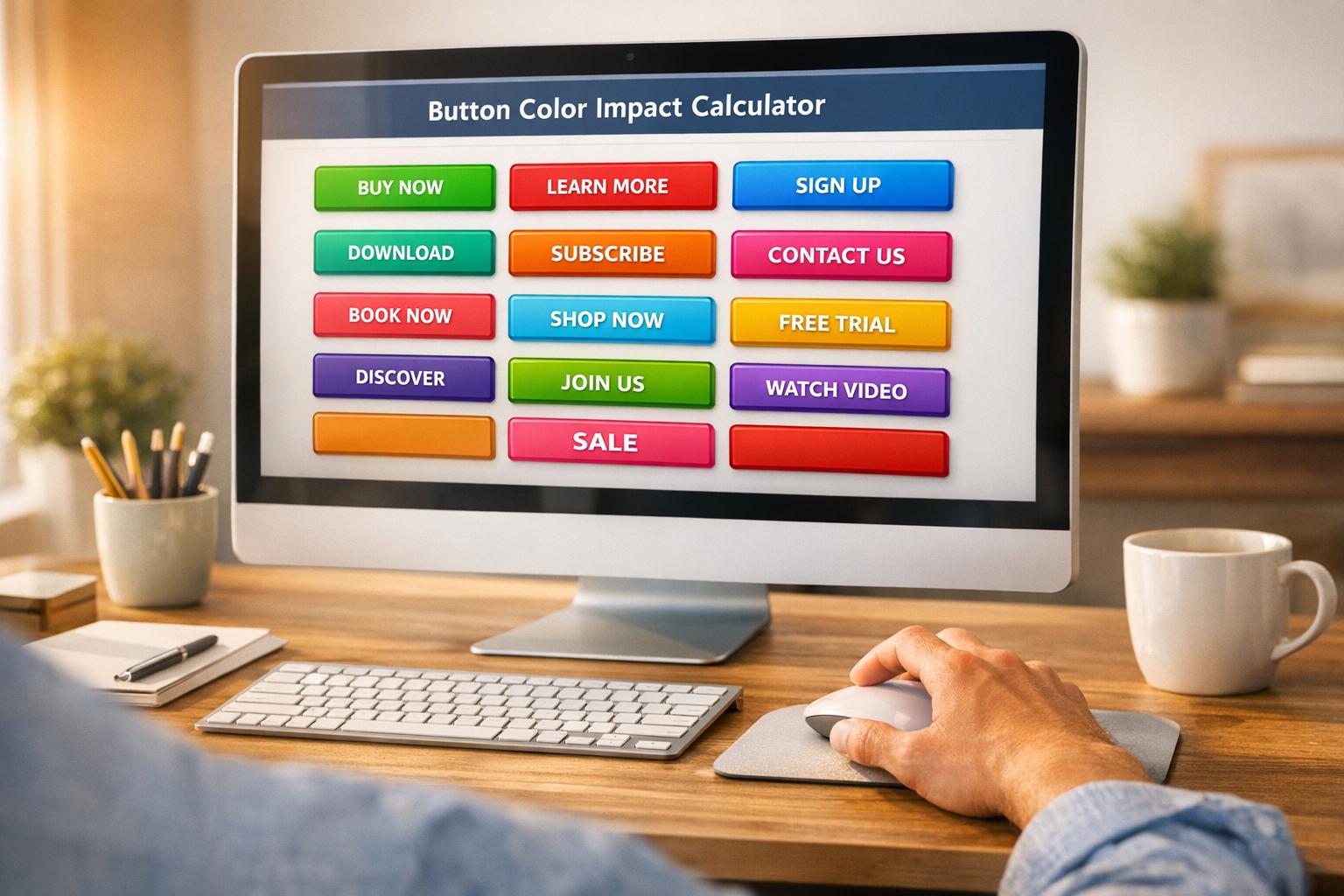
4. Too many button colors
Multiple CTA colors on one page dilute focus and confuse users.
We’ve seen pages regain clarity simply by standardising one primary CTA color and toning everything else down.
How to use a button color impact calculator properly
Here’s how teams usually get the most value:
-
Define the primary action
What is the single most important thing the user should do? -
Test the current button color
Run it through the calculator to check contrast, prominence, and accessibility. -
Compare alternatives
Test a few color options rather than guessing. Small differences matter. -
Check across devices
Mobile screens expose contrast issues quickly. -
Pair with wording tests
Color and text work together. Don’t change both at once unless you’re testing intentionally.
In our experience, button color is one of the fastest things to test because it requires minimal design effort and zero copy changes.
Button color, accessibility, and trust
Accessibility isn’t a nice-to-have. It directly affects conversions.
Buttons that fail contrast standards:
-
are harder to spot
-
feel less clickable
-
frustrate users
-
exclude part of your audience
A button color impact calculator helps ensure your CTAs are visible to everyone, not just users with perfect vision on ideal screens.
We’ve seen accessibility improvements lift conversion rates simply because more users could clearly see and interact with the CTA.
Why button color impacts engagement and SEO indirectly
Button color doesn’t affect rankings directly, but it influences:
-
click-through behaviour
Search engines and AI-driven systems favour pages that guide users clearly and keep them engaged. A visible, intuitive CTA supports that flow.
Pages with clear visual hierarchy tend to perform more consistently when algorithms change.
Where a button color impact calculator is most useful
A button color impact calculator works well for:
-
landing pages
-
checkout flows
-
SaaS onboarding
-
app interfaces
-
email CTAs
-
lead capture forms
Anywhere a click matters, color matters.
FAQs
What is a button color impact calculator?
It’s a tool that evaluates how effective your button color is based on contrast, visibility, emotional signalling, and accessibility standards.
Is there a “best” button color?
No. The best color depends on context, background, brand palette, and user intent. That’s why testing and evaluation matter more than rules.
Should I always use my brand color for buttons?
Not always. Brand colors often work best as accents. Buttons need to stand out, not blend in.