

Color Contrast Checker for Accessibility
Color Contrast Checker for Accessibility
![]() 08-12-2025 (Last modified: 12-12-2025)
08-12-2025 (Last modified: 12-12-2025)
Make Your Website More Accessible with a Color Contrast Checker
Accessibility isn’t just a box to tick. It’s about making sure everyone can actually read, use, and enjoy your website. And one of the easiest places to start is with a color contrast checker.
Quick snapshot:
-
A color contrast checker grades how readable your text is against its background
-
Meeting WCAG contrast ratios improves accessibility and trust
-
Better contrast = better UX, especially on mobile
-
Many accessibility issues come from color choices you don’t even realise are hard to read
We’ve seen plenty of sites look beautiful in a mood board but fall apart when real people try to read them on a phone outdoors. Contrast is one of those simple fixes that makes a huge difference.
Why color contrast matters
Color contrast is the difference in brightness between your foreground (usually text) and your background. A color contrast checker helps you quantify that difference using WCAG standards.
This matters because:
-
Low contrast makes text hard to read for anyone, not just people with visual impairments
-
Around 1 in 12 men and 1 in 200 women experience some form of color blindness
-
Studies show that improving contrast can lift task completion rates by over 20 percent in usability tests
In our experience, most accessibility issues don’t come from “unusual” colors. They come from trendy design choices like soft greys, thin fonts, or pastel text on pastel backgrounds. Looks great on a designer’s MacBook at 100 percent brightness. Not so great in the real world.
Good contrast isn’t just good manners. It’s good design.
What a color contrast checker actually does
A color contrast checker measures the contrast ratio between two colors using the WCAG formula, then tells you whether your combination is:
-
AA compliant
-
AAA compliant
-
Failing and needs improvement
You drop in your hex codes, hit check, and instantly see whether your color pairing works for:
-
Small text
-
Large text
-
UI elements like buttons, labels, and menus
Design teams use this daily because it saves guesswork. We’ve seen marketing teams fix accessibility issues within minutes by simply running their palette through a contrast checker before launch.
Using contrast to improve readability
Here’s a simple workflow:
-
Pick your colors
Choose your text and background colors, or grab them from an existing design. -
Run them through a color contrast checker
Get a score like 3.2:1, 4.8:1, or 7:1. -
Match the score to WCAG levels
-
AA for normal text: 4.5:1
-
AAA for normal text: 7:1
-
AA for large text: 3:1
-
AAA for large text: 4.5:1
-
-
Adjust as needed
-
Darken backgrounds
-
Lighten text
-
Avoid overly saturated or overly soft hues
-
-
Retest until both readability and brand aesthetics are balanced
We’ve seen contrast adjustments alone reduce bounce rates on content-heavy pages because users no longer struggle to read the text.
Practical improvements that make a big difference
A color contrast checker highlights the issue, but here are simple fixes:
-
Choose darker text on light backgrounds
-
Avoid ultra-light grey body text
-
Increase font weight to improve perception
-
Test color combos in different lighting conditions
-
Check mobile readability (it usually shows problems first)
One lesson we’ve learned repeatedly: designers often underestimate how bad thin, low-contrast text looks on mid-range Android screens. Testing with a contrast checker saves embarrassment later.
Why this matters for accessibility and SEO
Better accessibility isn’t just good practice. It supports:
-
Longer session times
-
Lower bounce rates
-
Stronger trust from users
-
Compliance with global accessibility standards
Google doesn’t rank pages because of contrast, but it definitely rewards improved usability and readability. If users can’t read your content, they won’t stay. Simple as that.
FAQs: Color Contrast Checker
What is a good contrast ratio for web accessibility?
It depends on text size and WCAG level:
-
Normal text: 4.5:1 (AA) or 7:1 (AAA)
-
Large text: 3:1 (AA) or 4.5:1 (AAA)
Higher ratios generally mean better readability. A color contrast checker tells you exactly where your pairings fall.
Why does color contrast matter for accessibility?
Low contrast makes text hard to read for people with low vision, color blindness, or even anyone standing outside in sunlight. Meeting WCAG standards widens your audience and improves usability. A color contrast checker makes it easy to hit the required ratios.
What if my colors don’t pass the contrast test?
It’s usually a quick fix. Try:
-
Darkening the background
-
Lightening the foreground
-
Switching to a more readable palette
Run the updated pair through the color contrast checker again to confirm your changes meet the guidelines.
say hello to easy Content Testing
try PageTest.AI tool for free
Start making the most of your websites traffic and optimize your content and CTAs.
Related Posts

![]() 30-03-2026
30-03-2026
 Ian Naylor
How Internal Links Boost Conversions
Strategic internal links guide users, improve SEO, and turn site navigation into measurable conversion growth.

![]() 28-03-2026
28-03-2026
Ian Naylor
Core Web Vitals Benchmarks by Industry
Industry Core Web Vitals benchmarks and practical fixes for LCP, INP, and CLS, plus mobile vs desktop gaps and optimization tips.
![]() 26-03-2026
26-03-2026
Ian Naylor
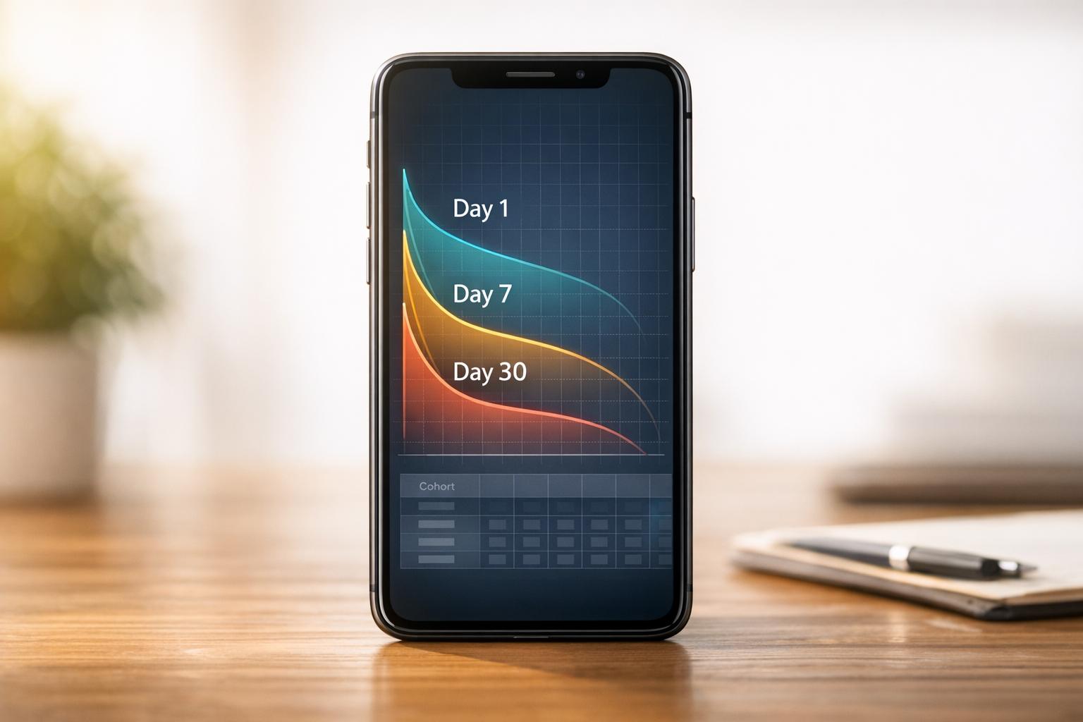
How to Benchmark Mobile Retention Rates
Benchmark Day 1/7/30 retention, run cohort analysis, and optimize onboarding, habit triggers, and personalization to improve app retention.