

10 Filter UX Best Practices for E-commerce
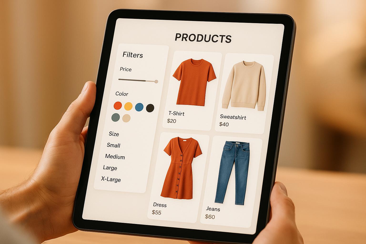
10 Filter UX Best Practices for E-commerce
![]() 26-07-2025 (Last modified: 05-10-2025)
26-07-2025 (Last modified: 05-10-2025)
Filters are essential for helping online shoppers navigate large product catalogs. Yet, only 16% of major e-commerce sites offer effective filtering, leading to frustration and lost sales. For instance, 54% of shoppers abandon purchases if they can’t quickly check stock availability. Well-designed filters simplify decision-making, improve usability, and boost conversions. Here’s a quick summary of the 10 best practices to enhance your e-commerce filter UX:
- Product-Specific Filters: Tailor filters to product attributes (e.g., size, color) for easier navigation.
- Multi-Select Filtering: Allow users to combine multiple criteria for refined results.
- Prioritize Filter Order: Display the most relevant filters first based on customer behavior.
- Clear Filter Controls: Use simple, familiar designs (e.g., checkboxes, "X" to remove filters).
- Visible Applied Filters: Show active filters prominently and make them easy to adjust.
- Product Counts: Display item counts for each filter option to set clear expectations.
- Mobile-Friendly Filters: Optimize for smaller screens with collapsible menus and sticky filters.
- Clear Labels: Use simple, user-friendly terminology for filter names.
- Fast Updates: Ensure filters update results instantly or with minimal delay.
- Continuous Testing: Analyze user behavior and refine filters regularly.
Key stat: Fully, a furniture retailer, revamped its filters and saw a 5.97% conversion boost and a 75:1 ROI. Better filters don’t just improve navigation – they drive sales and customer satisfaction.
How to Design Product Filter in eCommerce Website? 5 UI/UX Tips for Website Navigation
1. Use Product-Specific Filters
While generic filters work across all product categories, product-specific filters take the shopping experience to the next level. These tailored filters focus on the unique attributes that matter most for each product type, making it easier for customers to find exactly what they’re looking for.
Relevance to User Needs
Product-specific filters are designed to address the key factors that influence a customer’s decision-making process. For example, Columbia Sportswear allows shoppers to refine their search for ski pants by attributes like size, color, inseam type, and waterproofness. This level of precision ensures that customers are presented with the most relevant options for their needs.
"Product specific filters help online shoppers find exactly what they’re looking for. Adding more dynamic filters can also speed up the research phase by allowing browsing customers to easily narrow down search results. All of these benefits work together to bring your online shoppers closer to the point of conversion."
– Emma Forward, UX Strategist, eForward
Understanding how customers shop can lead to powerful results. For instance, StyleVault, a fashion retailer, noticed that customers often searched by "occasion" rather than traditional product categories. By introducing an "occasion" filter, they saw a 17% boost in conversion rates among users who engaged with the filters.
To identify which filters will work best for your store, analyze your product descriptions and titles. Attributes frequently mentioned in these areas are often the ones customers care about most. If a detail is important enough to include in the description, it’s likely worth turning into a filter.
Ease of Use and Intuitiveness
Filters tailored to specific categories make shopping more intuitive by narrowing down choices to what truly matters. For example, FocalPoint, a camera retailer, introduced a guided filtering system that asked users simple questions instead of overwhelming them with technical specs. This conversational approach led to a 34% increase in conversion rates among first-time visitors unfamiliar with camera jargon.
Impact on Conversion Rates
Product-specific filters can significantly reduce abandonment rates, which often range from 67% to 90%, bringing them down to 17% to 33%. By connecting customers with the right products faster, these filters play a key role in boosting sales. Take TechZone, an electronics retailer, as an example. By focusing on three primary filters – price, brand, and rating – and including a "More Filters" option for additional specifications, they achieved a 14.3% increase in mobile conversion rates.
Mobile and Desktop Adaptability
To maintain consistency and maximize conversion gains, product-specific filters need to function seamlessly across both desktop and mobile devices. On mobile, where screen space is limited, prioritizing the most relevant filters for each category is crucial.
Despite their importance, 42% of major e-commerce sites still lack product-specific filtering options.
Testing and tweaking your filter setup can make a big difference. Tools like PageTest.AI allow you to experiment with filter placement, labels, and functionality to see what works best for your audience. A well-optimized filtering system doesn’t just improve the browsing experience – it lays the groundwork for higher conversion rates and happier customers.
2. Enable Multi-Select and Combination Filtering
Multi-select filtering takes product search to the next level by allowing users to refine their searches with multiple criteria simultaneously. Instead of being limited to one filter at a time, shoppers can select options like "Red" and "Blue" under color while also narrowing their search with "Size M" and "Under $50" across other categories. This flexibility mirrors how people naturally shop and significantly improves the search experience.
Relevance to User Needs
This approach aligns with how customers think when shopping online. According to research from the Baymard Institute, 57% of users consider combining multiple filters essential for finding products quickly and efficiently. By enabling users to apply several filters at once, e-commerce sites help them locate the right products with less effort and frustration.
The logic behind multi-select filtering is straightforward: use "AND" logic to combine filters from different categories and "OR" logic within a single category. This setup reflects how users approach decision-making, making it easier for shoppers to discover products that meet their exact needs.
Despite its importance, many e-commerce sites still miss the mark. Studies reveal that 15% of sites don’t support multi-select and combination filtering, forcing users into a tedious cycle of filtering, reviewing results, and starting over.
Ease of Use and Intuitiveness
For multi-select filtering to succeed, the interface must be simple and intuitive. Checkboxes are the go-to tool for this feature, as they clearly signal that users can select multiple options. Websites like Home Depot and Zappos excel in this area, offering checkboxes that update results in real time. This design feels natural and easy to understand for users.
To further enhance usability, applied filters should appear prominently as removable "pills" or tags above the product grid. Each filter should include a clear removal option, typically an "X" icon, so users can adjust their selections effortlessly. This visual feedback keeps users aware of their choices and encourages experimentation without confusion.
Real-time updates, such as those on Home Depot and Zappos, reinforce the ease of use by instantly reflecting changes as users select or deselect filters.
Impact on Conversion Rates
A well-designed multi-select filtering system doesn’t just simplify the shopping experience – it can also boost sales. Sites that implement this feature effectively often see a 10-20% improvement in product findability, which directly impacts conversion rates. When shoppers can quickly narrow down large product catalogs to match their preferences, they’re more likely to make a purchase.
This reduction in search friction is key. Without the frustration of limited filtering options, customers can focus on exploring products that meet their needs, keeping them engaged and moving them closer to checkout.
Mobile and Desktop Adaptability
To maintain a seamless experience, multi-select filtering must work equally well on both desktop and mobile devices. On desktops, filters are typically displayed in a sidebar with clearly labeled checkboxes and ample space for multiple selections. Mobile devices, however, require a different approach due to their smaller screens.
Galaxus.ch, a Swiss e-commerce retailer, sets a high standard with its responsive multi-select filtering system. It uses a clean overlay design with real-time updates, ensuring a smooth experience across devices. Similarly, Ikea employs a sidebar mega-filter overlay that groups all options and updates results dynamically as users make their selections. These examples highlight how thoughtful design can adapt to different devices while maintaining usability.
For mobile users, collapsible filter panels or overlays are ideal. They provide access to multi-select options without overwhelming the screen. Controls should be large enough for easy tapping, and the interface should retain the same logical structure as on desktop.
Testing different filter layouts and logic can help fine-tune the system, track engagement, and improve conversion metrics. By focusing on both functionality and user experience, multi-select filtering can become a powerful tool for any e-commerce platform.
3. Order Filters by Importance
The way you arrange filters on your site plays a huge role in shaping the shopping experience. Customers naturally expect the most relevant options to be front and center. Unfortunately, many e-commerce platforms still rely on alphabetical or random order, which forces shoppers to hunt for the filters that truly matter to their purchase decisions. Let’s dive into why prioritizing filters based on importance can make all the difference.
Relevance to User Needs
To prioritize filters effectively, you need to understand what drives your customers’ decisions. This starts with analyzing search data and customer behavior to figure out which product attributes matter most. For instance:
- In clothing, size and color are key.
- Electronics shoppers care about brand, price, and features.
- Home improvement buyers focus on material type and dimensions.
The idea is simple: let data guide you rather than relying on guesswork. When you prioritize filters based on real customer needs, you make it easier for them to find what they’re looking for.
Here’s a surprising stat: 61% of e-commerce sites don’t highlight filters in their product listings, missing out on a major opportunity to guide shoppers toward relevant products.
Ease of Use and Intuitiveness
A well-organized filter hierarchy reflects how customers think about their purchases. Start with broad categories that help users narrow down large selections, then move into more specific options. This logical progression keeps navigation smooth and intuitive.
For example, a furniture retailer might structure filters like this:
- First: "Room" (broad category)
- Next: "Furniture Type"
- Then: "Material" and "Color"
- Finally: Specific details like "Assembly Required" or "Weight Capacity"
It’s also important to use terms your customers understand. If analytics show shoppers search for "waterproof" instead of "IP67 rated", stick with the more familiar term to avoid confusion.
Impact on Conversion Rates
Optimizing your filter order isn’t just about convenience – it can directly boost sales. When shoppers find the right filters quickly, they’re more likely to engage with your products and complete their purchases.
Take Fully, for example. A redesign that prioritized filters based on customer needs – like product availability – led to a noticeable increase in conversions. This demonstrates how aligning filters with customer priorities can produce real business benefits.
Mobile and Desktop Adaptability
Filter order becomes even more critical on mobile devices, where screen space is at a premium. Mobile users often see fewer filters at a time, so it’s crucial to display the most important ones first. Many users won’t scroll through a long list of options on a small screen.
On desktop, while more filters can be displayed simultaneously, the same principles apply. Start with broad, impactful filters and then drill down into specifics. Expandable sections can help keep the interface clean while still offering detailed options for those who want them.
Regular testing – like A/B testing and analytics reviews – can help you fine-tune your filter order for better results across both mobile and desktop platforms.
Ultimately, the ideal filter hierarchy is unique to your store. It should evolve continually, shaped by customer behavior and changing product trends, to deliver the best experience possible.
4. Use Clear Filter Controls
Clear filter controls are a game-changer for helping customers find what they need quickly and efficiently. If your filters are confusing or poorly designed, customers might abandon their search altogether. By making filters intuitive and easy to use, you can reduce frustration and create a smoother shopping experience. This small but impactful improvement can make a big difference in how users interact with your site.
Relevance to User Needs
Filters should speak the customer’s language – literally. When shoppers encounter vague or overly technical terms, they’re more likely to get frustrated and give up. Instead, use simple, familiar labels that resonate with your audience. For example, Amazon’s filters for price, brand, and rating are so straightforward that anyone can understand them instantly. Netflix does something similar, offering filters like genre, year, and language. If your audience is searching for "waterproof" items, don’t complicate things by labeling the filter as "IP67 rated." Speak in terms they know and trust.
Ease of Use and Intuitiveness
Good filter controls don’t make users think – they just work. To achieve this, rely on familiar design elements like color coding and clear feedback. Take Zappos, for instance: they use color to highlight active filters and include a simple "X" button to remove them. This visual clarity helps users stay in control of their search. Short, descriptive labels also prevent clutter and make decisions faster. If your site has a long list of filter options, adding a search bar within the filters can save users time and effort.
Impact on Conversion Rates
Clear filters don’t just make browsing easier – they also drive sales. Studies show that 30% of online shoppers use filters, and those who do are twice as likely to make a purchase compared to those who don’t. A great example is Fully, a company specializing in office furniture. They revamped their filter system to include simpler categories and clearer controls. The result? A 5.97% increase in conversion rates across both desktop and mobile, with an impressive 75:1 return on investment. When filters work well, customers find what they’re looking for faster, which leads to more engagement and purchases.
Mobile and Desktop Adaptability
Your filters need to shine on both desktop and mobile. On desktop, you’ve got more space to play with, so you can include features like a sidebar with checkboxes or fields that auto-apply changes without requiring an "Apply" button. Amazon’s desktop interface is a perfect example of this streamlined approach.
On mobile, where screen space is limited, you’ll need to be more strategic. Focus on the most important filters and use features like off-canvas menus, dropdowns, or expandable panels to keep things organized without overcrowding the screen. Touch targets – like buttons and checkboxes – should be large enough to avoid accidental taps. Sticky filters that stay visible as users scroll can also improve the mobile experience, ensuring customers can adjust their search criteria without hassle. Whether on a phone or a desktop, seamless filter functionality keeps users engaged and in control.
5. Show Applied Filters and Make Them Easy to Remove
Make applied filters prominent and simple to adjust. Clearly visible filters not only help shoppers stay aware of their selections but also make it easier to refine or reset them. When filters are hidden or unclear, users might feel uncertain about the product results they’re viewing, which can lead to frustration.
Why Applied Filters Matter
Applied filters give users immediate feedback on their choices, enabling quick adjustments while maintaining clarity about the product range being displayed. Without this visibility, customers might misinterpret the available options. In fact, research shows that 32% of top e-commerce sites fail to provide an overview of applied filters, which can lead to confusion.
Designing for Simplicity and Clarity
To make filters easy to remove, use familiar design elements like prominent "X" icons or a "Clear All" button. Examples from retailers such as Home Depot, Macy’s, and House of Fraser highlight how these features simplify the process . A "Clear All" button, like the one used by B&H Photo, not only resets all selections but also signals that filters are actively applied . These small design choices go a long way in making the shopping experience smoother.
Boosting Conversion Rates
When filters are easy to see and modify, shoppers feel more in control, which can positively impact their buying decisions. By making it easier for users to refine their searches, you increase the likelihood that they’ll find what they’re looking for and complete their purchase. According to the Baymard Institute, well-optimized filters can significantly reduce cart abandonment rates – from 67–90% down to 17–33%.
Adapting for Mobile and Desktop
Applied filters should be accessible and functional across devices. On desktop, they can be displayed in several places: above the product list, next to the filtering sidebar, or below a horizontal filtering toolbar. Ann Taylor, for instance, places its applied filters just below a horizontal toolbar for maximum visibility.
For mobile, where screen space is more limited, a horizontal scrolling list or stacked rows above the product list works well. If space is extremely tight, consider summarizing additional filters in a concise manner to avoid clutter. This approach ensures users can still understand their selections without feeling overwhelmed.
6. Show Product Counts for Each Filter Option
Adding product counts to filters makes the shopping experience clearer and more efficient. When users can see exactly how many items match a filter, they get a quick snapshot of their options before making a choice.
Relevance to User Needs
Product counts act as a guide, helping users navigate filters and avoid the frustration of empty results.
"Often, facets also show the number of elements available under each filter, and thus help users avoid zero-search results." – Nielsen Norman Group
For instance, if a shopper sees "Blue (47)", they immediately know there are 47 blue items to explore. This transparency builds confidence and helps narrow down choices.
Ease of Use and Intuitiveness
Including item counts makes filter options more intuitive by providing extra context. Users can quickly compare filters – like "Size 8 (2)" versus "Size 9 (24)" – to decide which one aligns better with their needs.
Brands like Home Depot highlight this feature by dynamically updating product counts as filters are applied. Similarly, Booking.com displays numbers next to each filter, giving users real-time feedback and setting clear expectations.
Impact on Conversion Rates
Product counts can directly influence buying decisions by showing availability upfront. Research indicates that real-time inventory visibility can boost conversion rates by up to 15%. Shoppers are less likely to leave frustrated when they know what’s available from the start.
These counts also have a psychological effect. For example, seeing "Only 3 left" can create urgency, while "127 available" might signal abundance. The Baymard Institute praises Macy’s for its standout filtering system, specifically noting how well they incorporate item counts.
Mobile and Desktop Adaptability
Whether users are on a desktop or mobile device, product counts enhance the filtering experience. On desktops, there’s plenty of room to display counts clearly. On mobile, where space is limited, these counts still provide crucial feedback. Airbnb, for example, shows how many results match a filter, ensuring users get real-time updates regardless of their device.
Dynamic updates keep the process seamless – whether someone is browsing on their phone during a commute or on their desktop at home. This instant feedback sets the stage for exploring how intuitive UI controls can further improve filtering.
"Filtering empowers the user to take a large generic product list and narrow it down to a small manageable selection of products that is uniquely tailored to their needs and interests." – Baymard Institute
Next, we’ll dive into how clear UI controls can make filters even easier to use.
sbb-itb-6e49fcd
7. Optimize Filters for Mobile
Mobile shopping is no longer a convenience – it’s the norm. In 2023, mobile e-commerce sales hit a massive $2.2 trillion, making up 60% of global e-commerce revenue. With such a dominant share, delivering a seamless mobile experience is critical. Here’s the catch: mobile devices have limited screen space, so every tap counts. In fact, 62% of shoppers say they won’t return to a site after a poor mobile experience. Optimizing your mobile filters can make all the difference in boosting engagement and driving conversions.
Ease of Use and Intuitiveness
Mobile filters need to be simple and touch-friendly. Controls should be large enough – at least 44×44 pixels – to ensure easy tapping. Leading brands like Gymshark and ASOS nail this by prioritizing usability. ASOS, for example, uses a horizontal top bar for quick filtering and expandable sections for more detailed options.
To make mobile filters more user-friendly, consider these strategies:
- Highlight essential filters like price, availability, and size at the top.
- Use collapsible menus to save space and reduce visual clutter.
- Add sticky filter buttons so users can always see their active filters while scrolling.
GameStop offers a great example with its mobile filtering system, which features tappable tags for easy filter removal.
Impact on Conversion Rates
When filters are optimized for mobile, they don’t just improve usability – they directly impact your bottom line. Studies show that mobile-friendly filters can increase usage by 40% and significantly boost conversions. For instance, StyleCentral revamped its mobile filtering system and saw a 23% jump in mobile conversion rates. Speed matters too; even a one-second delay in filter response time can slash conversions by up to 7%. StyleCentral’s redesign included a bottom sheet interface with large touch targets and clear visual feedback, ensuring faster and more intuitive filter interactions.
Mobile and Desktop Adaptability
Adapting filters to fit the unique needs of mobile and desktop users is another crucial step. Mobile users often benefit from a simplified filter set that focuses on the most relevant options, reducing cognitive load and speeding up the process. Full-screen filter interfaces work particularly well on mobile, as they give users plenty of space to make their selections without feeling cramped. By offering a dedicated, distraction-free area for filtering, users can make adjustments before returning to the product results, creating a smoother shopping experience.
Given that only 16% of major e-commerce sites offer a good filtering experience, this is an area where you can stand out. Investing in mobile filter optimization not only drives higher conversions and engagement but also builds customer loyalty, encouraging repeat visits. A well-designed mobile filter system is a win for both the user and your business.
8. Use Simple, Clear Filter Labels
Clear and straightforward filter labels are just as important as intuitive controls and well-organized hierarchies when it comes to creating a smooth shopping experience. They play a key role in helping shoppers quickly find what they’re looking for, which directly impacts conversions.
Relevance to User Needs
Customers prefer plain, everyday language. Filter labels should align with the terms they’re most likely to use. For instance, people are far more likely to search for "red shoes" than something like "#FF0000 footwear." Similarly, they expect to see "large" or "small" instead of overly technical sizing like "XL." The closer your labels mirror how customers think, the faster they’ll find what they need.
A great example is Drunk Elephant’s skincare section. Their filters avoid complicated scientific terms and stick to simple, user-friendly labels. This approach not only aligns with customer expectations but also makes the filtering process smoother and less intimidating for shoppers.
Ease of Use and Intuitiveness
Clear labels make it easy for customers to understand what each filter does at a glance. Replacing industry-specific jargon with familiar language simplifies the process. For example, The Toy Store categorizes its products with themes like monsters, space, trains, and mermaids. This setup makes browsing intuitive for both kids and parents. Similarly, essential filters – like price, size, and availability – should always be clearly labeled and easy to find.
Impact on Conversion Rates
The clarity of filter labels can significantly affect your bottom line. Research shows that up to 44% of e-commerce sites struggle with usability issues related to product lists and filters. By improving label clarity, conversion rates can increase by as much as 5.97%. That’s a tangible benefit for a relatively simple adjustment.
Mobile and Desktop Adaptability
On mobile devices, concise labels are especially critical to avoid truncation and clutter on smaller screens. Short and descriptive labels work better across all platforms, ensuring filters are easy to use whether customers are shopping on their phones or desktops. Paired with responsive design, clear labels help create a seamless experience across devices, making navigation effortless no matter where users shop.
9. Provide Fast Filter Updates
Fast filter updates are the final piece of the puzzle when it comes to creating a smooth shopping experience. They keep users engaged by delivering instant results, ensuring shoppers stay on track toward making a purchase.
Relevance to User Needs
Shoppers expect speed – and they won’t stick around if they don’t get it. If someone filters by "size medium" or "under $50", they want to see results immediately. Any delays interrupt their flow and can lead to site abandonment. Here’s the reality: 40% of shoppers leave websites that take longer than 3 seconds to load, and a 100-millisecond delay in load time can drop conversion rates by 7%. The stakes are high, as shown by Amazon customers completing 28% of purchases within just three minutes. Quick filter updates are no longer a luxury – they’re a necessity.
Ease of Use and Intuitiveness
Speedy updates go hand in hand with clear filters and labels to create a user-friendly experience. Instant updates reassure users that their actions are working, removing any guesswork. Real-time filtering, where results appear as options are selected or deselected, is particularly effective. It eliminates the need for page reloads, keeping the process seamless. On slower sites, though, batch filtering with an "Apply" button can maintain performance while still ensuring usability.
Impact on Conversion Rates
The connection between filter speed and sales is undeniable. Every millisecond of delay can cost you 1% in online revenue. Even small improvements in filter response times can produce noticeable revenue growth. For example, retail sites saw an 8.4% increase in conversion rates by improving mobile site speed by just 0.1 seconds. Faster filters not only drive conversions but also reduce bounce rates and encourage shoppers to browse more of your products.
Mobile and Desktop Adaptability
Mobile users are especially sensitive to delays, making instant updates critical for smaller screens. Depending on your site’s performance, your approach may need to vary. For fast-loading websites, interactive filtering works best, while batch filtering can help maintain stability on slower platforms or during peak traffic. Using AJAX or similar tools allows product results to update without refreshing the entire page. To handle multiple filter requests efficiently, optimize your server with caching, load balancers, and database indexing. In the end, fast filter updates are just as important as intuitive design for keeping users happy and boosting sales.
10. Test and Optimize Filters with Data
Even the best-designed filters can improve with continuous, data-driven adjustments. By analyzing how users interact with your filtering system, you can move past guesswork and make strategic decisions that truly enhance the shopping experience. This approach ensures your filters stay aligned with evolving customer needs.
Relevance to User Needs
To meet customer expectations, you first need to understand how they use your filters. Over 60% of consumers say that the ease of finding products is the most important factor in deciding whether to make a purchase or abandon a brand. This makes refining your filters a top priority.
Your site’s search data is a goldmine of insights, showing which product attributes matter most to shoppers. For example, if "waterproof jackets" is a common search term, but the waterproof filter is hard to find, you’re creating unnecessary hurdles. Regularly monitor filter usage to highlight the most popular options and phase out the ones that aren’t performing. Additionally, analyzing points where users drop off during filtered searches can reveal if your filters are too restrictive.
Ease of Use and Intuitiveness
Small tweaks to filter layouts, wording, and placement can make a huge difference in usability. A/B testing these elements is a great way to identify what works best. For instance, one clothing retailer allowed customers to select product colors directly on the category page, with images updating on hover. This simple change led to an 11.8% boost in conversion rates. Another experiment that made the filter menu "sticky" (always visible) resulted in a 2.3% increase in conversions.
Tools like heatmaps and session recordings can help you understand how users interact with your filters and pinpoint areas for improvement. You can also reorder filters based on frequent searches, placing the most-used options at the top to make them easier to find.
Impact on Conversion Rates
Optimizing filters can directly influence your bottom line. Shoppers who use a site’s internal search are 2–3 times more likely to make a purchase and tend to spend 2.6× more than those who don’t search. By redesigning filters based on data, you can see significant results. For example, one analytics-driven redesign led to a 5.97% increase in conversions and a 75:1 ROI.
Freedom of Movement, a fashion retailer, reworked its collection pages with more engaging visuals. The result? An 80% jump in purchase rates, a 16% increase in overall conversions, and a noticeable drop in bounce rates. These kinds of results come from closely observing how customers interact with your site.
Mobile and Desktop Adaptability
Filters need to work seamlessly across both mobile and desktop platforms, but the strategies for each can differ. Mobile users, for instance, often prefer fewer, more prominent filter options due to limited screen space. Tracking metrics like search frequency and outcomes can help you identify gaps in your product offerings or filter keywords.
Dynamic Yield analyzed hundreds of retailers and found that the average add-to-cart rate hovers around 6–7%, while cart abandonment rates are about 75%. These benchmarks can help you gauge whether your filters are performing well or need improvement.
To refine your filters further, consider using tools like PageTest.AI to run A/B tests on filter labels, button text, and layouts, ensuring better engagement across both mobile and desktop platforms.
Filter UI Controls Comparison
When it comes to filter usability, the type of UI controls you choose can significantly shape the shopping experience. The right combination of controls can simplify decision-making for users, while the wrong ones can lead to frustration. This becomes even more crucial when factoring in the distinct behaviors of mobile and desktop users.
Choosing the Right Data Retrieval Method
How your filters retrieve and display data directly influences user satisfaction. Here are three common methods:
- Live-filtering: Updates results instantly as users make selections. While this feels fast, it should only be used if updates happen seamlessly in the background to avoid disruptions.
- Per-filter refreshing: Results refresh after users close a dropdown or complete a single filter selection. This method demands high performance to prevent delays that could annoy users.
- Batch-filtering: Results update only after all selections are made. This approach suits enterprise tools where users often know exactly what they need.
Each method has its strengths, but the choice depends on your audience and product type.
Optimizing Mobile Filtering
On mobile, screen space is at a premium, so filter placement and simplicity are critical. Top drawers are the go-to option, as they’re immediately noticeable. Bottom drawers, on the other hand, are easier to access during one-handed use, making them a practical choice for mobile shoppers. Sidebar overlays can also be helpful, as they keep the background visible, helping users stay oriented while browsing.
To make mobile filters more user-friendly, consider showing only the top 3–4 essential options upfront, with the ability to "Show more filters." This progressive disclosure approach prevents users from feeling overwhelmed while still offering advanced options when needed.
Consumer vs. Enterprise Filtering
Consumer and enterprise filtering systems differ in their priorities. In enterprise applications, filters often need to display all available data points in customizable orders to meet specific needs. Consumer apps, however, should focus on curating filters that align with typical shopping behaviors, making it easier for users to find what they want.
Testing for Success
To find the best combination of UI controls for your platform, tools like PageTest.AI can help. Testing different setups ensures that your filtering system not only meets user expectations but also enhances their overall shopping experience.
Conclusion
Filters play a critical role in shaping successful e-commerce experiences, yet truly effective filtering systems remain surprisingly uncommon. This gap offers a major opportunity for online retailers ready to invest in thoughtful and user-centric filter design.
The benefits of improving filtering systems are clear: well-designed filters can boost conversions by up to 20%, while poor filtering experiences drive high cart abandonment rates and leave 88% of users less likely to revisit a website after a bad experience. That’s a lot of potential revenue left on the table for businesses that don’t prioritize this aspect of their site.
By implementing the ten best practices outlined in this guide – such as adding product-specific filters, enabling multi-select options, optimizing for mobile users, and ensuring quick updates – you can create a filtering experience that genuinely supports your customers. The results speak for themselves: Fully achieved a 5.97% increase in conversions and a 75:1 ROI after redesigning their filtering system. Tools like PageTest.AI make it simpler to experiment with different filter configurations, track performance, and determine what resonates most with your audience.
It’s important to remember that filter optimization isn’t a “set it and forget it” task. User preferences shift, product catalogs grow, and new technologies emerge. To keep up, you’ll need to continuously analyze how users interact with your filters, collect feedback, and test fresh ideas. This ongoing process ensures your filtering system stays aligned with both customer expectations and business objectives.
Better filters don’t just improve navigation – they enhance customer satisfaction, drive sales, and fuel growth. Start by focusing on the changes that will have the biggest impact for your audience, and then refine and iterate based on real-world data. A well-optimized filtering system is more than just a feature – it’s a competitive advantage.
FAQs
What are the best ways to identify the most important filters for my e-commerce site?
To figure out which filters are essential for your e-commerce site, start by digging into how your customers search for products. Check out data like popular search terms, browsing habits, and the filters they use most often. Pay special attention to filters that make it easier for users to narrow down their choices, such as price, brand, size, or color. These are the tools that can directly influence buying decisions and make the shopping experience smoother.
It’s also a good idea to keep an eye on how frequently each filter is used and test how they affect conversions. Taking a data-driven approach like this helps ensure your filters match what customers are looking for and improve overall usability.
How can I design mobile-friendly filters without sacrificing usability?
To design mobile-friendly filters that work seamlessly, aim for a clean and simple layout. Incorporate collapsible menus to conserve screen space, use clear and concise labels, and focus on including only the most important filter options to suit smaller displays.
Make sure the layout is optimized for touch by using large, tappable buttons or sliders that are easy to interact with. Speed is also key – filters should load quickly to prevent any lag that might frustrate users. A minimalist interface ensures users can apply filters smoothly without feeling overloaded by too many options.
How does regularly testing and optimizing filters improve e-commerce conversion rates?
Regular testing and fine-tuning of your e-commerce filters can significantly boost conversion rates. By studying how users interact with these filters, you can pinpoint the setups that work best, simplify product searches, and minimize shopper frustration. The result? A smoother shopping experience, fewer bounce rates, and, most importantly, more sales.
Keeping your filters updated and optimized ensures they meet customer needs and adapt to changing trends. An effective filter system helps shoppers quickly find exactly what they’re searching for, making purchases more likely and building stronger customer loyalty over time.
Related Blog Posts
say hello to easy Content Testing
try PageTest.AI tool for free
Start making the most of your websites traffic and optimize your content and CTAs.
Related Posts

![]() 30-03-2026
30-03-2026
 Ian Naylor
How Internal Links Boost Conversions
Strategic internal links guide users, improve SEO, and turn site navigation into measurable conversion growth.
![]() 28-03-2026
28-03-2026
Ian Naylor
Core Web Vitals Benchmarks by Industry
Industry Core Web Vitals benchmarks and practical fixes for LCP, INP, and CLS, plus mobile vs desktop gaps and optimization tips.

![]() 26-03-2026
26-03-2026
Ian Naylor
How to Benchmark Mobile Retention Rates
Benchmark Day 1/7/30 retention, run cohort analysis, and optimize onboarding, habit triggers, and personalization to improve app retention.