

Low Website Conversions? 7 Quick Fixes That Work

Low Website Conversions? 7 Quick Fixes That Work
![]() 17-06-2025 (Last modified: 17-06-2025)
17-06-2025 (Last modified: 17-06-2025)
Your website might be getting traffic, but if visitors aren’t taking action, you’re losing revenue. The global average website conversion rate in 2024 was just 2.35%, meaning most visitors leave without buying or signing up. But small tweaks can make a big difference.
7 Quick Fixes to Boost Conversions:
- Improve Call-to-Action (CTA) Placement: Place CTAs where users see them first (above the fold) and follow natural reading patterns (F- or Z-shaped). Use action-focused language like "Try Free" or "Get Started."
- Speed Up Page Load Times: Slow pages lose visitors. Even a 1-second delay cuts conversions by 7%. Optimize images, enable browser caching, and use Content Delivery Networks (CDNs).
- Simplify Navigation: Confusing menus drive users away. Stick to 7 or fewer links, use clear labels, and position key actions like "Contact" where users expect them.
- Leverage AI for Content Testing: Tools like PageTest.AI help identify what works best by testing different headlines, CTAs, and layouts in real time.
- Personalize Content: Tailor experiences based on user behavior, location, or past interactions. Personalized recommendations can increase conversions by 49%.
- Build Trust with Social Proof: Display customer reviews, trust badges, and security guarantees to reassure visitors.
- Create Urgency: Use countdown timers, limited-stock alerts, or exclusive offers to encourage immediate action.
Why It Matters:
- 40% of shoppers abandon sites that load slowly.
- 88% of people trust online reviews as much as personal recommendations.
- Urgency tactics can boost sales by up to 30%.
By addressing these issues, you can turn visitors into customers without overhauling your entire site. Start with the biggest roadblocks – slow loading times, poor CTAs, or lack of trust signals – and watch your conversions grow.
How to Improve Conversion Rate – 22 Strategies for Conversion Rate Optimization (with Roadmap)
Fix Call-to-Action Placement
Even the best-designed call-to-action (CTA) can fall flat if it’s in the wrong spot. Where you place your CTA directly impacts its visibility and accessibility. In fact, research shows that positioning a CTA button strategically can boost a blog post’s revenue by an impressive 83%.
To get the most out of your CTAs, start by placing them above the fold – this ensures visitors see them immediately without needing to scroll. For longer pages, consider adding CTAs at several key points – such as the beginning, middle, and end of the page. This way, you engage users no matter where they are in their journey.
Another important factor is how users naturally scan a page. Studies reveal that most people focus on the left side of the screen and follow an F- or Z-shaped reading pattern. Use this behavior to your advantage by positioning CTAs in areas where users are most likely to notice them.
Real-world examples back up the power of thoughtful CTA placement. Companies that repositioned their CTAs strategically reported conversion increases ranging from 15% to 25% across industries like e-commerce, content marketing, and SaaS platforms. These insights highlight the importance of combining smart placement with visually engaging design.
Best Practices for CTA Design
Once you’ve nailed the placement, the next step is crafting a design that grabs attention. A standout CTA often comes down to color contrast. For instance, HubSpot found that swapping a green CTA button for a red one led to a 21% lift in conversions. Similarly, Slack’s switch from green to purple increased click-through rates by 34% and sign-ups by 32%.
Your CTA text matters just as much. Avoid generic phrases like "Click Here" or "Learn More." Instead, opt for action-oriented language that clearly communicates the benefit. Words like "Download", "Try", "Join", or "Start" are specific and encourage immediate action. Studies suggest that even small commitments, like clicking a CTA, often lead to bigger actions such as completing a form or making a purchase.
Don’t forget usability. Make sure your CTA button is large enough to click easily, especially on mobile devices, and give it plenty of white space to stand out from surrounding elements.
Testing CTA Effectiveness with PageTest.AI
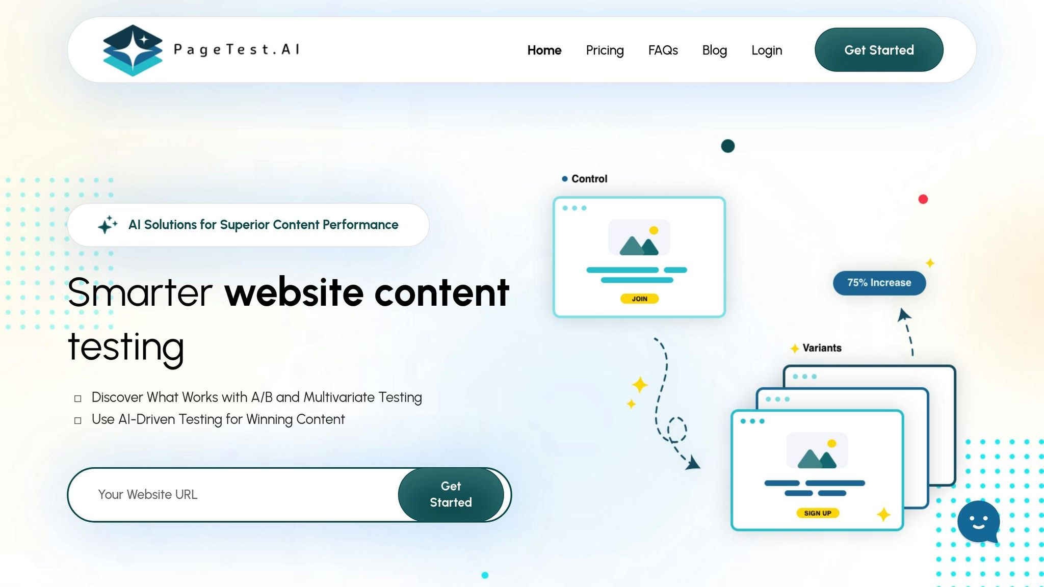
To optimize your CTAs, testing is essential – and PageTest.AI makes it easy. This tool allows you to experiment with different CTA placements and designs simultaneously, all without requiring coding skills.
With PageTest.AI, you can test variations like "Get Started" versus "Try Free for 30 Days" or compare how different button colors perform. The platform’s AI uses proven conversion strategies to generate options for text, colors, and placement, helping you see what resonates most with your audience.
PageTest.AI tracks key metrics such as click-through rates, engagement time, and scroll depth, giving you clear insights into how each version performs. Its Chrome extension lets you select your CTA, generate variations, and monitor real-time visitor responses. This continuous feedback loop ensures your CTAs are always optimized for maximum impact.
Speed Up Page Load Times
Once you’ve fine-tuned your CTAs, the next step to boosting conversions is improving your website’s loading speed. Why? Because page speed has a direct impact on your revenue. Even a one-second delay can slash conversions by 7%. For mobile users, the stakes are even higher, with conversions dropping by up to 20% for every second of delay.
The numbers tell a compelling story. Pages loading in 2.4 seconds see a 1.9% conversion rate. But when load times increase to 3.3 seconds, conversions dip to 1.5%. At 4.2 seconds, they fall below 1%, and beyond 5.7 seconds, they plummet to just 0.6%. It’s no wonder 40% of shoppers abandon websites that take more than three seconds to load.
Big brands have already proven that faster pages mean more revenue. Walmart, for instance, saw a 2% increase in conversions for every one-second improvement in load time. COOK achieved a 7% boost in conversions by shaving just 0.85 seconds off their page load time. Research from Bidnamic also found that for every second a site loads faster, conversion rates improve by 17%.
The benefits don’t stop at conversions. In 2021, Renault managed to cut the load time of their largest page elements to under one second, reducing their bounce rate by 14% and increasing successful conversions by 13%. Similarly, The Economic Times sped up their site by 80%, which led to a 43% drop in bounce rates that same year.
Steps to Speed Up Your Website
Improving your website’s speed doesn’t mean starting from scratch. Here are some effective strategies:
- Optimize images: Compress your images and switch to next-gen formats like WebP. Large, uncompressed images are a common culprit behind slow load times.
- Enable browser caching: This allows static files to be stored on users’ devices, so returning visitors don’t have to reload the same resources, significantly speeding up their experience.
- Minimize HTTP requests: Reduce the number of elements a page needs to load by combining CSS and JavaScript files and removing unnecessary plugins or scripts.
- Enable gzip compression: Compressing files can reduce their size by about 70%, making your pages load noticeably faster. Most modern servers support this feature.
- Use a Content Delivery Network (CDN): A CDN serves content from servers closer to users, cutting down load times, especially for visitors spread across the U.S.
- Audit third-party scripts: Remove nonessential scripts like social media widgets or tracking codes that can slow down your site.
- Choose fast hosting: Look for hosting providers with response times under 200 ms. A reliable hosting service is the backbone of all speed optimizations.
Using PageTest.AI to Monitor Speed Impact
After implementing these speed improvements, tracking their impact is key. Tools like PageTest.AI help you measure how faster load times affect user engagement. Just as you test CTAs to refine your conversion path, monitoring speed optimizations ensures your technical tweaks lead to real-world results.
PageTest.AI tracks metrics like time on page and scroll depth, which often improve with faster load times. For example, users who experience load times of three seconds or less visit 60% more pages. The platform also highlights changes in bounce rates and exit patterns, showing whether visitors are staying longer and engaging more with your content.
With the PageTest.AI Chrome extension, you can test lighter images, simpler layouts, or streamlined content while monitoring their effect on both load speed and user behavior. This data helps you pinpoint which changes drive the most significant conversion gains, ensuring your efforts pay off in both speed and customer engagement.
Fix User Experience and Navigation
Poor navigation can be a conversion killer. If visitors can’t find what they’re looking for, they’ll leave – fast. In fact, about 38% of consumers focus on navigational links and layout during their first visit to a site. And it’s not just about first impressions: nearly half of users who arrive through referrals or search engines rely heavily on the navigation menu to explore the site.
Simplify Navigation for Clarity
Good navigation starts with understanding your audience. Visitors don’t care about your internal structure or arbitrary labels; they just want to find what they need – quickly. Take Apple, for example. Their clean, horizontal navigation highlights clear product and service categories, making browsing effortless. Amazon, on the other hand, uses flyout menus to provide access to a wide range of categories without overwhelming users.
Keep your main navigation simple – stick to seven links or fewer. If you have more, group them into clear, logical categories. Avoid vague labels like "Articles" or "Videos." Instead, use specific, topic-driven names that clearly describe the content.
"Users interested in a specific topic usually don’t care in what format the information will be delivered to them; they are focused solely on finding answers that will address the question they had in mind." – Aurora Harley, Nielsen Norman Group
Position key pages where users expect them – like placing a "Contact" button in the top-right corner. This aligns with user habits, as 55% of marketing websites follow this convention. For mobile users, make your phone number clickable with proper HTML formatting to make it easier for them to take action.
A streamlined navigation system sets the stage for a smoother user journey, but to truly optimize, you’ll need to dig deeper into how users interact with your site.
Map the User Journey
Mapping the user journey helps identify where your site falls short of visitor expectations. For instance, Galeton used heatmap data to refine their navigation, which led to a 14% increase in sitewide conversions. Similarly, Muc-Off found that users weren’t scrolling down to see product images. By moving those images above the fold, they boosted purchases by 106%.
Start by combining data from website analytics – such as bounce rates, session duration, and traffic patterns – with customer interviews and session replays. This approach uncovers not just what users are doing, but why they’re doing it. It also highlights common drop-off points that might be hurting your conversions.
Even small adjustments can make a big difference. For example, a digital agency analyzed heatmaps on a client’s mobile product page and identified specific friction points. After making targeted changes, they achieved a 21.46% increase in click-through rates.
Whether it’s tweaking a button label, simplifying a form, or reorganizing your navigation, removing barriers creates a smoother path for visitors – and that naturally leads to higher conversions.
Use AI-Powered Content Testing
Traditional A/B testing can take weeks to yield actionable insights, but AI-powered content testing flips the script by automating the process and delivering results in real time. Instead of manually creating variations and waiting for statistical significance, AI dives into massive amounts of user interaction data – like clicks, time spent on a page, and purchase behavior – to instantly identify the best-performing content elements.
Building on earlier optimizations, AI-powered content testing provides immediate, data-backed insights to fine-tune conversion paths. What’s more, AI doesn’t just stop at speed – it gets smarter with every customer interaction, continually improving the accuracy of its testing over time.
Take The North Face as an example. They used AI personalization and predictive analytics to create tailored shopping experiences. By introducing a voice-powered AI assistant that guided product recommendations based on real-time weather data and user preferences, they saw a 60% jump in click-through rates. Similarly, Sephora transformed its online shopping experience with AI tools like Visual Artist and virtual assistants. By tracking user behavior and adapting recommendations on the fly, they achieved a 30% boost in engagement and an 11% increase in conversions.
For businesses of all sizes, platforms like PageTest.AI make this level of optimization accessible. With its Chrome extension, you can highlight any website element – headlines, CTAs, button text, or product descriptions – and let AI generate optimized alternatives. The platform then tracks key metrics like clicks, engagement, and scroll depth, automatically implementing the most effective variations.
Benefits of AI-Driven Testing
AI-driven testing offers several advantages that traditional methods simply can’t match. While 60% of businesses report higher conversion rates after adopting A/B testing, AI takes these results to another level. Unlike human testers, who might overlook subtle trends, AI can detect optimization opportunities across multiple variables simultaneously. For instance, Slack’s AI-driven upsell strategy boosted their average revenue per user (ARPU) by 25%. Similarly, Cadbury India’s campaign, which created personalized videos using Facebook profile photos and names, saw a 33.6% increase in conversion rates.
AI also shines in identifying friction points in the customer journey. It analyzes user behavior to reveal where visitors lose interest or drop off, helping businesses make smarter design decisions based on real data. Its ability to continuously learn is another game-changer. While traditional testing requires setting up new experiments manually, AI systems evolve and refine their recommendations in response to ongoing user interactions, making optimizations more effective over time.
Comparison: Manual vs. AI Testing
The practical differences between manual and AI-driven testing highlight why AI is becoming the preferred choice for many businesses. While manual testing has its merits, AI offers unmatched speed, precision, and efficiency.
| Aspect | Manual Testing | AI Testing |
|---|---|---|
| Time & Resources | Time-intensive and costly | Saves time and reduces costs |
| Execution Speed | Sequential and slower | Automated and faster |
| Human Input Required | High | Minimal |
| Productivity | Low | High |
| Accuracy | Prone to human error | More precise through automation |
| Test Coverage | Limited by human capacity | Broad coverage with quick execution |
| Parallel Testing | Expensive and resource-heavy | Efficient with cloud-based automation |
| Maintenance | Manual updates needed for UI changes | Automatically adapts to UI changes |
Leading QA teams report an 80% reduction in time spent and 100% test coverage when using AI tools. This is because AI automates repetitive tasks while maintaining a higher level of accuracy compared to manual testing.
For businesses aiming to boost conversion rates quickly, AI testing removes many of the traditional hurdles like time, cost, and complexity. Tools like PageTest.AI make it easy to get started – within minutes, you can install the platform and let the AI handle everything from generating content variations to analyzing performance. This allows you to focus on other priorities while ensuring your website is optimized for success. By integrating AI testing with design and performance adjustments, businesses can take a comprehensive approach to improving conversions.
sbb-itb-6e49fcd
Personalize Content for Visitor Segments
If you’re aiming to boost conversions, generic content just won’t cut it. In fact, 74% of customers report feeling frustrated when their online experiences lack personalization. On the flip side, companies that implement website personalization see conversion rates improve for 94% of them. Even basic efforts to personalize can lead to a 14% jump in sales.
To make personalization work, start by segmenting your audience. Group visitors based on geography, behavior, acquisition source, or psychographics. This allows you to tailor messages that resonate with specific groups.
Tools like Google Analytics can help you gather key data – demographics, user behavior, and device preferences. Combine this with survey insights to uncover user goals and pain points. Together, this mix of behavioral stats and direct feedback creates a solid base for effective segmentation.
Simple Personalization Tactics
You don’t need a complex setup to get started with personalization. Even small tweaks can make a big difference. For instance, dynamically adapting content based on user profiles can significantly boost engagement. If someone has visited your pricing page, a custom call-to-action (CTA) like "Ready to start your free trial?" can nudge them closer to converting.
Location-based personalization is another easy win. Use real-time location data to offer relevant suggestions, such as local store hours, region-specific shipping details, or weather-related product recommendations.
Personalized product recommendations are especially effective, increasing conversion rates by 49%. By analyzing browsing history or past purchases, you can suggest complementary items. For example, if a customer buys running shoes, you could recommend athletic socks or fitness trackers during their next visit.
Behavioral targeting takes things a step further. Use insights from past interactions – like abandoned carts, repeat visits, or first-time visits – to create tailored experiences. First-time users might appreciate educational resources and trust-building signals, while loyal customers could be enticed with exclusive offers or early access to new products.
Retargeting campaigns are also worth considering. They help reconnect with visitors who’ve shown interest but haven’t yet converted. For U.S. audiences, fine-tuning these campaigns to align with local preferences can make them even more effective.
Considerations for U.S. Audiences
When targeting U.S. consumers, specific expectations can shape how well your personalization efforts land. For instance, always display prices clearly with the $ symbol (e.g., $29.99) to align with local shopping norms.
Transparency about data collection is another must. With over 70% of customers concerned about privacy, it’s essential to be upfront about what data you’re collecting and why. Offering clear, detailed consent options lets users decide what they’re comfortable sharing.
Focus on gathering first-party data – information collected directly from users through opt-in methods like surveys or account sign-ups. It’s no surprise that 78% of businesses consider first-party data their most valuable resource for personalization.
Urgency cues like countdown timers or exclusive discounts can also drive results. These tactics have been shown to boost conversions by up to 41% and 59%, respectively. Pair these with time-sensitive deals on products users have already shown interest in for even better engagement.
It’s worth noting that 91% of consumers appreciate relevant, personalized offers and recommendations. However, there’s a fine line between being helpful and being intrusive. Avoid overdoing it – keep the experience efficient and user-friendly. Stay adaptable by aligning personalization with user preferences and adhering to privacy laws as they evolve. Regular A/B testing can help you fine-tune your approach and ensure your efforts resonate with your audience.
When combined with strong CTAs, fast load times, and intuitive navigation, personalized content becomes a powerful tool for driving conversions. It’s all about creating an experience that feels tailored, without crossing the line into invasive territory.
Build Trust with Social Proof and Security Signals
Trust is the backbone of turning visitors into customers online. When people can’t see or touch your product – or interact face-to-face with a salesperson – they rely on digital cues to decide if your business is worth their time and money. Consider this: 88% of people trust online reviews as much as personal recommendations, and 48% of shoppers feel more secure on websites displaying trust badges. Product pages with reviews experience 3.5x higher conversion rates, and trust badges can increase conversions by up to 30%. On the flip side, nearly 70% of shopping carts are abandoned, with 17% of those due to security concerns.
Building trust goes beyond offering great products – it’s about showcasing customer experiences and ensuring buyers feel secure.
Display Social Proof
Once people trust your website, let your happy customers do the talking. Social proof taps into our natural instinct to look to others for reassurance. Customer reviews and testimonials are some of your strongest tools for building confidence. Studies show that 72% of consumers trust businesses more after reading positive reviews, making them more likely to buy. To make these reviews even more impactful, ensure they’re authentic – include real names, photos, and specific details to reduce perceived risks.
Where you place reviews matters. Feature them near calls-to-action, on product pages, and even at checkout. For example, having 50 or more reviews can boost sales by 4.6%. Video testimonials, which create a stronger emotional connection, and user-generated content are also powerful, as 79% of buyers say it influences their decisions.
Real-world examples drive this point home. Outdoor gear company Cotopaxi uses campaigns like "Gear for Good" to showcase real customers and how their products perform in everyday adventures. Similarly, Hootsuite highlights logos of trusted partners to demonstrate their reliability. Case studies and success stories are another effective way to build trust – 65% of marketers rank them as the most impactful content format.
"We’re a lot more leery of pulling out our credit cards when we can’t see who we’re interacting with. Trust alleviates that. Building social proof through reviews and user-generated content builds trust that converts to sales."
- Annette Snow, Partner Manager at Stamped
But trust doesn’t stop with social proof – it needs to extend to security.
Use Security Badges and Guarantees
Security concerns are a major hurdle for online buyers. 19% of shoppers abandon their carts because they don’t feel their payment is secure, and 55% walk away when they don’t see clear security indicators. The solution? Make your security measures impossible to miss.
Start with SSL certificates – that little padlock in the browser tells visitors their data is encrypted. Display SSL badges prominently on checkout pages to reinforce this. Depending on your needs, SSL certificates can range from free to over $1,000.
Next, use payment method badges to show recognizable logos like Visa, PayPal, Stripe, Apple Pay, and Google Pay. Familiar symbols instantly reassure customers that their transactions are safe.
Money-back guarantees also play a big role in reducing hesitation. By offering a clear refund policy, you take the risk off the buyer’s shoulders. Highlight these guarantees on product pages and during checkout to ease concerns.
Finally, third-party endorsements – like accreditation from the Better Business Bureau – add another layer of credibility. These independent verifications show that your business operates responsibly.
Strategic placement of these trust signals is key. While the checkout page is an obvious choice, you should also feature them on product pages, near "Add to Cart" buttons, and even in the footer of your site. 76% of consumers say trust logos influence their confidence in a website, so make sure they’re visible where it matters most.
| Badge | Best Placement | Why it Works |
|---|---|---|
| Secure checkout badges | Product pages, checkout page, footer | Reassures customers their personal and payment information is protected |
| Money-back guarantee | Checkout page, about page | Signals a reliable refund policy and reduces buyer hesitation |
| Free shipping | Product pages, checkout page, home page | Communicates transparency about shipping costs |
| Third-party endorsement | Home page, about page, footer | Shows credible verification from an external source |
When used together, these trust signals can significantly reduce barriers to purchase. Pair them with optimized calls-to-action and faster site speeds to further improve conversions. By demonstrating that others trust your business and that their personal information is secure, you’ll create an environment where visitors feel confident hitting that "Buy Now" button.
Create Urgency
The fear of missing out (FOMO) is a powerful motivator. Limited-time offers can dramatically boost conversion rates – 60% of people admit that FOMO influences their buying decisions, and these tactics have been shown to deliver significant results.
But there’s a fine line: urgency must feel authentic to maintain trust. When done right, urgency benefits everyone – customers get great deals, and businesses see immediate sales. Like well-crafted CTAs or faster load times, urgency taps into human psychology to drive conversions.
"Whatever is rare, uncommon or dwindling in availability – this idea of scarcity – confers value on objects, or even relationships." – Robert Cialdini
Write Effective Urgency Messages
The language you use in urgency campaigns can make all the difference. Specific phrases and carefully chosen words can increase conversion rates by 12.7%, while urgency in email subject lines can lead to 14% higher open rates and a 16% boost in transaction rates. The key is action-oriented language that creates a sense of immediacy without sounding pushy.
Words like "now", "today", and "last chance" are effective, but they work best when paired with concrete details. For example, instead of saying, "Act now!" try something like, "Save $50 before midnight EST tonight" or "Only 3 spots left for our December 15th webinar." These messages feel more relevant and actionable.
Personalization can take urgency to the next level. Take Domino’s "Emergency Pizza" campaign, for instance. From October 2023 to February 2024, they offered loyalty members a free pizza within 30 days after a qualifying purchase. This promotion brought in two million new loyalty members and increased same-store sales by 2.8% in Q4 2023. Tailored messaging like this complements other optimization strategies and drives results.
Adding visual elements can amplify urgency. Use bold colors, numbers, and symbols to make offers stand out. Red buttons, countdown timers, and progress bars are particularly effective. For U.S. audiences, use familiar formats like "11:59 PM EST" or "December 31, 2025" to make deadlines easy to understand.
Finally, emphasize what customers lose if they wait. Instead of simply stating that an offer will expire, highlight the benefits they’ll miss. For example, "Price increases to $99 on January 1st" makes the potential loss clear and compelling.
Implement Urgency Tactics
Once you’ve nailed your urgency messaging, it’s time to put it into action. Countdown timers are one of the most effective tools. They can boost click-through rates by 30%, increase revenue by 9%, and some brands report conversion jumps of over 30%.
Placement matters. Timers work best in high-visibility areas like your homepage, product pages, or checkout screens. Make sure they’re mobile-friendly and use clean, contrasting designs for maximum impact. For U.S. users, stick to familiar formats like "2 days, 14 hours, 23 minutes."
Limited-time discounts are another effective tactic. Flash sales lasting 24–48 hours create a sense of urgency and drive quick decisions. For example, an online fashion retailer saw a 30% increase in conversions by adding an evergreen countdown timer to their homepage during a promotion.
Scarcity messages like "Only 7 left in stock" or "12 people are viewing this item" also tap into FOMO. Real-time inventory updates ensure these alerts stay accurate and credible. In 2025, Waterdrop used this strategy during Halloween, offering a limited "Wicked Hydration Set" bundle that sold out quickly.
Exclusive access is another way to create urgency while making customers feel special. Early-bird discounts, VIP deals, or invite-only events resonate well with U.S. audiences who value exclusivity.
"The timer reinforces a sense of urgency to decide, as it gradually ticks towards zero – to buy or not to buy. With a finite amount of time to purchase, many consumers will feel compelled to do so in fear of missing out on a good deal." – Brian Lee, Founder and CEO of Arena Club
A/B testing can help fine-tune your urgency tactics. Experiment with different timer designs, countdown lengths, and message placements to see what works best for your audience. One e-commerce site, for instance, found that adding a timer increased sales by 25% compared to campaigns without one.
Combining urgency with social proof can amplify results. Showing time pressure alongside indicators like recent purchases or customer reviews intensifies the drive to act. Research shows that pairing scarcity with a limited-time offer makes a product 178% more likely to be chosen.
Lastly, reduce hesitation with risk-free guarantees. Offering money-back guarantees, free trials, or clear return policies eases the anxiety of quick decisions, ensuring customers feel confident while acting fast.
The goal isn’t to pressure customers into regrettable choices. Instead, it’s about helping them overcome procrastination and seize opportunities that genuinely benefit them. When urgency feels sincere and beneficial, it builds trust and encourages repeat business.
Conclusion
Sometimes, small tweaks lead to massive payoffs. Take Expedia, for example – they boosted profits by $12 million just by making a simple adjustment to their checkout form. Similarly, Going achieved a 104% month-over-month spike in their homepage conversion rate by tweaking one word and adding two more to their call-to-action (CTA).
These kinds of changes are straightforward, quick to implement, and deliver instant results. Whether it’s repositioning a CTA, improving page load speed, or using countdown timers to create urgency, each adjustment tackles a specific hurdle that might be blocking conversions. They highlight how even the smallest details, like site speed or button text, can make a huge difference.
For businesses in the U.S., these strategies resonate particularly well because they align with what American consumers value most: clear messaging, fast-loading websites, and trustworthy interactions. For instance, testimonials alone can boost conversion rates by 34%. Research from Northwestern University also reveals that customer reviews and quotes can increase conversions by up to 270%.
"We’re not optimizing a webpage; we’re optimizing perception." – Austin McCraw, Head of Growth at DoWhatWorks
Ultimately, conversion optimization is about removing obstacles and helping visitors achieve their goals effortlessly. Tools like PageTest.AI, mentioned earlier, make it easy to test and apply changes – even if you’re not a tech expert. They allow you to experiment with different strategies and figure out what clicks best with your audience.
Start by tackling the biggest roadblocks. If your site is slow and users are leaving, focus on speeding it up and enhancing the overall user experience. If people are sticking around but not converting, refine your CTAs and add urgency triggers. These strategies work even better when combined, creating a smooth and intuitive path that naturally leads visitors to take action.
Turn your site into a conversion machine. By addressing friction at every step, you’ll create an experience that keeps visitors engaged and drives results.
FAQs
How can I figure out which quick fix will boost my website’s conversion rate the most?
To figure out which quick adjustments can make the biggest difference in your website’s conversion rate, start by digging into how visitors interact with your site. Tools like heatmaps can reveal areas where users might be struggling or leaving. Pay attention to navigation patterns and recurring friction points.
Then, take a closer look at key metrics like page load speed, bounce rates, and click-through rates on your call-to-action (CTA) buttons. These numbers can guide you toward impactful changes, such as improving site speed, making CTAs stand out more, or streamlining your navigation.
Once you’ve made updates, use A/B testing to measure their effectiveness. This method lets you see which tweaks resonate most with your audience, helping you zero in on changes that actually move the needle for your users.
What mistakes should I avoid when using urgency strategies on my website?
When using urgency strategies, steer clear of making false claims about scarcity or time limits. Misleading tactics like these can damage your reputation and weaken customer trust. Instead, focus on urgency methods that are genuine and supported by actual data or offers.
For instance, if you’re advertising a limited-time sale, ensure the deadline is real and explicitly stated. Being transparent not only fosters trust but also motivates customers to take action.
How is AI-driven content testing different from traditional A/B testing, and what are its advantages?
AI-powered content testing takes a different approach compared to traditional A/B testing. Instead of comparing static variations and manually pausing or restarting experiments, it works in real time. Using advanced algorithms, it continuously adjusts and improves content based on evolving user behavior.
This method offers several advantages: quicker insights, improved efficiency, and the ability to create tailored experiences that truly connect with your audience. By automating the process, it not only saves time but also ensures your content stays relevant and effective at driving conversions.
Related posts
say hello to easy Content Testing
try PageTest.AI tool for free
Start making the most of your websites traffic and optimize your content and CTAs.
Related Posts

![]() 30-03-2026
30-03-2026
 Ian Naylor
How Internal Links Boost Conversions
Strategic internal links guide users, improve SEO, and turn site navigation into measurable conversion growth.

![]() 28-03-2026
28-03-2026
Ian Naylor
Core Web Vitals Benchmarks by Industry
Industry Core Web Vitals benchmarks and practical fixes for LCP, INP, and CLS, plus mobile vs desktop gaps and optimization tips.
![]() 26-03-2026
26-03-2026
Ian Naylor
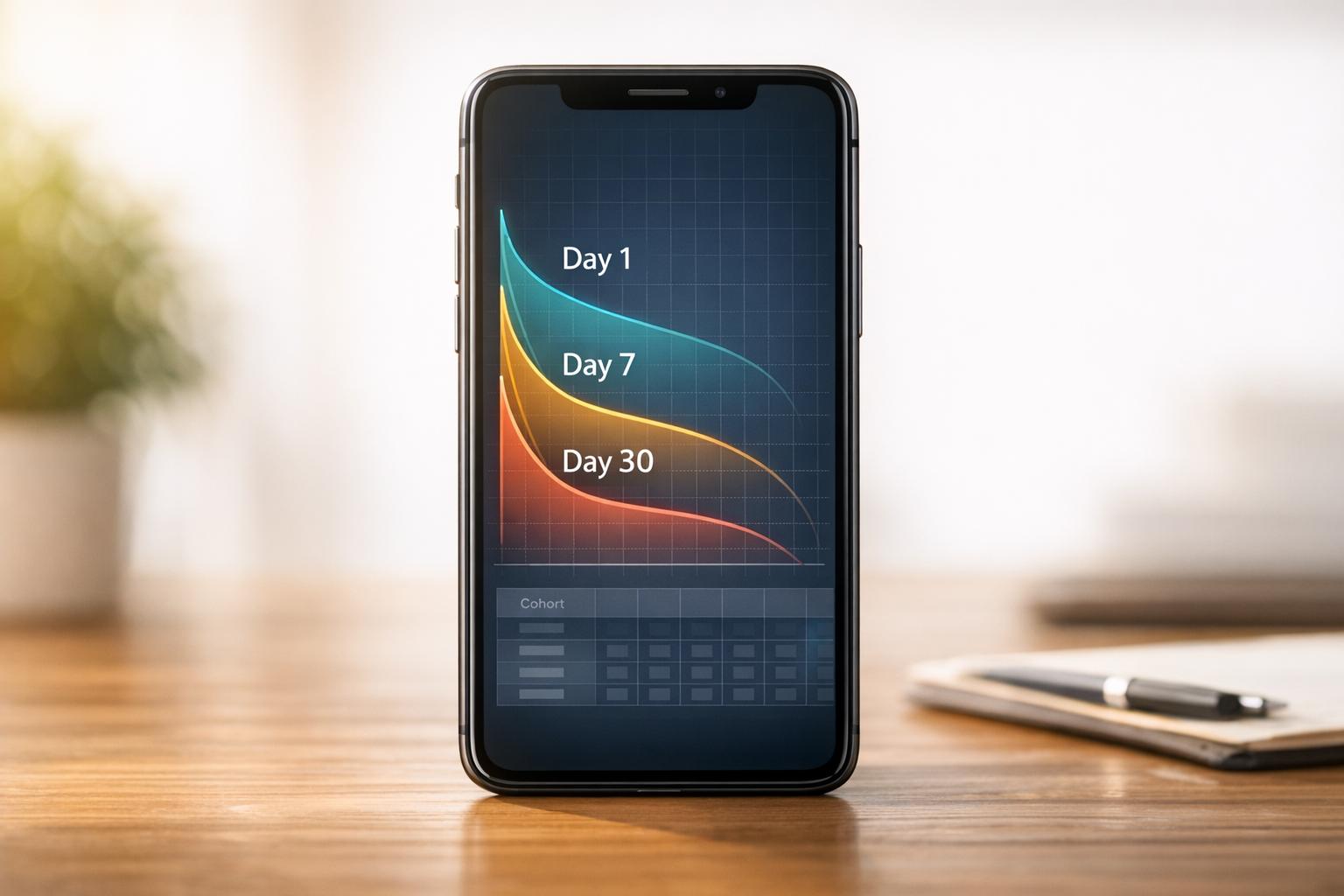
How to Benchmark Mobile Retention Rates
Benchmark Day 1/7/30 retention, run cohort analysis, and optimize onboarding, habit triggers, and personalization to improve app retention.