

How to Optimize Navigation for Higher Conversions
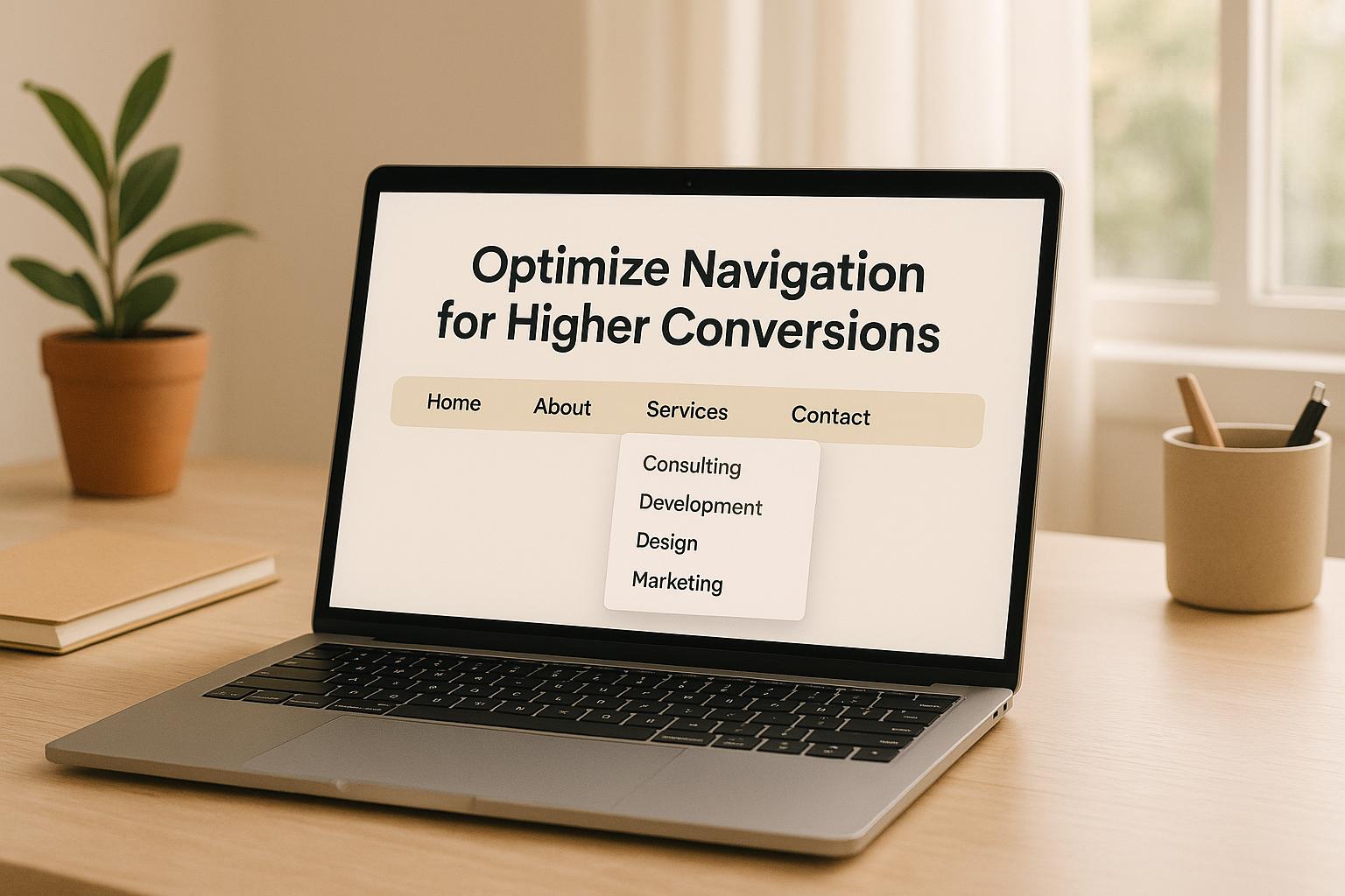
How to Optimize Navigation for Higher Conversions
 17-07-2025 (Last modified: 18-07-2025)
Website navigation is a make-or-break factor for user experience and conversions. If visitors can’t find what they need quickly, they’ll leave – taking potential sales with them. Here’s the bottom line: clear, simple, and mobile-friendly navigation boosts usability, reduces frustration, and increases conversions.
Key takeaways from this guide:
- Simplify navigation: Use clear labels, limit main menu items to 3–7, and organize content logically.
- Prioritize mobile design: Over 60% of traffic is mobile; design for smaller screens first.
- Advanced features matter: Breadcrumbs, sticky headers, and filtered navigation improve user flow.
- Test and refine: A/B test layouts, track user behavior, and adjust based on data.
- Measure success: Monitor KPIs like conversion rates, bounce rates, and session duration.
A well-structured navigation system doesn’t just guide users – it drives business growth. Let’s break down how to do it effectively.
Optimizing Website Navigation Increased Conversion Rate by 50%
How Navigation Affects Conversion Rates
Navigation plays a pivotal role in whether users stick around to convert or leave out of frustration. Confusing menus, broken links, or poorly structured navigation can quickly drive users away. On the flip side, a thoughtfully designed navigation system acts like a friendly guide, seamlessly leading users from curiosity to checkout. Let’s dive into how navigation missteps can derail conversions and what can be done to keep users on track.
How Poor Navigation Increases User Drop-Offs
When navigation is unclear, users face unnecessary hurdles that can devastate conversion rates. If they can’t quickly locate what they need, they’ll abandon the site altogether. The numbers paint a stark picture: eCommerce sites see an average cart abandonment rate of 69.99%, with confusing checkout navigation being a major reason for this loss.
Today’s users expect speed and simplicity. A whopping 61% of users believe they should find what they’re looking for in under five seconds. Meanwhile, 72% of consumers cite poor site or app performance as their top frustration.
“A funnel drop is a sign that something is missing or wrong with your product flow. It could be a technical issue like slow loading times, a usability problem, or simply because your product lacks a clear value proposition.” – Userpilot
Real-world cases highlight the financial impact of navigation failures. For instance, Sainsbury’s discovered that nearly half (47.7%) of its customers were abandoning their carts at checkout. The culprit? A technical glitch that prevented users from selecting the option to buy and collect items in-store. Fixing this issue helped the company recover over $200,000 in lost revenue per quarter.
Similarly, Classic Vacations, a luxury vacation rental company, faced an 86% weekly revenue drop. Session replays revealed users were getting stuck at the “Show property details” step because essential information wasn’t loading properly. Once they fixed this navigation flaw, bookings rebounded.
These examples underscore a critical point: when navigation is clunky, users struggle to understand your product or its value, leading to higher drop-off rates. If users can’t effortlessly move through your site, they won’t complete the actions you want them to take.
Guide Users Through the Conversion Funnel with Better Navigation
Improved navigation can transform the user experience by guiding visitors smoothly through the conversion process. It’s not just about helping users find what they need – it’s about strategically directing them toward taking action. When done right, navigation becomes almost invisible, subtly steering users toward their goals.
Nearly half of all visitors arriving via referrals or search engines rely on the navigation menu to explore a website. This makes navigation a powerful tool for shaping user behavior. Companies like Sephora, Amazon, and Novotel stand out by using smart navigation techniques tailored to their audiences.
- Sephora employs dropdown menus to organize its wide product range, creating a clean and user-friendly browsing experience.
- Amazon uses vertical navigation to integrate advanced search features without cluttering the page.
- Novotel keeps key options accessible with a sticky menu bar that stays visible as users scroll.
The secret lies in designing intuitive pathways that anticipate user needs and reduce decision fatigue. When navigation feels effortless, users can focus on engaging with your content and offers instead of figuring out how to use your site. Streamlined navigation minimizes friction in the conversion funnel, combining clear calls-to-action, logical pathways, and well-placed conversion points to create a seamless user journey.
But the benefits go beyond a single session. Effective navigation not only keeps users engaged but also boosts search engine rankings and enhances how people perceive your brand. When users can easily navigate your site, they’re more likely to return, recommend it to others, and take actions that contribute to your business goals. Up next, we’ll explore actionable strategies to refine your navigation and drive even better results.
Steps to Simplify and Optimize Navigation
Good navigation is all about making it easy for users to find their way around your site. Clear labels, logical organization, and mobile-friendly design are the key ingredients that guide visitors smoothly toward taking action.
Use Clear and Simple Labels
Navigation labels act like signposts, showing users exactly where to go. When it comes to labeling, clarity wins over creativity. Terms like “Services” or “Products” are far more direct than vague alternatives like “Solutions” or “Offerings.” The goal is to make sure users don’t have to guess what a menu option means.
“Clear, descriptive menu labels make it easier for visitors to find what they’re looking for, reducing frustration and increasing time spent on the site.”
– Kevin Sando, Founder and COO, VitalUp Marketing
Avoid using jargon or overly creative names. Stick to familiar terms like “Home”, “About Us”, “Services”, “Products”, “Blog”, and “Contact.” These are intuitive and universally understood, as highlighted by VitalUp Marketing’s 2025 recommendations. For example, if you’re running an online clothing store, tools like Google Keyword Planner and Google Trends can help you see that “shoes” is a more commonly searched term than alternatives like “footwear” or “footgear”. Not only do clear labels make navigation easier for users, but they also improve your site’s SEO performance.
By keeping your labels simple and straightforward, you set the foundation for an uncluttered and user-friendly navigation menu.
Limit Main Menu Items to 3–7 Options
Once your labels are clear, the next step is to keep your main menu concise. Too many choices can overwhelm users, leading to decision fatigue and frustration. Research shows that people tend to stop reading and start skimming after about seven options, which means they might miss something important. Andy Crestodina from Orbit Media explains:
“People scan websites to quickly find what they need, and they can’t do that if there are too many options.”
To avoid this, aim for 5–7 primary menu items. Think of these as broad categories that can include more detailed submenus. For instance, instead of listing “Web Design”, “Logo Design”, “Branding”, and “Marketing” separately, group them under a single “Services” category. This reduces cognitive load and helps users focus on the main pathways that lead to conversion. Companies like Crow Wing Power and United Fiber have successfully simplified their menus into easy-to-navigate sections.
A streamlined menu not only improves usability but also ensures a better experience for mobile users.
Design Navigation for Mobile First
With over 60% of web traffic coming from mobile devices, designing your navigation with mobile users in mind is no longer optional – it’s essential. Mobile-first design ensures your site performs well on any device, making it easier for users to browse and convert. As Neil Belliveau from Get The Clicks puts it:
“Mobile-first design isn’t just a trend – it’s a necessity.”
Google’s mobile-first indexing means that your mobile site plays a significant role in your search rankings. Companies that prioritize mobile-first design often see real benefits. For example, HubSpot reported a 9% increase in conversion rates and faster load times after adopting a mobile-first approach.
To optimize for mobile, ensure buttons and links are large enough to tap easily, with enough spacing to prevent accidental clicks. Speed is also critical – over 53% of mobile users will leave a site if it takes more than three seconds to load, and 88% are unlikely to return after a poor experience. Etsy’s shift to mobile-first design led to noticeable gains in organic search traffic and conversions.
Understanding how mobile users interact with your site – such as their preference for vertical scrolling and their shorter attention spans – can help you refine your navigation for a smoother, more effective experience.
Advanced Navigation Methods for Better User Experience
When it comes to improving usability, advanced navigation techniques are a game-changer – especially for websites with intricate content structures or large product inventories.
Add Breadcrumb Navigation to Show User Location
Breadcrumb navigation helps users keep track of their location on a site, making it easier to navigate through multiple levels without feeling lost. Studies reveal that while only about 30% of users actively notice breadcrumbs, those who do find them incredibly helpful for completing tasks faster. Major companies like Best Buy, LinkedIn Courses, and Flipkart rely on breadcrumb trails to give users a quick way to return to higher-level categories.
To implement breadcrumbs effectively:
- Position them below the main navigation.
- Start the trail with the homepage to provide a clear sense of orientation.
- Use breadcrumbs as a supplement to, not a replacement for, the primary navigation.
“A breadcrumb is a secondary navigation aid that improves customer experience by helping users understand their location on a website or mobile application.” – Sharan Suresh
Next, let’s look at sticky navigation, which ensures users always have access to key actions.
Use Sticky Navigation for Constant Access
Sticky navigation keeps essential menu options visible as users scroll, making it easier for them to take action or switch sections without having to scroll back up. This feature can save users valuable time – up to 36 seconds on a 5-minute visit – and even increase conversions by as much as 10%. For example, one retailer saw a nearly 3% boost in conversions after adopting sticky navigation.
“When users are reading scrolling content such as a feed or an article, it’s easy to get tunnel vision and ignore the navigation. When they finish consuming content or come out of that tunnel, it can be frustrating or disorienting to no longer have access to the main actions on the site because you were reading or engrossed in the content.” – Shawn Borsky
To make sticky navigation work smoothly:
- Keep headers compact, around 50px on mobile devices.
- Limit navigation to five core items to avoid clutter.
- Use animations (300–400 milliseconds) to hide the header when scrolling down and reveal it when scrolling up, ensuring a clean interface.
- Maintain strong visual contrast between the sticky header and page content, while keeping motion effects subtle to avoid distractions.
For websites with extensive product catalogs, filtered navigation is another essential tool.
Add Filtered Navigation for Large Product Catalogs
Filtered navigation is a must-have for sites with large product selections, helping users refine their choices quickly and avoid feeling overwhelmed. A great example is Fully, a furniture brand that revamped its filtering system in 2020. The redesign boosted their conversion rates by 5.97% and delivered an impressive 75:1 return on investment.
Here’s how to design effective filter navigation:
- Focus on key attributes like size, color, price, and availability.
- Allow users to select multiple options within a single filter category.
- Add visual aids, such as color swatches or thumbnails, to make filters more intuitive.
- Include a clear “Clear all filters” button and ensure filter selections persist as users browse.
- Organize products into logical categories and base filter options on customer preferences.
- Test the interface for accessibility to ensure a seamless user experience.
Test and Improve Navigation with Data
Once you’ve implemented advanced navigation features, the next step is to test and refine them using data. Rigorous testing eliminates guesswork, helping you identify which navigation tweaks genuinely enhance user experience and drive conversions, rather than just looking good on paper.
A/B Test Different Navigation Layouts
A/B testing is a powerful way to uncover how users interact with your navigation. For example, BrillMark ran an A/B test for Oflara, a Shopify ecommerce site, by adding “best sellers” links to the navigation bar for each category and including call-to-action links to full collections. The results? After just a week, direct visits and clicks increased, leading to a 53% boost in revenue.
Here are a few areas to test:
- Menu placement and structure: Compare horizontal menus to vertical ones or test fixed navigation versus sticky options.
- Visual hierarchy and labels: Experiment with link labels, positioning, and visual elements to make navigation intuitive and efficient.
Tools like PageTest.AI make this process easier. With its no-code platform, you can test different menu layouts, button text, and placements while tracking metrics like clicks, engagement, and user behavior.
It’s also crucial to align navigation design with user expectations. For example, horizontal menus are typically placed at the top, while vertical menus often sit on the left. After testing, analyze user interactions to uncover deeper insights.
Track User Behavior Metrics
To understand how well your navigation works, monitor key user behavior metrics. These provide a clear picture of what’s working and what needs improvement:
- User Engagement: Metrics like daily active users (DAU), session duration, and visit frequency show how often and how long users interact with your site.
- Behavioral Flow: Track conversion rates, drop-off points, and feature adoption to pinpoint strengths and weaknesses in navigation.
- Retention & Churn: Use cohort analysis and customer lifetime value (CLTV) to measure long-term user relationships and revenue impact.
- User Satisfaction: Collect net promoter scores (NPS) and qualitative feedback to understand overall user sentiment.
Heatmaps and session recordings can also highlight problem areas. For instance, research shows that leveraging customer insights can improve marketing ROI by 15–20%, and 80% of shoppers are more likely to buy from companies offering personalized experiences.
| Metric Type | Key Metrics | Why It Matters |
|---|---|---|
| User Engagement | DAU, Session Duration, Frequency | Tracks how consistently users interact with your site |
| Behavioral Flow | Conversion Rates, Feature Adoption | Highlights navigation strengths and weaknesses |
| Retention & Churn | Cohort Analysis, CLTV | Measures long-term user loyalty and revenue impact |
| User Satisfaction | NPS, Qualitative Feedback | Captures overall user sentiment and satisfaction |
These insights guide your next steps for optimization.
Make Changes Based on Test Results
Combining quantitative and qualitative data gives you a complete view of the user experience. For example, Red Dress Boutique used Hotjar recordings to discover that users were rage-clicking the “Add to bag” button because they hadn’t selected a size. After testing changes to the size selector and updating the UX copy, they saw improvements in both user experience and conversions.
Similarly, TicketSwap used Amplitude Audiences to analyze user behavior. This led them to implement changes that reduced unsold tickets and enhanced platform functionality, resulting in a 10% revenue increase.
“By testing different elements of your website or landing page, you’ll be able to determine which changes have the greatest impact on your conversion rate. That insight will, in turn, enable you to make stronger decisions that ultimately lead to better business outcomes.”
- Esat Artug, Senior Product Marketing Manager, Contentful
To stay on top of performance, schedule regular data reviews and automate reports for timely insights. After implementing changes, monitor their impact closely to confirm success and identify further opportunities for improvement. Collaborate across teams to ensure smooth implementation of tested updates.
Navigation optimization isn’t a one-and-done effort. Super.com increased retention by 90% by consistently using user insights to refine their navigation. Keep refining your navigation to minimize drop-offs and maximize conversions.
sbb-itb-6e49fcd
Measure Success and Keep Improving
After making changes to your website’s navigation, it’s crucial to track key metrics to confirm whether those adjustments are working. These metrics, rooted in earlier testing insights, help guide continuous improvements. Navigation optimization is an ongoing process that demands regular evaluation and refinement to keep delivering the best results.
Set Key Performance Indicators (KPIs)
To ensure your navigation continues driving conversions, you need to measure its effectiveness using clear, measurable KPIs.
“You can’t improve what you don’t measure”
Here are some important metrics to monitor:
- Traffic and Engagement Metrics: Keep an eye on unique visitors, sessions, traffic sources, average time on page, bounce rate, and pages per session. These numbers reveal how users interact with your site.
- Conversion Metrics: Measure conversion rates, goal completions, customer acquisition costs (CAC), and cart abandonment rates to understand how well your navigation supports business goals.
- Technical Performance: Evaluate site speed. Even a 0.1-second improvement in page load time can boost conversions by 8.4% and increase average order value by 9.2%.
Considering that 60% of consumers abandon purchases due to poor user experience, it’s wise to set SMART (Specific, Measurable, Achievable, Relevant, Time-bound) goals for these KPIs. This ensures your measurements align with your broader business objectives.
Use AI Tools for Automated Testing
AI tools can simplify and enhance navigation testing. Platforms like PageTest.AI allow you to test and optimize navigation elements without needing coding expertise.
PageTest.AI automates A/B and multivariate testing using a simple Chrome extension. You can test variations of menu labels, button texts, and layouts while the platform generates AI-driven content alternatives based on conversion data. It tracks key metrics like clicks, engagement, time spent on pages, and user behavior.
“Get the most from our site’s traffic. Knowing we can test every call to action and optimize our SEO efforts is very satisfying.”
– David Hall, CEO of AppInstitute
“Heaven sent!”
– Yaro Siryk, co-founder of 3way.Social, describing PageTest.AI as a cost-efficient way to test web page content
What makes it even easier? PageTest.AI integrates seamlessly with platforms like WordPress, Wix, Shopify, and Google Tag Manager, so you can get started no matter your current setup.
Update Navigation as User Needs Change
User behavior evolves, and your navigation should keep up. Use analytics tools and heatmaps to track how users interact with your site. Identify patterns, areas where users struggle, and opportunities to improve.
With 71% of consumers expecting personalized experiences and companies that excel at personalization earning 40% more revenue, keeping navigation fresh is essential. Regularly audit for broken links, outdated content, and crawl issues to avoid technical hiccups that could frustrate users.
For example:
- A content-heavy educational site simplified its structure by grouping related content, reducing user complaints while increasing page visits and time spent on the site.
- A major retail website reorganized its products into logical categories resembling a physical store layout, improving user satisfaction and boosting sales.
Also, remember that over half of mobile users abandon pages that take longer than 3 seconds to load. Regular performance monitoring ensures that navigation updates don’t slow your site down.
To stay ahead, schedule monthly or quarterly reviews of navigation performance. Use A/B testing to compare different navigation versions and measure their impact on your KPIs. Combine this data with user feedback from surveys and forms to get a complete picture of how well your navigation is working.
Conclusion: Key Steps for Better Navigation
Optimizing your site’s navigation isn’t just a one-time task – it’s an ongoing effort that has a direct impact on conversion rates. Studies reveal that 38% of users focus on navigation when they first land on a site, and those who use site search are twice as likely to convert.
The basics are simple but powerful: create clear menus with familiar labels, organize categories logically, limit top-level navigation to 3–7 options, and ensure users can reach important pages within three clicks. And don’t forget mobile users – prioritizing mobile-first design is essential. Even a one-second delay in load time can significantly hurt your conversions.
For those looking to go a step further, advanced navigation features can make the user journey even smoother. However, these enhancements need thorough testing to ensure they’re effective. This is where tools like PageTest.AI shine. With its Chrome extension, you can experiment with different navigation layouts, menu labels, and button texts – no coding required. The tool uses AI to generate content variations and tracks key metrics like click-through rates, engagement, and user behavior.
The work doesn’t stop there. Regular A/B testing combined with performance monitoring and user feedback ensures your navigation evolves with your users’ needs. For instance, one business saw a 15% increase in conversions after improving the visual hierarchy of its mobile menu.
Navigation is more than just a site feature – it’s your path to better conversions. By applying these strategies and leveraging AI-driven tools, you’re setting the stage for steady business growth. Test, measure, and refine based on user behavior to keep improving your site’s performance.
FAQs
How can I test and improve my website’s navigation to boost conversions?
Improve Website Navigation to Boost Conversions
If you want to improve how users move through your site and increase conversions, the first step is understanding how people actually use it. Tools like heatmaps and session recordings can show you where visitors get stuck or leave your site. To dig even deeper, try usability testing to hear directly from users about what’s working – and what’s not.
After identifying problem areas, focus on making specific changes. Simplify navigation paths, cut out unnecessary clutter, and make sure crucial actions (like buttons or links) are easy to spot. Once you’ve made updates, test them out. Platforms like PageTest.AI are great for running A/B tests to see which tweaks work best for menus, CTAs, and links.
By regularly fine-tuning your navigation, you’ll create a smoother experience that keeps visitors engaged and more likely to convert.
What advanced navigation features can improve user experience on websites with large product catalogs?
To make navigating large product catalogs easier for users, try integrating smart navigation tools like these:
- Mega menus: These menus neatly organize categories and subcategories, giving users a clear path to find what they’re looking for without aimless scrolling.
- Faceted search: Let users filter items by specifics such as price, size, color, or brand. This helps them zero in on their preferences quickly.
- Real-time inventory updates: Show accurate stock levels to manage expectations and avoid frustration when items are unavailable.
By simplifying navigation and eliminating unnecessary hurdles, these features not only improve the user experience but also encourage higher conversion rates.
Why is mobile-first design important for website navigation, and how does it affect conversions?
Why Mobile-First Design Matters
These days, most people browse the internet on their smartphones. That’s why designing with mobile users in mind is so important. A mobile-first approach means creating a site that works beautifully on smaller screens, with fast load times, touch-friendly navigation, and layouts that fit perfectly.
But it’s not just about making things look good – it’s about results. A site that’s easy to navigate keeps users happy and encourages them to take action. Whether it’s buying a product, signing up for a newsletter, or exploring your content, a smooth mobile experience makes all the difference. By focusing on mobile-first design, you align your site with today’s browsing habits and set it up to perform at its best.
Related posts
say hello to easy Content Testing
try PageTest.AI tool for free
Start making the most of your websites traffic and optimize your content and CTAs.
Related Posts

30-03-2026
 Ian Naylor
How Internal Links Boost Conversions
Strategic internal links guide users, improve SEO, and turn site navigation into measurable conversion growth.
28-03-2026
Ian Naylor
Core Web Vitals Benchmarks by Industry
Industry Core Web Vitals benchmarks and practical fixes for LCP, INP, and CLS, plus mobile vs desktop gaps and optimization tips.
26-03-2026
Ian Naylor
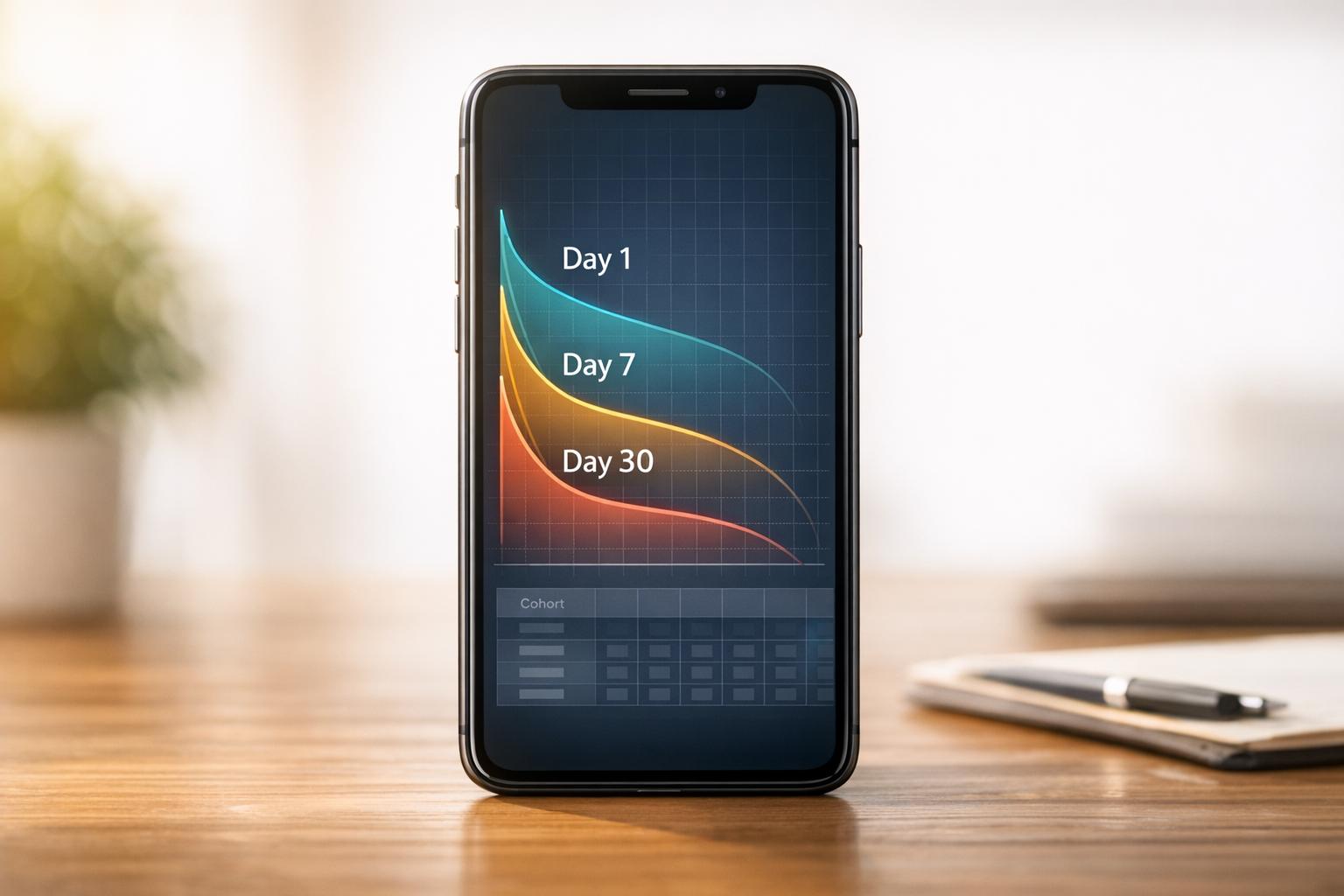
How to Benchmark Mobile Retention Rates
Benchmark Day 1/7/30 retention, run cohort analysis, and optimize onboarding, habit triggers, and personalization to improve app retention.