

How to Simplify Form Design for Conversions

How to Simplify Form Design for Conversions
![]() 21-07-2025 (Last modified: 31-07-2025)
21-07-2025 (Last modified: 31-07-2025)
Simplifying your online forms can directly boost your conversion rates. The key is to reduce friction, build trust, and improve usability. Here’s what you need to know:
- Fewer Fields = Higher Conversions: Forms with 3 fields convert 10% better than those with 6+ fields.
- Avoid Complexity: 67% of users abandon forms that feel long or confusing.
- Trust Matters: Clear privacy policies and visible security badges encourage users to complete forms.
- Mobile Optimization Is Essential: Over 60% of traffic comes from mobile, so forms must work seamlessly on smaller screens.
- Accessibility Is Non-Negotiable: Inclusive forms reach more users and reduce legal risks.
To improve your forms, focus on reducing unnecessary fields, breaking long forms into steps, and using tools like real-time validation. Test regularly with A/B or AI-powered tools to find what works best for your audience. A well-designed form isn’t just easier to use – it’s a critical step toward better results.
How to Get Form Optimization Right | CXL Institute Free Webinar
Common Form Design Problems
Understanding why forms fail is the first step to improving them. Many businesses unknowingly create obstacles that hinder conversions. Let’s dive into some of the most common issues that cause users to abandon forms before completing them.
What Is Form Friction?
Form friction refers to anything that makes completing an online form harder than it needs to be. This could include forms that are too long, use confusing language, lack autofill options, or require too many mandatory fields. These hurdles force users to put in extra effort, which often leads to frustration and drop-offs.
For example, a local HVAC company saw a 41% increase in bookings in just 30 days by cutting their form down from 12 fields to just three: name, phone number, and preferred time. Similarly, another company redesigned their lead generation form into a two-step process, asking for only a name and email on the first screen. This simple change boosted form completion rates by 42% in three weeks.
Even subtle design issues can create friction. A fintech company found that users were rage-clicking on credit card logos on their checkout page, mistaking them for payment buttons. Removing this confusing element resulted in a 7% increase in conversions.
"Friction isn’t just about how many fields you have; it’s about how they’re presented. When you create an experience that adapts in real time and removes irrelevant steps, users move faster and with less resistance. And in digital environments where attention is fragile, that small difference can be the deciding factor between drop-off and conversion." – Darryl Stevens, CEO, Digitech Web Design
These examples show how friction directly impacts user experience and can even erode trust.
Trust Issues That Stop Users
Beyond friction, trust plays a huge role in whether users complete a form – especially when personal or financial information is involved. Nearly half of consumers say they’d switch to a different brand if they were unsure how their data would be used.
Modern users are more aware of data privacy risks than ever. If a form lacks visible security badges, clear privacy policies, or straightforward explanations of how their data will be handled, users are likely to abandon it. Transparency is no longer optional – it’s a competitive edge. In fact, 73% of customers say they’re willing to pay more for products that are fully transparent.
The financial consequences of trust issues extend far beyond individual conversions. For example, 88% of global companies report spending over $1 million annually just to comply with GDPR. While compliance is expensive, losing customer trust costs even more.
"Technology does not need vast troves of personal data, stitched together across dozens of websites and apps, in order to succeed… If a business is built on misleading users, on data exploitation, on choices that are no choices at all, then it does not deserve our praise. It deserves reform." – Tim Cook, CEO of Apple
"Privacy cannot be a luxury good offered only to people who can afford to buy premium products and services… Privacy must be equally available to everyone in the world." – Sundar Pichai, CEO of Google and Alphabet
These statements underline why users expect honesty and clarity about how their data will be used. Forms that lack trust signals – like SSL certificates, links to privacy policies, or clear explanations of data usage – create unnecessary barriers to conversion.
Accessibility Problems
Accessibility issues are another major reason users abandon forms. These barriers often go unnoticed because they primarily affect people with disabilities, but their impact on conversion rates can be significant.
Common accessibility problems include poor color contrast, missing form field labels, lack of compatibility with screen readers, and forms that can’t be navigated using a keyboard. When forms aren’t designed with accessibility in mind, they exclude users who rely on assistive technologies or who have visual, motor, or cognitive challenges.
There’s also a strong business case for accessibility: accessible forms not only improve completion rates but also help businesses reach a broader audience, including customers with disabilities.
Failing to address accessibility can have serious consequences. For instance, lawsuits against Miami University in Ohio and Rite Aid Corporation highlighted how inaccessible web content and forms can lead to accusations of discrimination. These cases show that accessibility isn’t just about inclusion – it’s also about legal compliance and reducing risk.
Many accessibility issues stem from technical oversights, such as unlinked labels, poor color contrast, or forms that can’t be navigated without a mouse. These problems are preventable with proper design practices.
The solution? Follow established guidelines like the Web Content Accessibility Guidelines (WCAG) and apply the POUR principles – ensuring forms are Perceivable, Operable, Understandable, and Robust. By addressing these issues, businesses can create forms that work for everyone.
Basic Rules for High-Converting Forms
If you want your forms to convert better, stick to these essential principles. These strategies are the backbone of effective form design and can make a significant difference in user engagement.
Use Fewer Form Fields
One of the easiest ways to improve form conversions is by asking for less information upfront. Every additional field increases the chances that users will abandon the form. The trick is figuring out what you must know versus what you’d like to know.
Start by reviewing your forms and questioning the necessity of each field. For example, do you need both a phone number and an email address for an initial inquiry? Could you gather extra details later, once the user is already engaged?
Focus on collecting only the most important information. This approach not only reduces friction but also ensures the data you collect is more accurate and complete. To further simplify things, use predefined options for fields where users might otherwise make errors. For instance, instead of an open text field for a job title, provide a dropdown menu with common choices and an "Other" option. This minimizes mistakes and speeds up the process.
Additionally, set data quality standards to ensure completeness. If a phone number is critical, explain why and use validation to confirm the format is correct. The goal isn’t just to collect less data – it’s to collect better data that aligns with your business objectives.
Break Long Forms into Steps
If you can’t reduce the number of fields, breaking your form into smaller, more manageable steps is a smart alternative. Long forms can feel overwhelming, but multi-step forms make the process more approachable and less intimidating.
The impact can be dramatic. For example, BrokerNotes, a financial lead generation site, saw their conversion rate jump from 11% to 46% after switching to multi-step forms. Similarly, Formstack reports that multi-step forms can boost completion rates by up to 300% compared to single-step forms.
These forms work by reducing the mental load on users and creating a sense of progress. Group related fields into logical sections, with each step containing no more than 5–9 fields that users can complete in 1–2 minutes. For instance, an account registration form might separate personal details, preferences, and payment information into distinct steps.
Progress indicators are key. A simple progress bar or step counter (like "Step 2 of 4") helps users understand where they are and how much is left, reducing anxiety and encouraging them to finish. Companies like Dell use progress bars in their 3-step help ticket process to set clear expectations.
Multi-step forms also improve usability on mobile devices by breaking complex forms into smaller, more digestible sections.
Make Forms Work on Mobile
With over 60% of internet traffic coming from mobile devices, designing forms for smaller screens is no longer optional – it’s essential . Mobile users have unique needs, and even a one-second delay in load time can slash conversion rates by up to 20%.
To optimize for mobile:
- Stick to a single-column layout to guide users vertically, eliminating the need for horizontal scrolling. This creates a natural flow and improves usability . Ensure tap targets are large enough – at least 44 x 44 pixels – to avoid accidental clicks.
- Use the right input types. For example, display a numeric keypad for phone fields or an email-optimized keyboard for email fields. These small tweaks make a big difference in user experience.
- Leverage mobile features. Allow users to take photos instead of uploading files, use location services for auto-filling addresses, and enable voice input for longer text fields. These features make filling out forms quicker and more intuitive.
- Keep it short. Limit open-ended questions to reduce typing, which is often slower and more error-prone on mobile. When you need longer responses, use conditional logic to display additional fields only when necessary.
- Provide clear error messages and inline validation. This helps users fix mistakes as they go, rather than waiting until they submit the form .
How to Simplify Your Form Design
Creating forms that are easy to use and visually appealing is key to boosting conversions. Here’s how you can design forms that users will want to engage with.
Place Forms Where Users Can See Them
Visibility is everything. Place your forms above the fold so users can spot them immediately when they land on your page. If people have to hunt for your form, they’re more likely to leave without interacting.
For mobile users, a clean and responsive design is essential. Use consistent branding, ensure there’s enough contrast for readability, and add plenty of whitespace to make your form stand out without overwhelming the page.
Take Metropolis Moving, for example. Their quote form is front and center, paired with concise text that reassures potential customers by showcasing high Yelp ratings and a promise of a same-day response for early submissions.
Write Clear Form Headlines
A strong headline can make or break your form’s effectiveness. Since it’s often the first thing users see, it needs to grab attention, convey value, and encourage action.
Instead of generic titles like "Contact Us" or "Sign Up", opt for benefit-driven headlines. For instance, "Get Your Free Moving Quote in 60 Seconds" is much more engaging than "Request Quote." Clear, concise messaging helps users immediately understand what they’ll gain by completing the form.
"The purpose of a headline is to summarize a piece of content in the fewest words possible." – Constant Contact
Keep your headlines short – ideally under six words or 70 characters. Use active language and words that create urgency or highlight benefits. For example, Primal Pet Foods uses a simple signup form that sparks interest while being transparent about what users will receive after submitting their information.
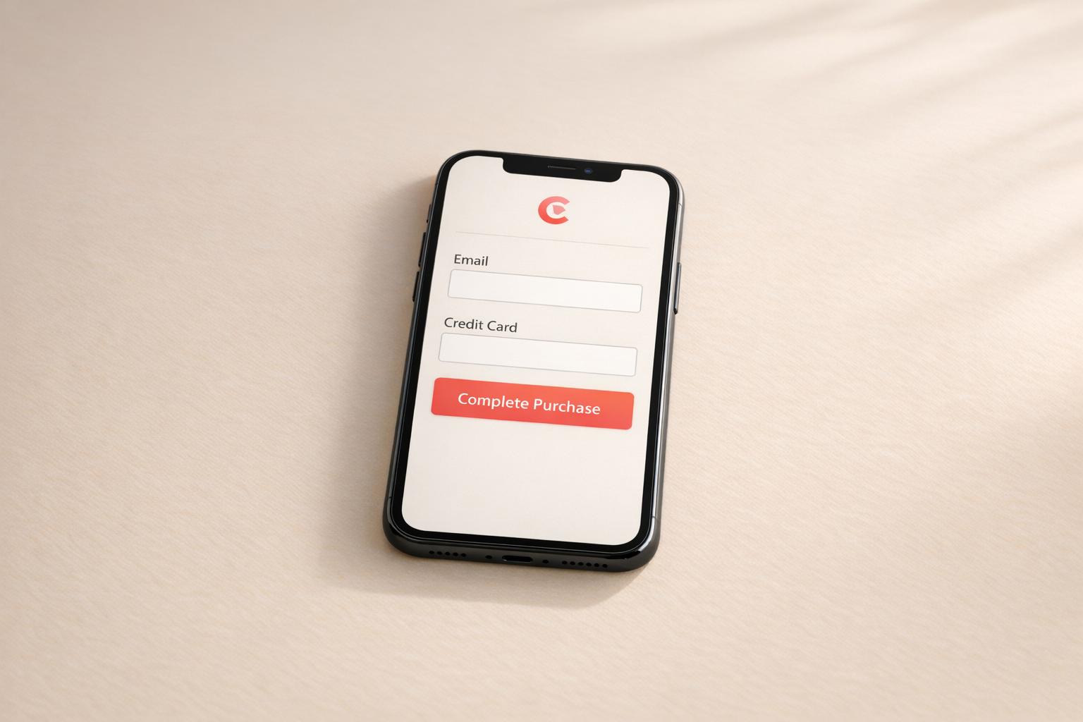
Make Input Fields Easy to Use
The usability of your input fields can significantly influence whether users complete your form. Clear labels and instructions ensure users know exactly what to do. Make your form flexible by accepting multiple input formats – for example, phone numbers with or without dashes or dates entered as "12/25/2024", "December 25, 2024", or "12-25-24."
Nike Run Club simplifies the process by specifying clear entry formats for dates. Inline validation is another helpful feature, offering real-time feedback so users can fix errors as they go. Autofill and predictive text options can further speed up form completion. Spotify Pets, for instance, uses an interactive slider to collect pet personality details, reducing the need for excessive typing.
Enhance Your CTA Buttons
Your call-to-action (CTA) button is the final step in converting users, so it needs to stand out. Use bold, contrasting colors to make the button easy to spot on any device. The text should be action-oriented and specific, like "Get My Free Quote", "Start My Trial", or "Download the Guide", so users know exactly what to expect.
Airbnb’s login forms are a great example of effective CTA design. They offer social media login options like Facebook and Google, making the process faster and more convenient. Consistent styling across your forms builds trust and familiarity, while emphasizing security reassures users who may be hesitant to share personal information.
"The system should treat all user input as sacred." – Jef Raskin
Every small improvement in your form design reduces friction and builds trust, ultimately leading to better conversion rates.
sbb-itb-6e49fcd
Testing and Improving Your Forms
Even well-designed forms can benefit from regular testing. What works for one business may not necessarily work for another. Ongoing testing allows you to make informed decisions that can boost your conversion rates.
Use A/B and Multivariate Testing
A/B testing involves comparing two versions of a form element to determine which one performs better. You can test various aspects, such as headlines, button colors, field arrangements, or input types, to see what resonates most with your audience.
"A/B testing allows individuals, teams, and companies to make careful changes to their user experiences while collecting data on the impact it makes." – Optimizely
For reliable results, test one element at a time. Changing too many elements simultaneously makes it hard to identify which specific adjustment led to the outcome. Multivariate testing, on the other hand, examines multiple variables at once to find the best combination. For instance, a recent case study by Munro Agency used Google Optimize to compare a Calendly widget with a Sharpspring form on a "Book a Demo" page. Over four weeks, the Sharpspring form delivered a 35% increase in conversions. Keep in mind that achieving statistical significance and having a sufficient sample size are key to drawing meaningful conclusions. Interestingly, only one in seven A/B tests typically results in a clear winner.
Use AI-Powered Testing Tools
AI-driven tools are changing the game when it comes to form optimization. These tools can automate test case creation, analyze performance data, and even predict outcomes to help you determine the best display options for your forms.
PageTest.AI is one example of this new wave of tools. It provides a no-code platform that generates AI-powered variations for your forms, tracks key metrics like clicks and engagement, and integrates seamlessly with popular website builders. Using your performance data, the AI generates test variations to optimize results.
These tools can significantly cut costs, reducing testing expenses by up to 40%, while increasing test coverage by 25%. It’s no surprise that over 81% of software teams now incorporate AI into their testing processes. By leveraging AI, you can streamline testing and focus on refining your forms based on actionable insights.
Review and Use Your Test Results
Testing is only as valuable as the actions you take based on the results.
Track key metrics that directly impact form performance, such as completion rates, abandonment rates, time to complete, and overall conversions. Analyze patterns in your data: Are users dropping off at specific fields? Do mobile users interact differently compared to desktop users? Are certain traffic sources leading to higher form completions?
Data helps you pinpoint areas for improvement, measure current performance, and assess the effectiveness of your changes. For deeper insights, use root cause analysis methods like the 5 Whys. For example, if users frequently abandon the form at the phone number field, consider whether the label is confusing, the field placement is awkward, or if privacy concerns are deterring users.
Document your findings and maintain a testing calendar to ensure continuous optimization. Compare data before and after implementing changes to evaluate the impact and identify areas for further improvement. Building a knowledge base from these insights can guide future testing efforts.
The Plan-Do-Check-Act (PDCA) cycle is a helpful framework for ongoing improvement . Start by planning your tests with clear hypotheses, execute them carefully, review the results against your expectations, and act on the insights to refine your forms and guide future experiments. This cycle ensures that your forms are always evolving to meet user needs.
Making Forms Accessible and Compliant
Creating accessible forms isn’t just about meeting legal requirements – it’s also a smart way to improve user experience and boost conversions. Studies show that over 67% of visitors abandon forms that are too complicated, and with 16% of the global population living with disabilities (71% of whom leave websites that are hard to use), designing with accessibility in mind is essential. By focusing on accessibility, you reduce form friction, comply with legal standards, and create a smoother experience for all users.
ADA Accessibility Best Practices
The Americans with Disabilities Act (ADA) mandates that web content be accessible to individuals with disabilities. This applies to state and local governments under Title II and businesses open to the public under Title III. While there’s flexibility in how organizations meet these standards, the ultimate goal is straightforward: make sure your forms are usable by everyone.
"Inaccessible web content means that people with disabilities are denied equal access to information. An inaccessible website can exclude people just as much as steps at an entrance to a physical location." – ADA.gov
Here are some essential tips to align your forms with ADA requirements:
- Use clear labels: Place labels outside input fields using the HTML
<label>tag. Avoid relying on placeholder text, which disappears when users start typing and can be problematic for screen readers. For example:
<label for="name">Name:</label> <input id="name" type="text">. - Keyboard accessibility: Ensure users can navigate all form functions using just a keyboard. According to WebAIM, "Keyboard accessibility is one of the most important aspects of web accessibility".
- Color contrast and visual cues: Maintain a color contrast ratio of at least 4.5:1 for small text and include additional text cues beyond color to convey information.
- Interactive elements: Make buttons and other interactive elements at least 44×44 pixels to ensure easy interaction.
- Group related controls: Use
<fieldset>and<legend>elements to group related form controls. For instance:
<fieldset> <legend>Choose a shipping method:</legend> <input type="radio" id="overnight" name="shipping" value="overnight"> <label for="overnight">Overnight</label> </fieldset>. - Error messages and validation: Provide clear error messages next to problematic fields (or below them on mobile). Mark invalid fields with
aria-invalid="true"and required fields witharia-required="true". This helps users understand what went wrong and how to fix it.
Deque Systems’ Senior Accessibility Consultant, Uday Shetty, highlighted in August 2024 the importance of using native HTML form controls. He recommended employing the "for and id" method to associate form fields with their labels, ensuring compatibility with assistive technologies.
Privacy and Data Collection Rules
Accessibility isn’t the only concern – data privacy is just as critical. Regulations like GDPR and CCPA require businesses to follow transparent data collection practices, whether operating globally or specifically in California. Here’s how you can ensure compliance:
- Active consent: Use unticked checkboxes for consent, accompanied by a clear explanation of what data is being collected and how users can withdraw their consent.
- Link to your privacy policy: Make it easy for users to review how their data will be used by providing a direct link to your privacy policy. Ensure the policy explains why you’re collecting certain information and how it will be handled.
- Limit data collection: Only ask for information that’s absolutely necessary. Keeping forms concise not only reduces privacy concerns but also increases completion rates.
- Secure data collection: Use SSL encryption for your forms and ensure sensitive data is encrypted. Additionally, provide users with options to correct or erase their data, as required by GDPR and CCPA.
Non-compliance with these regulations can result in hefty fines. By integrating these accessibility and privacy practices, you can create forms that are not only user-friendly but also compliant and secure.
Key Points for Simple Form Design
To craft simple, high-converting forms, focus on these five essentials: reduce the number of fields, design for mobile, use smart validation, ensure accessibility, and test regularly.
Cut down on fields. Research shows the average checkout form has 11.8 fields, but many websites can trim that by 20–60% without losing critical data. Each additional field can lower conversion rates by about 4%. Keep it lean – only ask for what you absolutely need.
Think mobile-first. With more people completing forms on their phones, your design must work seamlessly across devices. Single-column forms, for instance, are completed 15.4 seconds faster than multi-column layouts. Make sure buttons and interactive elements are easy to tap, and ensure keyboard-friendly navigation for users with disabilities.
Use smart validation and real-time feedback. Inline validation, as highlighted in research by Luke Wroblewski, can improve success rates by 22%, reduce errors by 22%, boost satisfaction by 31%, and cut completion times by 42%. Provide clear error messages and validate inputs in real time to guide users effectively.
Make accessibility a priority. Following ADA guidelines, ensure your forms are easy for everyone to use. Use clear labels, maintain a color contrast ratio of at least 4.5:1, and guarantee smooth keyboard navigation throughout the form.
Test and tweak continuously. Form optimization is an ongoing process. Regular A/B testing can uncover what resonates most with your audience. Tools like PageTest.AI make this easier with AI-driven, no-code testing solutions. Starting at $10 per month with a free trial offering 10,000 test impressions, it’s a straightforward way to refine your forms.
Lastly, don’t overlook speed. A 1-second delay in page load time can drop conversions by 7%. By focusing on speed, usability, and an effortless user experience, you’ll see your conversion rates improve as you apply the accessibility tips, testing methods, and design strategies shared here.
FAQs
How can I figure out which form fields are necessary without losing valuable data?
To figure out which form fields are necessary, start by diving into user behavior and feedback. Tools like A/B testing can be invaluable here – compare shorter forms with longer ones to see how they affect completion rates. Stick to collecting only the information you truly need, and make optional fields clearly labeled to reduce any potential stress for users.
You can also use analytics tools to pinpoint where users drop off during the form process. If a specific field consistently causes users to abandon the form, it’s worth reconsidering whether that field is essential or if it can be simplified. Through testing and fine-tuning, you can find the right mix of user-friendliness and effective data collection.
How can I make my forms accessible for users with disabilities?
To make your forms easier for everyone to use, start by adding clear, descriptive labels to all input fields. This helps users understand exactly what information they need to provide. Make sure the form is completely navigable with a keyboard, so users can move through fields and submit it without needing a mouse. Also, use high-contrast colors for text and backgrounds to make the form easier to read, especially for people with visual impairments.
Whenever possible, stick to native HTML controls since they are naturally more accessible. Include helpful error messages that explain what went wrong and offer guidance on how to fix the issue. These steps not only make your forms easier to use but also ensure they meet accessibility standards, creating a better experience for everyone.
What’s the best way to test my form design for higher conversions?
To evaluate your form design effectively, start by introducing variations that focus on one specific change at a time – like adjusting the order of fields, altering their length, or shifting the placement of buttons. Implement A/B testing to compare these versions and pinpoint which design performs better.
Keep a close eye on how users interact with the form, consider their feedback, and ensure accessibility standards are met. Aim for a design that’s straightforward, user-friendly, and fast to fill out. Continuously improve the form by analyzing key performance metrics, such as completion rates and user engagement, to boost conversions.
Related posts
say hello to easy Content Testing
try PageTest.AI tool for free
Start making the most of your websites traffic and optimize your content and CTAs.
Related Posts

![]() 14-03-2026
14-03-2026
 Ian Naylor
How AI Improves Mobile Retention Campaigns
How AI predicts churn, builds real-time segments, automates personalized campaigns, and increases mobile app retention and engagement.
![]() 12-03-2026
12-03-2026
Ian Naylor
Visual Design Mistakes That Hurt Conversions
Fix cluttered layouts, low contrast, inconsistent branding, and mobile issues to improve trust and boost conversions with practical design fixes.

![]() 10-03-2026
10-03-2026
Ian Naylor
Real-Time Metrics for CRO: What to Track
Monitor CVR, CTR, bounce rate, time on page and cart abandonment in real time to spot drop-offs and improve conversions.