

10 Website Elements to A/B Test for Higher Conversions
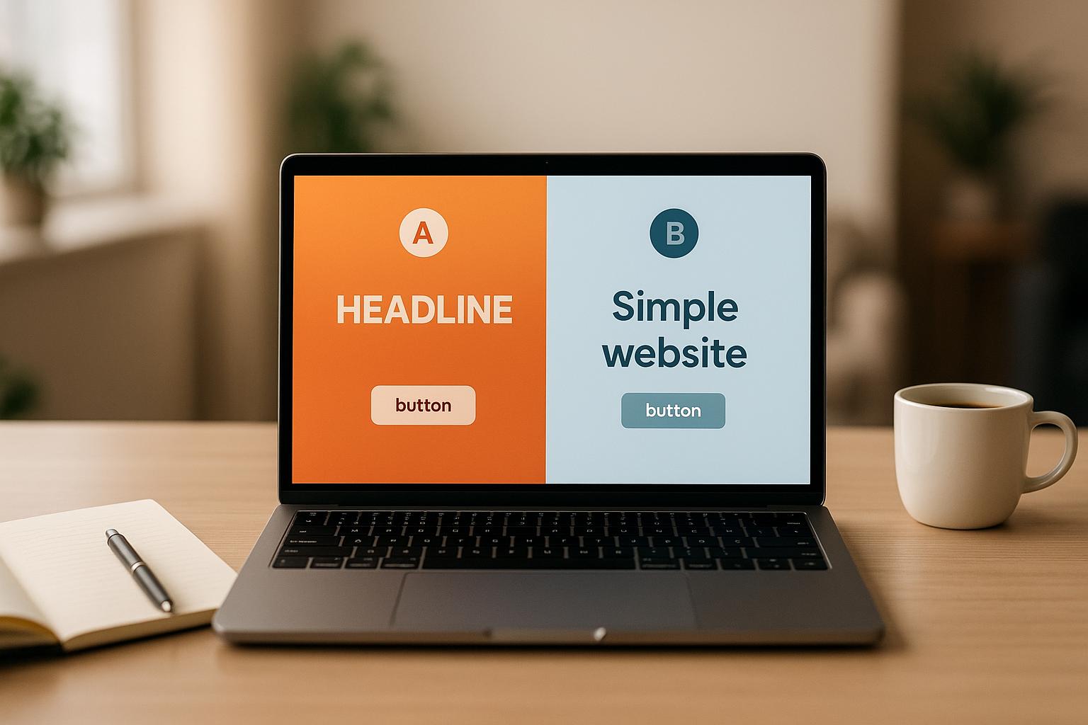
10 Website Elements to A/B Test for Higher Conversions
![]() 20-06-2025 (Last modified: 20-06-2025)
20-06-2025 (Last modified: 20-06-2025)
Want more clicks, more people to sign up, or more buys? A/B tests can help you find what does best on your site. Here are 10 main parts you should try to get more results:
- Headlines: Try new words, lengths, or looks to catch eyes.
- Call-to-Action (CTA) Buttons: Play with colors, words, size, and where they go to get more clicks.
- Images: Use different kinds, sizes, and looks to see what users like.
- Page Layout: Move things around to make the flow better and the use nicer.
- Forms: Make forms simple or break them into steps to keep people from leaving.
- Value Proposition: Try new ways to tell visitors why you stand out.
- Popups: Change when they show, how they look, and what they say to talk to users without bothering them.
- Trust Signals: Put in reviews, badges, or words of praise to seem more trusty.
- Pricing Display: Try different ways to show prices, deals, or free shipping.
- Checkout Process: Make steps easy, add guest checkout, or more ways to pay to keep carts from being left.
Why A/B Testing Is Good
A/B testing takes out the guess. It lets you see what your crowd likes more by looking at two types of a page or part. Even small things – like a button color or a new headline – can make big better changes. For example, HubSpot got 21% more results just by changing the color of a button.
Fast Look at Main Testing Spots
| Part | Check For | Effect |
|---|---|---|
| Headlines | Words, feel, length | Makes people look and join in |
| CTA Buttons | Color, word, size, spot | Makes more clicks and doings |
| Images | Kind, size, spot | Makes it look good and builds trust |
| Page Layout | Set-up of parts, space | Makes it easy to use and move |
| Forms | Size, must fill fields, look | Makes fewer people leave |
| Value Offer | Words, good points shown | Tells why people should pick you |
| Popups | When, look, talk | Gets leads with no bug |
| Trust Signs | Reviews, awards, good words | Makes trust and sureness |
| Pricing Show | Cuts, free send, ways to show | Makes worth look high |
| Checkout Steps | Steps, pay ways, not need to sign in | Makes fewer leave before buy |
Quick Tip: Kick off with key parts like CTAs, big titles, and checkout steps. Try tools like heat maps or looking at data to spot weak spots. Make sure your tests run long enough to get good data.
A/B Testing & Optimization Tips to Increase Web Conversion Rates
Why Split Test Web Parts
Split testing cuts out the guesswork in making your site better. It gives real, clear results that count. On average, companies that do split testing see a 49% jump in conversion rates – a real sign of its strength. By using real data instead of just guessing, this way makes big changes to important areas of your site.
Felix Chiu puts it well:
"A/B testing allows you to make data-driven decisions by testing different variations and measuring their impact on user behavior. This eliminates guesswork and ensures your decisions are based on user preferences."
It’s about knowing who comes to your site. For example, tests can show if people on phones like forms at the top more, or if special parts make them stay longer. These clues help you see trends in how users act, aiding you in making smart choices.
Look at HubSpot: when they switched their button from green to red, they saw a 21% jump in people taking action. It was just a small change, but it made a big splash.
With A/B testing, getting better keeps on going. Instead of betting it all on a big site redo, you can try out little fixes bit by bit. This safe, step-by-step way cuts down risk while you keep making your site better.
Another plus? You stay in front of the race. While others guess, A/B testing lets you adjust your site based on real user moves. The end game? A site that grows as the needs of your visitors do.
1. Headlines
Your headline grabs attention first. It shapes the mood and decides if visitors stay or go. Like the ad star David Ogilvy once said:
"On the average, five times as many people read the headline as read the body copy. When you have written your headline, you have spent eighty cents out of your dollar."
This means that headlines are key parts to try out in A/B tests.
Impact on User Need to Stay
A good headline acts as a strong grip – it catches the eye and wins trust. A headline with clear value shows users what they can get fast, while a bad one can turn them away.
For instance, firms like Crown & Paw and Bukvybag had great gains by just changing their headlines. Crown & Paw saw a 3.5x rise in sales, and Bukvybag upped its sales by 48% by just trying out new ways and feelings in their headlines.
What does best? Numbers, questions, and strong words. They make things clear, start wonder, and hit the heart. This pulls people in to look at your stuff.
Chances to Lift Up Sales
Headlines do more than get eyes on them – they spur action. Companies that fix their headlines often see a 25% better sale rate. A headline needs to catch the eye, match the page’s content right, and help users go to the next step.
Good headlines also help your SEO. They up the click rates and cut quick exits, showing search sites that your stuff is good and grabs people.
How Easy It Is to Test Headlines
Starting headline tests is easy. Making changes is fast, and you can track results by clicks, time spent, and sales.
A tip: Keep your headlines short – best at 10–12 words. Use doing words, add right words, and try using feelings or asking a question to make people want to know more.
Unlike hard tests, headline tests don’t need big edits. You just need clear and strong text that meets your viewers’ needs and wants.
2. Call-to-Action (CTA) Buttons
CTA buttons link what users like to what they do. Roman Kaminechnyi, the main design guy, talks about how key they are:
"A specific, clear CTA can boost conversion rates by up to 161%. It’s one of the most effective tools for impacting business results."
This makes them key to test and tune on your web page.
Impact on User Clicks
CTA buttons are big in how users click on your site. Studies show smart, sharp CTAs can draw 42% more people than plain ones. Even small tweaks help a lot: changing a button’s shade can lift clicks by 21%. For instance, Demio got a 57.79% boost just by making their button bigger and deeper.
Where you put your CTA counts as much as its look. Turning a plain "Get Started" to a clear "Download Now" upped clicks by 24%. Also, PartnerStack saw their main page clicks leap from 6.66% to 14.09% (+111.55%) when they swapped their CTA from "Book a Demo" to "Get Started".
Chance to Lift Click Rates
Fixing CTAs can show clear gains. Personal words like "Start Your Free Trial" tend to do better than plain ones, with a 15% rise in click rates. Place tweaks can also show big effects. Michael Aagaard saw a huge 304% rise in click rate by moving a CTA to the end of a long web page.
Adding a rush works, too. Words like "Limited Time Offer" can up clicks by 10%, while words like "Discover Exclusive Deals" can lift user clicks by 20%.
HubSpot found that phone users clicked 27% less on CTAs than computer users. After trying four phone page types, they saw that adding a sticky CTA bar upped clicks by 9%, and just redoing the main picture gave a 10% rise. These shifts could mean 1,400 more content leads and nearly 5,700 more form fills each month.
The chance to better CTA clicks is huge.
Easy to Test for A/B Tests
One of the best parts about tuning CTAs is how easy it is to test. Shifts like changing shades, text, size, or place don’t need much tech work. With phone visits being 63% of web looks, make sure tap spots are at least 44×44 pixels to help using them.
| Element | A/B Test Ideas |
|---|---|
| Color | Try out mixes that stand out more and fit the brand. |
| Copy | See if "do this" words work better than "get this" words. |
| Size | Look for a good mix of big but not too big. |
| Placement | Test spots like top, middle, or bottom of the page. |
| Shape | Check if round or sharp corners draw more eyes. |
Since 57% of users use most time on stuff at the top, test CTAs there first.
As Design Studio says:
"High-converting CTAs leave zero room for ambiguity. They do not hint, they declare."
Keep trying new mixes to find what clicks best with your people. Let the numbers lead you to the top plan.
3. Pictures and Looks
Pictures and looks are big in making more sales on websites. Since the mind sees looks 60,000 times faster than words, they draw eyes and get people into the site right away.
Looks go with how our minds work. Research says that folk keep only 10% of what they read, but with pictures, they hold 55%. This is why sites with good looks do better than those full of words. More people stick around and sales go up.
Look at what happened in 2025 with Optopus EU and Dragonfly AI. By making hero images better for their eCommerce friends – showing off goods and calls to act – they got a 40% rise in sales.
Looks that move raise the bar. When DueMaternity.com used 360° pictures of goods, their sales went up by 27%. Letting buyers see goods from all sides makes them trust and buy more.
Videos are a big win, too. Sites with videos on their front page can push sales by up to 86%, and 73% of folk may buy after they watch. For style sites, sales went up by 134%.
How to Boost Sales Rates
It’s sure: better looks can make sales soar. Brands with good look-based stuff see 7 times more sales than others. Even little changes can make big wins.
For one, bigger pictures of goods alone can up sales by 9%. Mall.cz saw this in a test with Optimics, where bigger images with hover details won a 9.46% rise in money made.
Life-like pictures also do much better than plain goods shots. Pages showing goods in real use had 24% more hits and a 12% rise in sales. Warm-colored goods pics got 18% more adds to cart than cooler colors. And, custom looks beat stock photos, with 35% better sign-up rates.
Swiss Gear got more sales by setting up their looks better. This smart layout got them 52% more sales, and up to 137% more during busy buy times.
Easy Ways to Test Looks and A/B Testing
Testing looks is easy, no need for big tech work. Changing pictures is simple and most A/B test tools give easy ways to drop new ones in place.
Here are some looks you can test:
| Visual Aspect | Test Changes |
|---|---|
| Kind of Image | Stock photos vs. made pictures vs. real-life snaps |
| Look at Product | One view vs. many views vs. total spin |
| Feel of Color | Warm hues vs. cool hues vs. plain colors |
| Size of Image | Tiny pics vs. big main pics vs. zoom-in option |
| Set Up | Item by itself vs. real-life set-up vs. before/after pics |
Email drives are a top way to try out new things. Using good-looking images fit for the deal made the open rates go up by 15% and the clicks up by 22% in a study. It is easy to try out new main images in emails and you do not have to change your website.
The great thing about using pictures to test is how fast you can see the results. In a few days, you can tell if a new main image gets more looks or if a new view of a product makes more sales. Start with the pages that get the most visits and try one picture change at a time. The info will point you to the pictures that work best with your crowd and get you the results you want.
4. Arranging Your Page
Fixing your page setup works well with testing titles and CTAs, as it plays a big part in how users feel when they visit your site. The way you place things on your page truly shapes how people use your site, if they stay, talk, or act. A smart design can change how people move through your site.
How It Touches User Involvement
Your page setup is like the first hello to those who come. In fact, people make a quick first view in just about 50 milliseconds. This means your setup must grab eyes fast, even before someone reads a title or sees a CTA.
Your page’s design pulls the eye and guides what people do. A clear visual order makes sure main things like titles and CTAs pop out. When you put these key bits in smart spots, you lead visitors to do what you’d like them to do.
"A well-designed layout makes the information it contains easy to consume." – Stephanie Corrigan, Flux Academy
But it’s not just about looks – it’s about how fast it works too. How a site is set up really affects its speed. A one-second delay in loading can cut user interest by 7%. Big images, heavy designs, and complex setups can slow your site, making people leave before they even start.
A simple, easy-to-get layout keeps users around – it also helps better the chance of making sales.
Chance to Boost Sales Numbers
A smooth page design is key for good sales numbers. It gets easier to use, people leave less, and visitors are more likely to act. The top part of the page, seen without scrolling, is super important. It’s the first thing people see.
Finding the right mix of words and pictures is important. Too much text can be too much for visitors, and too many images without clear direction can confuse. Choosing to leave space around your content makes it easy to read and points out the most important parts.
Here’s what happened: A famous online clothes shop made their main page simpler with nice images and a neat design. The result? A big jump in sales.
Easy to Test Different Layouts
With clear benefits, trying out different designs is a smart move. And it’s pretty easy. By changing how things are set up, the way people move through your site, or how much space there is, you can test different flows and see what’s best. Start with key spots, like the top part, and keep the changes interactive.
Testing isn’t just a wild guess. Tools like Crazy Egg show how people use your site. For instance, Crazy Egg used these heatmaps to check user actions, which led to design tweaks that increased sales. These tools also point out which calls to action aren’t working well, letting you fix them fast without redoing whole pages.
"Once people are actually using your website, it’s important to measure everything and get concise data to drive business development, and design & technical development of the website." – Petar Starcevic, Founder, Clastr
Begin with simple steps: place your main call-to-action button higher on the page, change the layout of content, or shift the sidebar. Test these changes early to check if your ideas work and keep testing all through your site’s life. Keep testing even after your site goes live, especially after new updates or features. This helps make sure that the user experience stays smooth and works well.
5. Forms and Input Fields
Once you tune your layout, making your forms better is the next step to turn people who look into real buyers. Forms, like headlines and CTAs, are key in getting more sales. They’re often the last part a user sees, and even small changes in design can cut down on people leaving and boost form fills.
Impact on How Users Take Part
Just adding one more field to a form can drop conversion rates by 8% to 50%. This shows how much users don’t like forms that are long or complex.
Very long forms can turn users off right away. For instance, forms with only three fields can boost conversions by up to 160% compared to those with ten or more fields. But it’s not only about making forms shorter – it’s about making them feel easy to handle.
Splitting long forms into smaller, easy steps with several parts can help. One firm used a four-step form with over 30 questions and still got a 53% conversion rate. Where you put the form matters too. Whether it’s on the left, middle, or right of the page can change how users interact with it. Testing these spots can show what your audience likes best.
Chances to Get Better Results
Well-tuned forms can do better than the usual 10% conversion rate.
But, not every change is good. In one test, taking out engaging fields led to a 14% fall in conversions. Michael Aagaard from ConversionXL put it plainly:
"I removed all the fields that people actually want to interact with and only left the crappy ones they don’t want to interact with. Kinda stupid."
On one hand, a test found that a form with 15 spots made 109% more people sign up. This was because the spots asked for were very needed and meant a lot to the users.
The Munro Agency got a 35% rise in sign ups by changing a Calendly widget to a Sharpspring form on their "Book a Demo" page. This only had three spots to fill: First Name, Last Name, and Email.
By always testing forms, sign-up rates can go up by as much as 30%. The big lesson? Different groups and times need things made just for them.
Making A/B Testing Easy
A/B testing forms can be easy. Start small – change one or two parts at a time to find what works.
Look first at parts that change a lot but are easy to fix. For example, simple moves like changing button text can push people to act a lot. Also, playing with field names – their words, size, color, or spot – can give quick wins without needing big tech changes.
You can try out different ways to fill in info. For example, test text spots against drop-down menus, or round choices against tick boxes. Even tiny things, like using hints, can shape how users see and use your forms.
Test on pages with lots of visits to get useful data fast. Most A/B test tools make it easy to make and manage different versions of forms. Just be sure both work well – nothing stops signs-ups like a form that doesn’t work.
Lastly, keep to your testing plan. Ending tests early can throw off results, since people won’t always sign up at once. Longer test times tend to give better and more solid facts. These methods fit with wider A/B testing ways, letting you always get better at how users interact and boost sign-ups.
6. Why You Matter and What Makes You Stand Out
Your value talk is like a promise of what your stuff does for people who come by. It’s often what they see first, and it can make them want to stay or go. Trying out different value talks helps you find the words and perks that really hit home with your folks. This builds a base for better ties.
How It Drives User Engagement
Value talks are key in shaping how people see your brand and if they click with your stuff. Making things personal, for example, has shown to make a 41% bigger mark than normal ways. This shows how custom messages can build deeper links with visitors.
Look at Bloom & Wild for instance. Their big boss, Aron Gelbard, laid out their value talk clearly:
"We’re enabling [our customers] to order flowers and gifts from the palm of their hand with better product, designs and payments."
This short and clear note pops by showing what makes them special: flowers come in buds through small door slots, so they last longer, and you can order them fast and easy.
The way they talk to the heart also matters a lot for drawing people in. Take Brooks Running: 88% of their buyers loved their made-for-them service, which really helped build trust and more talks. These types of clues lead to better sales.
Chance to Up Sales
Trying out different promises through A/B tests can show real jumps in sales. By testing changing words and perks, you can see what hits home with your people.
Look at these wins:
- Visa got a 20% bump in sales by fitting their stuff and deals to certain user groups.
- News UK pushed up digital sign-ups by 39% with made-for-you tips and aimed experiences.
- Mailchimp got more users to go for paid plans, pulling in lots more money.
- ClassPass went way past their aim, bringing a 10% jump in joins by redoing their site with better promises.
These cases show how tuning your words can really help your profits.
Easy Steps for A/B Tests
You don’t need to redo your whole site to test promises. Often, just a change in the words or the message works. Start with trying new headers since they pack your main promise tight.
Here are main spots to look at when trying new promises:
How it Strikes the Heart: Dan Demsky, a start boss from Unbound Merino, said it just right:
"At its core, a value proposition is a promise you make to your customer post-purchase."
Try out different feelings to see what your people like best. Maybe it’s about how easy it is, how much they save, how good it is, or how new it is.
Make it Clear: Stay away from hard words. Use easy, clear words. Talk about the good things your customers will get, straight to the points they care about.
Be Different: Make your main selling point stand out from others. Kassandra Rodriguez, who started 1st House Branding, says:
"I always tell my clients that if their value proposition matches their competitors’, then there’s something wrong."
Begin with small changes on busy pages to get data fast. Test just one thing at once – the main title, smaller title, or key benefit – to see what works best. Also, keep getting feedback from your viewers to make sure your words match what they expect and need.
sbb-itb-6e49fcd
7. Popups and On-Site Messages
We’ve looked at forms and what they offer; now let’s talk about popups – a good way to get more from your site. Popups and on-site messages may help or hurt how users feel on your site. Done well, they push for action; done badly, they push people away. The trick? Good A/B tests to see what works with your crowd.
Impact on User Engagement
Popups can really change how much users take part. The top popups get a 9.28% rate of pulling people in, just under the 11.09% norm. When and why they show up matters a lot. For instance, exit-intent popups, which show up as users are about to go, can lift sign-ups by 4.1% and help get 53% more cart saves. A big case is OptinMonster’s exit-tech, which uses cursor moves to show popups just before users exit. Crossrope, a fitness name, tried this and saw sign-ups soar by 900%.
Potential to Enhance Conversion Rates
With smart tests, popups can bring great gains. Firms that often run A/B tests see a 20–25% rise in conversion rates. Some do even better. Somfy, a home setup firm, tried a simple "Don’t leave yet!" against a short-time discount offer. The deal one pulled in a 47.27% rate in just 14 days. Also, Cracku, a test prep site, used a countdown in their popup and saw a 300% jump in sign-ups. Other top tales are Asphalte, which took its popup click rate from 15% to 25%, making 4,000 new leads a month. Blueland puts out coupon popups to build its email list, while Leadfeeder tailors popups based on page visits.
Easy Steps for A/B Tests
Testing popups isn’t big work. Start with key parts like titles, button words, looks, color types, and showing time. Test each part alone to know what works best. To trust your results, run tests for at least 7 days to see both weekday and weekend acts, and aim for at least 100 signs per style.
It’s key to fit your popups to what your crowd wants. Like, Zendesk uses neat designs with lots of clean space and brand-right talk in demo sign-up popups to pull in more users. Also, Really Good Emails uses a fun, wise style, saying they know folks usually don’t like popups, but still keeps it real.
A/B testing popups is a clear but strong way to make your site better. Focus on things that catch the eye, test often, and follow what the data says. Even simple tests on popups can make a real better change in pulling people in.
8. Trust Signs and Social Proof
Trust signs and social proof show that your site is safe and can be trusted. When people see others have good things to say, they feel more okay with your brand. The key is to find the best mix of trust parts, which you can tweak with smart A/B tests.
How It Affects User Talks
Trust signs make a big mark on how users deal with your site. For example, 93% of buyers say online words shape their buy choices. When folks see good trust signs, they want to look more at your site and use its main parts.
Where you put these signs matters a lot. Like, moving trust marks from the bottom to a spot up high, such as the top, can change how users see your site’s trust level. Sites that keep an eye on and change their trust parts often see a 45% rise in user talks.
User words and stories help others see themselves using your product, while trust marks and safety signs help with any worries about harm. This boost in talks sets the stage for more sales.
Chance to Up Sales
When used right, trust signs can greatly up sales. Data shows that adding things like safety marks and stories can raise sales by up to 42%. Even more, sites with social proof see a 270% higher sales rate than those without.
Real-life cases show how key it is to use trust signs well. True Botanicals, for one, saw over $2 million in likely ROI rise and a 4.9% whole-site sales rate after adding social proof to their product pages. Also, Clear Within remade their product page with a focus on trust and clear facts, leading to an 80% rise in cart adds.
The data are clear: a product with just five reviews is 270% more likely to be picked than one with none. By easing doubts and helping wise choices, social proof changes the game for sales.
Easy to Test with A/B Tests
Testing trust signs is not hard. Begin by picking the main parts on your site – like buyer words, safety marks, stories, client marks, or papers – and test them one by one to see their impact.
Studies support this method: a deep look at 2,732 A/B tests found that focusing on a single change gives more sure tips than testing many changes at once. Try different spots, looks, and talks. For instance, put buyer words near call-to-action links or try new ways to show safety marks. Since 72% of buyers won’t act without reading words, making these parts stand out can lead to real results.
| Trust Signal Type | Top Testing Areas |
|---|---|
| Customer Reviews | Where and how many are shown |
| Security Badges | Where it’s seen and how it looks |
| Client Logos | Which are used and how set up |
| Testimonials | What they say and where placed |
It’s key to run tests for a long time to see many user acts over time.
"Social proof is one of the most powerful tools of persuasion that sellers can employ on their sites. Getting others to promote you is infinitely more effective than just promoting yourself." – Jon MacDonald, Founder and President of The Good
Here, being real is vital – 94% of people note that bad reviews have made them steer clear of a business. Don’t use fake or over the top good words. Rather, work on getting and showing true reviews and stories that match what your audience feels. When you mix this with other parts of the site that work well, these signs of trust can really help your site turn visitors into buyers.
9. How You Show Prices and Deals
The way you show the cost can really change if a buyer will get it or not. Even small changes in how you list prices can make a big difference in sales. Trying out different price styles can help find what works best with your crowd, mixing what they think it’s worth with what you earn. It’s not just about the numbers – it’s about how people use your site.
What It Does to How Users Act
How prices are listed can push users to act in certain ways. Hard-to-understand costs or extra fees no one saw coming can make people leave fast. In fact, 48% of business buyers stop buying because of extra costs like shipping or taxes.
Small changes, like using $19.99 instead of $20, can show how mind tricks in pricing change what people do. For instance, Rhett Crites, who started Theme Park Brochures, tried different prices for his old maps. He sold a $9.99 digital copy and a $14.99 paper one, aiming for two types of buyers: regular visitors and real map lovers. The outcomes showed that while map lovers paid more for the paper map, regular visitors liked the cheaper digital one.
"Pricing is vital for niche products like ours, and we rely heavily on split testing to refine it."
– Rhett Crites, Founder, Theme Park Brochures
Making More Sales
How you set your prices can greatly change how many people buy your stuff. Trying out different kinds of price cuts helps you see what drives your buyers. For example, 28% of buyers are more likely to buy if you give a percent off, while 30% like a fixed money cut.
For cheap things, percent cuts work well. For pricey items, fixed money cuts are better. Keep it simple – people like prices that are easy to figure out.
Free shipping is a strong trick too. It’s clear, very likable, and usually beats other price cuts. Studies show that 40% of buyers pick discounts over points. Also, small cuts like 15–30% get more people involved than no cuts at all. It’s interesting that a 15% cut gets the most buys, as it pulls in regulars without drawing too many just-looking folks.
Trying Different Prices
Changing prices, like other web stuff, needs regular trying and tuning. Start with easy tests – check prices ending in .99 versus whole numbers – and see which gets more sales. Then look at different cuts, like automatic ones at buying versus codes sent by email. Try short-time deals versus always-there prices to see which makes people feel they must act fast. Grouping things at a lower total price is good to try too, as it often makes people buy more and spend more.
Mary Zhang, the boss of Marketing and Money at Dgtl Infra, says it’s key to think long-term when trying prices:
"Don’t just focus on conversion rates. We track metrics like Customer Lifetime Value and churn rate to understand the long-term impact of price changes."
– Mary Zhang, Head of Marketing and Finance, Dgtl Infra
| Test on Price Set | Compare This | Main Things to Watch |
|---|---|---|
| Type of Price | $19.99 vs $20 | Rate of buys, money per guest |
| Kind of Cut in Price | 25% off vs $25 off | Rate of clicks, usual buy worth |
| How the Deal Looks | Free shipping vs 10% off | Rate of left carts, all buys made |
When you do price tests, make sure they last long to see how different buyers act. Some people look up prices in the week but buy on the weekend. Others might change what they spend based on their budget each month. Timing is key, so let your tests run long enough to get useful info.
10. Checkout Process
When users reach the checkout, they choose to buy or leave. A huge 70% leave their carts at this point, so it’s your last chance to win the sale. Even tiny tweaks to the checkout can make a big difference, giving you more sales, so it’s key to make it as good as it can be.
Impact on User Engagement
The checkout process really shapes how people see your site and if they feel like buying. If the checkout is hard or has sudden blocks, it can harm your sales – a single extra step might cut sales by up to 35%. Also, 63% of online buyers leave if they can’t check out as a guest.
Hannah Juley sums it up well:
"Optimizing your checkout experience and shopping cart is essential for your online store to combat shopping cart abandonment and drive more successful conversions while providing a seamless checkout process for your consumers."
While signed-in users buy more often (64%) than guest users (52%), forcing someone to make an account can push possible buyers away. Finding a good mix of getting customer data and making the process easy is very important.
Trust is also key. When 40% of people leave their carts because there are no mobile payment choices, adding options like Apple Pay or Google Pay can really help. By fixing these points, you can get back lost sales and make the shopping feel better.
Chance to Make Buying Rates Better
Making the checkout smoother is a strong way to get back lost money. Every year, online shops lose about $18 billion from carts left behind. But, doing smart changes can get back as much as 35.26% of those sales.
Real stories show the big effect. For example, White Stuff cut its checkout from three pages to one, made its mobile checkout two times faster, upped buying rates by 37%, and raised the average buy value by 26%. In a like way, Wreaths Across America made a checkout that lets you change the cart. This led to a 63% rise in money made, 28% more orders, and a 27.5% bigger average buy value.
Another good tale comes from a LinkedIn story, where a firm got back $368,000 by using a cart-left-behind email set with a quick coupon. Babyshop Group also found that though higher shipping costs cut buying rates by 2.45%, it raised the average buy value by 4.2%, making shipping money go up by 11% and gross gain per visit by 5.5%.
How Easy It Is to Try A/B Tests
Tackling common issues is a good first step. For instance, extra costs are the main reason carts are left, said by 48% of buyers. Testing if showing all costs at the start or at the end changes buying rates can give useful tips.
Other parts to try include cutting the number of needed fields, using instant checks rather than checks after sending, and changing the order of payment choices. IDEAL OF SWEDEN tried free shipping limits and saw a 7.81% rise in sales, a 7% bigger average buy value, and a 10.75% rise in done buys.
Payment choices are another big area to work on. Try different orders of payment methods or try pay-later options. Adding ways to see progress, like step counts or bars, can also better the feel by showing buyers how much they’ve done and what’s left.
Here’s a quick view at some main points to try:
| Check Part | What to Check | Main Points to Watch |
|---|---|---|
| Input Boxes | Needed vs. not needed fields | How often they finish, how fast they fill them |
| Ways to Pay | Card first vs. online wallet first | How often deals close, which ways are used most |
| Step Displays | Step count vs. progress line | Leaving at each part, how often they get to the end |
To see real results, test one change at a time. Share your traffic the same way across different versions, let tests go on long enough to catch how people buy each week, and pay attention to key numbers like how many buy, how many leave without buying, and how much they spend on average.
How to Run A/B Tests Well
To get the best results from your A/B tests and make your site work better, it is key to have a clear plan. Here are some easy steps to make sure your tests give useful insight.
Test just one thing at a time. If you check many things at once, it’s hard to know what made the difference. A look at 2,732 A/B tests showed that working with one thing gives more sure results. It could be a headline, button color, or how you set up a form. Keep it to one thing for clear and useful findings.
Know your needed number of visitors first. A big error is to run tests with too few people to get good data. Use a web tool to find out how many people you need from your current rate, hoped for better results, and how sure you want to be. Let the test go until you reach this number to keep your results solid.
Start with the top part of the page. The first part seen before you scroll often matters the most. Start tests here with your main headline, action button, or big image – these are key to making a strong first take and can really help get more clicks or sales.
Make sure it works well on phones. Since most site visits now are on phones, it’s key to check how things work on smaller screens. Try out easy-to-tap buttons, simple forms, and phone pay options. What works on phones often helps desktop users too.
Use tools like PageTest.AI to make things faster. This tool looks at your site info to offer strong test ideas and makes new versions for you, saving time from doing it all yourself.
Look at your data by group. Split your data by type of visitor, where they came from, and what device they used. A test might work for phone users but not for computer users. Also, new visitors might see things differently than those coming back. Watching things like how often people leave quickly or how much they scroll can show extra trends.
Wait for clear results. Many A/B tests fail because they don’t have enough data or they stop too soon. Aim for a 95% sure level or more before making decisions. Even if early numbers look good, let the test finish to be sure.
Write down everything. Keep full notes for each test, including what you checked, why, how long it ran, and what happened. These notes help with later tests and stop you from repeating ones that didn’t work.
Use both numbers and stories. Numbers can show what changed, but tools like spot maps, watchbacks of visits, and what users say can tell you why. Putting these insights together often leads to better guesses and a deeper know of your users.
Think about other things that could affect results. Stuff like season changes, ad campaigns, or tech problems can change your test results. If you see odd patterns, look into if outside things affected how users acted during your test period.
Using Simple Charts to Show Test Scores
Charts are an easy tool for showing results from A/B tests in a way everyone can grasp. They help point out trends and guide what to do next. You can think of them as a visual summary that backs up the testing plans we’ve gone over.
Begin by looking at the main numbers – things like how many clicked, how often people clicked through, and how many left right away – for both Option A and Option B. To make things even clearer, add in the rate of change to show how each choice affects the results. For instance, if clicks rose from 3.2% to 3.7%, that means there’s a 15.6% boost.
It’s key to add a sureness level (target 95% at least) to trust the shifts you see are based on real data.
Here’s a basic chart comparing what happens when you test different "press me" buttons:
| Version | % Who Bought | % Who Clicked | % Who Left | Number of People | Trust in Data | Change from Normal |
|---|---|---|---|---|---|---|
| A (Usual) | 4.1% | 12.3% | 58.2% | 2,847 | – | – |
| B (Red Button) | 4.8% | 14.1% | 55.7% | 2,901 | 96% | +17.1% bought more |
| C (Big Text) | 3.9% | 11.8% | 59.4% | 2,823 | 94% | –4.9% bought less |
Breaking Down Results
When you split up results by types of users, you may find more details. For example, those who use desktops might act different from those on mobiles, or new guests might act different from those who come back. You can put these groups in different tables or add columns to show how each group does. This way, you can spot good chances, like a change that helps one group but not the other.
Looking at Other Metrics
Though conversion rates are usually key, don’t miss other metrics. A change that lifts conversions can drop other things, like average order size, time on page, or customer happiness scores. Adding these metrics lets you see more of the impact of your test.
Adding Details and Visual Help
At times, outside things like season changes, ad push, or tech troubles can change your results. Make sure to write these in notes below your table. This detail can clear up any odd trends.
To make your tables simpler, use colors. For instance, use green for good changes and red for bad ones. This makes it easy to go through the results and find the best chances fast.
Choosing the Right Metrics
Make your tables fit your test’s aim. If you’re testing a headline, look at things like time on page or scroll depth. But if you’re testing a checkout, watch for things like completion rates and abandonment points. It’s important to match the metrics with the reason for your test.
Using these methods to look at your A/B test results can help you shape your plans, boost conversions, and make a better time for your users.
Ending Thoughts
Testing 10 parts of your site can change your business a lot. The facts show it: on average, a 49% jump in users doing what you want, with cases like HubSpot where just a small CTA change made a 21% increase. Also, Electronic Arts saw a 43.4% more buys for SimCity 5 by just taking out ads from their order pages. These aren’t just one-time wins – they show how strong and good doing many tests can be.
What makes A/B tests so good is they use real info, not just guesses. You’re not just thinking what may work; you’re using what your users actually do to make things better. This way, you make things work smoother and make sure you’re using money and time well.
Making things better has to keep going. Each test adds to the last, making effects that keep getting better over time. As those who know lot about this say: "Keep making things better. Never stop testing". By always working on even small parts, you’re also making your whole site work better.
For businesses in the U.S., tools like PageTest.AI make this easier. It helps with AI tips for content and you don’t need to code, cutting down the time to set up tests by about 40%. This lets you look more at the data and spend less time on setups, whether you run a small new company or a big one.
The middle score for turning users into customers is 6.6%. By testing key parts like headlines, CTAs, pictures, and forms, you can aim to double these figures. Using what real users do helps make sure every step to do better is based on good information – a key point in this whole text. A/B testing does work; the main thing is how fast you want to start using it.
FAQs
What parts of a site should you test first to up your sales?
To get the best from A/B testing, begin by looking at parts of your website that greatly impact how people act and buy. Focus mainly on key features like headlines, call-to-action (CTA) buttons, and page layouts as they greatly shape how people use your site.
Use tools like analytics and heatmaps to see where people stop or engage the most. This way of using real data means you make choices based on facts, not just guesswork. By zeroing in on these key parts, you can push big upgrades in both how your site runs and how much you sell.
What are the top missteps to dodge when doing A/B tests on your site?
Mistakes in A/B Testing
A/B testing is strong, but easy mess-ups can wreck your work. The main mistake is cutting tests short before you have enough data for good results. Without this, you are just guessing.
Another big error is testing too many things at once. When you change lots of parts at the same time, it’s hard to tell which change made the difference. Plus, not caring about statistical significance or stopping a test too early can lead to false leads that push you off path.
To avoid these traps, test one idea at a time. Be sure to gather lots of data and let the test finish. Keep a steady track and split groups right to get results you can trust and use with sureness.
Related posts
say hello to easy Content Testing
try PageTest.AI tool for free
Start making the most of your websites traffic and optimize your content and CTAs.
Related Posts

![]() 26-02-2026
26-02-2026
 Ian Naylor
How AI Creates Personalized Email Content
AI uses user data to build dynamic email templates, generate personalized variants, and run continuous tests to boost engagement and conversions.

![]() 24-02-2026
24-02-2026
Ian Naylor
Mouse Tracking Data: What to Measure
Track clicks, hovers, scroll depth, and cursor movement to find frustration points, prioritize CTAs, and improve UX and conversion rates.
![]() 23-02-2026
23-02-2026
Ian Naylor
Top 10 CRO Tips for Web Page Design
Practical web design CRO tips — value props, CTAs, speed, mobile, visuals, trust, short forms and A/B testing to lift conversions without extra traffic.