

Ultimate Guide to Navigation for Conversions
Ultimate Guide to Navigation for Conversions
 09-10-2025 (Last modified: 09-10-2025)
Navigation directly impacts whether users stay on your site, take action, or leave. A clear, intuitive menu makes it easier for visitors to find what they need, reducing frustration and increasing trust. This boosts conversions – whether it’s making a purchase, signing up, or downloading a resource. Poor navigation, on the other hand, leads to confusion, abandoned sessions, and missed opportunities.
Key takeaways:
- Clarity matters: Use simple, descriptive labels and logical groupings to guide users effortlessly.
- Consistency builds trust: Uniform design across pages and devices ensures reliability.
- Mobile is critical: Optimize navigation for smaller screens and faster loading to retain users.
- Visual hierarchy guides actions: Highlight important links and calls-to-action with strategic design.
- Accessibility is non-negotiable: Follow WCAG guidelines to make your site usable for everyone.
Testing and improving your navigation with tools like A/B testing or AI can reveal what works best for your audience. Metrics like click-through rates, bounce rates, and heatmaps help measure success. Strong navigation isn’t static – it evolves based on user behavior and testing insights to remain effective.
Optimizing Website Navigation Increased Conversion Rate by 50%
Core Principles of Navigation That Converts
Creating navigation that drives conversions isn’t about fancy visuals or over-the-top animations – it’s about making the user’s journey as seamless as possible. When navigation is built around principles that prioritize usability, it clears the way for visitors to take action without unnecessary distractions or confusion.
Clear and Simple Design
Navigation should answer one simple question: “Where can I go?” If users have to pause and figure it out, your menu isn’t doing its job. Overly complex menus or vague labels can quickly derail the experience.
Stick to clear, descriptive labels like “Men’s Running Shoes” or “24/7 Customer Support.” Group similar items logically to make things easier to find while also naturally boosting SEO through keyword-rich labels. Avoid internal jargon or niche terminology that might confuse visitors. What makes sense to your team might leave users scratching their heads. A good way to test this? Ask someone unfamiliar with your brand to navigate your site and see if it clicks for them.
By keeping labels straightforward and intuitive, you create a navigation system that’s easy to understand and enhances the overall user experience.
Consistent Design Across Pages and Devices
Once you’ve nailed clarity, consistency becomes key. A uniform navigation design across your site helps build trust and keeps users engaged. When navigation looks and behaves the same everywhere, it feels reliable. This consistency reduces the learning curve, making it easier for users to explore your content and take action.
Ensure that menus, styling, hover effects, and interaction patterns remain uniform across all pages. This way, users can focus on your products or services instead of figuring out how to get around your site.
Don’t forget about mobile users. With mobile devices dominating web traffic, your navigation must work just as well on smaller screens. While the mobile layout might differ – like switching from a horizontal menu to a collapsible hamburger menu – the structure and labels should remain familiar. Users switching between devices should feel right at home.
Also, keep in mind that speed matters. Research shows that 53% of shoppers will abandon a mobile page if it takes more than 2 seconds to load. A responsive and efficient navigation system is critical for keeping these users engaged.
Visual Hierarchy and Accessibility
A strong visual hierarchy does more than make your site look good – it directs users to the actions that matter most. Strategic design choices like color, spacing, and font size can guide attention and encourage conversions. For example, primary actions such as “Shop Now” or “Get Started” should stand out with bold colors or prominent placement.
Use contrasting colors to differentiate between primary and secondary navigation elements, and make sure users can easily identify where they are on your site. Highlighting the current page – through bold text, underlining, or a color change – gives users a sense of orientation and reduces frustration.
Spacing is just as important. Avoid cramming navigation elements together, especially on touch devices, where crowded menus can lead to accidental clicks. Well-spaced menus are easier to use and keep users from abandoning your site out of frustration.
Accessibility isn’t optional – it’s a must. Following WCAG guidelines ensures your site is usable for everyone, including those with disabilities. This means using proper HTML elements like headings and lists, maintaining sufficient color contrast, and adding alt text for images.
Keyboard navigation is another crucial aspect. Users should be able to tab through your menu logically and activate links with the Enter key. This isn’t just helpful for users with disabilities – it also benefits power users who prefer keyboard shortcuts.
Finally, place your primary navigation where users expect it – typically at the top of the page or along the left side. Meeting these expectations makes your site easier to use and keeps visitors focused on what matters: engaging with your content or making a purchase.
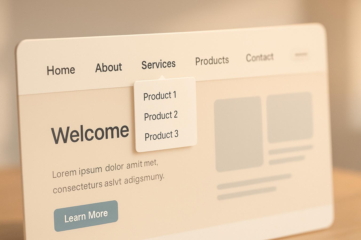
Navigation Types and Their Impact on Conversions
The type of navigation your site uses can directly influence how well it converts visitors into customers. Different navigation styles cater to different website types and user behaviors. By understanding how each option affects engagement, you can choose the best setup for your needs.
Primary Navigation: Horizontal vs. Vertical Menus
Horizontal menus are the go-to choice for most websites. Positioned at the top of the page, they feel natural and intuitive, making it easy for users to find what they need. These menus work best for sites with up to seven main categories – perfect for keeping things simple and organized.
E-commerce websites often rely on horizontal menus to display broad categories. Dropdowns within these menus allow for detailed subcategories without cluttering the main navigation. This approach not only keeps things tidy but also maximizes the page’s content area. By running across the top, horizontal menus leave more room for key elements like product displays, blog posts, or conversion-focused landing pages.
Vertical menus, on the other hand, are usually placed on the left side of the page and shine on content-heavy sites. They can handle a large number of items without making the layout feel cramped, making them ideal for software companies or B2B platforms that need to showcase extensive product features, resources, or support options.
A big advantage of vertical menus is that they often stay visible as users scroll, giving constant access to navigation options. This can reduce bounce rates and encourage users to explore more. However, vertical menus do take up screen width, which might not work as well for image-heavy sites or mobile users. Balancing navigation accessibility with content space is key.
While primary navigation sets the foundation, secondary navigation fine-tunes the user experience.
Secondary Navigation: Breadcrumbs and Submenus
Secondary navigation elements like breadcrumbs and submenus help users dive deeper into your site without getting lost.
Breadcrumbs are especially useful for e-commerce sites. They show users their exact location within a site’s structure – like “Home > Men’s Clothing > Shirts > Casual Shirts” – and allow them to backtrack easily without starting over. This flexibility keeps users engaged and reduces frustration, increasing the likelihood of continued browsing or purchasing.
Breadcrumbs also have SEO perks. They create a clear internal linking structure that search engines can follow, helping to define your site’s hierarchy. Plus, breadcrumbs can appear in search engine results, giving users more context before they even click through to your site.
Submenus are another way to organize detailed content without overwhelming the main navigation. Dropdown menus work well for desktop users but need extra attention for mobile devices, where touch interactions replace hover states. Mega menus, which display multiple columns of links, images, or promotions, take submenus to the next level. Retailers like Best Buy use mega menus to highlight product categories, featured items, and special deals, exposing users to more options and boosting conversions.
The key to effective submenus is speed and responsiveness. If they’re slow or glitchy, they can frustrate users and derail their journey.
Advanced Navigation Options
For more complex needs, advanced navigation styles can enhance user engagement and guide visitors toward conversion.
Sticky navigation keeps menus visible as users scroll, ensuring they always have access to important options like calls-to-action (CTAs). However, sticky menus can reduce screen space on mobile devices, so it’s important to weigh content priorities before implementing them.
Faceted navigation is essential for large product catalogs or content-heavy sites. It allows users to filter and refine their search using multiple criteria, like price, brand, or size. Retailers often use this system to help customers find exactly what they’re looking for. But be cautious – too many filters can overwhelm users. Focus on the most relevant options and present them in a clear, logical order.
Pagination and infinite scroll each have their strengths. Pagination divides content into manageable chunks, giving users a sense of progress and control. It also loads faster, which can be crucial for keeping users engaged. Infinite scroll, on the other hand, creates a seamless browsing experience that works well for platforms like social media. However, it can make it harder for users to return to something they viewed earlier, so it’s not ideal for every site.
| Navigation Type | Best For | Conversion Impact | Mobile Considerations |
|---|---|---|---|
| Horizontal Menu | Simple site structures, broad categories | Familiarity builds trust | Requires a hamburger menu for adaptation |
| Vertical Menu | Complex sites, many navigation items | Constant visibility encourages exploration | Reduces screen width on smaller devices |
| Sticky Navigation | Long content pages, constant CTA access | Keeps users on conversion paths | Can feel cramped on mobile screens |
| Faceted Navigation | Large catalogs, detailed filtering | Helps users find specific items | Needs a simplified interface for mobile |
Choosing the right navigation type depends on your website’s goals and audience. A small service business might do well with a straightforward horizontal menu, while a large e-commerce site may need advanced filtering and organization. Testing different approaches with real users is the best way to find what drives the most conversions for your site.
sbb-itb-6e49fcd
Testing and Improving Navigation for Better Conversions
After deciding on your navigation structure, the real challenge begins: testing and refining it to boost conversions. The secret? Let data guide your decisions instead of guessing what users might want. Below, we’ll explore practical ways to test and improve navigation for better results.
A/B and Multivariate Testing for Navigation
Testing navigation elements can reveal valuable insights into user behavior. Even small tweaks – like renaming a menu item or changing button placement – can significantly influence how users interact with your site.
Menu labels and navigation order are often game-changers. Avoid internal jargon and use labels that align with how your customers think about your offerings. For example, instead of “Solutions”, try more descriptive terms like “Products” or “Services.” Similarly, rearranging menu items can impact user actions. Since users often scan menus from left to right, placing high-priority pages (like pricing, demos, or contact info) earlier can lead to better engagement. Experiment with different sequences to see what works best.
Buttons and calls-to-action (CTAs) in the navigation bar also deserve attention. The wording, size, and color of buttons can all affect conversion rates. For instance, test “Start Free” versus “Free Trial”, or try switching button colors from blue to orange. These seemingly minor changes can reveal what resonates most with your audience.
Dropdown menus are another area to optimize. Test how many options you include, how content is categorized, and whether a mega menu outperforms a simple dropdown. Interestingly, reducing the number of dropdown options can sometimes boost engagement by preventing users from feeling overwhelmed.
For the best results, focus on one element at a time during testing. While it’s tempting to make multiple changes simultaneously, isolating variables ensures you know exactly what’s driving improvements. Once you’ve mastered these techniques, you can take it a step further with AI-powered tools.
Using AI Tools for Navigation Improvement
AI tools can simplify and supercharge your navigation testing efforts. Platforms like PageTest.AI make it easy to experiment with navigation elements, even if you lack technical expertise.
With its Chrome extension, you can select any navigation element and instantly create tests. The tool generates AI-powered variations based on best practices for conversions. Want to test different CTA text, menu labels, or layouts? You can launch experiments without writing a single line of code.
Performance tracking goes beyond basic click-through rates. PageTest.AI monitors metrics like time on page, scroll depth, and user behavior patterns. This gives you a detailed view of how navigation changes impact the user experience – not just what users click, but how they interact with your site as a whole.
The platform integrates seamlessly with website builders like WordPress, Wix, and Shopify, making it accessible to businesses of all sizes. With pricing starting at $10 per month for 10,000 test impressions, it’s a budget-friendly option for optimizing navigation. Once your tests are live, focus on measuring their impact on conversions.
Measuring Success with Conversion Metrics
After making navigation improvements, it’s essential to track their effectiveness with precise metrics.
- Click-through rates (CTR): This metric shows which menu items and CTAs attract the most clicks. If your pricing page link has a low CTR, consider repositioning it or revising the copy to make it more compelling.
- Bounce rates: High bounce rates often signal poor navigation. If users can’t easily find what they’re looking for, they’re likely to leave. Analyze bounce rates across different traffic sources to identify problem areas.
- Conversion funnel analysis: Navigation changes may increase clicks to product pages but could also lead to fewer purchases if the traffic isn’t well-targeted. Track the entire customer journey to ensure improvements lead to meaningful outcomes.
- Heatmaps and session recordings: These tools provide a visual and qualitative understanding of user behavior. You can identify pain points, like menu items that users frequently click but don’t lead anywhere, or dropdowns that confuse them.
- Session duration and pages per session: Longer sessions and more page visits often indicate that navigation improvements are helping users explore your site more effectively. This is especially important for complex products or services that require more research.
Finally, set up conversion tracking to connect navigation interactions to actual business results. For example, track how many users who click on the “Products” menu ultimately make a purchase.
Navigation testing isn’t a one-and-done process. User preferences evolve, and what works today might not work six months from now. Regularly revisit your navigation strategy, test new ideas, and adapt based on fresh data to keep your site performing at its best.
Navigation Design Best Practices
Creating effective website navigation hinges on design principles that make it easier for users to find what they need while improving conversion rates.
Keep Top-Level Links Minimal
Simplifying your main navigation can significantly reduce mental effort for users, making it easier for them to locate essential sections quickly. Overloading the navigation with too many links often leads to confusion and higher bounce rates. By focusing on fewer top-level links, you not only create a cleaner user experience but also concentrate authority on your homepage, which can improve rankings for interior pages. This streamlined method also lays the groundwork for strategic link placement and well-thought-out anchor text in your navigation.
Conclusion: Key Points for Navigation That Converts
Navigation isn’t just about helping users find their way – it’s a key player in driving conversions. A clear and consistent design across every page and device helps establish the trust users need to take action. But this consistency goes beyond visuals; it’s also about creating a logical flow of information that aligns with what users expect.
Keeping navigation simple is essential. A straightforward structure reduces decision fatigue and avoids overwhelming visitors – both of which can lead to higher bounce rates. For more detailed content, well-organized secondary navigation can handle the load without cluttering the main menu.
Testing with real user data transforms navigation into a tool for boosting conversions. Platforms like PageTest.AI make it easy to experiment with different navigation designs, helping you base decisions on actual user behavior rather than guesses. This approach ensures your navigation evolves in step with your audience’s needs.
The best navigation systems are always evolving. By regularly analyzing user behavior, conversion metrics, and testing outcomes, you can fine-tune elements like clarity, placement, or labeling to improve performance. Treating navigation as a dynamic, adaptable system ensures it remains a powerful driver of conversions – not just a functional tool for getting around your site.
FAQs
How can I make my website navigation work well on mobile devices without compromising desktop functionality?
To make sure your website navigation works smoothly on both mobile and desktop devices, rely on responsive design. This means using flexible layouts and media queries to automatically adjust your navigation menus based on screen size. For mobile users, compact options like hamburger menus or slide-in sidebars are great choices. Meanwhile, for desktop users, keep navigation menus fully visible and easy to use.
Prioritize simplicity by using clear, straightforward labels and designing touch-friendly buttons for mobile users. For desktop, focus on creating a logical, well-organized structure that feels intuitive. The goal is consistency – your navigation should deliver a seamless experience across all devices, encouraging engagement and improving conversion rates.
How can I test and improve my website’s navigation to boost conversions?
To make your website easier to navigate and boost conversions, begin by experimenting with various navigation designs, labels, and layouts through A/B testing. This approach helps pinpoint the options that users find most intuitive and effective. Pair this with usability testing to get firsthand feedback from real users about their experience with your navigation.
Dive into important engagement metrics like click-through rates and the amount of time users spend interacting with navigation elements. These numbers can highlight problem areas and guide you in fine-tuning your navigation. The goal? To steer users more effectively and encourage actions that lead to better conversion rates.
Why is consistent navigation design important across pages and devices?
Consistency in navigation design plays a key role in creating a smooth and user-friendly experience, making it simpler for visitors to move through your website. When your layout is familiar and predictable, users can quickly locate what they’re looking for, which reduces frustration and builds trust. This consistency is especially critical for accessibility, as it enhances usability for everyone, including individuals with visual impairments.
Keeping navigation uniform across all pages and devices ensures a cohesive experience. This approach not only keeps users engaged but also increases the likelihood of them interacting with your content and completing actions. When people feel confident navigating your site, they’re more inclined to stick around and take the steps you want them to.
Related Blog Posts
say hello to easy Content Testing
try PageTest.AI tool for free
Start making the most of your websites traffic and optimize your content and CTAs.
Related Posts

30-03-2026
 Ian Naylor
How Internal Links Boost Conversions
Strategic internal links guide users, improve SEO, and turn site navigation into measurable conversion growth.

28-03-2026
Ian Naylor
Core Web Vitals Benchmarks by Industry
Industry Core Web Vitals benchmarks and practical fixes for LCP, INP, and CLS, plus mobile vs desktop gaps and optimization tips.
26-03-2026
Ian Naylor
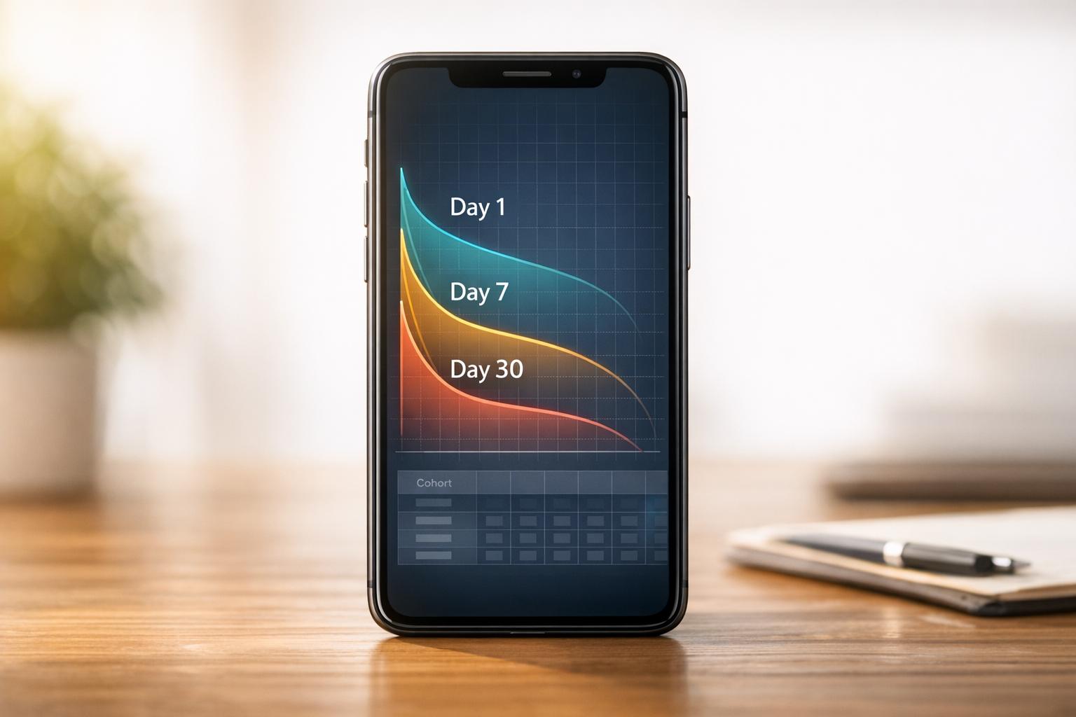
How to Benchmark Mobile Retention Rates
Benchmark Day 1/7/30 retention, run cohort analysis, and optimize onboarding, habit triggers, and personalization to improve app retention.