

How Heatmaps Improve Conversion Rates

How Heatmaps Improve Conversion Rates
![]() 12-01-2026 (Last modified: 13-01-2026)
12-01-2026 (Last modified: 13-01-2026)
Heatmaps visually show where users interact most on your site – clicks, scrolls, and hovers – making it easier to identify problem areas and opportunities for improvement. Want to know why users leave without converting? Lets learn how heatmaps improve conversion rates…
Here’s the gist:
- Conversion rates measure how many visitors complete desired actions (buying, signing up, etc.).
- Heatmaps show user behavior visually using color codes (red = high activity, blue = low).
- They reveal issues like ignored CTAs, confusing layouts, or hidden content.
- Small design changes based on heatmap insights can lead to big results, like increased revenue or reduced drop-offs.
For example:
- A construction supplier moved their mobile CTA higher, gaining $12,000 more yearly revenue.
- A shoe retailer fixed a broken filter after spotting “rage clicks” and boosted conversions by 55%.
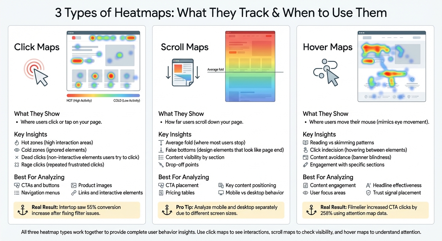
Heatmaps come in three types:
- Click Maps: Show where users click, highlighting interactive or ignored elements.
- Scroll Maps: Reveal how far users scroll, helping you position key content effectively.
- Hover Maps: Track mouse movement to understand what users focus on or avoid.
How Heatmaps Improve Conversion Rates on Landing Pages
Types of Heatmaps and How to Use Them
Three Types of Heatmaps and Their Use Cases for Conversion Optimization
Different heatmaps shed light on various user behaviors, and knowing which type to use – and when – can help you figure out exactly where your website might be losing potential customers. Let’s break down the three most common types of heatmaps, how they work, and what they can reveal about your conversion funnel.
Click Maps
Click maps show exactly where users are clicking or tapping on your page. They highlight “hot” zones – areas with high interaction – and “cold” zones that users tend to ignore. These maps are perfect for analyzing CTAs, navigation menus, product images, and links. For instance, click maps can uncover dead clicks, which happen when users click on elements they believe are interactive but aren’t.
Take this example: UX designer Conan Heiselt at Techsmith noticed users were clicking on product images instead of the text-based CTA buttons below them. By redesigning the layout to make both the image and text block clickable, the team created a more intuitive experience for users, addressing this issue directly.
Click maps also reveal rage clicks, where users repeatedly click on unresponsive elements out of frustration. A great case study comes from the digital agency Turum-burum, which analyzed click maps for shoe retailer Intertop. They discovered users were repeatedly clicking “show all” because they couldn’t find specific size filters. After redesigning the filtering feature based on these insights, Intertop saw a 55% increase in their conversion rate.
Scroll Maps
Scroll maps show how far users scroll down your page, revealing the percentage of visitors who reach each section. These maps are critical for identifying the average fold – the point where most users stop scrolling – and for spotting false bottoms, which are design elements like full-width images or sign-up forms that give the impression the page has ended.
If your pricing table or primary CTA is positioned below the point where most users stop scrolling, you may be unintentionally hiding your most important content. It’s also important to analyze mobile and desktop scroll maps separately since user behavior and screen sizes vary significantly between devices.
Hover Maps and Attention Maps
Hover maps track where users move their mouse cursor, which often mimics their eye movement. This makes them a powerful tool for understanding what content users are actually reading versus skimming. Hover maps can also reveal click indecision, where users hover between two similar elements, indicating confusion or uncertainty. For example, extended hovering over a headline or FAQ suggests users are engaged and reading carefully. On the other hand, content avoidance, where cursors deliberately steer clear of a specific area, might signal banner blindness.
“Reading movement maps is similar to reading eye-tracking heat maps. For many users, their mouse movement follows their gaze, so knowing where mouse movement occurs tells us what content users are reading or paying attention to.” – Maggie Paveza, Strategist, The Good
Attention maps go one step further by using AI to predict which design elements will grab user focus. This allows you to optimize your layout before launching high-traffic campaigns. While traditional eye-tracking studies require costly lab equipment, mouse-tracking heatmaps provide a budget-friendly alternative, delivering similar actionable insights for most websites.
Next, we’ll dive into how to set up and collect reliable heatmap data.
How to Set Up and Collect Heatmap Data
Preparing for Heatmap Implementation
Before diving into heatmap tracking, zero in on the pages that matter most for your revenue – like your homepage, landing pages, product pages, pricing tables, and checkout flows. There’s no point in analyzing pages with minimal traffic or impact on conversions.
Start by reviewing your analytics to pinpoint where users are dropping off. Tools like Google Analytics can help you spot “leaks” in your funnel – look for pages with high exit rates or low time-on-page metrics. These problem areas should be your first focus for heatmap analysis. To make the most of your efforts, define clear hypotheses beforehand. Ask questions like, “Are users noticing our main CTA?” or “Are they clicking on elements that aren’t interactive, thinking they are?”.
“If you don’t know what you’re looking for in your heatmaps, you’re basically screwed because you’re literally looking for a needle in a haystack.” – Dr. David Darmanin, CEO, Hotjar
On the technical side, ensure your website supports an asynchronous JavaScript snippet in the <head> section. This prevents the snippet from slowing down your page load speed. Also, confirm that your heatmap tool complies with GDPR, anonymizes personal data, and suppresses form fields to protect user privacy.
Installing and Configuring Heatmap Tools
Once you’ve outlined your objectives, it’s time to set up the heatmap tool. Most platforms require adding a JavaScript tracking snippet to your website’s <head> section. This snippet tracks every click, scroll, and hover, generating a comprehensive report of user interactions. After installation, double-check that the tool is correctly recognizing essential UI elements like buttons and form fields – some tools refer to this as “auto-rectangles” or element-level tracking.
To get the most out of your heatmap data, configure filters to separate desktop, tablet, and mobile users. Also, segment traffic by source to account for varying interaction patterns across devices and channels. With mobile commerce making up about 68% of global online spending, mobile-specific insights are especially important.
For dynamic elements like mobile menus or image sliders, use the screenshot feature with a countdown timer. This ensures the heatmap captures the page in its active state rather than its default view. Keep in mind that most tools require at least 50 visits to a page to generate accurate heatmap data. If you’re analyzing mobile experiences, use QR codes provided by your heatmap tool to capture screenshots directly from a mobile device, ensuring the data aligns with what users actually see.
Ensuring Reliable Data Collection
To gather reliable insights, collect data over a full week, ideally covering two business cycles. Avoid using data from atypical periods like holidays, flash sales, or site outages, as these can skew user behavior.
Cross-check your heatmap findings with other data sources to validate your insights. Combine heatmap data with session recordings, A/B test results, and traditional web analytics to confirm whether the visual patterns indicate broader issues. For instance, Australian retailer MyDeal used heatmap data to identify “rage clicks” on a credit card form field during checkout. Fixing this issue boosted their conversion rate by 2%.
Lastly, update your heatmap screenshots whenever you make changes to your website’s design or code. These steps will ensure your heatmap data remains accurate and actionable, helping you make informed decisions to enhance conversions.
Using Heatmaps to Find Conversion Opportunities
Heatmaps provide a visual way to understand user behavior, helping you optimize content placement to drive conversions.
Analyzing Click Maps for Interaction Insights
Click maps show exactly where users interact with your site and where they face obstacles. They can reveal unexpected behaviors that challenge your assumptions.
Start by pinpointing the top three most-clicked elements on your high-value pages. If these clicks aren’t guiding users toward a conversion goal, they might be distractions pulling attention away from what’s important. Pay close attention to “rage clicks” – clusters of repeated clicks on an unresponsive element. These often signal user frustration. Similarly, “dead clicks” – clicks on non-interactive elements like images or plain text – indicate users are expecting functionality that isn’t there.
A great example comes from the e-commerce brand Original Grain. Using click map data tied to revenue, they identified the highest-performing areas on their site. By reorganizing their products based on revenue-per-session insights, they achieved a 17% boost in Revenue per Session.
“If visitors aren’t interacting with critical areas – like a checkout button or lead magnet – a heatmap lets you know where those lost conversions are going.” – Crazy Egg
Device-specific analysis is also key. Compare mobile taps to desktop clicks to spot issues like buttons that are too small for mobile users to tap easily. You can also segment click maps by traffic source to see how paid visitors interact differently from organic ones.
Once you’ve analyzed clicks, scroll maps can help you figure out whether your key content is visible or buried too far down the page.
Evaluating Scroll Maps for Content Placement
Scroll maps highlight where users lose interest and leave the page, helping you determine if important content is placed effectively. The “average fold” – what users see without scrolling – is prime real estate for your value propositions and CTAs.
Look for “false bottoms”, where design elements trick users into thinking the page has ended. If a scroll map shows a sharp drop-off in a specific section, redesign it to signal that more content lies below. Ryan Velez from NP Digital shared how his team used scroll maps to make user experience adjustments that kept key conversion elements visible:
“Reading how far our readers scroll on an average blog helped us decide to make UX changes to make it easier to skip to a certain section”
Cross-device analysis is crucial here too. Content that’s prominent on desktop might be buried far below the fold on mobile, where screen space is limited. If users are scrolling deep into the page, they might be highly engaged – or they could be struggling to find information that should’ve been placed higher. On the flip side, shallow scrolling suggests the content isn’t relevant or the page design doesn’t encourage scrolling.
| Scroll Map Pattern | What It Looks Like | What It Means |
|---|---|---|
| False Bottom | High drop-off above the halfway mark | Users think the page ends due to design cues like sign-up boxes or color changes |
| Halted Pattern | Drop-off just above the fold | Users clicked a link, bounced, or encountered a false bottom |
| Deep Scroll | Warm colors extending far down the page | Users are engaged or searching for missing info |
| Shallow Scroll | Rapid shift to cold colors | Content feels irrelevant, too lengthy, or the page doesn’t invite scrolling |
Once you’ve addressed click and scroll patterns, hover and attention maps can provide even deeper insights into user engagement.
Using Hover and Attention Maps
Hover maps track mouse movement, which often mirrors where users are visually focused. These maps can show whether users are reading carefully (horizontal movement over text) or skimming for specific details (vertical movement).
When users hover without clicking, it could mean they’re uncertain or need more information. If a section shows high hover activity but low clicks, consider adding trust signals like badges, FAQs, or clearer messaging to build confidence. On the other hand, areas with little hover activity might need stronger headlines, better visuals, or repositioning to draw attention. Attention maps can also highlight distractions – like decorative images or GIFs – that pull focus away from primary CTAs.
Watch for “banner blindness”, where users deliberately avoid certain areas with their mouse, often perceiving them as irrelevant or ad-like. For example, Filmelier made changes based on attention map data and increased CTA button clicks by 258%, while Humana optimized visuals and achieved a 433% jump in banner click-through rates. If your key elements – like headlines and CTAs – are in “cold” zones, consider moving them higher or making them visually stand out to capture attention where it matters most.
sbb-itb-6e49fcd
Turning Heatmap Insights into Website Changes
Heatmaps reveal how users interact with your website, but the real challenge lies in turning those observations into meaningful improvements. To make the most of this data, you need a clear strategy that prioritizes changes, validates their effectiveness, and measures their impact on conversions.
Prioritizing and Implementing Changes
Not every insight from a heatmap demands immediate action. Using the ICE framework – Impact, Confidence, and Ease – can help you rank potential updates and focus on the ones with the biggest payoff first. This ensures you’re not wasting time on minor tweaks when there are bigger opportunities to improve.
Start by addressing key pages like your homepage, landing pages, and checkout flows. These are the areas where even small adjustments can lead to noticeable revenue gains. For instance, if click maps highlight rage clicks on a broken checkout button, fixing that issue should be a top priority. Similarly, if scroll maps reveal that 40% of visitors never see your primary call-to-action (CTA), moving it above the fold becomes an immediate must-do.
Real-life examples show how impactful this approach can be. Galeton, for instance, used heatmap data to optimize their navigation bar by removing unused tabs and repositioning high-engagement elements. The result? A 14% boost in sitewide conversions. Similarly, Muc-Off discovered that users weren’t scrolling far enough to view product images. By moving visuals higher up the page, they increased purchases by an impressive 106%.
When tackling friction points, be systematic. Fix broken elements that users repeatedly click on (rage clicks), eliminate non-interactive areas that confuse visitors (dead clicks), and reorganize navigation to prioritize links that actually get clicks.
“A heatmap is like an x-ray of your website… By incorporating a regular feedback loop to identify user behavior, you gain actionable insights to design content in a more intuitive way that removes friction and drives performance.” – Heatmap.com
To dig deeper, segment your analysis by device type, traffic source, and visitor behavior (new vs. returning). For example, mobile users might struggle with buttons that desktop users find easy to click, or paid traffic might interact differently than organic visitors. These insights help you uncover hidden friction points that average data might overlook.
Once you’ve prioritized changes, the next step is to test their effectiveness.
Validating Changes with A/B Testing
Heatmaps provide valuable clues, but they don’t tell the full story. That’s where A/B testing comes in. Testing confirms whether your proposed changes actually improve conversions or just shift user behavior in unhelpful ways.
Start with a clear hypothesis. For example: “Because scroll maps show that 40% of users drop off before seeing our CTA, we believe moving the button above the fold will increase click-through rates by 15%, as measured by button clicks per session.” Then, run your test and aim for a 95% confidence level to ensure reliable results.
This method has proven effective for companies like U-Digital, which used heatmaps to pinpoint friction on a client’s mobile product page. After implementing changes and validating them through A/B testing, they achieved a 21.46% increase in click-through rates. The combination of qualitative heatmap insights with quantitative test results was key.
“Heatmaps enable you to go a layer deeper and look for the possible causes… By incorporating this type of qualitative analysis into your review process, you can bridge the gap between what the results say vs. what visitors actually do.” – Ashley Bhalerao, Associate Manager of Content, VWO
For the most robust results, combine heatmap data with metrics from tools like Google Analytics, session recordings, and user surveys. This approach helps you understand both what users are doing and why they’re doing it, giving you a more complete picture of their behavior.
Using PageTest.AI to Streamline Optimizations

Once you’ve validated your insights, tools like PageTest.AI can simplify the implementation process. This platform uses AI to generate content variations based on heatmap findings, allowing you to quickly test changes – whether it’s repositioning a CTA to a high-engagement area or redesigning elements that users find confusing.
The no-code interface means you can make updates instantly, without waiting on developers. Simply use the Chrome extension to select an element, and PageTest.AI will create multiple variations for testing. This is especially useful when heatmaps reveal issues like CTAs in low-engagement zones or navigation tabs that go unused.
PageTest.AI also tracks key metrics like engagement, scroll depth, and revenue (in USD), helping you prioritize updates based on their financial impact rather than just traffic or click data. For example, if heatmap data highlights two potential changes, the platform can show you which one delivers the highest return on investment.
The tool supports up to 100 tests across 100 pages on its Enterprise plan ($50/month) and offers unlimited testing on the Agency plan ($200/month), making it a scalable option for businesses of various sizes.
Measuring Success and Maintaining Continuous Improvement
Making heatmap-driven changes is just the beginning; proving their effectiveness is crucial. Start by documenting your baseline metrics and comparing them to results after implementation to confirm their impact.
Tracking Before-and-After Metrics
Begin with a clear baseline. Record metrics like your current conversion rate, revenue per session (in USD), average order value (AOV in USD), and lead volume. Don’t forget secondary metrics like click-through rate (CTR), scroll depth, and average session duration to assess changes in user engagement.
Pay attention to friction indicators, such as rage clicks or dead clicks, to validate improvements. For instance, if you repositioned a call-to-action (CTA) button above the fold because scroll maps showed users weren’t seeing it, your updated scroll depth data should confirm increased interaction with that element.
Real-world examples illustrate the value of tracking these changes. Obvi, an e-commerce brand, repositioned their CTA button based on heatmap insights and saw a 7.8% increase in revenue per session, generating an additional $2.5 million in just one month. Similarly, The Cooking Guild reorganized product placement on their collection pages, resulting in a 48% increase in revenue per session and a 40x return on investment within 30 days.
To ensure accurate results, compare metrics over similar timeframes and traffic volumes. Conduct your analysis for at least one week or two full business cycles to avoid skewed data from holidays or unusual events. Strive for a 95% statistical confidence level before concluding that a change is successful.
Once you’ve established clear metrics, schedule regular reviews to keep performance on track.
Establishing a Review Schedule
User behavior changes over time, so it’s essential to review heatmap data and conversion metrics regularly.
For high-priority pages – like your homepage, landing pages, or checkout flows – review heatmaps at least weekly. This frequent monitoring helps you quickly identify and address issues, such as unexpected behavior from new traffic sources or unintended impacts from site updates.
A good example comes from Vimcar, a fleet management company. By consistently monitoring heatmaps across all pages, they achieved a 2.5x increase in traffic to high-value pages and a 24% boost in total leads.
Set a consistent schedule: weekly check-ins for heatmaps, bi-weekly test launches, monthly analytics reviews, and quarterly strategic planning. This rhythm ensures optimization becomes an ongoing effort rather than a one-off task.
“Without Hotjar we would still be making decisions based on gut instinct instead of qualitative user feedback.” – Karl Rowlands, UX Manager, Matalan
For time-sensitive campaigns, consider monitoring data in real time. This allows you to identify successful variations within a week, enabling quicker iterations when speed is critical.
Building a Testing Roadmap
Once you’ve measured the initial impact of changes, consolidate your findings into a structured testing roadmap.
Document every hypothesis, change, and outcome to build a repository of knowledge. This approach not only avoids repeating unsuccessful experiments but also helps you spot patterns across multiple tests.
Use a structured format for hypotheses, such as:
“Because scroll maps show that 40% of users drop off before seeing our CTA, we believe moving the button above the fold will increase click-through rates by 15%, measured by button clicks per session.”
Prioritize your hypotheses using the ICE framework (Impact, Confidence, Ease). Track both macro conversions (like purchases or subscriptions) and micro conversions (like add-to-cart actions or email signups) to fully understand the effects of your optimizations.
A great example of this process is TomTom. By combining on-site surveys with heatmap data, they refined their landing pages and documented a 491% increase in email click-through rates and a 49% boost in landing page conversions.
Tools like PageTest.AI can simplify this process. It automatically tracks key metrics – such as engagement, scroll depth, and revenue – for each test. With built-in reporting, it’s easy to compare variations and identify which changes deliver the best results, helping you create a data-driven roadmap for future improvements.
Conclusion
So… How Heatmaps Improve Conversion Rates… Heatmaps translate user behavior into visual insights, highlighting how visitors interact with your site. They reveal critical details like click patterns, scrolling depth, and frustration points (such as repeated “rage clicks”). This data provides a clear path for refining your website’s performance.
By leveraging these insights, you can tackle specific friction points. For instance, if you notice a 40% drop-off before your call-to-action, you can redesign that section to keep users engaged. Once changes are made, A/B testing can confirm whether these adjustments improve conversions.
“Heatmap data enables you to align your website’s design and functionality with users’ preferences and behaviors, thus maximizing your performance on key digital objectives.” – Tim Rotolo, Co-founder, Trymata
This is where tools like PageTest.AI come into play. While heatmaps indicate where improvements are needed, PageTest.AI helps you act on those insights efficiently. Its AI-powered platform monitors engagement, scroll activity, and revenue, enabling you to quickly transition from identifying issues to optimizing your site for better results.
FAQs – How Heatmaps Improve Conversion Rates
How can I choose the best heatmap to improve my website’s conversion rates?
To pick the right heatmap for your needs, start by pinpointing your specific goal. Want to know which buttons, links, or images grab the most attention? A click map is your best bet. Trying to figure out how far visitors scroll and where they lose interest? A scroll map can provide those answers. For insights into how users interact with your content, movement maps track cursor activity, often revealing where their eyes are drawn.
Looking for even deeper insights? Eye-tracking heatmaps show exactly where users focus their attention, which can be a game-changer for refining your page layout. And if you suspect usability issues, rage-click maps can identify areas of frustration, like when users repeatedly click on non-clickable elements.
Tools like PageTest.AI simplify the process of creating these heatmaps – no coding required. This means you can easily match the right heatmap to your goals and fine-tune your website for better results.
What are rage clicks, and how do they impact my website’s conversions?
Rage clicks occur when a user repeatedly clicks on the same element or even a non-clickable area out of sheer frustration. This usually happens when something on the site isn’t functioning as it should. These clicks are a strong indicator of user dissatisfaction, often leading visitors to abandon your site entirely.
When these clicks happen on critical elements – like an Add to Cart button, a sign-up form, or a checkout link – the impact can be especially damaging. Every frustrated click could mean a lost customer, driving up bounce rates and cutting into your revenue. By using heatmaps to pinpoint clusters of rage clicks, you can identify issues such as broken buttons, unclear labels, or pages that take too long to load. Addressing these problem areas can help smooth out the user experience and boost your site’s overall performance.
AI-driven tools like PageTest.AI are particularly useful for spotting and analyzing rage-click patterns. They can guide you in prioritizing fixes that directly improve conversion rates and keep users engaged.
How can I use heatmaps to make smarter website improvements?
Heatmaps are a powerful way to understand how visitors interact with your site. They visually map out where users click, scroll, and spend their time, helping you pinpoint areas that could use some improvement. For starters, dive into click maps to see which elements catch attention but fail to drive conversions. Then, check out scroll maps to ensure critical content – like product details or CTA buttons – is placed in the most active zones of the page.
Pay close attention to areas where user actions coincide with high drop-off rates. These spots should be your top priority for adjustments. If you notice sections with minimal interaction, think about removing or relocating them to make room for content that delivers more value. Once you’ve identified problem areas, come up with testable ideas, such as “Moving the CTA button to the top-center might boost clicks by 10%.” Tools like PageTest.AI can help you quickly test these changes without needing to touch any code. Use the data to prioritize fixes and keep refining until you see the results you’re aiming for.
Related Blog Posts
say hello to easy Content Testing
try PageTest.AI tool for free
Start making the most of your websites traffic and optimize your content and CTAs.
Related Posts

![]() 30-03-2026
30-03-2026
 Ian Naylor
How Internal Links Boost Conversions
Strategic internal links guide users, improve SEO, and turn site navigation into measurable conversion growth.

![]() 28-03-2026
28-03-2026
Ian Naylor
Core Web Vitals Benchmarks by Industry
Industry Core Web Vitals benchmarks and practical fixes for LCP, INP, and CLS, plus mobile vs desktop gaps and optimization tips.
![]() 26-03-2026
26-03-2026
Ian Naylor
How to Benchmark Mobile Retention Rates
Benchmark Day 1/7/30 retention, run cohort analysis, and optimize onboarding, habit triggers, and personalization to improve app retention.