
Cumulative Layout Shift: Debugging Guide
Cumulative Layout Shift: Debugging Guide
 05-03-2026 (Last modified: 06-03-2026)
Unexpected layout shifts can frustrate users, reduce trust, and harm conversions. Cumulative Layout Shift (CLS) measures how often and how much visible content moves unexpectedly during page load. A good CLS score is 0.1 or less, while anything above 0.25 is considered poor. CLS is also a key Google ranking factor, directly impacting SEO and user experience.
Key Causes of CLS:
- Images/Videos Without Dimensions: Missing width and height attributes cause layout adjustments as media loads.
- Ads and Third-Party Embeds: Late-loading content pushes elements around without reserved space.
- Dynamic Content: Injected elements or font changes can disrupt layout stability.
- Animations Using Layout Properties: Animating
top,left, orheightinstead oftransformcan trigger shifts.
How to Fix CLS:
- Set Explicit Dimensions for Media: Add
widthandheightattributes to images/videos and use CSS for responsiveness. - Reserve Space for Ads/Embeds: Define
min-heightor use theaspect-ratioproperty to allocate space. - Optimize Font Loading: Use
font-display: optionaland preload critical fonts. - Stabilize Dynamic Content: Predefine container sizes for injected elements and avoid collapsing reserved spaces.
Tools for Debugging:
- Chrome DevTools: Use the Performance panel to track layout shifts in real-time.
- PageSpeed Insights & Lighthouse: Analyze CLS scores and identify problematic elements.
- PerformanceObserver API: Monitor layout shifts in production environments with JavaScript.
Improving CLS enhances user experience, reduces accidental clicks, and ensures better SEO performance. Focus on defining dimensions, reserving space, and optimizing font and content loading for stable and reliable layouts.
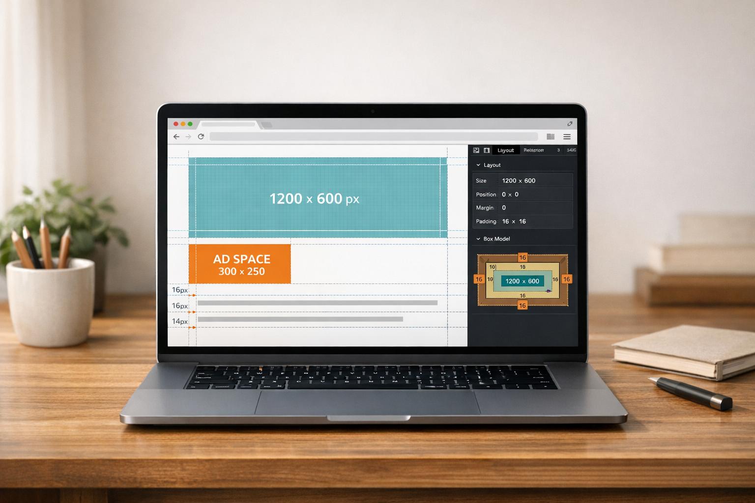
Diagnose CLS issues by pausing page loading in Chrome
Common Causes of Layout Shifts
CLS (Cumulative Layout Shift) problems usually stem from a few key issues. These unexpected shifts can disrupt the user experience and hurt your Lighthouse Performance Score, where CLS accounts for 25% of the total. Let’s break down the main culprits.
Images and Videos Without Defined Dimensions
When images or videos lack specific width and height attributes, browsers initially allocate a 0x0 pixel area. As the media loads, it forces the layout to adjust, causing a noticeable shift. This is why properly sizing your media elements is so important.
Now, think about how ads and third-party embeds can add even more instability to your layout.
Ads and Third-Party Embeds
Ads and embeds often load asynchronously, meaning they appear after the rest of the page has already rendered. If you don’t reserve enough space for the largest possible size, these late-loading elements can push other content around.
Take embeds like YouTube videos, Google Maps, or social media widgets – they often don’t define their size upfront. This means browsers can’t preallocate space, leading to layout instability. To make matters worse, third-party content can behave differently during production compared to development, where faster local API calls might hide these shifts.
“Unexpected movement of page content usually happens when resources load asynchronously or DOM elements are dynamically added to the page before existing content.” – Milica Mihajlija and Philip Walton, web.dev
Scripts that insert banners, cookie notices, or promotional messages at the top of a page can also create layout shifts, making it crucial to manage dynamic content carefully.
Dynamic Content and Font Loading
Dynamic elements – like banners or “load more” buttons – can cause layout shifts if their heights aren’t defined in advance. As these elements are injected into the page, they force other content to move.
Web fonts are another common source of trouble. When a custom font loads, it might differ in size from the fallback font, causing either a Flash of Unstyled Text (FOUT) or a Flash of Invisible Text (FOIT). When the custom font finally renders, text blocks may resize, pushing nearby elements out of place.
Animations can also contribute. If you animate properties like top, left, width, or height, you trigger re-layout and repaint cycles, which add to your CLS. Instead, using CSS transforms can help avoid these disruptions and keep animations smooth. Otherwise, what should feel seamless can quickly become jarring for users.
How to Measure and Debug CLS
To effectively address Cumulative Layout Shift (CLS) issues, you’ll need a combination of tools and methods. Browser tools, online audits, and real-time monitoring each offer unique insights into layout shifts. Using them together provides a full understanding of the problem and helps pinpoint specific issues.
Using Chrome DevTools
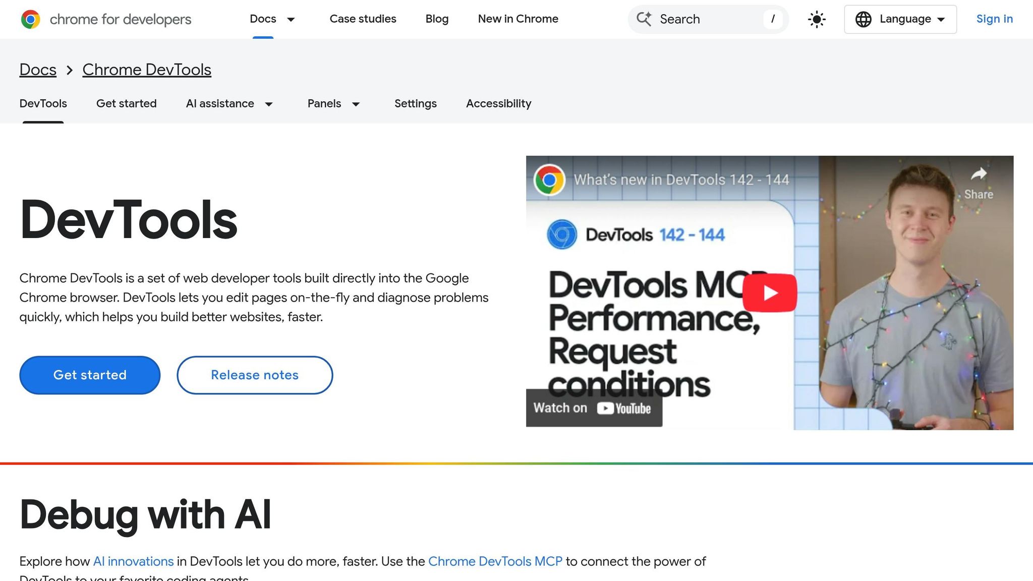
Chrome DevTools gives you a hands-on way to catch layout shifts as they occur. Open the Performance panel, where you’ll find a “real-time metrics” view that displays live CLS scores as you interact with the page. This immediate feedback helps identify when shifts happen.
To dig deeper, start recording a performance profile by hitting the record button, then reload or navigate through the page. Once you stop recording, look for the Layout Shifts track in the timeline. Purple bars and diamonds mark layout shifts, making them easy to spot. Clicking on these markers reveals details about the elements that moved, their coordinates, and their contribution to the CLS score. If you see a cluster of purple markers, it indicates multiple shifts happening in quick succession, which likely adds to a higher cumulative score.
For more detailed analysis, move on to tools like PageSpeed Insights and Lighthouse.
PageSpeed Insights and Lighthouse
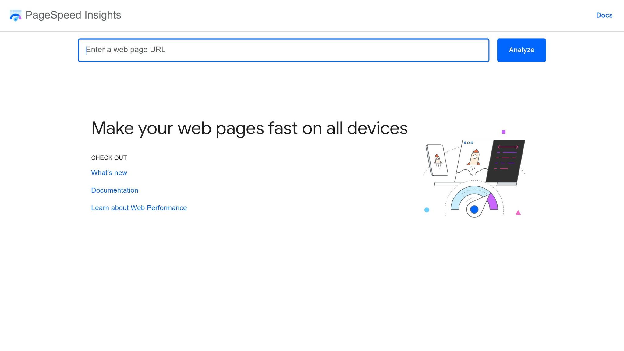
PageSpeed Insights (PSI) provides two important datasets: Field Data and Lab Data. Field Data is collected from real users over 28 days via the Chrome User Experience Report, while Lab Data is generated from a controlled Lighthouse simulation. PSI reports the 75th percentile score, which reflects the experience of most users.
Here’s how PSI categorizes CLS performance:
| CLS Category | Score Threshold | Color Code |
|---|---|---|
| Good | ≤ 0.1 | Green |
| Needs Improvement | 0.11 – 0.25 | Amber |
| Poor | > 0.25 | Red |
Lighthouse audits, such as “Avoid large layout shifts”, identify specific elements causing layout shifts and their individual impact on the CLS score. Another audit, “Image elements do not have explicit width and height”, flags a common cause of CLS. If Field CLS is much higher than Lab CLS, it suggests layout shifts are occurring after the initial load – possibly during scrolling, lazy-loading, or the appearance of dynamic content. Use the visual filmstrip feature to see exactly when and where these shifts occur during page loading.
For monitoring shifts in real-time production environments, dive into Programmatic Debugging with PerformanceObserver.
Programmatic Debugging with PerformanceObserver
The PerformanceObserver API is ideal for real-time CLS monitoring in production. It works with the Layout Instability API, supported in Chromium-based browsers, to capture detailed data about layout shifts as they happen.
Here’s a sample script to track CLS:
let clsValue = 0; const observer = new PerformanceObserver((entryList) => { for (const entry of entryList.getEntries()) { if (!entry.hadRecentInput) { clsValue += entry.value; console.log('New Layout Shift:', entry); console.log('Current Cumulative CLS:', clsValue); } } }); observer.observe({type: 'layout-shift', buffered: true}); The buffered: true option ensures you capture shifts that occurred before the script initialized, including those during the early page load. By checking if (!entry.hadRecentInput), you can exclude shifts caused by user interactions. The sources array in each entry reveals which DOM elements moved, along with their previousRect and currentRect coordinates. For debugging purposes, you can insert a debugger; statement inside the callback to pause the script when a shift is detected.
These methods and tools, used together, provide a comprehensive way to measure and debug CLS effectively.
sbb-itb-6e49fcd
How to Fix CLS Issues
Common CLS Issues: Causes and Fixes Guide
To address CLS problems effectively, you’ll need to tackle the specific causes outlined earlier. Below are targeted solutions to help reduce CLS and stabilize your page layout.
Set Explicit Dimensions for Media
Browsers need predefined dimensions to allocate space for media. By adding width and height attributes directly to your HTML tags, you can prevent layout shifts.
When you include these attributes, browsers calculate the aspect ratio automatically. Even for responsive designs, where images scale to fit various screen sizes, always specify the original dimensions in your HTML. For instance, if your image is 800 pixels wide and 600 pixels tall, your HTML should look like this:
<img src="image.jpg" width="800" height="600" alt="Description"> To ensure the image remains responsive, add CSS like this:
img { max-width: 100%; height: auto; } This approach lets the browser reserve space for the image while CSS handles scaling. For critical images, avoid lazy loading and use fetchpriority="high" to ensure space is reserved early. Studies show that adding explicit dimensions to images can significantly lower CLS scores – for example, from 0.44 to 0.21.
For <video> tags, include a poster attribute along with width and height. This provides a placeholder while the video is loading. For background images, define an aspect-ratio or min-height for the container to prevent it from collapsing during loading.
Once media dimensions are set, the next step is to stabilize ads and embeds.
Reserve Space for Ads and Embeds
Ads and third-party embeds, such as YouTube videos or social media posts, often load asynchronously, causing layout shifts when they render. To prevent this, reserve space in advance.
Use a min-height on the container element to allocate vertical space for ads or embeds. For responsive video embeds, the CSS aspect-ratio property is handy:
.video-container { aspect-ratio: 16 / 9; width: 100%; } For a standard 16:9 aspect ratio, the padding-top value is 56.25%. Additionally, always specify width and height attributes for <iframe> tags to reserve space immediately.
If an ad fails to load, avoid collapsing the reserved space – it can cause as much layout shift as the initial insertion. Instead, use placeholders or “house ads” to maintain the layout. Position late-loading content lower on the page to minimize disruptions. For example, Twitter mitigates layout shifts by loading new feed updates offscreen and offering a “Scroll to top” or “See new Tweets” button, allowing users to control when the layout changes.
Optimize Fonts and Dynamic Content
Web fonts can trigger layout shifts when fallback fonts are replaced. To avoid this, use font-display: optional. This tells the browser to use the web font only if it’s available during the initial layout. Otherwise, it sticks with the fallback font:
@font-face { font-family: 'CustomFont'; src: url('customfont.woff2') format('woff2'); font-display: optional; } Preload critical fonts using <link rel="preload" as="font" crossorigin> to fetch them alongside other render-blocking resources. For dynamic content injected via JavaScript, wrap the elements in a container with a set min-height to preserve layout during loading. When animating, use transform and opacity to avoid recalculating the layout.
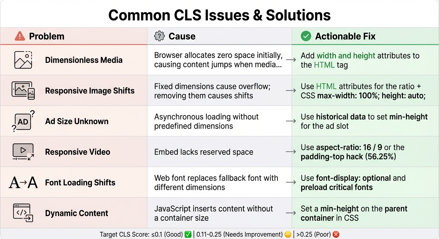
Here’s a quick summary of common CLS issues and their fixes:
| Problem | Cause | Actionable Fix |
|---|---|---|
| Dimensionless Media | Browser allocates zero space initially, causing content jumps when media loads. | Add width and height attributes to the HTML tag. |
| Responsive Image Shifts | Fixed dimensions cause overflow; removing them causes shifts. | Use HTML attributes for the ratio + CSS max-width: 100%; height: auto;. |
| Ad Size Unknown | Asynchronous loading without predefined dimensions. | Use historical data to set min-height for the ad slot. |
| Responsive Video | Embed lacks reserved space. | Use aspect-ratio: 16 / 9 or the padding-top hack (56.25%). |
| Font Loading Shifts | Web font replaces fallback font with different dimensions. | Use font-display: optional and preload critical fonts. |
| Dynamic Content | JavaScript inserts content without a container size. | Set a min-height on the parent container in CSS. |
Conclusion
CLS (Cumulative Layout Shift) plays a critical role in shaping user experience and influencing conversion rates. A score of 0.1 or less reflects good stability, while anything above 0.25 can frustrate users and negatively impact conversions. Barry Pollard, a web developer and author, highlights that poor CLS can lead to lower engagement, higher bounce rates, and decreased revenue.
To tackle layout shift issues, focus on key solutions: define explicit dimensions for media, allocate space for ads and embeds, and fine-tune font loading. While these fixes are straightforward, they demand careful implementation and thorough testing. Tools like Chrome DevTools, PerformanceObserver, and real-user data from PageSpeed Insights or PageTest.AI are essential for verifying these adjustments. The effort put into resolving CLS issues directly translates into better outcomes for users and businesses alike.
From an SEO standpoint, CLS contributes to 25% of the overall Lighthouse Performance score and is a recognized Google ranking factor. Google assesses CLS based on the 75th percentile of real-user page loads, meaning even occasional layout shifts can negatively impact your search rankings.
Improving CLS also has broader benefits. It enhances accessibility by reducing accidental clicks and supporting users with cognitive or motor challenges. When buttons or other elements shift unexpectedly, users may trigger unintended actions, eroding trust and conversion rates. This aligns with WCAG principles, reinforcing the importance of stable, user-friendly design.
FAQs
Why is my CLS worse in the field than in Lighthouse?
Cumulative Layout Shift (CLS) can often appear worse in real-world scenarios compared to lab tests. Tools like Lighthouse operate in controlled environments, using fixed devices and stable networks, and primarily measure the initial page load. On the other hand, field data reflects the experience of actual users, who encounter a wide range of devices, network conditions, and interactions. This variability often exposes layout shifts caused by dynamic content, late-loading images, or ads.
To minimize CLS, it’s important to take proactive steps, such as reserving space for images and ads in advance and fine-tuning how dynamic content loads on the page. These adjustments can help create a smoother and more stable user experience.
Which layout shifts are excluded from CLS (like user clicks or typing)?
User-initiated layout shifts, like those caused by clicking or typing, are not included in Cumulative Layout Shift (CLS) calculations. Since these shifts happen as a direct result of user actions, they don’t negatively affect the metric.
What’s the fastest way to find the exact element causing CLS?
The fastest way to find what’s causing CLS issues is by using debugging tools that help visualize layout shifts. Chrome DevTools is a great option – it includes features that highlight layout shifts, making it simpler to identify troublesome elements like images, fonts, or dynamically injected content. Another handy tool is Unlighthouse, which offers CLS debugging capabilities to quickly locate and fix these problems.
Related Blog Posts
say hello to easy Content Testing
try PageTest.AI tool for free
Start making the most of your websites traffic and optimize your content and CTAs.
Related Posts

30-03-2026
 Ian Naylor
How Internal Links Boost Conversions
Strategic internal links guide users, improve SEO, and turn site navigation into measurable conversion growth.
28-03-2026
Ian Naylor
Core Web Vitals Benchmarks by Industry
Industry Core Web Vitals benchmarks and practical fixes for LCP, INP, and CLS, plus mobile vs desktop gaps and optimization tips.
26-03-2026
Ian Naylor
How to Benchmark Mobile Retention Rates
Benchmark Day 1/7/30 retention, run cohort analysis, and optimize onboarding, habit triggers, and personalization to improve app retention.