

How Responsive Design Boosts Mobile Conversions
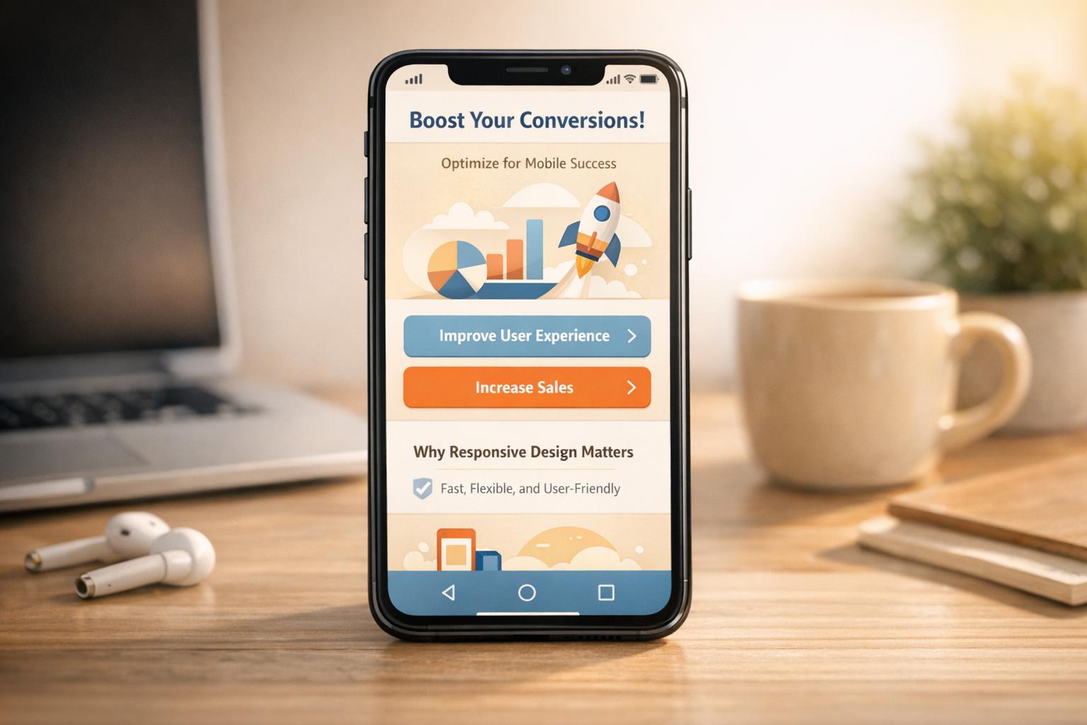
How Responsive Design Boosts Mobile Conversions
 19-01-2026 (Last modified: 22-01-2026)
Responsive design is the key to improving mobile conversions. It ensures your website works smoothly across devices by automatically adjusting layouts, text, and images for smaller screens. With mobile accounting for over 60% of web traffic, a poor mobile experience can cost you visitors and revenue. Here’s why responsive design matters:
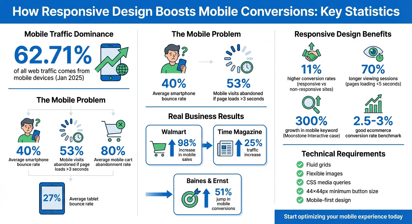
- Better User Experience: Fixes issues like tiny text, hard-to-tap buttons, and frustrating navigation. Example: Time Magazine saw a 25% traffic increase after a responsive redesign.
- Higher Conversions: Mobile-friendly layouts improve engagement and reduce bounce rates. Walmart‘s mobile sales jumped 98% after adopting responsive design.
- Improved SEO: Google prioritizes mobile-first indexing, so a responsive site can boost search rankings.
- Practical Steps: Use fluid grids, scalable images, and media queries. Optimize navigation and CTAs for touch screens.
Responsive design not only meets user expectations but also drives better business outcomes. Start with mobile-first principles, test changes, and monitor performance to keep improving.
Mobile Responsive Design Impact on Conversions: Key Statistics and Results
What Responsive Design Means for Mobile Conversions
Defining Responsive Design
Responsive Web Design (RWD) is all about making websites adaptable. It ensures your site looks and works great, no matter the screen size or orientation. This is achieved by combining flexible grids, fluid images, and CSS media queries, which work together to adjust your website’s layout and content in real time to fit any device.
Here’s how it works: fluid grids use relative measurements like percentages instead of fixed pixel values, so elements scale proportionally. Flexible images are set with a max-width: 100% property to prevent them from spilling out of their containers. Media queries apply different styles based on the device’s characteristics, like screen width. And don’t forget the viewport meta tag (<meta name="viewport" content="width=device-width, initial-scale=1.0">), which tells browsers to match the website’s width to the device’s screen.
These technical elements come together to create a seamless browsing experience, setting the stage for better mobile conversions.
How Responsive Design Affects Mobile Conversions
Responsive design isn’t just about aesthetics – it’s about making life easier for mobile users. When your site adjusts perfectly to a phone or tablet, visitors don’t have to pinch the screen to read text or struggle with tiny buttons. Instead, they get a smooth, frustration-free experience. And that’s a big deal because mobile users expect fast, intuitive interactions. By catering to touch screens and smaller displays, you can significantly improve conversions. Take Walmart, for example: after implementing a mobile-first responsive redesign, their mobile sales shot up by 98%.
“Responsive design is supposed to make a cross-device world a more seamless experience by adapting your desktop design to a smaller mobile screen.”
– Talia Wolf, Conversion Optimization Expert
But it’s not just about user experience – responsive design also plays a key role in search rankings. Google now uses mobile-first indexing, meaning it primarily evaluates the mobile version of your site when determining rankings. If your site isn’t responsive, it could hurt your search visibility, leading to fewer visitors and, ultimately, fewer conversions. Considering that mobile devices accounted for 62.71% of all web traffic as of January 2025, ensuring your site performs flawlessly on smartphones is no longer optional – it’s essential for reaching and converting your audience.
Benefits of Responsive Design for Conversions
Better User Experience on Mobile Devices
Responsive design adjusts layouts to fit any screen size, eliminating issues like pinch-to-zoom, horizontal scrolling, and distorted layouts. This makes it easier for visitors to read content and interact with buttons without fighting the interface’s quirks.
The results speak for themselves. Time Magazine, for example, saw a 25% increase in traffic and a noticeable drop in bounce rates after rolling out a mobile-responsive redesign. Readers no longer had to zoom in and out to view content comfortably. Features like touch-friendly menus and search bars make navigation smoother, while appropriately sized buttons (at least 48×48 pixels) prevent frustrating “fat-finger” mistakes.
These improvements don’t just enhance usability – they also encourage users to stick around longer.
Reduced Bounce Rates and Longer Sessions
By reducing friction, responsive design keeps visitors engaged and boosts conversions. On average, smartphone bounce rates hover around 40%, compared to 27% for tablets. Addressing these pain points motivates users to explore more of your site.
Take Baines & Ernst, a debt management company. After adopting a responsive design, they saw a 30% increase in average visit duration and a 51% jump in mobile conversions. Similarly, Offspring, a footwear retailer, experienced a 15.19% boost in mobile/tablet conversion rates and a 102.58% surge in mobile/tablet revenue in 2016 after incorporating sticky headers and predictive search into their redesign. Faster load times, easy-to-read text, and intuitive navigation contribute to more engaging user experiences. For instance, pages that load in five seconds or less can lead to 70% longer viewing sessions.
Improved Search Rankings
Responsive design doesn’t just enhance user experience – it can also improve your site’s search rankings. Since mobile-friendliness became a key ranking factor in 2021, a poor mobile experience can hurt both your visibility and conversions.
Consider this: In 2025, Moonstone Interactive worked with a client whose site had 1,200 desktop-indexed keywords but only 12 on mobile due to a non-responsive design. After implementing a mobile-friendly layout, the client saw mobile keyword visibility grow by 300% in just 60 days. Bounce rates dropped by 40%, and mobile conversions nearly doubled. Using a single URL for both desktop and mobile versions also prevents duplicate content penalties and ensures efficient use of Google’s crawl budget.
With over 90% of web traffic now coming from mobile devices and roughly 63% of Google searches happening on mobile, having a responsive design isn’t optional – it’s essential. A poor mobile experience can drive away as much as 75% of users, making mobile optimization a direct path to higher conversions.
How to Implement Responsive Design for Mobile Conversions
Start with Mobile-First Design
Designing with mobile in mind from the start ensures that your site prioritizes essential content and functionality for smaller screens before adapting to larger displays. This way, you’re not trying to cram a desktop layout onto a tiny screen, which often leads to a frustrating user experience.
This approach reflects how people actually browse the web. In 2023, the top 100 most visited websites in the U.S. saw 313% more mobile visits compared to desktop visits. As Linear Design puts it:
“When you think desktop first, you’re doing mobile wrong.”
To create a responsive layout, use relative units like percentages or viewport units and implement media queries at key breakpoints. This allows your design to shift seamlessly from a single-column mobile view to a multi-column desktop layout. Don’t forget to include the viewport meta tag to ensure proper scaling and display on mobile devices.
Simplify Navigation and CTAs for Small Screens
Mobile users don’t have the patience for complex menus or buttons that are hard to tap. A streamlined navigation system, like a hamburger menu, saves valuable screen space while keeping essential links – like “Contact” or “Search” – readily accessible. The goal is to make information easy to find without unnecessary effort.
Pay special attention to your call-to-action (CTA) buttons. Make them large enough – at least 44×44 pixels (some suggest 48×48 pixels) – and ensure there’s enough spacing to avoid accidental taps. Use bold, high-contrast colors, and place these buttons within “thumb-friendly” zones, such as the middle or bottom of the screen, where they’re easy to reach with one hand. For mobile-specific conversions, consider adding click-to-call buttons that instantly open the phone dialer.
Positioning your primary CTA above the fold is key. This ensures users see it immediately without scrolling, which can significantly boost click-through rates. Keep forms short and simple – mobile users often abandon lengthy forms. In fact, 18.6% of users drop mobile transactions due to usability issues, and the average mobile cart abandonment rate is a staggering 80%.
Once you’ve optimized navigation and CTAs, test these changes to ensure they work effectively.
Test Mobile Elements with PageTest.AI
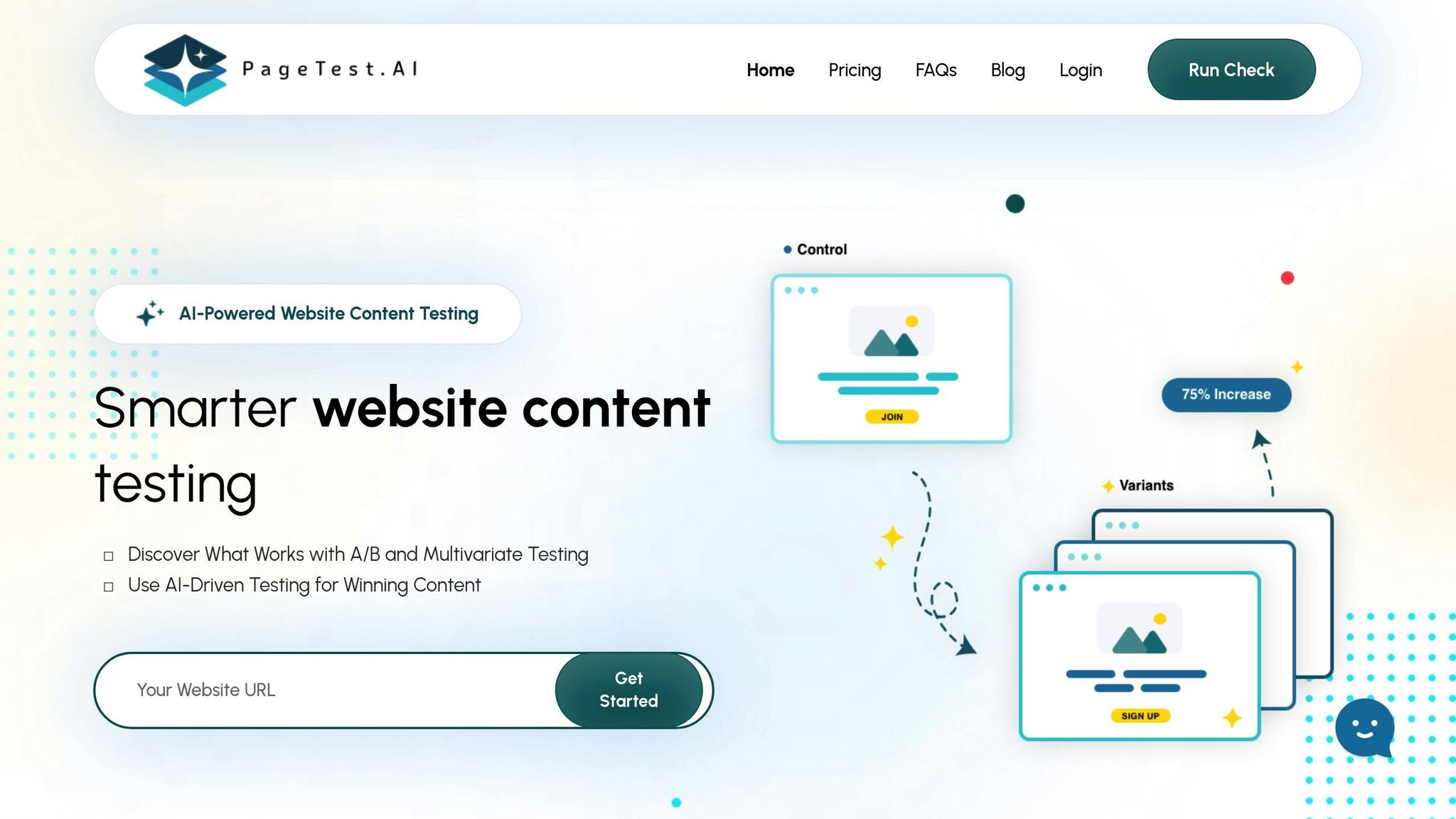
After refining your mobile design, thorough testing is essential to ensure each element contributes to conversions. A/B testing can help you determine what works best, whether it’s the placement of CTAs, button colors, or headline variations. Tools like PageTest.AI make this process easier by offering a no-code solution for testing key elements like headlines, buttons, and forms.
PageTest.AI generates AI-powered content variations and tracks performance metrics such as clicks, engagement, scroll depth, and time on page. For example, you can compare single-step forms to multi-step ones to see which reduces user friction. Or, test whether shorter paragraphs and simplified content improve user engagement on mobile. The platform integrates seamlessly with popular website builders, allowing you to test your entire mobile experience with ease.
The results speak for themselves: websites with responsive design see an average of 11% higher conversion rates compared to non-responsive sites. Testing ensures you’re making the right changes to meet the needs of your audience and boost mobile performance.
sbb-itb-6e49fcd
Tracking and Improving Mobile Conversion Performance
Metrics to Track for Mobile Performance
Once your responsive design is in place, it’s crucial to keep an eye on performance metrics to measure and improve mobile conversions. Start with your conversion rate – this is calculated by dividing the number of conversions by the total number of mobile visitors and multiplying by 100. Generally, a “good” ecommerce conversion rate across platforms ranges from 2.5% to 3%. However, there’s a 270% gap between desktop and mobile conversion rates, often due to subpar mobile experiences.
Other key metrics include your bounce rate (the percentage of visitors who leave after viewing just one page) and average session duration (how long users stay engaged). A high bounce rate or session duration under 5 seconds can signal poor mobile design or slow loading times. You should also monitor the click-through rate (CTR) to see how well your call-to-action (CTA) buttons are performing, and track the form abandonment rate to identify where users drop off during checkout or sign-up processes.
Page load speed is another critical factor. Mobile users expect pages to load almost instantly, and 53% of mobile visits are abandoned if loading takes more than 3 seconds. Google recommends mobile pages load in under 1 second. Lastly, metrics like revenue per visitor (RPV) provide insight into financial performance, while engagement metrics such as scroll depth and pages viewed per session reveal how users interact with your content.
Tools for Testing Mobile Usability
To ensure your site meets mobile usability standards, leverage tools like the Google Mobile-Friendly Test. This is especially important since Google primarily uses the mobile version of your site for indexing and ranking. For analyzing speed issues, tools such as Google PageSpeed Insights and WebPageTest can help you identify and resolve slow load times.
For deeper insights into user behavior, tools like Google Analytics, Microsoft Clarity, and Hotjar track data such as traffic patterns, behavior flows, and session recordings. These tools can also highlight where users click, tap, or scroll, helping you identify “dead zones” or unclear elements on mobile pages. To gather qualitative feedback, platforms like Qualaroo and Hotjar allow you to run mobile-specific surveys, giving you a better understanding of user frustrations. Combining these tools can help you pinpoint issues and refine the mobile experience.
Run A/B Tests on Design Changes
Once you’ve analyzed metrics and usability data, it’s time to test design changes to maximize mobile conversions. A/B testing different responsive design elements lets you determine which layouts and features work best on mobile devices. The trick is to test one variable at a time – like a headline, CTA color, or image – so you can clearly measure its impact.
Base your tests on mobile-specific data, such as heatmaps and session recordings, rather than assuming desktop behaviors will translate. Run tests for 2 to 4 weeks to capture enough data for statistical significance, aiming for a 95% confidence level. Focus on critical elements like placing CTAs in the thumb zone (the middle or bottom of the screen where users can easily reach with one hand). You could also try the Breadcrumb Technique, which breaks multi-step forms into smaller, easier-to-complete steps to reduce friction.
For a more streamlined approach, tools like PageTest.AI can generate content variations and track performance metrics – such as clicks, engagement, and scroll depth – without requiring any coding. This makes it easier to test and optimize your mobile design effectively.
Increase Mobile Conversions in 2025!
Responsive Design Boosts Mobile Conversions – Conclusion
Responsive design isn’t just about making your website look good – it’s a key driver of conversions. By automatically adjusting layouts and eliminating the hassle of pinch-to-zoom, it delivers a smooth, user-friendly experience that keeps visitors engaged. Did you know that pages loading in under five seconds lead to 70% longer viewing sessions? On the flip side, a poor mobile experience can cost you up to 90% of potential customers.
It’s not just about user experience either. Responsive design plays a big role in reducing bounce rates – smartphones see bounce rates around 40%, compared to 27% on tablets. Plus, it boosts search rankings, thanks to Google’s mobile-first indexing. Real-world examples speak volumes: Skinny Ties saw a 71.9% increase in mobile conversion rates after launching their responsive site, and Wal-mart enjoyed a 20% conversion boost across all devices. These numbers highlight why ongoing optimization is so important.
But launching a responsive design isn’t the finish line – it’s the starting point. As mobile user behavior changes, so should your approach. Continuous A/B testing is crucial to fine-tune performance and keep conversions climbing. By focusing on mobile-first principles and adapting your design through regular testing, you can maintain and even grow your competitive edge.
To make this process easier, tools like PageTest.AI simplify optimization by generating content variations and tracking key metrics – no coding skills required. With mobile devices driving over 60% of web traffic, staying ahead means committing to rigorous testing and constant refinement. Keep your mobile experience fresh, fast, and user-focused to stay ahead of the curve.
How Responsive Design Boosts Mobile Conversions – FAQs
How does responsive design help improve SEO and search rankings?
Responsive design plays a critical role in SEO by ensuring your site uses a single URL and consistent HTML across all devices. Why does this matter? It simplifies the job for search engines like Google, making it easier for them to crawl, index, and rank your site. Plus, it eliminates duplicate content issues and consolidates link equity, which boosts your page authority and helps improve search rankings.
But that’s not all. Responsive websites also load faster and deliver a smoother experience on mobile devices – two factors that Google considers heavily in its ranking algorithms. A mobile-friendly design means visitors can easily read, navigate, and interact with your site, which often leads to longer session times and fewer bounce rates. These positive user interactions send strong signals to search engines, further enhancing your rankings.
If you’re looking to fine-tune your responsive design for maximum SEO impact, tools like PageTest.AI can help you identify areas for improvement and ensure your site performs at its best.
What are the main features of a mobile-first design approach?
A mobile-first design approach starts by prioritizing the experience on smaller screens, such as smartphones, before adapting it to larger devices. This method ensures that core functionality and usability are tailored specifically for mobile users.
Here are some key elements:
- Responsive layouts: These adjust automatically to fit any screen size, so your content looks polished and accessible on everything from phones to desktops.
- Prioritized content: Essential information is front and center, keeping the interface clean and focused for mobile users.
- Touch-friendly design: Large, easy-to-tap buttons and intuitive navigation make interacting with the site effortless on touchscreens.
- Optimized performance: Lightweight assets, compressed images, and streamlined code ensure fast load times, even on slower mobile networks.
By designing for mobile first, you create websites that are quick, easy to use, and consistent across all devices.
Why is A/B testing crucial for improving mobile conversions?
A/B testing plays a key role in improving mobile conversions by offering insights based on real data. It helps you understand which design elements or layouts connect best with users. For example, testing variations like button placements or different call-to-action text can reveal which tweaks boost user engagement and drive more conversions.
Tools like PageTest.AI simplify this process with no-code solutions that let you run experiments and analyze performance metrics effortlessly. By relying on actual user behavior, you can fine-tune your mobile experience to achieve better results with precision and ease.
Related Blog Posts
say hello to easy Content Testing
try PageTest.AI tool for free
Start making the most of your websites traffic and optimize your content and CTAs.
Related Posts

30-03-2026
 Ian Naylor
How Internal Links Boost Conversions
Strategic internal links guide users, improve SEO, and turn site navigation into measurable conversion growth.

28-03-2026
Ian Naylor
Core Web Vitals Benchmarks by Industry
Industry Core Web Vitals benchmarks and practical fixes for LCP, INP, and CLS, plus mobile vs desktop gaps and optimization tips.
26-03-2026
Ian Naylor
How to Benchmark Mobile Retention Rates
Benchmark Day 1/7/30 retention, run cohort analysis, and optimize onboarding, habit triggers, and personalization to improve app retention.