

Checklist for Cross-Browser Compatibility Testing
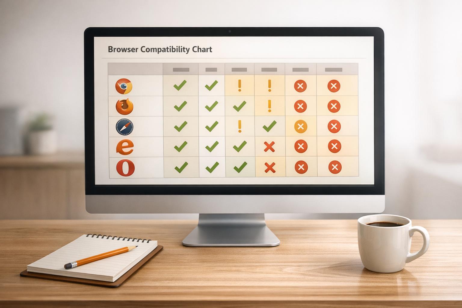
Checklist for Cross-Browser Compatibility Testing
 17-01-2026 (Last modified: 22-01-2026)
Does your website work flawlessly on every browser? If not, cross-browser compatibility testing is your answer. It ensures that your site performs consistently across browsers, devices, and operating systems, preventing user frustration and revenue loss.
Here’s the quick takeaway:
- Why it matters: A site that works on Chrome might break on Safari or Firefox. With over 65% of web traffic coming from mobile devices, ignoring this step can alienate users.
- Key steps: Test on popular browsers (e.g., Chrome, Safari, Edge, Firefox) and devices (iOS, Android, Windows, macOS). Focus on critical features like forms, buttons, and payment processes.
- Tools to use: Analytics tools (like Google Analytics) to identify target browsers, W3C Validator for code checks, and automation tools like Selenium for efficient testing.
- What to check: Visual consistency, responsive design, functionality, performance, and accessibility.
Bottom line: Cross-browser testing ensures your site delivers a consistent experience, improves usability, and avoids costly fixes post-launch.
Cross Browser Testing – Ultimate Guide (Start to Finish) [With Checklist]
Preparation Steps for Cross-Browser Testing

Browser Market Share and Cross-Browser Testing Coverage Statistics 2025
Identify Target Browsers and Devices
Use tools like Google Analytics or Matomo to analyze which browsers and devices your audience relies on most. This ensures your testing aligns with actual user behavior. If you’re entering a new market, StatCounter can provide browser usage data specific to that region.
As of December 2025, Chrome dominates with a 71.23% market share, followed by Safari at 14.84% and Edge at 4.6%. Testing on Chrome, Safari (Mobile), and Edge will cover about 94% of users, while adding Firefox and Safari (Desktop) increases coverage to nearly 99%. For business-focused applications, prioritize Chrome and Firefox. For iPhone-heavy audiences, Safari is a must.
Pay special attention to high-risk areas like payment processes, login systems, and form submissions. Since over 60% of traffic now comes from mobile devices, testing on iOS Safari and Chrome Mobile – using actual devices – can help identify issues related to touch functionality, memory usage, and performance.
Once you’ve identified the key browser and device combinations, document them in a detailed testing matrix.
Create a Testing Matrix
A testing matrix serves as a roadmap, listing all the browser, operating system, and device combinations you need to test. Use a tiered approach:
- A-grade: Modern browsers like the latest Chrome and Safari.
- B-grade: Older browsers, such as Opera Mini.
- C-grade: Rarely used browsers, where defensive design is sufficient.
Your matrix should include:
- Device types (desktop, mobile, tablet).
- Specific browser versions.
- Operating systems (Windows, macOS, Linux, iOS, Android).
- Screen resolutions.
Take baseline screenshots for visual comparisons. Keep the matrix updated – either quarterly or whenever browser usage shifts by more than 2–3%. Any browser-OS combination accounting for over 5% of your traffic should be prioritized for testing.
Validate Standards and Compatibility
Start by validating your HTML, CSS, and XHTML with tools like W3C Validator and CSSLint to catch syntax errors. Make sure every page includes a proper DOCTYPE declaration. Also, check that your SSL certificate is compatible with all target browsers, as older ones may not support certain certificates.
Use resources like caniuse.com to verify which HTML, CSS, or JavaScript features are supported across different browsers. Apply tools like Normalize.css or a CSS reset to minimize styling inconsistencies. Instead of detecting browsers, rely on feature detection with native options like @supports or JavaScript libraries to implement fallbacks where needed. Keep in mind that different rendering engines – like Blink, WebKit, and Gecko – can lead to inconsistencies, so thorough testing is essential.
Visual and Layout Compatibility Checks
With your testing matrix and standards in place, it’s time to ensure your website maintains visual consistency across platforms.
Verify Layout and Design Consistency
Start by taking baseline screenshots of your website in the primary browser it was designed for – these will act as your “source of truth” for future comparisons. Pay close attention to differences in font rendering between operating systems, as these can subtly impact readability and the overall visual balance.
Check that dynamic elements are properly aligned and not overlapping. Images should stay within their designated containers, icons need to be correctly positioned, and form fields like checkboxes, radio buttons, and dropdown menus should appear uniformly. Manually resize your browser window to confirm that no horizontal scrolling occurs due to long words or links spilling out of view. These small details ensure your site looks polished and professional on all platforms.
The next step is to evaluate how media assets and graphics perform across different browsers.
Test Media and Graphics Rendering
Make sure images scale correctly by using percentage-based widths or max-width properties in your CSS. This prevents distortion or overflow issues. Test animations and media formats across your targeted browsers, and offer fallback solutions where necessary. Additionally, check that media performs smoothly on lower-spec mobile devices to avoid lag or glitches.
Be aware that rendering engines and GPUs can interpret color profiles differently, sometimes causing slight color shifts between browsers. Test media elements in both portrait and landscape modes on mobile devices to ensure they display correctly when users rotate their screens. Also, confirm that critical elements like sign-up buttons and input fields remain visible and accessible, even when the mobile keyboard pops up.
Once your visuals are solid, move on to testing your responsive design.
Check Responsive Design Adaptation
Use developer tools for quick viewport checks, but don’t stop there – validate your layouts on actual devices to catch any hardware-specific quirks.
Focus on the most common device and browser combinations that account for over 5% of your traffic. Test that buttons and links have enough spacing for easy touch interaction, reducing the chance of accidental clicks. Verify that all breakpoints function as intended, ensuring your layout adjusts smoothly for various screen sizes and resolutions. This step is key to delivering a seamless experience across devices.
Functional Compatibility Checks
Once the visuals are approved, it’s time to dive into testing functionality. Every form, button, and interaction needs to work seamlessly across all target browsers.
Test Interactive Elements
Start by thoroughly testing buttons, forms, and input fields in each browser. Ensure that required fields trigger proper validation messages when left empty or filled incorrectly. Submit buttons should send data to the correct endpoint, and features like save, import, and export must perform without a hitch.
Interactive elements should respond consistently, whether accessed via mouse clicks, touchscreen taps, or keyboard navigation. Dropdown menus need to display all options without cutting off content, and checkboxes should align properly with their labels while maintaining consistent toggle behavior. Navigation links must redirect to the right URLs without delays or broken paths.
For a more controlled environment, test in private or incognito mode to rule out interference from third-party extensions or cached data. Establish a baseline by testing interactions in your primary browser, then compare results across others to spot inconsistencies.
Lastly, verify that scripts and external integrations work uniformly across browsers.
Validate Scripts and Integrations
Different browsers rely on unique JavaScript engines, such as V8, SpiderMonkey, or JavaScriptCore, which can lead to variations in execution. Test all JavaScript, jQuery, and Ajax functionalities to ensure they behave as expected across your target browsers.
Instead of relying on browser sniffing, use feature detection to check for API or JavaScript feature support before running specific code. For example, some browsers like Opera Mini don’t support WebSockets or certain getUserMedia requests, potentially breaking real-time features. Tools like caniuse.com can help verify browser compatibility before implementing such features.
Ensure that API calls and third-party integrations function smoothly without disrupting core site features. Test event handling – like clicks, keypresses, and touch interactions – to confirm consistent behavior across different browser engines. For older browsers, polyfills and tools like Babel can bridge compatibility gaps by enabling modern JavaScript features.
After validating scripts, move on to testing file and media operations for a complete functionality check.
Confirm File and Media Handling
File uploads and downloads should work flawlessly for all supported formats, including text files, images, videos, and other media types. Audio and video files must play without stuttering or errors.
Pay special attention to media performance on lower-spec mobile devices, as issues like lagging animations or buffering high-resolution videos might not appear on desktops. Media elements should adapt smoothly to both portrait and landscape orientations when users rotate their screens.
Scripts managing file interactions – such as submit, save, or download buttons – must function consistently across browsers to avoid data loss during transfers. Use feature detection to confirm support for media APIs, and offer fallback options for users on older browsers that may not handle certain formats.
| Element Type | Key Functional Checks |
|---|---|
| Buttons | Proper alignment, hover states, click/touch response, accurate URL redirection |
| Forms | Input validation, successful data transfer to API endpoints, submit/reset functionality |
| Dropdowns | Full visibility of options, keyboard accessibility, selection persistence |
| Checkboxes | Proper alignment with labels, consistent toggle states, adequate touch target size |
| Media/Plugins | Smooth playback controls, file upload/download functionality, proper animation rendering |
sbb-itb-6e49fcd
Performance and Accessibility Testing
Making sure your website is fast and accessible is key to providing a great user experience. These tests go beyond functional compatibility to ensure your site works smoothly in real-world scenarios and is usable by everyone.
Measure Website Speed and Responsiveness
Start by monitoring Core Web Vitals like Largest Contentful Paint (LCP), Cumulative Layout Shift (CLS), and Interaction to Next Paint (INP). Use browser tools like DevTools to record CPU profiles and identify any performance bottlenecks.
For a deeper dive, tools like WebPageTest analyze your site’s performance across different browsers, devices, and network conditions. They check components like DNS, TCP, and TLS to help pinpoint issues. To see how your site performs for actual users, compare your local testing results with real-world data from sources like the Chrome UX Report.
Simulate real-world conditions by applying CPU and network throttling – try settings like “Fast 4G” or “20x slowdown”. Don’t forget to test on both high-end and budget devices. Features like animations or complex scripts that run smoothly on powerful desktops might struggle on low-end mobile devices.
Conduct Accessibility Testing
Accessibility is about making your site usable for everyone, and following the POUR principles – Perceivable, Operable, Understandable, Robust – is a great starting point.
Use semantic HTML with proper landmarks like <header>, <main>, <nav>, and <footer>. This helps screen readers interpret your site’s structure. Ensure all functionality can be accessed with a keyboard, and include visible focus indicators and a logical tab order. For images, provide descriptive alt text for content images and use alt="" for decorative ones. Maintain a contrast ratio of at least 4.5:1 for regular text and 3:1 for larger text to meet WCAG Level AA standards.
To identify accessibility issues, run automated scans with tools like WAVE, Google Lighthouse, or Deque’s aXe. Follow up with manual testing using screen readers like VoiceOver (macOS/iOS), NVDA (Windows), or TalkBack (Android). Check that screen readers can correctly interpret element roles and states. For additional testing, disable CSS in your browser to confirm that the content structure remains logical. Finally, resize text to 200% on a 320-pixel-wide screen to ensure the layout adjusts without causing horizontal scrolling.
Final Validation and Continuous Testing
Once you’ve completed initial testing and applied necessary fixes, it’s time to focus on continuous testing. This step ensures your platform remains stable and functional as updates are made. By refining your debugging process and automating checks, you can maintain a seamless user experience.
Debug and Resolve Issues
Start by isolating specific issues. Test across various platforms, devices, and browser versions to pinpoint inconsistencies. Browser developer tools can help identify CSS or syntax errors, while W3C validation services are excellent for catching code issues. Keep in mind that different browsers handle errors in unique ways, which can lead to inconsistent rendering across platforms.
For modern web features that older browsers might not support, you can use tools like @supports in CSS or JavaScript libraries such as Modernizr. These tools enable feature detection and allow you to add polyfills to ensure fallback functionality where necessary.
Testing in private or incognito mode with browser extensions disabled is another good practice. This eliminates potential interference from cached files or add-ons, ensuring more accurate results.
Retest and Document Results
After implementing fixes, retest your platform to confirm that the issues have been resolved without causing new problems. Regression testing is crucial here – it ensures that updates haven’t disrupted existing functionality. Stick to the same predefined test scripts used during initial testing to maintain consistency across devices and browsers.
Document everything. Capture logs, screenshots, and even video recordings of your test executions. These artifacts are invaluable for debugging and serve as clear evidence for any further troubleshooting.
“If you leave all the testing to the end of a project, any bugs you uncover will be a lot more expensive and time-consuming to fix than if you uncover them and fix them as you go along.” – MDN Contributors
Keep a centralized record of your testing process. This should include your list of supported browsers, test coverage details, and any known limitations. Such documentation saves time in future testing cycles and ensures everyone on the team is on the same page.
Use Automation Tools
Automation tools are essential for integrating continuous testing into your workflow. Tools like Selenium WebDriver are widely used for their compatibility with all major browsers. Microsoft’s Playwright is another solid option, offering fast execution and native support for Chromium, Firefox, and WebKit. For a developer-friendly experience, Cypress provides real-time debugging capabilities by running tests directly in the browser.
These tools can be connected to CI/CD pipelines through platforms like Jenkins, GitHub Actions, or GitLab. This setup allows test suites to run automatically with every pull request or deployment, ensuring issues are caught early. Running tests in parallel across multiple browser and device combinations can significantly reduce execution time.
For teams that want to simplify testing further, PageTest.AI offers an AI-driven platform to streamline content testing and optimization across various browsers. This helps ensure consistent performance as you make updates.
Finally, use data analytics tools like Google Analytics to understand which browsers and devices your audience uses most frequently. Prioritizing these configurations allows you to focus your testing efforts where they matter most, ensuring a better experience for your users.
Conclusion
Cross-browser compatibility testing isn’t just a technical task – it’s a business necessity. With over 9,000 active browser and operating system combinations, ensuring your website performs seamlessly across all platforms is critical. Add to that the fact that more than 65% of global web traffic now comes from mobile devices as of 2024, and the stakes for consistent performance are even higher.
When browsers fail to render your site properly, it frustrates users, tarnishes your brand’s image, and can negatively affect your SEO. Avoid these pitfalls by following a structured approach:
- Use analytics to pinpoint your target browsers (e.g., Chrome at 65.4% and Safari at 18.7%).
- Validate your code against W3C standards.
- Ensure visuals and functionality are flawless.
- Leverage automation to streamline your testing process and keep detailed documentation of results.
Catching compatibility issues early in development isn’t just smart – it’s cost-effective. Fixing bugs before launch is far cheaper than addressing them after they’ve already impacted your users.
Make continuous testing a habit. Automate checks, retest with every update, and focus on the browsers your audience uses most. This proactive approach ensures your website delivers a consistent, frustration-free experience for everyone.
FAQs
How can I decide which browsers and devices to focus on for cross-browser testing?
To figure out which browsers and devices should take priority in your testing, dive into your website’s traffic data. Look for patterns – what browsers, operating systems, and screen sizes are your visitors using the most? Pay attention to both the latest versions and any older versions that still show significant activity among your audience.
By concentrating your testing on these platforms, you’ll make sure your site provides a smooth and reliable experience where it counts the most.
What are the best tools to automate cross-browser compatibility testing?
Automating cross-browser testing ensures your website performs consistently across various browsers, devices, and operating systems. A few standout tools can make this process smoother. BrowserStack Automate, for instance, provides cloud-based access to real browsers and integrates seamlessly with CI pipelines. Similarly, Selenium WebDriver is a widely-used open-source library that excels in browser automation. For modern needs, frameworks like Cypress and Playwright deliver fast and dependable testing with built-in support for major browsers.
Other notable tools include WebDriverIO, Puppeteer, and TestCafe, each offering distinct APIs and features to scale your testing efforts. The best choice depends on your team’s preferred programming languages, workflow requirements, and whether you need real-device testing or headless execution. These tools simplify repetitive tasks such as rendering checks, user interactions, and visual validations, making cross-browser testing more efficient and consistent.
How often should I update my testing matrix and retest my website for cross-browser compatibility?
It’s smart to keep your testing matrix up to date and retest your website on a regular basis. This ensures your site performs well across all major browsers. While there’s no hard-and-fast rule, it’s a good practice to retest whenever you roll out significant updates, like new features, page redesigns, or changes to core functionality.
You should also revisit your testing matrix every few months or at least twice a year. This allows you to adapt to new browser versions, shifts in user behavior, or advancements in technology. Taking these steps ensures your site delivers a smooth and consistent experience for everyone who visits.
Related Blog Posts
say hello to easy Content Testing
try PageTest.AI tool for free
Start making the most of your websites traffic and optimize your content and CTAs.
Related Posts

30-03-2026
 Ian Naylor
How Internal Links Boost Conversions
Strategic internal links guide users, improve SEO, and turn site navigation into measurable conversion growth.

28-03-2026
Ian Naylor
Core Web Vitals Benchmarks by Industry
Industry Core Web Vitals benchmarks and practical fixes for LCP, INP, and CLS, plus mobile vs desktop gaps and optimization tips.

26-03-2026
Ian Naylor
How to Benchmark Mobile Retention Rates
Benchmark Day 1/7/30 retention, run cohort analysis, and optimize onboarding, habit triggers, and personalization to improve app retention.