
How To Read Heatmap Data For CRO

How To Read Heatmap Data For CRO
![]() 31-01-2026 (Last modified: 03-02-2026)
31-01-2026 (Last modified: 03-02-2026)
Heatmaps are visual tools that show where users engage most on your site using color-coded data. Red and orange indicate high activity, while blue and green show less interaction. They help identify user behavior patterns, like where visitors click, scroll, or hover, and uncover issues like missed CTAs or confusing layouts. By analyzing heatmaps, you can pinpoint problem areas and make changes to improve conversions.
Key Takeaways:
- Click Heatmaps: Show where users click, revealing effective CTAs and problem areas like “rage clicks” on non-functional elements.
- Scroll Heatmaps: Highlight how far users scroll, helping optimize content placement above the fold.
- Mouse Movement Heatmaps: Track cursor movement to understand attention patterns and identify confusion or “banner blindness.”
To get actionable insights:
- Collect 1,000–3,000 page views over a week and segment data by device, traffic source, and visitor type.
- Look for “hotspots” (high engagement) and “cold spots” (low engagement) to adjust content placement.
- Use tools like PageTest.AI to test changes based on heatmap data.
Heatmap analysis helps you see your site through users’ eyes, guiding data-driven changes to boost engagement and conversions.
Website Heatmaps – 1 Simple Trick to Analyse Your Users Behavior
Types of Heatmaps and Their Use Cases
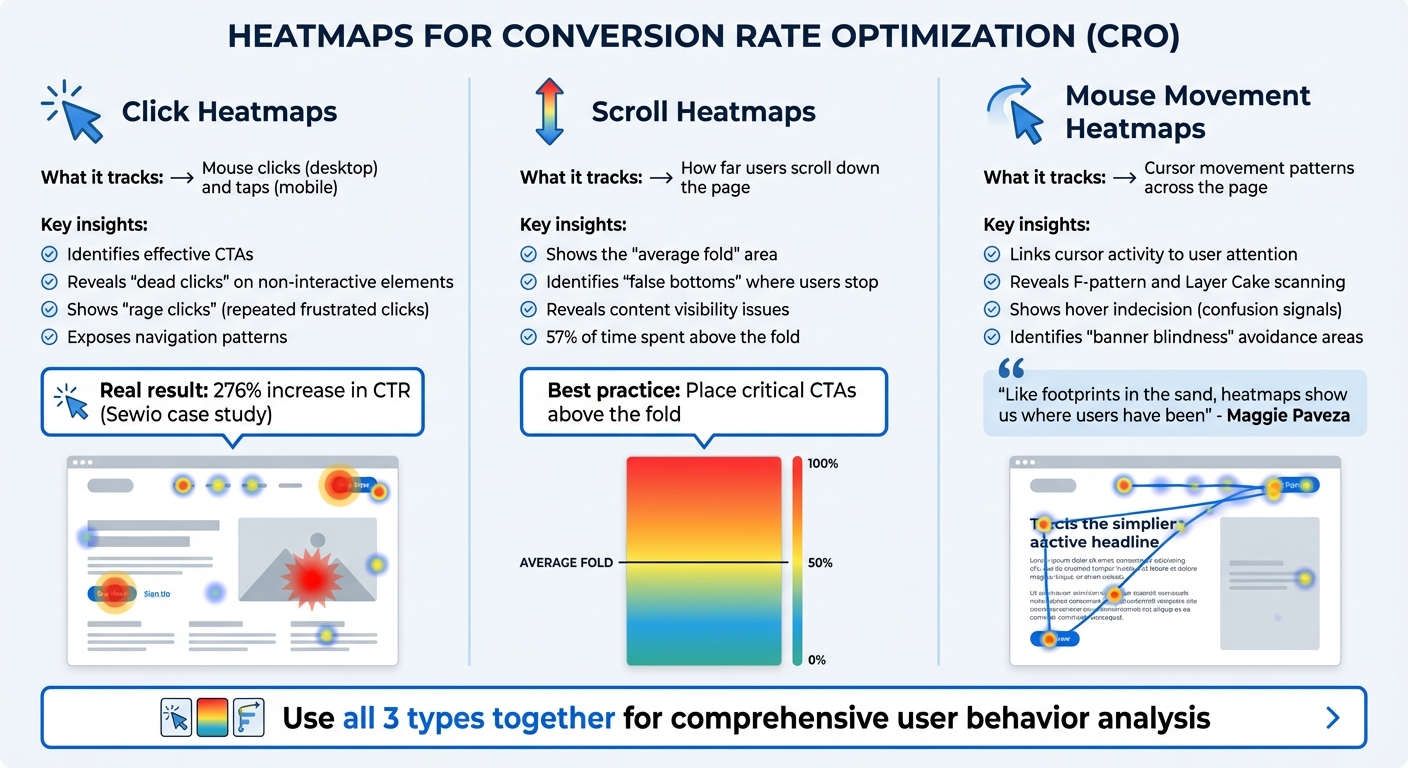
3 Types of Heatmaps for CRO: Click, Scroll, and Mouse Movement Analysis
Click Heatmaps
Click heatmaps use color coding to visually map where users interact with your page, tracking every mouse click on a desktop or tap on a mobile device. They are particularly useful for identifying which CTAs are working well and which ones are being ignored.
These maps also expose “dead clicks” – instances where users click on non-interactive elements – and “rage clicks”, which occur when users repeatedly click out of frustration, often due to broken links or slow-loading features. For example, Sewio used click maps to discover their homepage’s critical buttons were being overlooked. After repositioning the “Go to store” button to a more prominent location, they saw a 276% increase in click-through rate.
Click heatmaps also shed light on navigation patterns. If users frequently click on a category buried in the middle of a menu, it might be time to bump it up higher. Conversely, if a search function sees little activity, it could mean the design or placement needs improvement.
But clicks are only part of the story – understanding how far users scroll adds another layer of insight.
Scroll Heatmaps
Scroll heatmaps show how far down a page users venture before leaving or bouncing. Using color gradients, they illustrate the percentage of visitors reaching each section, which helps pinpoint the “average fold” – the area of the page most users see without scrolling.
These maps also uncover “false bottoms”, where design elements unintentionally signal the end of a page, causing users to stop scrolling prematurely. Since users spend about 57% of their time above the fold, placing critical CTAs or key content below this area could mean missed opportunities for conversions. By analyzing scroll data, you can decide where to position conversion-focused elements for maximum visibility.
To go even deeper, mouse movement heatmaps offer a closer look at user behavior.
Mouse Movement Heatmaps
Mouse movement heatmaps track how users move their cursors across the page, providing insights into attention patterns. While not as precise as eye-tracking studies, they offer a solid alternative by linking cursor activity to user focus. These maps reveal common scanning behaviors, like the F-shaped or Layer Cake patterns, and highlight moments of indecision when users hover between options – often a sign of confusion that could hurt conversions.
“Like footprints in the sand, heatmaps show us where users have been. And we use that information to infer and imply intent.”
- Maggie Paveza, Strategist, The Good
Mouse movement maps also help identify “banner blindness”, where users intentionally avoid certain areas they perceive as irrelevant, such as ads or cluttered sections. By spotting these avoidance patterns, you can refine your layout to better guide users toward key actions.
When used together, these heatmaps offer a comprehensive view of user behavior, helping you optimize your site for better engagement and conversions.
How to Read Heatmap Data
Understanding the different types of heatmaps is just the beginning. The real value lies in interpreting the data to uncover patterns in user behavior that directly influence your conversion goals. A careful approach to collecting and segmenting data ensures your analysis is accurate and actionable.
Collect and Segment Data
Start by organizing your data based on device type, traffic source, and visitor behavior. It’s crucial to analyze mobile and desktop traffic separately since screen sizes and layouts significantly impact where users click or how far they scroll. Also, break down data by traffic source – for example, organic search versus social media – and by visitor type (new versus returning users). This segmentation helps you understand how different groups interact with your site. Don’t forget to exclude internal IP addresses to prevent your team’s activity from distorting the results.
Identify Hotspots and Cold Spots
Heatmaps use colors to represent engagement levels. Warm colors like red, orange, and yellow highlight areas with high activity – these are your hotspots. Cool colors like blue and green mark areas with low engagement – your cold spots. However, as Marie Sevel points out, not all red zones are positive – they might indicate distractions rather than meaningful engagement.
Check that hotspots align with your key calls-to-action (CTAs). If users are clicking heavily on non-clickable elements like images or headings, it signals confusion – they’re trying to interact with something that doesn’t respond. On the flip side, if critical elements like your value proposition or main CTA are in cold zones, they might be poorly positioned, lack visual emphasis, or be too far down the page to catch attention.
For scroll maps, pay attention to the “average fold” – the portion of the page most users see without scrolling. Since 57% of viewing time occurs above the fold, placing essential content below this line increases the risk of it being overlooked. Sudden shifts from warm to cool colors can indicate a “false bottom”, where users mistakenly think they’ve reached the end of the page.
“We’ve seen teams panic over ‘dead’ areas on a heatmap when, in reality, users were completing their goal without needing to interact. Heatmaps only show movement, not success.” Ian Naylor, Founder of PageTest.ai
Analyze Patterns and Anomalies
Dive deeper into specific user behaviors to uncover potential issues. For instance, rage clicks – clusters of rapid, repeated clicks in one spot – often reveal frustration caused by broken links, slow-loading elements, or confusing interfaces. These should be addressed immediately.
“In our experience, heavy clicking often signals confusion (a nicer way of putting ‘rage’) rather than interest. Some of the highest-converting pages we’ve worked on actually had fewer clicks, not more.” Ian Naylor, Founder of PageTest.ai
Pay attention to reading patterns as well. The F-pattern, where heat concentrates on the top and left side of the page, shows users are scanning rather than reading every word. Similarly, the Layer Cake pattern, with heat on headlines but not on body text, suggests users are skimming and might miss critical information. Instances of click indecision, where users hover between two similar elements, point to unclear choices or poorly labeled options.
Other movement anomalies can also provide insights. Erratic cursor movements suggest users are lost or distracted by competing elements on the page. Areas users consistently avoid with their cursor may suffer from “banner blindness”, where content is dismissed as irrelevant advertising.
Here’s a quick reference table to summarize key patterns:
| Pattern | What It Means | Priority Action |
|---|---|---|
| Rage Clicks | User frustration or broken element | Investigate and fix technical issues |
| False Bottom | Users think the page has ended | Add visual cues to encourage scrolling |
| Cold Zone CTA | Poor visibility or placement | Reposition or redesign critical elements |
| Layer Cake | Users skipping details | Improve headlines and simplify subtext |
The goal is to link these patterns to their impact on your business. Once you’ve gathered enough data and identified clear trends, you’ll be ready to make informed decisions to enhance your site’s performance.
“Heatmap patterns often look completely different on mobile versus desktop. We’ve seen ‘ignored’ desktop sections become high-engagement zones on mobile once the layout shifts.” Becky Halls, Strategist at PageTest.ai
sbb-itb-6e49fcd
How to Optimize Website Elements Using Heatmap Data
Once you’ve analyzed your heatmap data, it’s time to put those insights to work. By focusing on low-engagement areas and adjusting content placement, you can address friction points, draw attention to neglected sections, and drive more conversions.
Fix Low Engagement Areas
Low-engagement zones, often shown as blue or “cold spots” on heatmaps, highlight missed opportunities. For instance, if your primary call-to-action (CTA) is stuck in a cold spot, most visitors probably aren’t seeing it. Moving these critical elements to high-engagement zones identified by your heatmap can make all the difference.
Take Muc-Off as an example. In May 2025, they noticed users dropping off before reaching product images on their homepage. By moving these images above the fold, they achieved a 106% increase in purchases.
“Identifying low-performing areas is just as important as highlighting hotspots. These zones reveal gaps and opportunities for improvement that can transform your page.” – Angi Bowman, Lucky Orange
Sometimes, users interact with static elements like images that aren’t clickable. If this happens, consider adding functionality such as links, tooltips, or pop-ups. Similarly, if your navigation menu has tabs or options that no one is using, move popular items to the forefront and remove the underperforming ones.
Improve Scroll Depth and Content Placement
Scroll maps help you pinpoint where users stop engaging with your page. Sudden shifts in color often indicate “false bottoms”, where users think they’ve reached the end of the page due to poor design.
“We’ve found that scroll maps are most useful when paired with conversion data. A drop-off doesn’t always mean users lost interest but it sometimes means they found what they needed sooner.” Ian Naylor, PageTest.ai
To maximize engagement, place your most important elements – like your value proposition, primary CTA, and key messaging – above the fold. Less than 50% of users typically scroll below the fold, so this area is prime real estate. It’s also crucial to segment your analysis by device type. Content that appears above the fold on desktop may fall below it on mobile, which can affect engagement.
For example, U-Digital used heatmaps to analyze a client’s mobile product page in May 2025. By reworking the layout and rearranging elements based on their findings, they saw a 21.46% increase in click-through rates. Aligning content with natural reading patterns, like the F-pattern (where users scan left to right and top to bottom), can also significantly improve usability.
These adjustments provide a foundation for further testing.
Test Variations with PageTest.AI

Once you’ve made initial changes, use tools like PageTest.AI to test variations of your website elements. This no-code platform allows you to create A/B tests for headlines, CTAs, button text, and layouts based on your heatmap data. Instead of guessing which adjustments will resonate, you can measure the actual impact.
For example, if heatmaps show that users are ignoring your current CTA placement, you can use PageTest.AI to try out different positions, colors, or wording. The tool tracks performance metrics like clicks, engagement, time on page, and scroll depth, giving you clear data on which version works best.
Celerity India Marketing Services utilized this approach during a B2B campaign. By combining heatmap insights with A/B testing, they identified user behavior improvements with each iteration, ultimately quadrupling their client’s ROI in just two months.
This combination of data-driven insights and systematic testing creates a continuous optimization loop. Heatmaps reveal problem areas and opportunities, while tools like PageTest.AI validate solutions before you implement them permanently. The result? Every change you make is backed by evidence, ensuring improved user engagement.
How To Read Heatmap Data – Conclusion
Heatmap analysis changes the way you understand how visitors interact with your website. Instead of relying on guesswork, it provides visual proof of where users are engaging and where they’re losing interest. This shift from assumptions to data-driven decisions can have a direct impact on your conversion rates.
“Mastering how to read a heat map is about seeing your website as your customers do. It strips away assumptions and puts real user behavior front and center.” – Dylan Ander, Founder of Heatmap
By collecting enough segmented data, you can identify problem areas like rage clicks or dead zones and make targeted improvements. Focus on high-visibility areas for your most important content, and use these insights to guide your optimization efforts. But analyzing data is just the first step – what really matters is how you act on it.
Testing your ideas is essential to turning insights into measurable results. For example, tools like PageTest.AI let you experiment with changes inspired by your heatmap findings, such as adjusting CTA placement, tweaking headlines, or modifying button colors. These tests reveal which adjustments truly enhance engagement and boost conversions.
When heatmap analysis is paired with structured testing, you create a cycle of continuous improvement. Each round of changes brings your site closer to matching your visitors’ actual behaviors, not just your expectations. The payoff? Better engagement, smoother user experiences, and higher conversion rates.
How To Read Heatmap Data – FAQs
How do heatmaps help boost my website’s conversion rate?
Heatmaps visually show how visitors interact with your website, highlighting where they click, scroll, or linger the longest. These patterns help you identify which elements engage users and which might be causing frustration.
With this insight, you can fine-tune your website’s design, content, and layout to improve the overall experience, reduce drop-offs, and boost conversions. For instance, you could adjust the placement of a call-to-action button or tweak key content to grab attention more effectively.
What are rage clicks, and why do they matter for user experience?
Rage clicks happen when users repeatedly click on a specific part of a website out of frustration – usually because the element isn’t responding or working the way they expect. This kind of behavior often points to usability problems or areas where the site creates unnecessary friction for visitors.
Spotting rage clicks is a key step in enhancing the user experience. These clicks act as a red flag, showing where your site’s design or functionality might need tweaking. Fixing these problem areas can make the experience smoother, reduce frustration, and even lead to better engagement and higher conversions.
How can I use heatmap data to find the best spot for my CTAs?
To figure out the best spots for your CTAs, start by analyzing heatmap data. Heatmaps visually display user engagement through color coding – hot spots (usually red or orange) highlight areas with the most activity, like clicks, scrolls, or hovers.
Pay attention to patterns showing where users naturally focus, such as areas above the fold or sections that attract frequent clicks. By placing your CTAs in these high-engagement zones, you increase their visibility and make them easier to interact with. Heatmap data can also reveal problem areas, like sections where users lose interest or encounter friction, allowing you to tweak your layout and boost conversions.
Related Blog Posts
say hello to easy Content Testing
try PageTest.AI tool for free
Start making the most of your websites traffic and optimize your content and CTAs.
Related Posts

![]() 30-03-2026
30-03-2026
 Ian Naylor
How Internal Links Boost Conversions
Strategic internal links guide users, improve SEO, and turn site navigation into measurable conversion growth.
![]() 28-03-2026
28-03-2026
Ian Naylor
Core Web Vitals Benchmarks by Industry
Industry Core Web Vitals benchmarks and practical fixes for LCP, INP, and CLS, plus mobile vs desktop gaps and optimization tips.

![]() 26-03-2026
26-03-2026
Ian Naylor
How to Benchmark Mobile Retention Rates
Benchmark Day 1/7/30 retention, run cohort analysis, and optimize onboarding, habit triggers, and personalization to improve app retention.